Connect with us

Published

on

The UK’s climate saw a record-breaking 2025, with the year being both the warmest and sunniest seen since observations began.

The year 2025 has joined 2024, 2023, 2022 and 2014 in the UK’s top-five warmest years.

In this review, we take a look back at the UK’s climate in 2025 and place the record-breaking year in the context of human-caused climate change. We find:

  • It was the warmest and sunniest year on record. January and September were the only months that were cooler than average.
  • A Met Office attribution study estimates that 2025’s average temperature would have been exceptionally unlikely in pre-industrial times – but could now occur, on average, every three years. 
  • Spring was the warmest on record, breaking a record set in 2024.  
  • Spring was not only the sunniest on record, but the fourth-sunniest season ever recorded, after the summers of 1976, 1996 and 1911. 
  • It was the warmest summer on record. The summer temperature record was made around 70 times more likely due to human-induced climate change.
  • The persistent high-pressure systems in spring and summer, which contributed to the warm and sunny conditions, also resulted in an extended dry spell – including the driest spring since 1974.
  • Wetter conditions at the end of the year alleviated some of the rain shortfall. The year concluded with 90% of average annual rainfall.
  • Storm Éowyn in late January was the most powerful wind storm in over a decade and the most severe storm in Northern Ireland since 1998. 
  • Storm Floris in early August was not unprecedented for a storm, but was one of the most severe wind storms to affect Scotland during the summer.
  • Storm Amy in early October hit north-western parts of the UK, with heavy rain falling widely, resulting in the wettest day of the year for the UK overall.

(See our previous annual analysis for 2024, 2023, 2022, 2021, 2020, 2019 and 2018.)

The year in summary

The Met Office relies on the long-running HadUK-Grid dataset to place recent UK weather and climate into its historical context. The gridded, geographically complete dataset combines observational data for monthly temperature since 1884, rainfall since 1836 and sunshine since 1910.

Unless stated otherwise, the rankings of events and statements (such as “warmest on record”) in this article relate to the HadUK-Grid series.

The “climate anomaly” maps below show the difference between the average temperature (left), rainfall total (middle) and sunshine duration (right) between 2025 and the 1991-2020 period. In other words, they show how much warmer, cooler, wetter, drier, sunnier or cloudier the year was than average for each county of the UK.
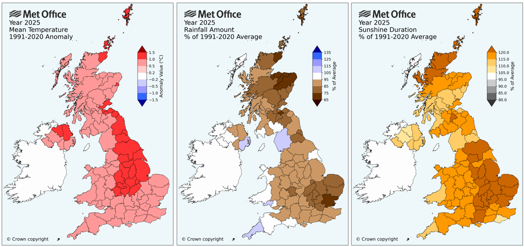
Maps showing anomalies in 2025 relative to a 1991-2020 reference period for temperature (C), precipitation (%) and sunshine (%). The darker shading indicates a greater departure from average. Credit: Met Office

The maps show that the whole country was warmer than average, with central and north-east England, parts of Northern Ireland and the tip of north-west Scotland, Orkney and Shetland seeing the greatest change.

The UK overall had 90% of average rainfall. The driest regions relative to average were around Essex, Moray and Aberdeenshire, which received less than 75% of normal annual rainfall.

In contrast, some western counties were slightly wetter than average – including Cornwall (110%) and Cumbria (107%).

Sunshine was above average across the UK, with eastern England and north Scotland exceeding 120% of the average.

Attribution

The UK’s absolute temperature averaged at 10.09C in 2025. This follows 2022 (at 10.03C) as the second time that the annual average temperature has exceeded 10C.

In our analysis of the UK’s climate in 2022 for Carbon Brief, we reported on a Met Office attribution study that found that human-caused climate change had increased the likelihood of UK annual absolute temperature averaging above 10C by a factor 160.

That study concluded that exceeding 10C – while unprecedented in the historical observational record – would become increasingly common and would likely occur every three-to-four years.

Three years on from that analysis and the 10C threshold has been breached for a second time – and an updated attribution analysis has been produced exploring the likelihood of a return of temperatures above the 10.09C recorded in 2025.

The study, which uses the same methodology as the 2022 paper, finds that UK annual mean temperatures above 10.09C are estimated to occur approximately every three years in the current climate. In contrast, they would have occurred around every 780 years in pre-industrial times.

Human-caused climate change has, therefore, increased the probability of average temperatures in excess of 10.09C by a factor of 260.

These results show that 2025’s record-breaking annual temperature – while unprecedented in the historical observational record – should be considered fairly normal in the current climate.

Climate projections indicate that, by the later part of the 21st century, a year like 2025 could be a relatively cool year.

The figure below compares observations of UK annual average temperatures (black line) – relative to the long-term average – to climate model simulations that include (red/purple) or exclude (green) human-caused emissions of greenhouse gases and land-use change.

The green and red curves start to diverge from around the 1980s, suggesting that human influence is indeed the dominant factor in the warming trend. The shaded range of the simulations show that in our current and future climate, much warmer years than 2025 are plausible.

Colder years are also still possible, but it is much less likely that we would experience a cold year like 2010 – and exceptionally unlikely for a year to be in the top-10 coldest years for the UK. The most recent year to feature in the top-10 coldest years was 1963.
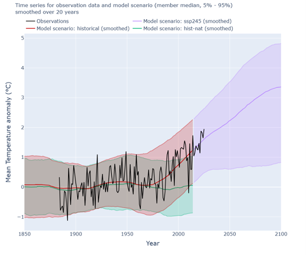
Chart showing the time series for observation data and model scenario smoothed over 20 years
Timeseries of the UK annual mean temperature anomaly (w.r.t. 1901 – 1930). Observational data from HadUK-Grid (black). Simulations from the CMIP6 historical simulation including natural and human-caused drivers (red), SSP2-4.5 projections of future climate based on a “medium” emissions scenario (purple) and “hist-nat” simulations that include only natural drivers of climate such as solar and volcanic activity (green). Simulation data is represented as median values and filled 5-95th percentile ranges explored by members of the multi-model ensemble. Percentiles of simulation data are smoothed with a rolling window of 20 years, with historical and SSP2-4.5 combined into one continuous series. Observed data runs from 1884-2025. Credit: Met Office

Warmer, wetter, sunnier

Four of the UK’s last five years all appear in the top-five warmest years since 1884.

The Central England Temperature (CET) series is the longest continuous instrumental climate record in the world, dating back to 1659. Covering a region roughly enclosed by Lancashire, London and Bristol, it does not represent the whole of the UK. However, when averaged across a year and analysed across centuries, it does provide a multi-century perspective that is representative of climate variations and changes that impacted the UK.

As with the HadUK-Grid temperature record, the CET series also identifies 2025 as the warmest year on record. The longer-running temperature series identifies the same five years – in the same order – as the warmest on record. This is shown in the table below. 

Year UK (from HadUK-Grid) Central England Temperature
2025 10.09C 11.23C
2022 10.03C 11.18C
2023 9.97C 11.13C
2014 9.88C 11.04C
2024 9.79C 10.96C

The graph below of the CET series shows that temperatures recorded in recent years are well outside the range of variability recorded over more than 300 years.
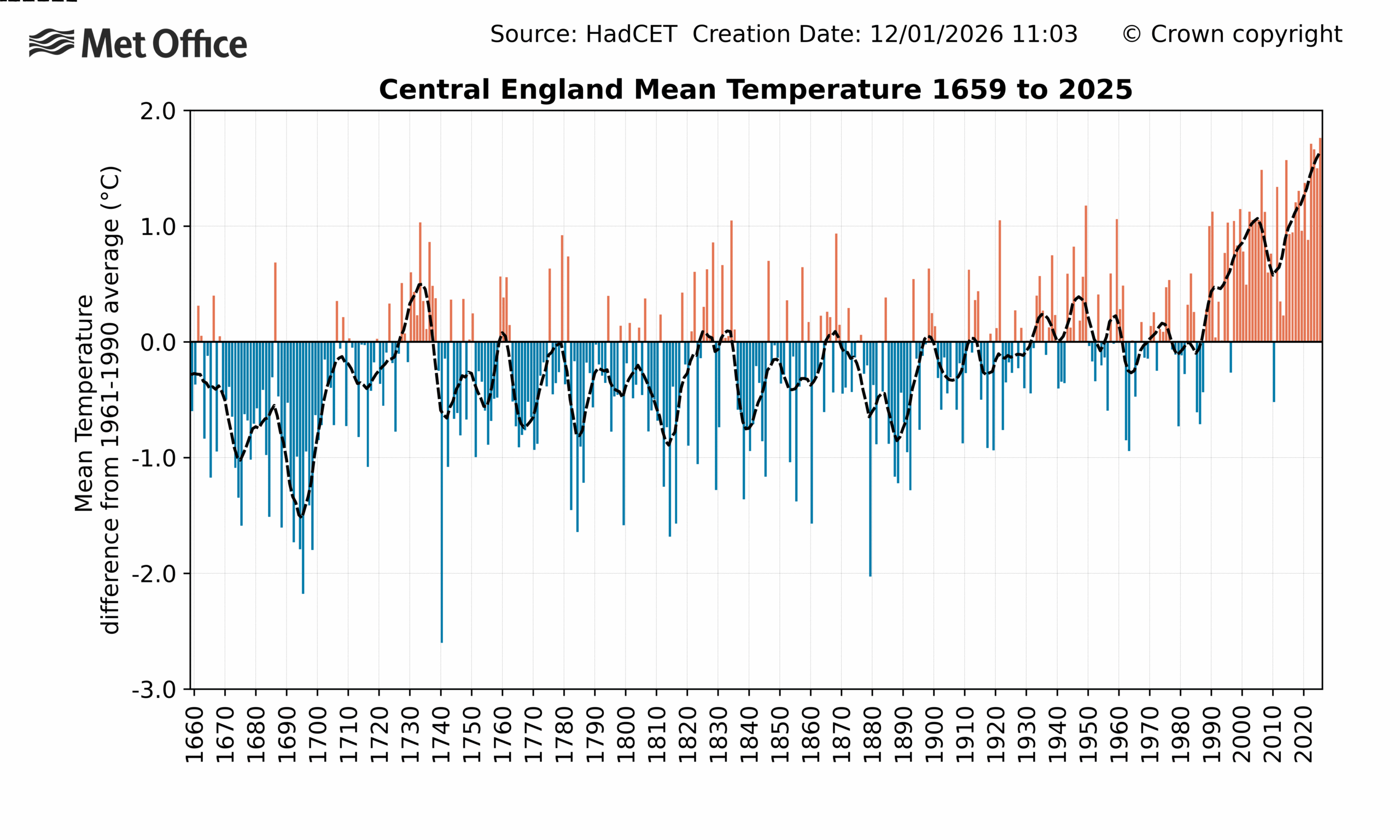
Chart showing the mean temperature in England from 1659 to 2025
Average temperature anomalies (relative to a 1961-90 average) for each year in the CET series from 1659 to 2025. Colours show years that are above (red) or below (blue) average. The dashed line is a smoothed series to show the decadal variations and trend. Credit: Met Office

However, the UK is not only warming, it is also getting wetter and sunnier. The year 2025 was relatively dry, recording 90% of average rainfall. This made it the driest year recorded since 2010 and put it in contrast to relatively wet years in 2023 and 2024.

The longer-term trend can be seen in the figure below, which shows that 2025 was relatively dry compared to recent decades, but not exceptional in the longer-term historical context.

The last time the UK had a year in the top-10 driest was in 1955, whereas all five of the top-10 wettest years have occurred this millennium. The wettest year on record still stands as 1872.
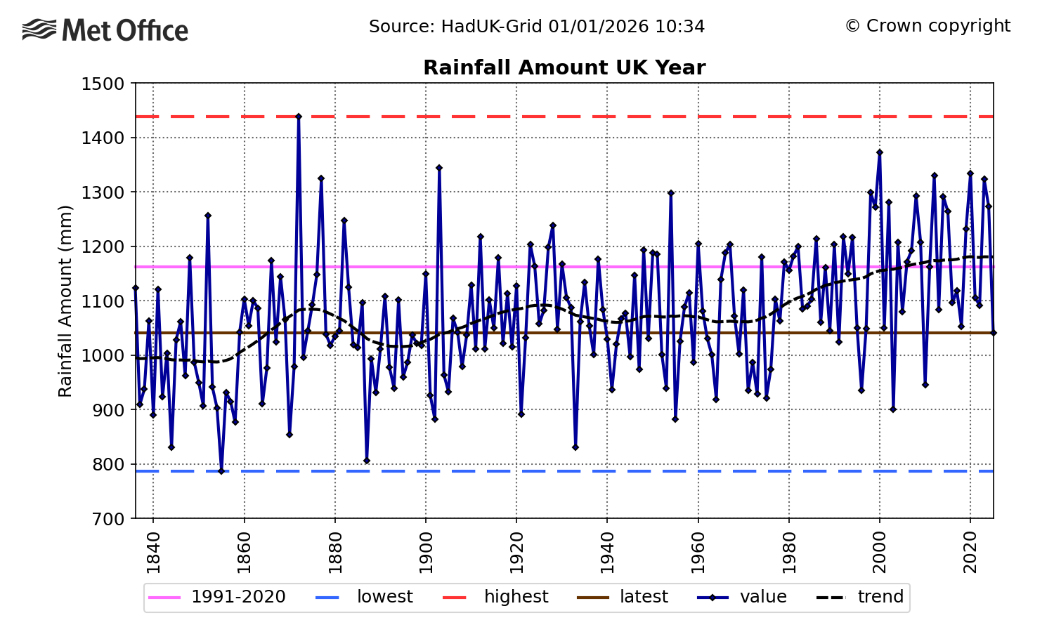
Chart showing the total rainfall from 1836 to 2025 in the UK.
Timeseries of UK total rainfall from 1836 to 2025. The trend is represented by a black dashed line, the 1991-2020 average is shown in pink and the highest and lowest values in the series are shown by the red and blue dashed lines, respectively. The 2025 value is represented by the horizontal brown line. Credit: Met Office

The drivers of annual rainfall trends are more complex than for temperature.

A significant factor in rainfall trends is a warming atmosphere’s ability to hold more moisture. However, this does not completely account for recent increases in rainfall.

Large-scale atmospheric circulation patterns – particularly features such as the jet stream and associated storm tracks across the North Atlantic – also play a crucial role. These are influenced by annual and decadal fluctuations in the Earth’s climate, as well as human-caused climate change.

UK annual sunshine totals have also been rising since the 1980s, with 2025 setting a record by a considerable margin. This is in sharp contrast to 2024, which was the dullest year since 1998. This is shown in the graph below, where the dotted line shows the underlying long-term trend, with year-to-year variations removed.
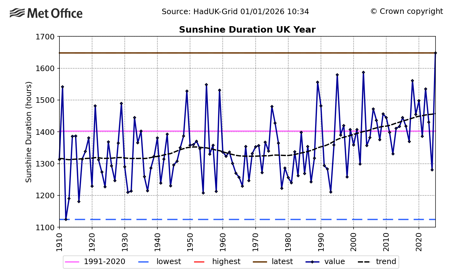
Chart showing the total annual sunshine hours from 1910 to 2025 in the UK.
Timeseries of UK total annual sunshine hours from 1910 to 2025. The trend is represented by a black dashed line, the 1991-2020 average is shown in pink and the highest and lowest values in the series are shown by the red and blue dashed lines, respectively. The 2025 value is represented by the horizontal brown line (which covers the red line for the highest in the record). Credit: Met Office

The cause of the sunshine trend is also uncertain, with both natural climate variability and human activity (through reduced regional air pollution caused by a reduction in aerosol emissions) potential contributors. Climate projections do not provide any strong evidence for how sunshine trends might develop.

The year in storms

The Met Office has been naming storms since 2015. Each storm-naming period runs from September to August.

(For more on storm naming in the UK, read Carbon Brief’s explainer.)

The criteria for storm naming has changed over time. It accounts for meteorological conditions, as well as the potential severity of impacts. As a result, comparisons between years can indicate relative levels of storm activity, but should not be done on a like-for-like basis.

Between the 2015-16 and 2024-25 storm seasons, there have been, on average, 7.7 named storms each year, with a high of 12 recorded in the 2023-24 season and a low of four over 2022-23. This is shown in the line chart below.
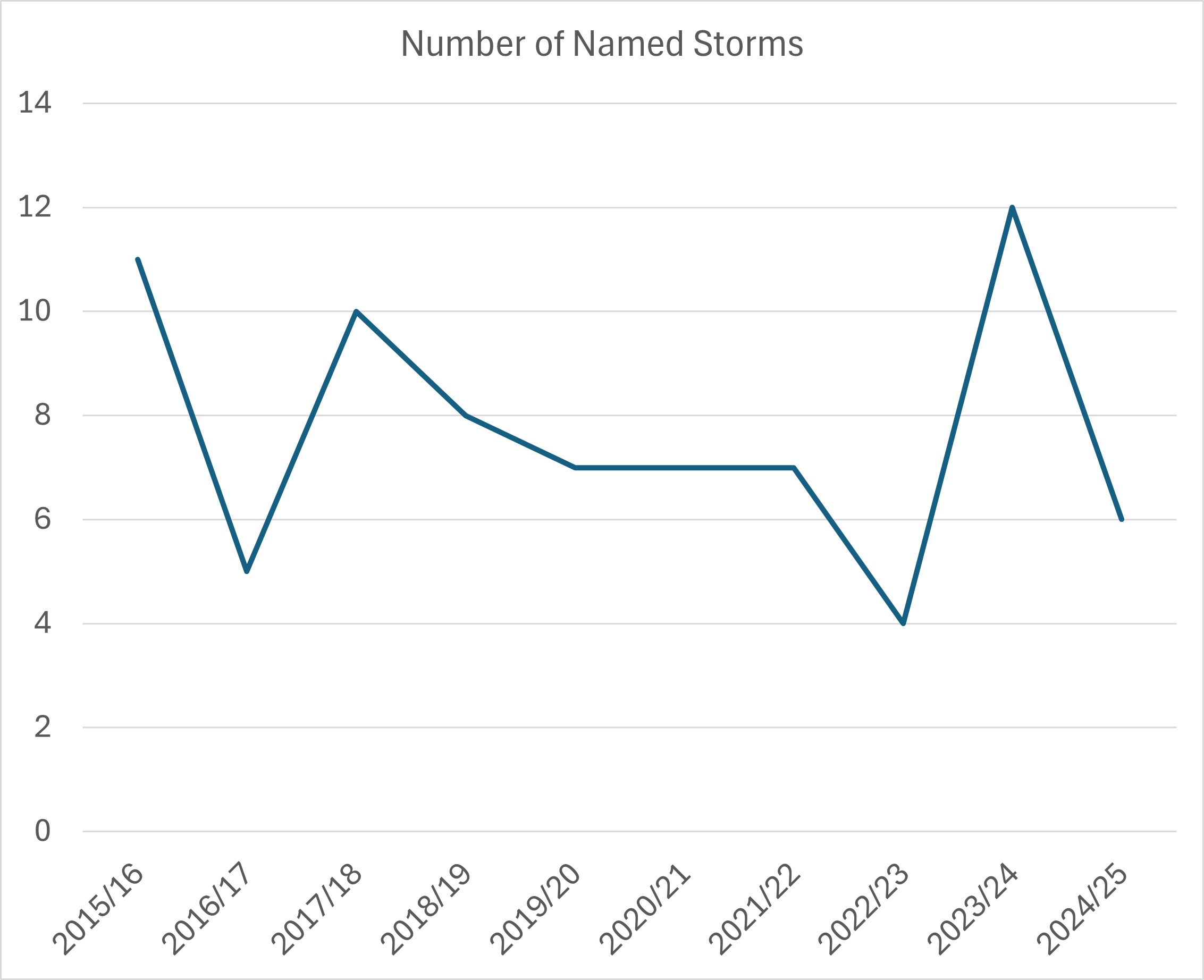
Chart showing the total number of named storms in UK from 2015 to 2025.
Timeseries of the number of named storms for each storm-naming period (which runs from September to August) since 2015. It includes storms named by other Met Services that impacted the UK. Source: Met Office

By this measure, 2025 was not exceptional with six named storms – two from the 2024-25 season and four from 2025-26. These are listed in the table below. 

Storm name Date(s) of impact in UK Maximum wind gust Notable features
2024-25 names
Éowyn 24 January 87Kt (100mph), Drumalbin, Lanarkshire Most powerful storm for over a decade
Floris 4-5 August 71Kt (82mph) at Wick Airport, Caithness Equalled Scotland’s August gust speed record
2025-26 names
Amy 3-4 October 83Kt (96mph) at Tiree, Argyll Significant disruption from flooding.
Benjamin (named by Meteo France) 22-23 October 52Kt (60mph) Needles, Isle Of Wight Strongest winds affected northern France
Claudia (named by AEMET, Spain) 14 November 59Kt (68mph) Warcop Range, Cumbria Extensive heavy rainfall across England and Wales
Bram 8-10 December 73Kt (84mph), Capel Curig, Conwy Flooding from heavy rainfall on saturated ground.

Credit: Met Office storm centre

Storm Éowyn in January had the most severe winds of any storm in 2025. The Met Office issued a red warning for wind across Northern Ireland and the south-west and central belt of Scotland. An amber warning was issued for the northern half of the UK. At the peak of the storm, power outages were reported at around 1m homes.

Storms from October to December were notable for bringing some persistent and heavy rain during a period of wetter weather, in contrast to the extended dry spell earlier in the year.

Weather through the year

The charts below show the progression of temperature and rainfall through the course of 2025.

The plot below charts average daily temperature over the course of 2025, with orange shading showing warmer-than-average conditions. Overall, the year had 244 days – 66% of the total – where temperatures were above average.

On the other hand, cold spells – indicated by blue shading – were generally short-lived and not very severe, with the exception of events in early January and November.
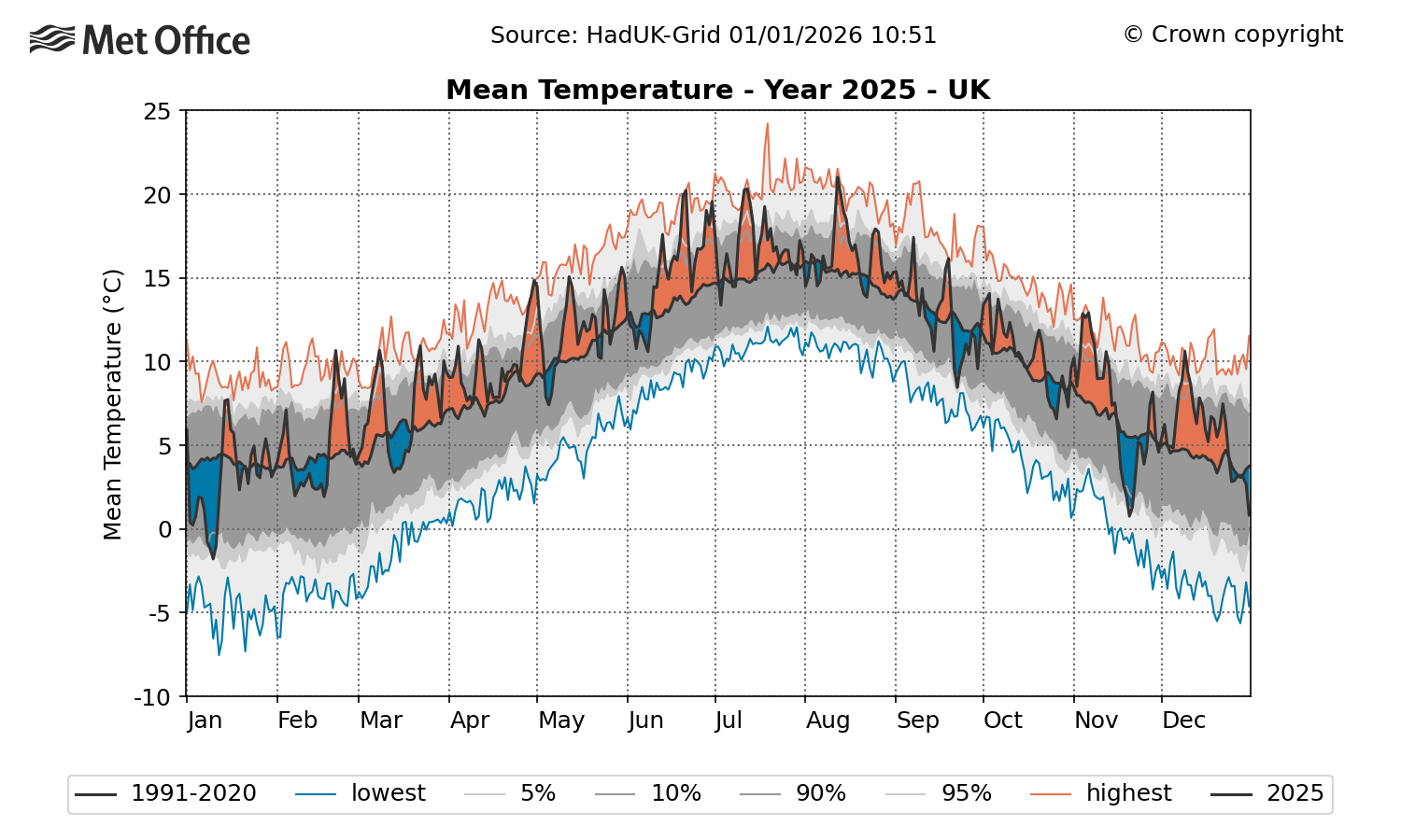
Chart showing mean temperature in the UK in 2025
Timeseries of daily UK average temperature during 2025. Orange shading indicates periods of above-average temperature and blue shading below average. The solid black line is the 1991-2020 reference period by day of the year. The grey shading reflects the 5th, 10th, 90th and 95th percentiles of the temperature distribution and the red and blue lines are the highest and lowest values for each day of the year, based on a dataset of daily data from 1960. Credit: Met Office

Fifty-one days in 2025 were in the top 5% warmest for the time of year in the historical record, but only one day – 20 November – was in the 5% of coldest.

The significant number of warmer days and absence of cool ones helps build a picture of how 2025 was the warmest year overall.

The highest daily maximum temperature recorded in the year was 35.8C at Faversham, Kent on 1 July during an early summer heatwave. The lowest minimum temperature was -18.9C, recorded at Altnaharra, Sutherland on 11 January.

A maximum annual temperature of 35.8C is not an exceptional high for recent years – especially when compared with 2022’s record of 40.3C. However it would have been a rare event in the 20th century, when just three years – 1932 (36.1C), 1976 (35.9C) and 1990 (37.1C) – saw a higher temperature.

In the 21st century, six years have seen temperatures above 35.8C – 2003, 2006, 2015, 2019, 2020, and 2022.

The plot below illustrates 2025’s below-average rainfall accumulation.

The brown shading – which represents the deficit in rainfall at that point of the year compared to the 1991-2020 average – highlights how rainfall totals were particularly low during the dry spring and summer period. The lower blue line shows how rainfall accumulation in 2025 came close to – but did not quite reach – a record low in late May and late August.

Wetter conditions in the autumn saw rainfall totals recover a little to reach 90% at the end of the year – which is below average, but not exceptional. As noted previously, there were regional variations.
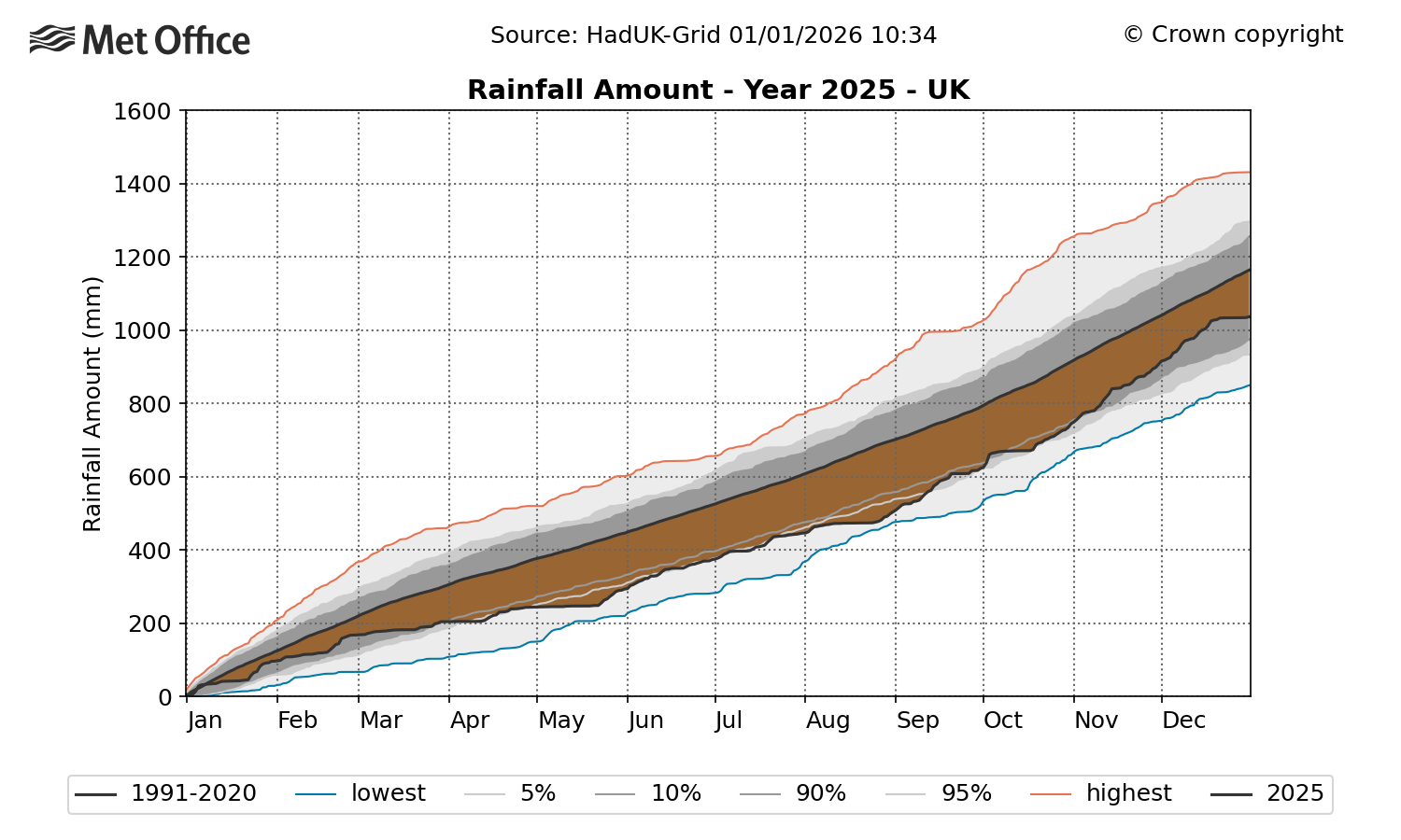
Chart showing the total amount of rainfall in the UK in 2025
Timeseries showing rainfall accumulation through 2025 for the UK. Brown shading represents a deficit in rainfall compared to average for that point in the year, and blue shading is an excess of rainfall compared to average. The solid line represents the 1991-2020 average and grey shading shows the 5th, 10th, 90th and 95th percentiles of the distribution. The blue and red lines represent the lowest and highest values based on a dataset of daily rainfall from 1891 to 2022. Credit: Met Office

Winter

In climate terms, the UK winter spans the calendar months of December, January and February.

The winter of 2024-25 was slightly warmer than average, but not exceptional, with an average temperature of 4.62C. This is 0.53C above the 1991-2020 average. The winter months had 89% of average rainfall and 94% of average sunshine.

New Year’s Day saw significant flooding that affected parts of Lancashire and the south side of Manchester. The River Mersey reached record levels in the wake of two days of heavy, persistent rain.

The coldest spell of 2025 occurred in early January, with significant snowfall in some regions.

Storm Éowyn and heavy rain at the end of January were the winter’s most impactful events, bringing high winds and flooding that resulted in considerable disruption.

Spring

Spring – which encompasses the months of March, April and May – was the warmest and sunniest on record, as well as the sixth driest.

The record high temperature came only one year after the previous record set in 2024, continuing a trend of increasing spring time temperature for the UK.

(A Met Office attribution analysis which explored the record-breaking temperatures of May 2024 showed that the temperatures were caused by a combination of a marine heatwave which persisted through May and into June and human-induced climate change.)

The timeseries below shows average spring temperature in the UK over 1884-2025. It shows a significant warming trend since the 1970s, with temperatures in 2024 and 2025 sitting well outside the range of variability observed in the late 19th and 20th centuries.
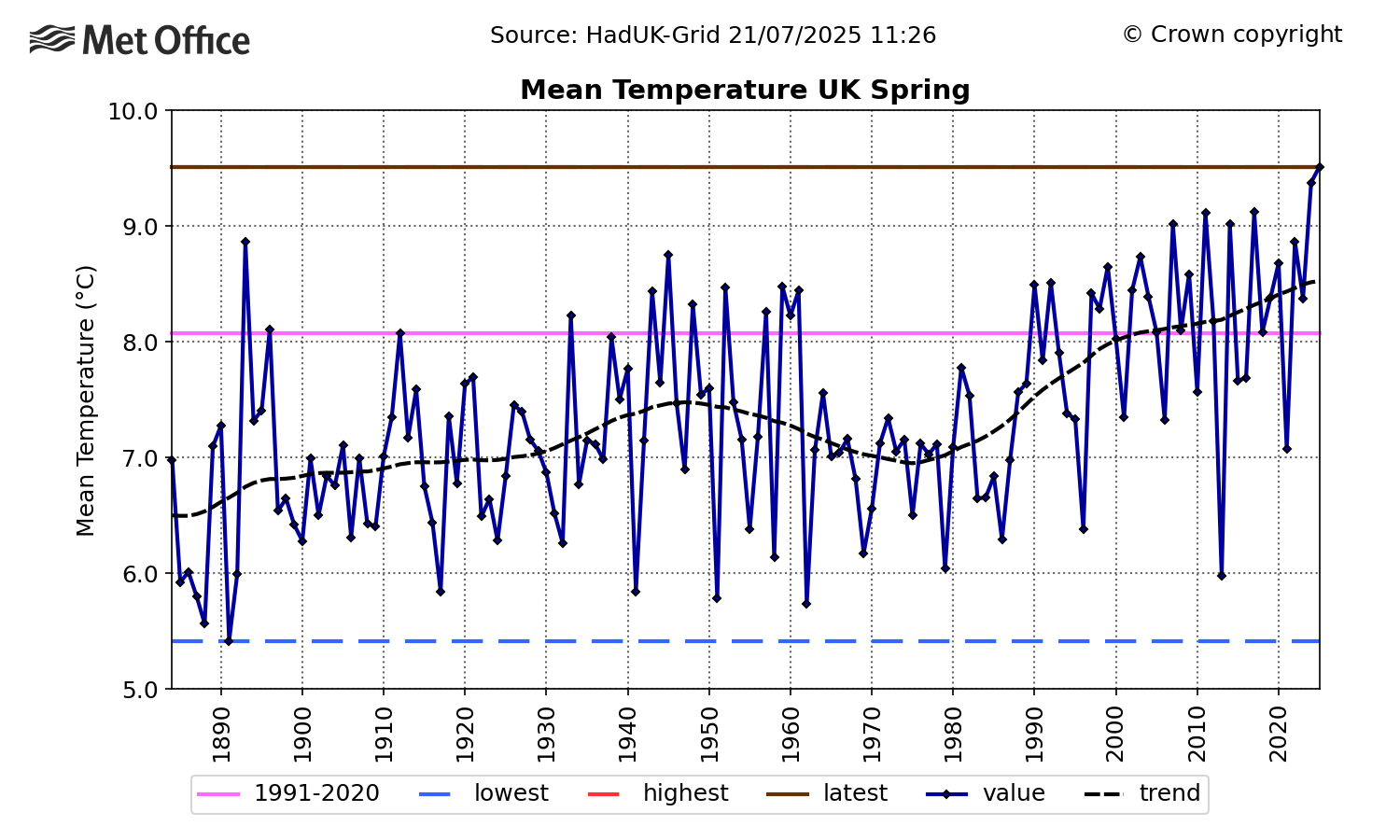
Chart showing the mean temperature for UK spring from 1885 to 2025.
Timeseries of spring average absolute temperature for the UK over 1884-2025. The trend is represented by a black dashed line, the 1991-2020 average is shown in pink and the highest and lowest values in the series are shown by the red and blue dashed lines, respectively. The 2025 value is represented by the horizontal brown line (which covers the red line for the highest in the record). Credit: Met Office

The UK’s changing climate is having an impact on the natural cycles of many species and habitats. Citizen science initiatives have highlighted how “signs of spring” – for instance, the first flowering or first nest-building – occur increasingly early in the year.

Summer

Warm, sunny and dry conditions persisted into the summer season, drying out soils.

There were four heatwave events, which impacted almost all regions of the UK. Two of these events took place in June.

A marine heatwave also took place, with sea surface temperatures of 1.5-3C above the 1983-2012 average in the Celtic Sea, English Channel and southern North Sea.

An attribution study by the World Weather Attribution service estimated that human-caused climate change had made exceeding June heatwave thresholds around 10 times more likely. The research also found that one of the June heatwaves had been made 2-4C more intense as a result of human influence.

The five warmest summers recorded in the UK to date are 2025 (16.10C), 2018 (15.76C), 2006 (15.75C), 2003 (15.74C) and 2022 (15.71C).

Met Office analysis estimates that in a pre-industrial climate, a summer like 2025 would be expected to occur every 340 years. However, in the current climate, we could expect to see these sorts of summers roughly once every five years.

The study also shows that the UK could plausibly experience much hotter summers in the current and future climate. Events that would have been seen as extremes in the past are becoming more common.

A Met Office attribution study published in 2019 estimated that the then record-breaking summer of 2018 had a statistical return period of approximately eight-to-nine years. The summer of 2025 has broken that record in seven years, consistent with these previous findings.

The science is clear that UK summers are becoming warmer and extreme heat events are becoming more common. This could mean more significant impacts on people, infrastructure and the environment – both now and in the future.

The map below plots the number of heatwaves that took place in June, July and August across the UK. It shows how a significant number of regions across saw more three (green shading) or four (pink shading) over the summer months.
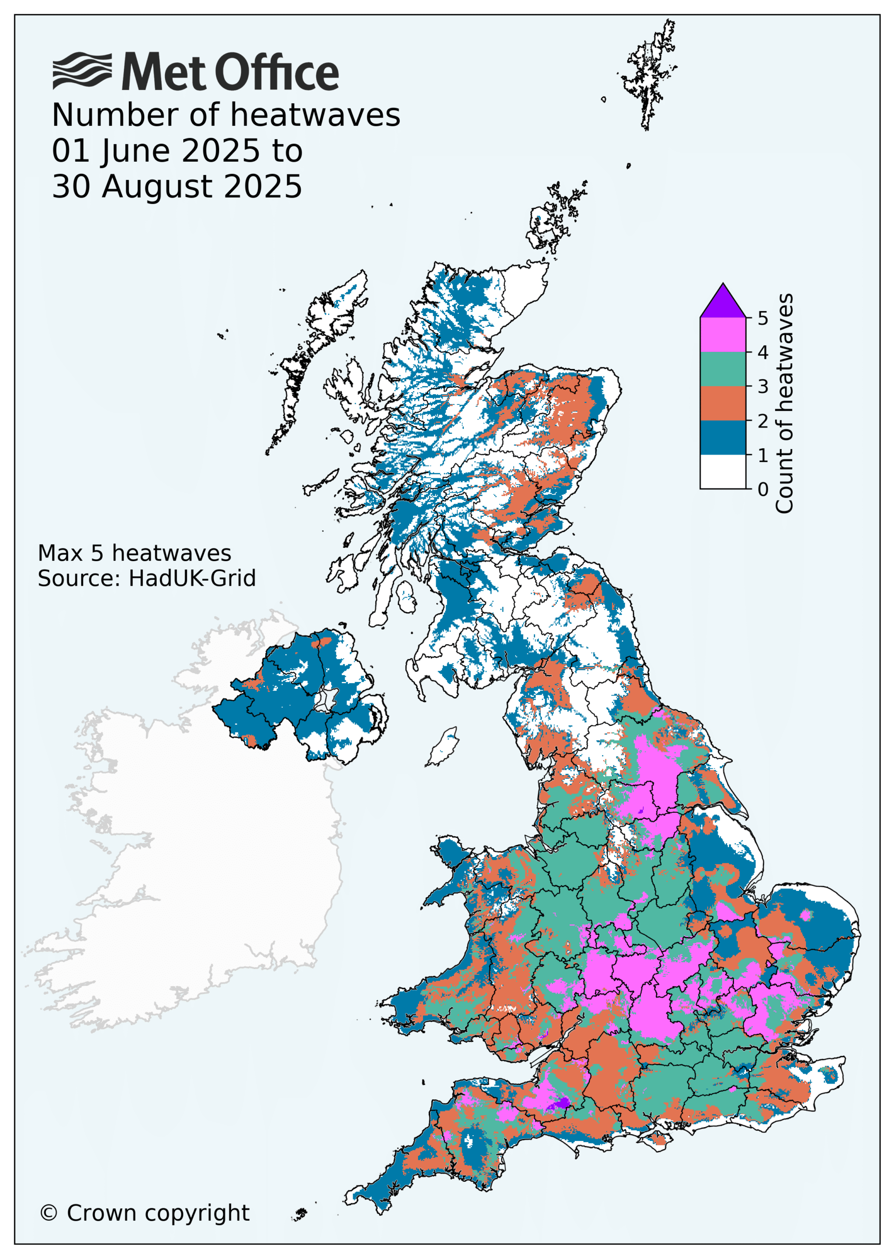
Map of the UK showing the number of heatwaves from June to August 2025
Map showing the number of heatwaves by location during the summer of 2025. Source: Met Office

Autumn

Autumn and the month of December were marked with unsettled weather, with mild and wet conditions over the four-month period.

The season was warmer and wetter than average. Northern Ireland had its third-wettest autumn on record, Northern England its fifth wettest and Wales its 10th wettest.

Storm Amy set a record for highest gust speed for a storm in October, with 80Kt (92mph) recorded at Magilligan, County Londonderry.

Other major storms were notable for heavy rainfall that caused flooding. Storm Claudia brought heavy rainfall to central England and Wales in mid-November, which fell on already saturated ground.

The second half of November saw snow cause across the North York Moors during a cold northerly spell which saw some hard frosts. This was followed by generally mild and unsettled conditions until late December, when strong easterly winds brought more low temperatures and hard frosts.

The UK chalked up a number of significant climate records in 2025, particularly for high temperatures. This aligns with the well-established warming trend that is the result of human-caused climate change.

Climate attribution studies continue to provide further evidence that human factors are increasing the likelihood and severity of UK climate extremes.

Many of 2025’s records will not stand for long. There is a high chance they will be broken again in the near future as the climate continues to warm.

The post Met Office: A review of the UK’s climate in 2025 appeared first on Carbon Brief.

Met Office: A review of the UK’s climate in 2025

Continue Reading

Climate Change

Pacific Islands Forum leaders, Albanese must not lose focus on Pacific priorities of climate and ocean

Published

on

KOROR, PALAU, Monday 31 August 2026 — As Pacific leaders gather for the 55th Pacific Islands Forum Leaders Meeting in Palau from today, Greenpeace Australia Pacific is urging Prime Minister Anthony Albanese to stand with Pacific family by keeping Pacific needs at the heart of negotiations, backing longstanding Pacific leadership, supporting Pacific energy sovereignty and ocean custodianship, and holding the line on 1.5°C.

Against the backdrop of tense geopolitical turmoil, increasingly frequent and lethal extreme weather disasters, the threat of deep sea mining and an energy crisis driven by fossil fuel dependence, the Pacific Islands Forum Leaders Meeting (PIFLM) is a critical moment for Pacific nations to unite with Pacific needs central to regional dialogue.

The climate crisis, security, the opportunities of renewable energy in the Pacific, ocean protection, and the shifting political landscape will be the focus of the Forum’s discussions.

Speaking from Palau, Shiva Gounden, Head of Pacific at Greenpeace Australia Pacific, said:
“The Pacific Islands Forum is the most important multilateral forum in our region, unifying the Pacific under increasingly turbulent global circumstances. We are urging Forum members, including Australia, to not lose focus of Pacific priorities of climate and oceans amid noise and external pressures at this year’s meeting.

“It is very clear that the greatest security threat to our region is climate change and the only way we can address that is through a just transition away from fossil fuels. Regional cooperation is an antidote to climate chaos and geopolitical tension – together, our region can be guided by Pacific nations’ legacy of leadership from the frontlines of the climate crisis, as we build a more peaceful and secure world.

“This year’s Forum will set the stage as we build momentum toward COP31 and a Fossil Fuel Free Pacific. Australia must back Pacific energy sovereignty as a solution to the compounding threats facing our region, including soaring costs of living and increasingly lethal extreme weather disasters, and resist the militarisation of our oceans, deep sea mining, and power politics.

“We must not lose sight of what is needed. The regional adoption of Pacific-led solutions, a Pacific pre-COP with focus on advancing the just transition away from fossil fuels and community-targeted finance for strong and resilient futures beyond fossil fuels must be the foundations of this year’s Forum discussion. What we need now is stronger political will.”

Also in Palau, Dr Simon Bradshaw, COP31 Lead and climate expert at Greenpeace Australia Pacific, said:
“Prime Minister Albanese faces a major test of Australia’s climate credibility and Pacific partnership this week. We cannot be a friend to the Pacific and continue to expand fossil fuel production. The best way for Australia to remain the Pacific’s security partner of choice is to act faster on the Pacific’s number one security concern — climate change.

“The Albanese Government has approved at least five new coal and gas projects since the last Pacific Islands Forum Leaders Meeting, and 36 since being elected, every one of which increases the threats to life, security and sovereignty facing Pacific communities.

“Nowhere in the world are the dangers of fossil fuels or the benefits of renewable energy clearer than in the Pacific, which faces the double blow of climate disasters and expensive fuel imports.

“Australia, as incoming President of Negotiations for COP31, has a responsibility to follow the Pacific’s lead, embrace the vision of a resilient Fossil Fuel Free Pacific, and do everything possible to keep 1.5°C alive. Doing so would establish Australia as a highly effective middle power, a force for good in troubled times, and a true ally and partner to the Pacific.”

—ENDS—

Greenpeace Australia Pacific has delegates from the Pacific and Australia at the PIFLM in Palau available for interview

Pacific Islands Forum leaders, Albanese must not lose focus on Pacific priorities of climate and ocean

Continue Reading

Climate Change

Explainer: The CMIP7 emissions scenarios – and how they explore future climate change

Published

on

Every six to seven years, climate modelling groups around the world run a coordinated set of simulations that explore how the climate could change in the future.

These simulations form a key line of evidence for future projections used in Intergovernmental Panel on Climate Change (IPCC) assessment reports.

They are built around a set of common scenarios – or “pathways” – of future greenhouse gas emissions.

A new set of scenarios has now been published for the seventh phase of the Coupled Model Intercomparison Project (CMIP7).

These replace the “shared socioeconomic pathways” (SSPs) that drove the previous generation of climate models and featured heavily in the IPCC’s sixth assessment report (AR6).

The new scenarios are quite different from their predecessors in a number of notable ways.

Rather than being named, somewhat enigmatically, according to their “radiative forcing levels”, the new scenarios are named simply by their emissions trajectories – ranging from “low-to-negative” to “high”.

They no longer consider “no-climate-policy” baseline worlds, but instead explore the implications of current policies continuing, being strengthened, or weakening.

These new scenarios also dramatically revise high-end future emissions downward, far below the highest scenarios in prior generations, in order to reflect a world where a 21st century dominated by coal use is no longer plausible.

At the same time, they revise the lowest emissions scenarios upwards relative to those featured in the AR6, with at least some “overshoot” of the Paris Agreement’s “aspirational” target to limit global warming to 1.5C now “unavoidable”.

While modelling groups are just getting started on the full Earth-system model simulations, the emissions scenarios give a clear picture of the range of futures that will inform the IPCC’s seventh assessment cycle (AR7).

Here, Carbon Brief unpacks how the new scenarios were designed and how they differ from the SSPs published almost a decade ago.

The article also compares CO2 emissions and warming outcomes between the new scenarios and their predecessors, explores the range of future warming outcomes and examines why the high end of the scenario range has shifted markedly downward.

Finally, Carbon Brief examines the scale of carbon dioxide removal (CDR) built into the scenarios and new extensions of scenarios to 2150 and beyond.

Key highlights from Carbon Brief’s analysis of the new scenarios include:

  • The seven new scenarios give a range of global warming in 2100 from 1.6C to 3.3C above pre-industrial levels – markedly narrower than the 1.5C to 4.7C range in their SSP predecessors.
  • The top of the scenario range has fallen for the first time in four generations of climate modelling. The highest scenarios used in the three previous IPCC assessment cycles all produced around 4.6-4.9C of global warming in 2100, whereas CMIP7’s high scenario only reaches 3.3C and has around half the cumulative CO2 emissions.
  • The new “medium” scenario that is analogous to policies in place today reaches 2.9C in 2100, crossing 2C around 2050 and 3C around 2110, with a one-in-four chance of exceeding 4C by 2150.
  • The lowest scenarios have shifted modestly upwards, as a future that avoids any overshoot of 1.5C is no longer considered plausible. The very-low scenario peaks at around 1.8C mid-century before falling back close to 1.5C by 2100.
  • The updated socioeconomic assumptions underpinning the new scenarios describe a more crowded and less wealthy planet than the original SSPs, with the global human population now peaking at 10.1bn people around 2080 in the medium pathway and income per person in 2100 between 10% and 25% lower.
  • Every scenario that limits warming leans heavily on carbon dioxide removal, with cumulative removals by 2150 ranging from 655GtCO2 in the very-low scenario to 2,360GtCO2 in low-to-negative scenario.

Article sections

Article Contents

A new generation of scenarios

To simulate how human activity could shape the climate of the future, climate modellers must estimate future levels of “radiative forcings” – the external drivers that cause global warming. These include atmospheric concentrations of greenhouse gases, air pollutants and land-use changes.

Given that no one knows how the future will unfold, modellers use a handful of scenarios that span a wide range of plausible outcomes.

The Scenario Model Intercomparison Project (ScenarioMIP) coordinates the development and running of emissions scenarios for climate models used in IPCC reports.

In April 2026, high-level details about the new set of scenarios for CMIP7 were published in the journal Geoscientific Model Development (GMD).

On 1 September, the underlying emissions data was released into the public domain by the ScenarioMIP team.

There are seven new CMIP7 scenarios designed to drive model simulations for AR7. The first model runs took place in spring 2026 and initial results are expected later this year.

The previous SSP scenarios were starting to show their age. Finalised in 2015-17 using historical data ending in 2015, several years projected by the SSP scenarios were already in the past by the time AR6 concluded in 2021. Meanwhile, the world had changed considerably.

(For a full guide to the SSPs, see Carbon Brief‘s 2018 explainer.)

Storylines and emissions levels

The most visible change in the new generation of scenarios is their names. Where the SSPs combined five socioeconomic “storylines” with radiative forcing targets (SSP1-2.6, SSP5-8.5, etc), the CMIP7 scenarios are named simply for the emissions trajectory that they follow.

The table below summarises the seven scenarios and the integrated assessment model (IAM) that produced each “marker” run – in other words, the specific IAM run used to generate the scenario that, in turn, will be used by CMIP7 climate models. IAMs run simulations of how the future energy system and emissions may evolve under different assumptions around socioeconomics, future technology costs and climate policy.

The table below also details how the scenario fares against a number of key metrics assessed by Carbon Brief, including CO2 emissions and warming outcomes.

(For more on Carbon Brief’s approach, see: Methodology.).

Scenario Marker IAM Underlying SSP Emissions pathway Net CO2 in 2100 (GtCO2/yr) Cumulative CO2, 2024-2100 (GtCO2) Warming in 2100 (C vs 1850-1900)
High (H) GCAM 8s SSP3 Emissions as high as plausible with policy rollback 55 3,820 3.3 (2.6-4.4)
High-to-low (HL) WITCH 6.0 SSP5 High to mid-century, then net-zero CO2 by 2100 -1 2,566 2.8 (2.1-4.0)
Medium (M) IMAGE 3.4 SSP2 Current policies frozen at 2025 levels 34 2,814 2.9 (2.2-3.9)
Medium-low (ML) COFFEE 1.6 SSP2 Medium until 2040, then decline to net-zero CO2 by 2100 -9 1,757 2.3 (1.7-3.3)
Low (L) MESSAGEix-GLOBIOM 2.1 SSP2 Aims to keep warming likely below 2C -9 673 1.8 (1.3-2.7)
Very-low (VL) REMIND-MAgPIE 3.5-4.11 SSP1 1.5C with as little overshoot as plausible -6 310 1.6 (1.1-2.5)
Low-to-negative (LN) AIM 3.0 SSP2 1.5C with higher overshoot, then net-negative greenhouse gases -25 384 1.7 (1.2-2.5)

Warming values are medians (with the 5-95% range) from the 841-member FaIR ensemble used in this article (see: Methodology); the marker model assignments come from the ScenarioMIP database. Note that scenario names in the database differ from the official CMIP7 names (for example, the high-to-low scenario appears as “SSP5 – Medium-Low Emissions_a”).

Each of the new scenarios is built on a set of updated SSP storylines similar to those used in the original SSP scenarios. These include assumptions about future population, technological and economic growth, as well as potential for international cooperation that shape the resulting emissions pathways. The socioeconomic assumptions underlying these revised SSPs were updated in 2024 with new population and economic projections.

Most of the new emissions scenarios are now based on the “middle-of-the-road” SSP2 that assumes current socioeconomic trends broadly continue, with only one scenario using each of SSP1 (“sustainability”), SSP3 (“regional rivalry”) and SSP5 (“fossil-fuelled development”). None of the new scenarios uses SSP4 (“inequality”).

The solid lines in the figure below show updated global human population, GDP and GDP per capita values in CMIP7 (solid lines), compared to the original SSPs from CMIP’s sixth phase (CMIP6), shown by the dashed lines.

The updated SSPs in CMIP7 compared with CMIP6. Chart shows the world population, GDP and GDP per capita in the original CMIP6 SSPs and the 2024 update underpinning the CMIP7 scenarios.
World population (left), GDP (centre) and GDP per capita (right) for SSPs 1-5 in the original 2013-era SSP database (dashed) and the 2024 update (solid). Note that the updated SSP1 and SSP5 population curves effectively overlap. GDP is shown in 2017 US dollars PPP, with the original converted from 2005 US dollars using the US GDP deflator (x1.235). Data from the IIASA SSP database; chart by Carbon Brief.

The change in socioeconomic assumptions is substantial. Global population was revised upward in nearly every scenario, with the updated SSP2 projecting there will be 9.9 billion people in 2100 – an increase of 1 billion people compared to the 2013-era SSP.

GDP was revised downward in the high-end growth scenarios (SSP1 and SSP5), slightly upward in SSP3 and SSP4 and was largely unchanged in SS2.

The combination of these changes means that income per person in 2100 is around 10-25% lower in most scenarios, with only SSP3 and SSP4 seeing mostly unchanged income per capita.

In short, the socioeconomic world underlying the new scenarios is somewhat more crowded and less wealthy per person than the one the SSPs originally imagined.

Another notable change is the shift in the SSP that underlies the highest future emissions scenario.

In the original SSPs, the “very high” SSP5-8.5 scenario was based on SSP5, while the new “high” scenario in CMIP7 is based on SSP3.

The GMD study explains that this is because IAM teams that developed the scenarios found that SSP3 and SSP5 variants produced similar emissions. They judged that the “fragmented” SSP3 world – which is characterised by large challenges to adaptation – to be more relevant for exploring high-end risks.

No more ‘baseline’ scenarios and other changes

In another important change, the authors of the CMIP7 scenarios decided to eliminate “baseline” scenarios that assumed a world without any climate policy. These scenarios were previously used as a counterfactual against which to compare climate-changed worlds.

Instead, the range of future emissions scenarios starts with current policies and explores ways that they could be strengthened, weakened, or kept the same. The high scenario explores a plausible “rollback of current mitigation policies“.

The medium scenario, by contrast, extends climate policies officially implemented as of 2025, without assuming countries achieve their Paris Agreement pledges – known as nationally determined contributions (NDCs) – or net-zero targets that are not yet backed by legislation.

In their GMD paper, the authors of the CMIP7 scenarios emphasise that the medium scenario “should not be considered as a ‘most likely’ scenario”, but that it can provide a benchmark against which the effect of future policy strengthening or weakening can be measured. It is roughly analogous in its emissions levels to the old SSP2-4.5 scenario.

The new low scenario explores a world where climate policy is rapidly strengthened and warming by 2100 is limited to below 2C. This makes it analogous to the old SSP1-2.6 scenario.

The very-low scenario limits global warming to around 1.5C by 2100, similar to the old SSP1-1.9 scenario. However, it involves a greater degree of overshoot mid-century, reflecting the fact that global emissions did not begin to rapidly decline in 2020 as envisioned by SSP1-1.9. As the authors of the GMD ScenarioMIP paper point out: “At this point of time, some overshoot of the 1.5C seems unavoidable.”

In addition, there are a number of scenarios that start on one path before undertaking rapid mitigation. These high-to-low, medium-to-low and low-to-negative scenarios are intended to explore futures where mitigation is further delayed, followed by a rapid turn-around later in the century.

The scenario developers noted that there is no specific likelihood or probabilities assigned to any scenario, but rather only a judgement that all are within the realm of plausibility given where the world is today. They also said that “there might be potential futures outside the ScenarioMIP scenario range”.

Timescales and other changes

In addition to the shift away from baseline scenarios, there are three other notable design changes made in CMIP7.

First, CMIP7 models will be driven by emissions of CO2 and other greenhouse gases, rather than set atmospheric concentrations.

In every previous generation of models, the ScenarioMIP experiments required that modelling groups simulate future climate using the same set of CO2 concentrations. For CMIP7, models with an interactive carbon cycle are asked to run in “emissions-driven” mode for CO2, calculating atmospheric concentrations themselves based on emissions.

This is a significant improvement. It means that the substantial uncertainty in carbon-cycle feedbacks will now show up directly in the range of projected warming, rather than being overlooked. (The change applies to CO2 only; methane, nitrous oxide and halocarbons remain prescribed as concentrations.)

Second, emissions match observations up to 2023. IAM modellers were asked to stay close to observed trends up to 2025 to avoid emissions diverging from reality before models were run. Scenario differences only open up after 2026, avoiding an earlier problem of scenarios diverging from reality years before the models were even run.

Finally, the period over which models are being run has been extended from 2100 to 2150. This is important as the world is already more than a quarter of the way through the 21st century.

The extended model runs out to 2150 will provide a more thorough exploration of the warming that people born in the coming decades may experience within their lifetimes.

In addition, all scenarios have extensions to 2500 where temperatures are eventually stabilised. These allow scientists to explore changes to long-term Earth-system processes, such as ice sheets and sea level, as well as whether warming is reversible.

A narrower range of future CO2 emissions

Overall, the new scenarios provide a notably more narrow range of future CO2 emissions than the SSP scenarios used in CMIP6.

The figure below shows net global CO2 emissions (combining fossil-fuel and land-use emissions) for the seven new scenarios, alongside the five SSP scenarios used for climate model runs in CMIP6 (e.g. SSP1-1.9, SSP1-2.6, SSP2-4.5, SSP3-7.0 and SSP5-8.5).

The new CMIP7 scenarios feature much lower emissions at the high end. Chart shows net global CO2 emissions (fossil fuels, industry and land use) in the seven CMIP7 marker scenarios and the CMIP6-era SSP marker scenarios.
Net global CO2 emissions (GtCO2/yr) in the seven CMIP7 scenarios (solid lines, coloured) and the CMIP6-era SSP scenarios (dashed) for the period from 1990 to 2100. CMIP7 scenarios are harmonised to 2023, while SSP scenarios (from RCMIP) were harmonised to 2015. Data from the ScenarioMIP database and RCMIP; chart by Carbon Brief.

At the bottom of the range, the new scenarios closely track their predecessors: the very-low scenario reaches net-zero CO2 around mid-century much like SSP1-1.9, while the low scenario lands close to SSP1-2.6.

The chart below shows total emissions for the same scenarios for the period 2024-2100.

Cumulative net CO2 emissions, 2024-2100. Chart shows CMIP7 marker scenarios and CMIP6-era SSP markers.
Cumulative global CO2 emissions (GtCO2) between 2024 and 2100 in the seven CMIP7 scenarios (solid colours) and the CMIP6-era SSPs (light colours). Data from the ScenarioMIP database and RCMIP; chart by Carbon Brief.

The lowest emissions scenarios now have somewhat higher total emissions, reflecting the failure of the world to rapidly reduce emissions after 2020 that occurred in the lower SSP emissions scenarios, such as SSP1-1.9 and SSP1-2.6. The very-low scenario results in 310bn tonnes of CO2 (GtCO2) cumulative emissions between 2024 and 2100, compared to around 110GtCO2 in SSP1-1.9.

At the top end, the change is particularly dramatic. The high scenario in CMIP7 reaches 55GtCO2 per year in 2100. The previous high scenario, SSP5-8.5, by contrast, reached around 126GtCO2 per year in 2100.

In cumulative terms – which is what matters most for global warming – high reaches around 3,820GtCO2 over 2024-2100, half the roughly 7,600GtCO2 of SSP5-8.5 and about three-quarters of the 5,140GtCO2 of SSP3-7.0.

To put it another way: the top of the new scenario range sits between SSP2-4.5 and SSP3-7.0 in cumulative emissions terms, which is territory that CMIP6 treated as its middle ground.

To make the scale of this shift clear, Carbon Brief analysed the CO2 emissions trajectories in each of the prior generations of high-end emissions scenarios, using the same simple climate model – FaIR – to calculate future warming.

Comparing four generations of high-end emissions scenarios. Chart shows fossil fuel and industrial CO2 emissions in the highest scenario of each climate modelling generation.
Fossil CO2 emissions relative to 1850-1900 for the highest scenario of each climate modelling generation: SRES A1FI (CMIP3, used in AR4), RCP8.5 (CMIP5, AR5), SSP5-8.5 (CMIP6, AR6) and CMIP7’s high, all run through AR6-calibrated FaIR ensemble. Data: SRES database v1.1, RCMIP v5.1, ScenarioMIP database; chart by Carbon Brief.

Below, four different generations of emissions scenarios are examined. The SRES scenarios were originally published in 2000 and used in the IPCC’s third (2001) and fourth (2007) assessment reports (and the corresponding CMIP3 model runs). The RCPs were developed in the early 2010s and used in the IPCC fifth assessment report (AR5; 2013) and CMIP5, while the SSPs were developed in the late 2010s and used in the IPCC AR6 report and CMIP6.

Over the past two decades, the highest emissions scenarios all resulted in comparable amounts of warming in 2100: SRES A1FI (the highest SRES scenario) reached 4.6C in 2100 (5-95% range; 3.5-6.1C), RCP8.5 reached 4.9C (3.7-6.5C) and SSP5-8.5 reached 4.6C (3.5-6.2C).

(RCP8.5 edges out its successor despite lower CO2 emissions because it assumed considerably more methane and nitrous oxide.)

Warming in 2100 in each model generation's highest scenario. Bar chart shows that the median and 5-95% range run through the same IPCC AR6-calibrated FaIR ensemble
Global mean surface temperature change in 2100 relative to 1850-1900 (medians and 5-95% ranges) for the highest scenario of each climate modelling generation: SRES A1FI (CMIP3, used in AR4), RCP8.5 (CMIP5, AR5), SSP5-8.5 (CMIP6, AR6) and CMIP7’s high, all run through AR6-calibrated FaIR ensemble. Data: SRES database v1.1, RCMIP v5.1, ScenarioMIP database; chart by Carbon Brief.

CMIP7’s high scenario comes in remarkably lower, at 3.3C (2.6-4.4C).

The downward revision of future emissions in CMIP7 reflects two key changes since RCP8.5 was published back in 2011. First, the plausible baseline of a repeal of current policy has fallen. Cheap solar, wind and batteries, a global plateau in coal use and more than $2tr per year in clean-energy investment mean that a rollback in climate policy would not result in coal deployment levels assumed in the RCP8.5 scenario.

The GMD study states that CMIP6’s high-emission levels “have become implausible, based on trends in the costs of renewables, the emergence of climate policy and recent emission trends”.

(For more, see Carbon Brief’s recent factcheck of false claims around the retirement of the SSP5-8.5 emissions scenario. Also see Carbon Brief’s recent interview with Prof Detlef van Vuuren, a key architect of both the old SSPs and new scenarios.)

Second, part of the apparent decline reflects a correction of how scenarios are communicated – rather than real-world progress. The old high-end scenarios always represented an estimate of worst-case scenarios at the time, rather than likely outcomes.

Genuine progress in reducing emissions probably accounts for around 0.7C of the roughly 1.7C gap between SSP5-8.5 and today’s current-policy trajectory, with the remainder reflecting that the baseline was never particularly likely.

What the new scenarios mean for future warming

To compare warming outcomes across scenario generations on a like-for-like basis, Carbon Brief ran both the seven CMIP7 scenarios and the CMIP6 SSP emission scenarios through the same simple climate model.

(This is FaIR v2.2, using the 841-member ensemble calibrated and constrained to match the assessment of climate sensitivity in IPCC AR6, historical warming and ocean heat uptake).

These values may differ from the ultimate results that are found by CMIP7 climate models, but give a sneak peak of what those results may look like when they become available.

Where the new scenarios take global temperatures. Chart shows median warming relative to 1850-1900 for the seven CMIP7 marker scenarios.
Median warming relative to 1850-1900 for the seven CMIP7 scenarios, with observations to 2025 (black) and the 5-95% ensemble range shaded for the medium and low scenarios. Dashed lines show warming between 2100 and 2150. Chart by Carbon Brief.

The seven scenarios produce warming in 2100, relative to pre-industrial (1850-1900), that ranges from 1.6C (with a 5-95% range of 1.1-2.5C) in the very-low scenario to 3.3C (2.6-4.4C) in high, with the current-policy medium scenario reaching 2.9C (2.2-3.9C). Warming also continues after 2100 in both the medium and high scenarios.

The figure below shows the range of 2100 warming (5th to 95th percentile) relative to the preindustrial period expected in each of the old SSP scenarios and the new CMIP7 ones, along with a central estimate (white dots).

Warming in 2100 in the new CMIP7 and old CMIP6 scenarios. Chart shows that seven CMIP7 marker scenarios and the CMIP6-era SSPs all run through the same FaIR climate model ensemble.
Warming in 2100 for CMIP7 scenarios and CMIP6 SSPs run through the identical FaIR ensemble (medians and 5-95% ranges). Chart by Carbon Brief.

The largest changes are, unsurprisingly, at the top. CMIP7’s high scenario (3.3C in 2100) produces less warming than SSP3-7.0 (3.7C in the same ensemble) and far less than SSP5-8.5 (4.7C).

The entire CMIP6 “high” tier (e.g. SSP5-8.5 and SSP3-7.0) now sits above anything in the new scenario set, at least up to 2100. Extended beyond 2100, however, high keeps climbing towards levels the previous extreme scenarios reached earlier.

At the low end, the picture is more similar. The very-low scenario (1.6C in 2100) lands close to SSP1-1.9 (1.5C) and low (1.8C) is essentially indistinguishable from SSP1-2.6 (1.8C) in 2100.

However, the new low scenario involves more rapid late-century emissions reductions and greater amounts of carbon removal than its SSP analogue, while the very-low scenario involves greater overshoot of 1.5C mid-century.

Crossing warming thresholds

In addition to calculating 2100 and 2150 warming, Carbon Brief has calculated the likelihood of passing different global warming levels (2C, 2.5C, 3C, 4C and 5C) over time in the new CMIP7 scenarios.

The chart below uses the IPCC approach of calculating the crossing year based on a 20-year average, rather than when a single year exceeds the warming level.

How likely is the world to pass each warming level? Chart shows the share of an IPCC-calibrated climate model ensemble exceeding each level in a given year, with dots marking the year each level becomes more likely than not.
Share of the 841-member FaIR climate model runs that exceed each warming level by year under the medium (top) and high (bottom) scenarios. Marked years show the median IPCC-convention (20-year average) crossing; percentages show the chance of exceeding each level by 2150. Chart by Carbon Brief.

Under the medium scenario, which reflects a world where current policies are maintained, passing 1.5C is essentially locked in.

Most models cross the threshold by the late 2020s or early 2030s. The 2C limit is crossed around 2050 on average and 3C by around 2110. The chance of exceeding 4C is around one-in-four by 2150, but, ultimately, rises to roughly 50% if emissions continue after that point.

Under the high scenario, 2C arrives in the 2040s, 3C in the 2080s and the chance of exceeding 4C by 2150 is around 60% (and around 95% by 2300). Even 5C is reached by 2150 in roughly 20% of climate model simulations.

The lower scenarios tell a different story. In the very-low scenario, the chance that peak warming (which the IPCC determines using a 20-year average of warming) ever exceeds 1.5C is around 90%. This reflects the fact that passing 1.5C is almost unavoidable at this point.

However, the chance of surpassing 2C sits at around 30% and the scenario has warming falling after mid-century as more CO2 is removed from the atmosphere than is added.

Carbon dioxide removal

Every scenario that has global warming peaking and declining requires pulling CO2 back out of the atmosphere. Otherwise, warming from CO2 emissions will persist for millennia.

CO2 removal (CDR) remains one of the few levers available to reduce future temperatures – particularly given additional warming caused by cuts to aerosol pollution.

The chart below shows the total CDR deployment in each of the different scenarios by year, reflecting the sum of both land-based and engineered approaches (top), as well as the total CDR deployment between 2024 and 2150 (bottom).

How much CO2 the scenarios pull back out of the atmosphere. Chart shows the total CO2 removal from engineered and novel methods (BECCS, direct air capture, enhanced weathering, biochar) plus the net land sink and soil carbon in the CMIP7 marker scenarios and extensions.
Total carbon dioxide removal (CDR) in the CMIP7 scenarios (solid) and their extensions (dashed), including both “engineered” and “novel” methods (bioenergy and carbon capture and storage (BECCS), direct air capture (DAC), enhanced weathering, biochar) plus land-based removals (the net land-use sink plus soil carbon management), along with with cumulative CDR for 2024-2150. Chart by Carbon Brief.

Every scenario that deeply cuts global emissions in CMIP7 also involves a large amount of CDR.

The low-to-negative scenario pulls a cumulative 2,360GtCO2 out of the atmosphere by 2150, roughly 60 years of today’s emissions run in reverse.

The high-to-low scenario has around 1,480GtCO2 cumulative CDR, medium-low has 1,450GtCO2 and low has 1,360GtCO2.

Even the very-low scenario, which seeks to minimise CDR use, requires 655GtCO2 of removals between 2024 and 2150.

The degree to which scenarios rely on “engineered” removals – such as the use of biochar or direct air capture – or land-based removals – including afforestation and reforestation – ranges across models.

In the low scenario, roughly one-third of the removals is from the land “sink”, while low-to-negative relies almost entirely on engineered methods, with direct air capture alone reaching around 16GtCO2 per year by 2100.

The chart below shows the deployment of engineered removals by year (top), as well as the total engineered CDR used between 2024 and 2150 (bottom). The lower plot also includes a breakdown between the portion of CDR that requires geologic storage (e.g. DAC and BECCS) and the portion that does not (e.g. enhanced weathering and biochar) and compares the total to a recent “prudent” total CO2 storage limit published in the scientific literature.

(For more on limits to carbon storage capacity, see Carbon Brief’s 2025 guest post.)

Carbon removal in CMIP7 scenarios. Engineered and novel CO2 removal (BECCS, direct air capture, enhanced weathering, biochar) in the CMIP7 marker scenarios and extensions, cumulative BECCS + DAC compared against estimated geological storage limits.
Engineered and novel CO2 removal only, with the cumulative BECCS and direct air capture component – the technologies requiring geological storage – compared against the “prudent” 1,460GtCO2 (range 1,290-2,710GtCO2) geologic storage limit set out in Gidden et al. (2025). Chart by Carbon Brief.

The amount of CDR going toward geological storage is most highest in the low-to-negative scenario, which injects around 1,750GtCO2 of BECCS and direct-air-capture CO2 underground by 2150.

The high-to-low and low scenarios each commit around 800GtCO2 to storage by 2150. This is within the range of available geologic storage, but would require that the storage industry handles more CO2 than the mass of oil currently moved by the fossil-fuel industry.

That said, there are other potential CDR approaches – such as enhanced rock weathering, surficial mineralisation and ocean alkalinity enhancement – that do not require injection of CO2 into geologic formations. In-situ mineralisation approaches that inject CO2 into alkaline rock formations such as basalt or peridotite could also open up more potential CO2 storage.

It is worth noting that the amount of CDR deployed in these scenarios would require planetary-scale engineering at the cost of trillions of dollars, while many of the engineered CDR approaches are still relatively early-stage technologies.

No single climate future

The goal of scenarios is to span a range of possible futures. While it may be tempting to treat current climate and energy policies – and the medium scenario – as a forecast, there is no reason to expect that they will not change in the future.

It is likely that policies will continue to be strengthened, as has been the case over the past two decades. However, they may also be weakened if national priorities or politics change, as has happened in the US during the two terms of the Trump administration.

In the new CMIP7 scenarios there is no “business-as-usual” scenario, but rather a narrower range of futures than was available in CMIP6, reflecting greater clarity among scientists on where the world is heading in terms of future energy use and emissions.

The fact that the worst-case scenarios of the past have become increasingly implausible is good news. However, this is tempered by the fact that the very-low emission scenarios have, in turn, become harder to achieve given that global emissions have yet to decline.

There is also real uncertainty in the climate-system response to emissions. This is due to uncertainty around how sensitive the climate is to a build-up of CO2 in the atmosphere, as well as how the carbon cycle will respond to emissions.

The CMIP7 medium scenario – which has a central estimate of 2.9C of warming by 2100 – still has around a 3% chance of reaching 4C by that date. If emissions continue, those odds increase to 25% by 2150. This remains far outside anything resembling a safe outcome for the climate system.

The scenarios are now being run using the new CMIP7 models, whose emissions-driven runs will fold carbon-cycle uncertainty directly into projections. These projections will subsequently be analysed in the reports of AR7.

Ultimately, it will be decisions made by governments, businesses and individuals that decide which of these seven futures become closest to reality.

Methodology

Emissions scenarios shown in this article are the seven CMIP7 ScenarioMIP scenarios set out in van Vuuren et al. (2026), harmonised to observed 2023 emissions, with rule-based extensions to 2500 generated using the FLEX methodology. Emissions through 2100 match the ScenarioMIP database; extension trajectories are indicative and may differ from the final published extensions.

Temperature projections use FaIR v2.2 with the fair-calibrate v1.4.5 constrained ensemble (841 members set out in Smith et al. (2024), which matches the AR6 assessed climate sensitivity (ensemble ECS median 3C, 5-95% 2.0-5.1C), historical warming and ocean heat content.

Historical emissions (1750-2022) use the FaIR historical emissions dataset, with scenario emissions spliced in after 2023.

Solar and volcanic forcing are updated through 2025 from the Climate Indicator forcing timeseries; future volcanic forcing ramps to the 1850-2021 climatological background by 2035 (following the CMIP7 protocol) and solar forcing follows a SOLARIS-HEPPA-derived cycle projection to 2300.

All warming is expressed relative to 1850-1900.

SSP comparisons run the RCMIP-harmonised CMIP6 scenario emissions through the FaIR ensemble, which yields 2081-2100 warming 0.1-0.3C below the AR6-assessed values at the high end (e.g. SSP5-8.5: 4.2C vs 4.4C assessed), reflecting differences between the AR6 assessment and the FaIR configurations used here. Updating the volcanic dataset to use CMIP7 values (which revises the eruption-rich 1850-1900 baseline period) raises all reported anomalies by 0.03-0.05C.

For CDR, the scenario database reports the technology split (for example, BECCS, direct air capture, enhanced weathering, biochar, ocean-based, soil carbon management). Agriculture, forestry and other land-use (AFOLU) removals are available only as a net flux, so are shown as the net sink where negative. Soil-carbon management is grouped with land-based rather than engineered removal, and the geological storage comparison uses BECCS plus direct air capture only.

The figure showing high-end scenarios for the past four CMIP generations runs SRES A1FI through the same ensemble using the A1G MiniCAM model from the SRES database v1.1, spliced onto historical emissions at 2000, and covering CO2 (fossil and land use), methane, nitrous oxide and sulphur; SRES-era ozone-precursor projections (nitrous oxide, carbon monoxide and volatile organic compounds) lie outside the calibrated range of FaIR, so RCP8.5 values are used instead. RCP8.5 uses RCMIP v5.1 emissions, with 13 minor halogenated gases absent from the RCP database following SSP5-8.5.

The post Explainer: The CMIP7 emissions scenarios – and how they explore future climate change appeared first on Carbon Brief.

Explainer: The CMIP7 emissions scenarios – and how they explore future climate change

Continue Reading

Climate Change

India needs climate adaptation cash to be an investment, not a quick fix

Published

on

Anuradha Barua, Aakriti Wanchoo and Swapan Mehra are from Iora Ecological Solutions, a New Delhi-based company focused on nature-based solutions, climate action, conservation and environmental policy.

When Rojo Neog’s village in northeast India was hit by a power cut in July, he headed out to buy candles. Three days later, his body was recovered – swept away by surging floodwaters. His niece said the water had risen from knee- to neck-level in about half an hour.

The devastating floods highlight how climate risk across India is becoming harder to confine to a season or a disaster bulletin. Just weeks before the disaster in Assam, authorities in Mumbai rationed water as reservoir storage fell to just over 10%.

India does not lack warnings about climate risk. The more difficult task is making sure money, institutions and communities are ready to act before those warnings become disasters. Adaptation should not be just an obligation once a crisis has arrived, but an investment made while there is still something to protect.

    As governments head towards COP31 in Antalya this November, India should push not only for more adaptation finance, but for finance that arrives earlier and can be traced to outcomes on the ground.

    That is the gap India needs to close if we wish to become truly resilient in the face of the changing climate. Money must move with risk, institutions must know what to do before an emergency is declared, and long-term spending must reduce vulnerability before it becomes loss.

    India’s adaptation disconnect

    This year the disconnect has become painfully clear in Assam, where more than 100 people have died due to the flooding, with nearly 140,000 people across seven districts affected. More than 450 villages remain inundated, while some 49,000 people are taking shelter in relief camps after losing everything.

    No financing mechanism can stop a river from rising. But timely measures can change what happens before it does. If forecasts and river levels triggered financing before the water arrived, authorities could position boats and stock shelters, and evacuate people where needed, while families could move cattle, seed, medicines and documents before roads disappeared.

    For Indian women workers, a just transition means surviving climate impacts with dignity

    India already has much of the information needed to address climate change. High-risk states and districts should agree in advance which local thresholds trigger action, who is responsible and how funds will be released, so officials do not have to negotiate responsibility and budgets from scratch once risk becomes an emergency.

    Linking community know-how to financing

    Our work in Majuli, a river island district in Assam, shows why this matters.

    Across 64 villages, communities helped identify flood and erosion risks, assess their capacity to respond, and to develop resilience measures with indicative budgets and possible funding sources.

    Communities often know what would help; the harder task is connecting that knowledge to institutions and finance that can act on it.

    Extreme heat costing India’s poorest workers 2% of GDP, survey finds

    Public health offers an example of how systems can adapt as risks change. In New Delhi, vector-control workers who once prepared for a defined “dengue season” now remain on alert throughout the year, using surveillance and hotspot mapping to identify risks earlier.

    The next step is to make these systems more predictive by integrating climate forecasts into public health planning.

    India needs sustained investment in drainage, health systems, wetlands, water security and climate-resilient agriculture. Some will remain public responsibilities; others, including water reuse, efficient irrigation, resilient cold chains and risk-proofed infrastructure, can generate savings or revenue and attract private capital if projects are prepared well.

    The economic case for adaptation is not always about generating new revenue. Often, it is about avoiding future costs. Flood shelters, public-health preparedness, early-warning systems and support for the poorest households will still need public or grant finance. The point is to match the finance to the risk rather than treat adaptation as a single financing problem.

    A sugarcane farmer removes weeds which have grown in floodwater in Kolhapur district, Maharashtra, India. Credit: Meenal Upreti

    A sugarcane farmer removes weeds which have grown in floodwater in Kolhapur district, Maharashtra, India. Credit: Meenal Upreti

    Rising disaster bill shows cost of inaction

    India is already spending heavily on adaptation, with related expenditure reaching 5.6% of GDP in 2021-22. Yet tracked adaptation finance was only about $15 billion annually, almost entirely from domestic public sources, against estimated needs of about $100 billion a year through 2030.

    Internationally, the shortfall is wider: developing countries may need $310 billion-$365 billion annually by 2035, compared with just $26 billion in international public adaptation finance in 2023.

    For governments repeatedly paying for flood, droughts and heat relief, the cost of inaction can quickly exceed the cost of building resilience, though not all the costs of inaction appear neatly on a balance sheet.

    In floodplain landscapes such as Assam’s Kaziranga National Park, animals move towards higher ground every monsoon as the floodplain fills, crossing roads and leaving the park in search of safety. During the 2024 floods, 215 animals died, including 13 one-horned rhinos.

    Development plans in such sensitive landscapes must leave room for water, wildlife and communities to move safely. A wetland may not generate monetary revenue, but the floodwater it stores has real value. The cost of losing that capacity may only become visible when the next flood arrives.

    Comment: Climate adaptation in Africa needs investment, not imported solutions

    Success should not be measured only by how quickly relief follows a disaster. It should also be measured by what never had to be replaced: people and animals moved before the water rose, seeds kept dry, medicines waiting at the shelter, a wetland that still had room to hold water, and a family that could leave while the road was still open.

    Adaptation becomes an investment when it preserves those choices before they disappear.

    The post India needs climate adaptation cash to be an investment, not a quick fix appeared first on Climate Home News.

    India needs climate adaptation cash to be an investment, not a quick fix

    Continue Reading

    Trending

    Copyright © 2022 BreakingClimateChange.com