Hunger has, on average, fallen worldwide after hitting 15-year highs in 2021 and 2022.
This is one of the key findings from the latest “State of Food Security and Nutrition in the World” (SOFI) report, an annual assessment produced jointly by the UN Food and Agriculture Organization (FAO), International Fund for Agricultural Development, UN Children’s Fund, World Food Programme and World Health Organization.
The SOFI report also examines the cost of a “healthy” diet around the world, the surge in food price inflation and the contribution of energy and fertiliser prices to overall food inflation.
In a statement, FAO director-general Dr Qu Dongyu said that it is “encouraging” to see the world making progress on hunger, but added: “We must recognise that progress is uneven.”
Below, Carbon Brief highlights five charts from the report which explain the state of food insecurity around the world.
- Hunger decreased in recent years in most parts of the world, following sharp increases in 2020-21
- The cost of a healthy diet increased around the world
- Food price inflation outstripped general inflation over 2019-25
- Gas price shocks contributed to high commodity prices
- Fertiliser prices have remained high following Russia’s invasion of Ukraine
1. Hunger decreased in recent years in most parts of the world, following sharp increases in 2020-21

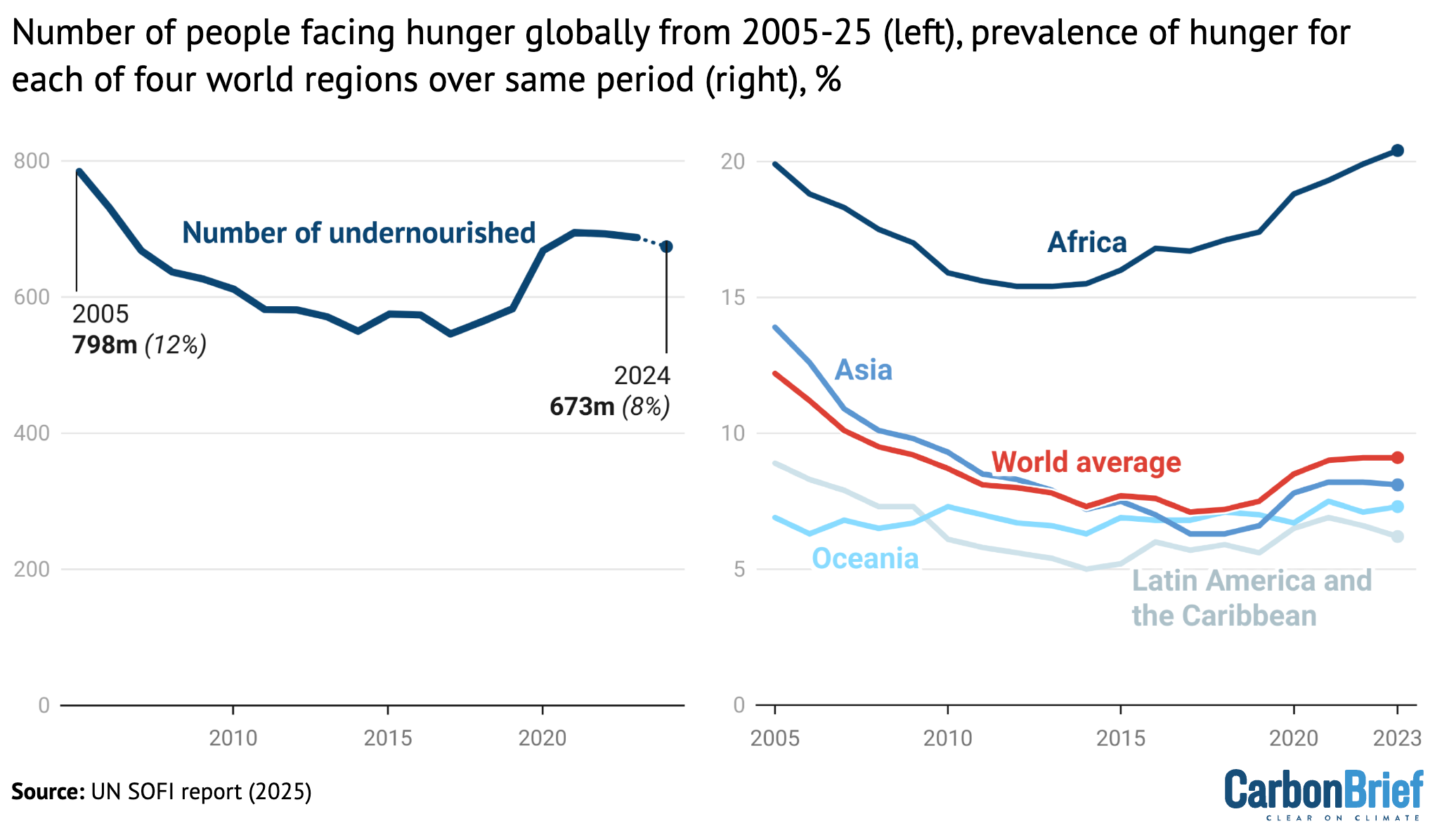
Number of undernourished people, globally, from 2005-24 (left) and the prevalence of undernourishment (right) for the world (red), Africa (dark blue), Asia (blue), Latin America and the Caribbean (light blue) and Oceania (cyan) over the same time period. Credit: Carbon Brief, based on the UN State of Food Security and Nutrition in the World report (2025)
Since 1975, the FAO has tracked the prevalence of undernourishment – the proportion of the population in each country who does not regularly consume sufficient amounts of food for sustaining a healthy life.
These estimates are used to assess progress on achieving global goals, such as the 2030 Sustainable Development Goals (SDGs), launched in 2015.
The left-hand chart above shows the number of people facing hunger each year from 2005-24. The right-hand chart shows the percentage of the population facing hunger over this time period for the world as a whole (red), Africa (dark blue), Asia (blue), Latin America and the Caribbean (light blue) and Oceania (cyan).
Over the past 20 years, undernourishment broadly decreased until 2016 and then began to rise sharply in 2020 and 2021. This increase coincided with the Covid-19 pandemic.
The report estimates that the population facing hunger in 2024 was between 638 million and 720 million people, or between 7.8% and 8.8% of the global population.
The report sets its “best estimate” of the population facing hunger at 673 million people, which represents a decrease of 15 million people compared to the previous year.
However, the report notes that the progress made in reducing hunger worldwide has been uneven, as seen in the chart above.
There were improvements in south-west and southern Asia, as well as Latin America, but a continuing rise in hunger in much of Africa and western Asia.
The report also finds that around 2.3 billion people were “moderate or severely food insecure” in 2024, noting that this represents an increase of 683 million more people than when the SDGs was launched a decade ago.
The report projects that by 2030 around 512 million people could face chronic hunger, with 60% of the world’s undernourished people located in Africa.
It highlights that achieving the goal of eliminating hunger by 2030 will be an “elusive target”.
The report warns that the “deteriorating food insecurity” in territories and countries currently affected by humanitarian crises – such as the Gaza Strip, South Sudan, Sudan, Yemen and Haiti – may not be fully reflected in its current estimates.
2. The cost of a healthy diet increased around the world

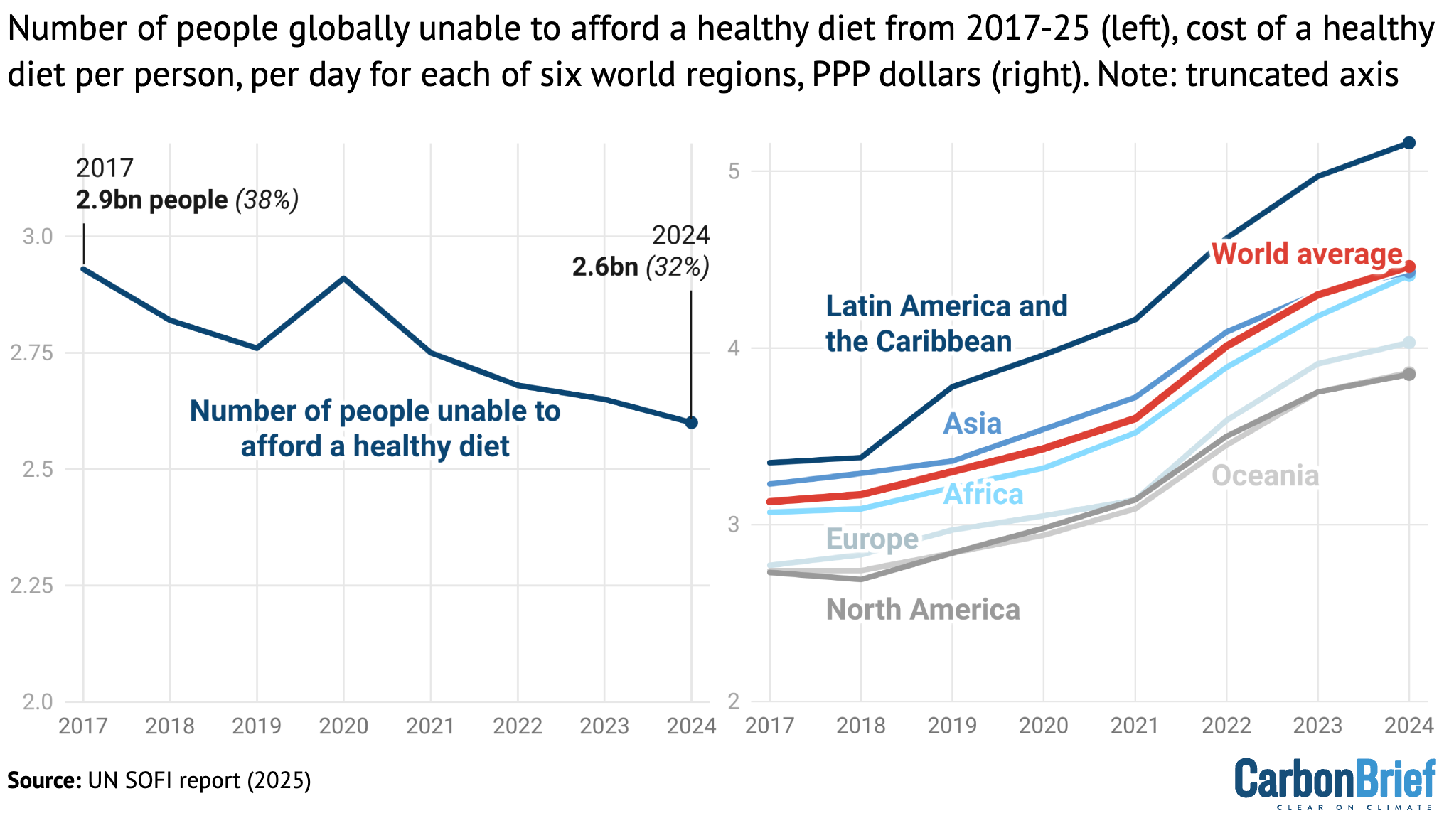
The number of people around the world who were unable to afford a healthy diet (left) from 2017-24. The cost of a healthy diet per person, per day in purchasing power parity dollars (right) for the world (red), Africa (cyan), Asia (blue), Europe (light blue), Latin America and the Caribbean (dark blue), North America (dark grey) and Oceania (light grey). Credit: Carbon Brief, based on the UN State of Food Security and Nutrition in the World report (2025)
The report finds that the cost of a “healthy” diet rose during 2023 and 2024.
It defines a “healthy” diet as one that comprises a “variety of locally available foods that meet energy and most nutrient requirements”. A healthy diet should be diverse, adequate and balanced, while maintaining moderation in consumption of food related to poor health outcomes, the report says.
In 2019, a healthy diet cost, on average, 3.30 purchasing power parity (PPP) dollars per person, per day. (Purchasing power parity is a type of currency conversion, based on the cost of goods in different locations, that allows one to compare the purchasing power of different currencies.)
By 2024, increasing food prices had driven this cost up to 4.46 PPP dollars, the report says.
At the same time, the report finds that the proportion of the population unable to afford a healthy diet has decreased every year since 2017, with the exception of 2020. For example, in 2020, the number of people worldwide who could not afford healthy food was 2.9 billion, which fell to 2.6 billion in 2024.
This is due to the economic recovery following the Covid-19 pandemic, which led to an increase in incomes that outstripped the rise in food prices, the report says.
The chart above shows how the global population was unable to afford a healthy diet each year from 2017-24 (left) and the average cost of a healthy diet, in PPP dollars per person, per day (right, red). The right-hand chart also shows the cost in each of six regions: Latin America and the Caribbean (dark blue), Asia (blue), Africa (cyan), Europe (light blue), Oceania (light grey) and North America (dark grey).
However, not all regions experienced the same economic recovery, it adds.
Asia, as a whole, saw the largest decrease in the unaffordability of healthy food – with the proportion of people unable to afford a healthy diet falling from 35% in 2019 to 28% in 2024. In contrast, the unaffordability of healthy diets increased “substantially” in Africa, with two-thirds of the population unable to afford healthy diets in 2024.
The rest of the world’s regions – with the exception of Oceania – saw a “marginal” decrease in the unaffordability of healthy food in recent years, the report says.
There are significant differences in affordability according to national incomes.
In low-income countries, the number of people unable to afford a healthy diet “has been steadily increasing since 2017”, says the report. This is attributed to a recent halt in economic growth and a sharp rise in food prices.
In lower-middle-income countries, that number decreased from 2020 to 2024, mainly due to improvements in affordability in India.
Conversely, in upper-middle- and high-income countries, the number of people unable to afford healthy food has been declining since 2020.
The report concludes that “people who are unable to afford even a least-cost healthy diet are likely experiencing some level of food insecurity”.
3. Food price inflation outstripped general inflation over 2019-25

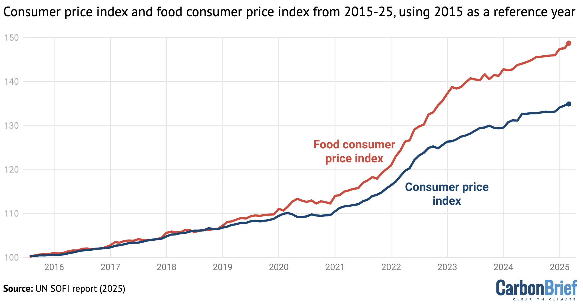
Consumer price index (blue) and food consumer price index (red) from 2015-25, using 2015 as a reference year. Credit: Carbon Brief, based on the UN State of Food Security and Nutrition in the World report (2025)
The report finds that food price inflation has “significantly” outstripped general inflation over the past five years. Median global food price inflation rose from 2.3% in December 2020 to 13.6% in January 2023.
The chart above shows consumer price index (blue) – which includes price changes to all of the items a household typically consumes – and the consumer food price index (red) over 2015-25, with 2015 taken as the reference year.
The highest rates of inflation occurred in low-income countries, with several countries experiencing “hyperinflation”, including inflation levels above 350%. The report explains that most households in low-income countries source much of their food from local markets, which are more vulnerable to price shocks.
The authors attribute the heightened inflation to a combination of factors that includes the Covid-19 pandemic, the war in Ukraine and shifting monetary policy – from lowering interest rates and launching fiscal support at the beginning of the pandemic to raising interest rates to combat surging prices.
According to the report, previous food-price shocks – such as the one that occurred during the 2008 global financial crisis – were “predominantly” driven by supply, while the current surging inflation was driven initially by demand.
Supply-side shocks occur when production or distribution of food are disrupted by external factors, resulting in a “steep and prolonged rise in food prices”. Supply-side shocks create “persistent inflationary pressures”, the report says.
Demand-side shocks – a “sudden and unexpected increase in consumer demand for food products” – are often due to economic growth and changes in consumption patterns. (The report cites as an example the Covid-19 pandemic, which led to a “surge” in demand for food at home.) Demand-side shocks are characterised by rapid increases in price, but do not typically have a long-term impact.
In addition to the global factors driving food inflation, localised shocks – such as extreme weather events – impacted inflation on sub-national and national scales, by destroying crops, disrupting supply chains and suppressing household incomes.
Since 2020, the report says, 139 out of 203 countries have faced cumulative food price inflation above 25%, with 49 countries experiencing cumulative food inflation higher than 50%. It warns:
“Such prolonged food price pressures risk undermining household coping capacities and worsening food insecurity.”
According to the report, food price rises of 10% are associated with a 3.5% rise in “moderate or severe” food insecurity, with women “disproportionately affected”.
It also notes that food price inflation has previously been found to have “detrimental effects on child nutrition”, particularly among vulnerable populations.
4. Gas price shocks contributed to high commodity prices

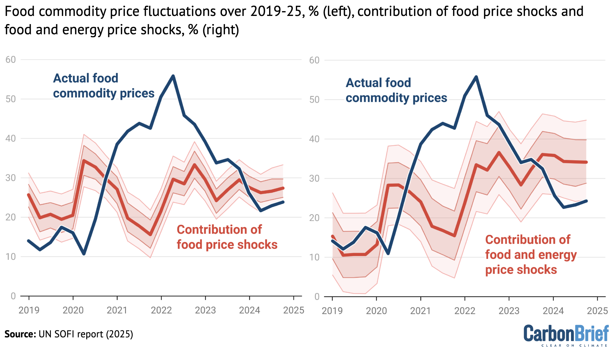
Contribution of food price shocks (left) and food and energy price shocks (right) to global commodity food prices, from 2019-25. Overall fluctuations in food commodity prices are shown in dark blue on both charts. Credit: Carbon Brief, based on the UN State of Food Security and Nutrition in the World report (2025)
Rising food prices were amplified by rising energy costs over the past several years, the report says.
It points out that oil and gas are “key input[s] in agriculture production – from fertiliser manufacturing through to transportation”.
(Nitrogen-based fertilisers are typically produced using fossil gas as an input. The process of manufacturing them is an energy-intensive one – accounting for about 1% of all global energy usage.)
The report cites two “waves” of shocks that “largely shaped” the changes in agricultural commodity prices over 2020-22.
The first wave, it says, occurred early in the Covid-19 pandemic as food supplies contracted due to supply-chain disruptions, as well as “precautionary trade restrictions and increased stockpiling”.
Global energy markets were further “destabilised” by the second shockwave – Russia’s invasion of Ukraine in February 2022. Prior to the outbreak of the war, Russia was the third-largest producer of oil and the second-largest producer of fossil gas in the world.
The war resulted in “significant price increases and heightened volatility”, which translated into higher production costs economy-wide, the report says.
The initial surge at the beginning of the pandemic contributed about 15 percentage points to global food inflation, while the war in Ukraine added 18 percentage points, the report says.
The charts above show global food price inflation (black lines) over 2019-25. The blue line in the left panel shows the contribution of “food price shocks”, such as the disruption of the Black Sea trade corridor and the decline in fertiliser exports from Russia. In the right panel, the red line shows the contribution of both food price and energy price shocks to food inflation.
According to the report, the rise in agricultural and energy commodity prices account for nearly half of food price inflation in the US and more than one-third of food price inflation in the Euro area during peak inflation over the past few years.
It adds that the remaining inflation is explained by several other factors, “including rising labour costs, exchange rate fluctuations and pricing behaviour along the supply chain”.
5. Fertiliser prices have remained high following Russia’s invasion of Ukraine

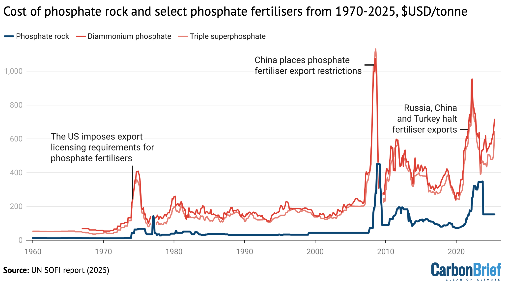
Monthly price of phosphate rock (blue), diammonium phosphate fertiliser (dark red) and triple superphosphate fertiliser (light red) from 1970-2025. Credit: Carbon Brief, based on the UN State of Food Security and Nutrition in the World report (2025)
The report notes that Russia’s invasion of Ukraine in February 2022 upended global fertiliser markets due to economic sanctions against Russia and Belarus – two of the world’s largest fertiliser exporters.
In 2020, Russia exported 14% of globally traded urea, the most commonly used nitrogen fertiliser. Belarus and Russia combined account for more than 40% of traded potash, a key potassium fertiliser.
While many of the sanctions against Russia following the outbreak of the war specifically omitted fertilisers and agricultural commodities, the report notes that restrictions on banking and trade increased the “cost of doing business” and restricted the ability of countries to purchase food and fertilisers from Russia.
However, the report points out, global potassium fertiliser prices were already on the rise prior to Russia’s invasion of Ukraine, due to export restrictions on fertilisers from China.
Similar trade measures on fertilisers – both export restrictions and import tariffs – have “played a role” in price spikes during previous episodes of global food price crises, including in 2007-08 and 2011-12, the report says.
The report looks specifically at phosphate fertilisers, noting that those prices have “historically been shaped by both long-term structural trends and short-term shocks”. These factors include trade restrictions, energy costs, geopolitical tensions and imbalances in supply and demand.
The chart above shows the monthly price of phosphate rock (blue), diammonium phosphate (dark red) and triple superphosphate (light red) from 1970 to 2025.
(Phosphate rock is the raw material used to manufacture most phosphate-based fertilisers, while diammonium phosphate and triple superphosphate are two commonly used phosphate fertilisers.)
Export restrictions were “critical factors” in driving the three major historical phosphate price spikes highlighted in the chart – in 1974, 2008 and 2021-22.
Given the small number of countries that produce phosphate fertilisers – their production is highly concentrated in China, the US, India, Russia and Morocco – these actions “exacerbat[e] global shortages”, the report says.
The report also points out that the concentration of agricultural markets – including the fertiliser market – is a “systemic issue that undermines efficiency and affordability” in both low- and high-income countries.
The post UN report: Five charts explaining the rise of global food insecurity appeared first on Carbon Brief.
UN report: Five charts explaining the rise of global food insecurity
Climate Change
DeBriefed 30 January 2026: Fire and ice; US formally exits Paris; Climate image faux pas
Welcome to Carbon Brief’s DeBriefed.
An essential guide to the week’s key developments relating to climate change.
This week
Fire and ice
OZ HEAT: The ongoing heatwave in Australia reached record-high temperatures of almost 50C earlier this week, while authorities “urged caution as three forest fires burned out of control”, reported the Associated Press. Bloomberg said the Australian Open tennis tournament “rescheduled matches and activated extreme-heat protocols”. The Guardian reported that “the climate crisis has increased the frequency and severity of extreme weather events, including heatwaves and bushfires”.
WINTER STORM: Meanwhile, a severe winter storm swept across the south and east of the US and parts of Canada, causing “mass power outages and the cancellation of thousands of flights”, reported the Financial Times. More than 870,000 people across the country were without power and at least seven people died, according to BBC News.
COLD QUESTIONED: As the storm approached, climate-sceptic US president Donald Trump took to social media to ask facetiously: “Whatever happened to global warming???”, according to the Associated Press. There is currently significant debate among scientists about whether human-caused climate change is driving record cold extremes, as Carbon Brief has previously explained.
Around the world
- US EXIT: The US has formally left the Paris Agreement for the second time, one year after Trump announced the intention to exit, according to the Guardian. The New York Times reported that the US is “the only country in the world to abandon the international commitment to slow global warming”.
- WEAK PROPOSAL: Trump officials have delayed the repeal of the “endangerment finding” – a legal opinion that underpins federal climate rules in the US – due to “concerns the proposal is too weak to withstand a court challenge”, according to the Washington Post.
- DISCRIMINATION: A court in the Hague has ruled that the Dutch government “discriminated against people in one of its most vulnerable territories” by not helping them to adapt to climate change, reported the Guardian. The court ordered the Dutch government to set binding targets within 18 months to cut greenhouse gas emissions in line with the Paris Agreement, according to the Associated Press.
- WIND PACT: 10 European countries have agreed a “landmark pact” to “accelerate the rollout of offshore windfarms in the 2030s and build a power grid in the North Sea”, according to the Guardian.
- TRADE DEAL: India and the EU have agreed on the “mother of all trade deals”, which will save up to €4bn in import duty, reported the Hindustan Times. Reuters quoted EU officials saying that the landmark trade deal “will not trigger any changes” to the bloc’s carbon border adjustment mechanism.
- ‘TWO-TIER SYSTEM’: COP30 president André Corrêa do Lago believes that global cooperation should move to a “two-speed system, where new coalitions lead fast, practical action alongside the slower, consensus-based decision-making of the UN process”, according to a letter published on Tuesday, reported Climate Home News.
$2.3tn
The amount invested in “green tech” globally in 2025, marking a new record high, according to Bloomberg.
Latest climate research
- Including carbon emissions from permafrost thaw and fires reduces the remaining carbon budget for limiting warming to 1.5C by 25% | Communications Earth & Environment
- The global population exposed to extreme heat conditions is projected to nearly double if temperatures reach 2C | Nature Sustainability
- Polar bears in Svalbard – the fastest-warming region on Earth – are in better condition than they were a generation ago, as melting sea ice makes seal pups easier to reach | Scientific Reports
(For more, see Carbon Brief’s in-depth daily summaries of the top climate news stories on Monday, Tuesday, Wednesday, Thursday and Friday.)
Captured

Sales of electric vehicles (EVs) overtook standard petrol cars in the EU for the first time in December 2025, according to new figures released by the European Automobile Manufacturers’ Association (ACEA) and covered by Carbon Brief. Registrations of “pure” battery EVs reached 217,898 – up 51% year-on-year from December 2024. Meanwhile, sales of standard petrol cars in the bloc fell 19% year-on-year, from 267,834 in December 2024 to 216,492 in December 2025, according to the analysis.
Spotlight
Looking at climate visuals
Carbon Brief’s Ayesha Tandon recently chaired a panel discussion at the launch of a new book focused on the impact of images used by the media to depict climate change.
When asked to describe an image that represents climate change, many people think of polar bears on melting ice or devastating droughts.
But do these common images – often repeated in the media – risk making climate change feel like a far-away problem from people in the global north? And could they perpetuate harmful stereotypes?
These are some of the questions addressed in a new book by Prof Saffron O’Neill, who researches the visual communication of climate change at the University of Exeter.
“The Visual Life of Climate Change” examines the impact of common images used to depict climate change – and how the use of different visuals might help to effect change.
At a launch event for her book in London, a panel of experts – moderated by Carbon Brief’s Ayesha Tandon – discussed some of the takeaways from the book and the “dos and don’ts” of climate imagery.
Power of an image
“This book is about what kind of work images are doing in the world, who has the power and whose voices are being marginalised,” O’Neill told the gathering of journalists and scientists assembled at the Frontline Club in central London for the launch event.
O’Neill opened by presenting a series of climate imagery case studies from her book. This included several examples of images that could be viewed as “disempowering”.
For example, to visualise climate change in small island nations, such as Tuvalu or Fiji, O’Neill said that photographers often “fly in” to capture images of “small children being vulnerable”. She lamented that this narrative “misses the stories about countries like Tuvalu that are really international leaders in climate policy”.
Similarly, images of power-plant smoke stacks, often used in online climate media articles, almost always omit the people that live alongside them, “breathing their pollution”, she said.

During the panel discussion that followed, panellist Dr James Painter – a research associate at the Reuters Institute for the Study of Journalism and senior teaching associate at the University of Oxford’s Environmental Change Institute – highlighted his work on heatwave imagery in the media.
Painter said that “the UK was egregious for its ‘fun in the sun’ imagery” during dangerous heatwaves.
He highlighted a series of images in the Daily Mail in July 2019 depicting people enjoying themselves on beaches or in fountains during an intense heatwave – even as the text of the piece spoke to the negative health impacts of the heatwave.
In contrast, he said his analysis of Indian media revealed “not one single image of ‘fun in the sun’”.
Meanwhile, climate journalist Katherine Dunn asked: “Are we still using and abusing the polar bear?”. O’Neill suggested that polar bear images “are distant in time and space to many people”, but can still be “super engaging” to others – for example, younger audiences.
Panellist Dr Rebecca Swift – senior vice president of creative at Getty images – identified AI-generated images as “the biggest threat that we, in this space, are all having to fight against now”. She expressed concern that we may need to “prove” that images are “actually real”.
However, she argued that AI will not “win” because, “in the end, authentic images, real stories and real people are what we react to”.
When asked if we expect too much from images, O’Neill argued “we can never pin down a social change to one image, but what we can say is that images both shape and reflect the societies that we live in”. She added:
“I don’t think we can ask photos to do the work that we need to do as a society, but they certainly both shape and show us where the future may lie.”
Watch, read, listen
UNSTOPPABLE WILDFIRES: “Funding cuts, conspiracy theories and ‘powder keg’ pine plantations” are making Patagonia’s wildfires “almost impossible to stop”, said the Guardian.
AUDIO SURVEY: Sverige Radio has published “the world’s, probably, longest audio survey” – a six-hour podcast featuring more than 200 people sharing their questions around climate change.
UNDERSTAND CBAM: European thinktank Bruegel released a podcast “all about” the EU’s carbon adjustment border mechanism, which came into force on 1 January.
Coming up
- 1 February: Costa Rican general election
- 3 February: UN Environment Programme Adaptation Fund Climate Innovation Accelerator report launch, Online
- 2-8 February: Intergovernmental Platform on Biodiversity and Ecosystem Services (IPBES) 12th plenary, Manchester, UK
Pick of the jobs
- Climate Central, climate data scientist | Salary: $85,000-$92,000. Location: Remote (US)
- UN office to the African Union, environmental affairs officer | Salary: Unknown. Location: Addis Ababa, Ethiopia
- Google Deepmind, research scientist in biosphere models | Salary: Unknown. Location: Zurich, Switzerland
DeBriefed is edited by Daisy Dunne. Please send any tips or feedback to debriefed@carbonbrief.org.
This is an online version of Carbon Brief’s weekly DeBriefed email newsletter. Subscribe for free here.
The post DeBriefed 30 January 2026: Fire and ice; US formally exits Paris; Climate image faux pas appeared first on Carbon Brief.
DeBriefed 30 January 2026: Fire and ice; US formally exits Paris; Climate image faux pas
Climate Change
Factcheck: What it really costs to heat a home in the UK with a heat pump
Electric heat pumps are set to play a key role in the UK’s climate strategy, as well as cutting the nation’s reliance on imported fossil fuels.
Heat pumps took centre-stage in the UK government’s recent “warm homes plan”, which said that they could also help cut household energy bills by “hundreds of pounds” a year.
Similarly, innovation agency Nesta estimates that typical households could cut their annual energy bills nearly £300 a year, by switching from a gas boiler to a heat pump.
Yet there has been widespread media coverage in the Times, Sunday Times, Daily Express, Daily Telegraph and elsewhere of a report claiming that heat pumps are “more expensive” to run.
The report is from the Green Britain Foundation set up by Dale Vince, owner of energy firm Ecotricity, who campaigns against heat pumps and invests in “green gas” as an alternative.
One expert tells Carbon Brief that Vince’s report is based on “flimsy data”, while another says that it “combines a series of worst-case assumptions to present an unduly pessimistic picture”.
This factcheck explains how heat pumps can cut bills, what the latest data shows about potential savings and how this information was left out of the report from Vince’s foundation.
How heat pumps can cut bills
Heat pumps use electricity to move heat – most commonly from outside air – to the inside of a building, in a process that is similar to the way that a fridge keeps its contents cold.
This means that they are highly efficient, adding three or four units of heat to the house for each unit of electricity used. In contrast, a gas boiler will always supply less than one unit of heat from each unit of gas that it burns, because some of the energy is lost during combustion.
This means that heat pumps can keep buildings warm while using three, four or even five times less energy than a gas boiler. This cuts fossil-fuel imports, reducing demand for gas by at least two-fifths, even in the unlikely scenario that all of the electricity they need is gas-fired.
Since UK electricity supplies are now the cleanest they have ever been, heat pumps also cut the carbon emissions associated with staying warm by around 85%, relative to a gas boiler.
Heat pumps are, therefore, the “central” technology for cutting carbon emissions from buildings.
While heat pumps cost more to install than gas boilers, the UK government’s recent “warm homes plan” says that they can help cut energy bills by “hundreds of pounds” per year.
Similarly, Nesta published analysis showing that a typical home could cut its annual energy bill by £280, if it replaces a gas boiler with a heat pump, as shown in the figure below.
Nesta and the government plan say that significantly larger savings are possible if heat pumps are combined with other clean-energy technologies, such as solar and batteries.

Both the government and Nesta’s estimates of bill savings from switching to a heat pump rely on relatively conservative assumptions.
Specifically, the government assumes that a heat pump will deliver 2.8 units of heat for each unit of electricity, on average. This is known as the “seasonal coefficient of performance” (SCoP).
This figure is taken from the government-backed “electrification of heat” trial, which ran during 2020-2022 and showed that heat pumps are suitable for all building types in the UK.
(The Green Britain Foundation report and Vince’s quotes in related coverage repeat a number of heat pump myths, such as the idea that they do not perform well in older properties and require high levels of insulation.)
Nesta assumes a slightly higher SCoP of 3.0, says Madeleine Gabriel, the organisation’s director of sustainable future. (See below for more on what the latest data says about SCoP in recent installations.)
Both the government and Nesta assume that a home with a heat pump would disconnect from the gas grid, meaning that it would no longer need to pay the daily “standing charge” for gas. This currently amounts to a saving of around £130 per year.
Finally, they both consider the impact of a home with a heat pump using a “smart tariff”, where the price of electricity varies according to the time of day.
Such tariffs are now widely available from a variety of energy suppliers and many have been designed specifically for homes that have a heat pump.
Such tariffs significantly reduce the average price for a unit of electricity. Government survey data suggests that around half of heat-pump owners already use such tariffs.
This is important because on the standard rates under the price cap set by energy regulator Ofgem, each unit of electricity costs more than four times as much as a unit of gas.
The ratio between electricity and gas prices is a key determinant of the size and potential for running-cost savings with a heat pump. Countries with a lower electricity-to-gas price ratio consistently see much higher rates of heat-pump adoption.
(Decisions taken by the UK government in its 2025 budget mean that the electricity-to-gas ratio will fall from April, but current forecasts suggest it will remain above four-to-one.)
In contrast, Vince’s report assumes that gas boilers are 90% efficient, whereas data from real homes suggests 85% is more typical. It also assumes that homes with heat pumps remain on the gas grid, paying the standing charge, as well as using only a standard electricity tariff.
Prof Jan Rosenow, energy programme leader at the University of Oxford’s Environmental Change Institute, tells Carbon Brief that Vince’s report uses “worst-case assumptions”. He says:
“This report cherry-picks assumptions to reach a predetermined conclusion. Most notably, it assumes a gas boiler efficiency of 90%, which is significantly higher than real-world performance…Taken together, the analysis combines a series of worst-case assumptions to present an unduly pessimistic picture.”
Similarly, Gabriel tells Carbon Brief that Vince’s report is based on “flimsy data”. She explains:
“Dale Vince has drawn some very strong conclusions about heat pumps from quite flimsy data. Like Dale, we’d also like to see electricity prices come down relative to gas, but we estimate that, from April, even a moderately efficient heat pump on a standard tariff will be cheaper to run than a gas boiler. Paired with a time-of-use tariff, a heat pump could save £280 versus a boiler and adding solar panels and a battery could triple those savings.”
What the latest data shows about bill savings
The efficiency of heat-pump installations is another key factor in the potential bill savings they can deliver and, here, both the government and Vince’s report take a conservative approach.
They rely on the “electrification of heat” trial data to use an efficiency (SCoP) of 2.8 for heat pumps. However, Rosenow says that recent evidence shows that “substantially higher efficiencies are routinely available”, as shown in the figure below.
Detailed, real-time data on hundreds of heat pump systems around the UK is available via the website Heat Pump Monitor, where the average efficiency – a SCoP of 3.9 – is much higher.

Homes with such efficient heat-pump installations would see even larger bill savings than suggested by the government and Nesta estimates.
Academic research suggests that there are simple and easy-to-implement reasons why these systems achieve much higher efficiency levels than in the electrification of heat trial.
Specifically, it shows that many of the systems in the trial have poor software settings, which means they do not operate as efficiently as their heat pump hardware is capable of doing.
The research suggests that heat pump installations in the UK have been getting more and more efficient over time, as engineers become increasingly familiar with the technology.
It indicates that recently installed heat pumps are 64% more efficient than those in early trials.
Notably, the Green Britain Foundation report only refers to the trial data from the electrification of heat study carried out in 2020-22 and the even earlier “renewable heat premium package” (RHPP). This makes a huge difference to the estimated running costs of a heat pump.
Carbon Brief analysis suggests that a typical household could cut its annual energy bills by nearly £200 with a heat pump – even on a standard electricity tariff – if the system has a SCoP of 3.9.
The savings would be even larger on a smart heat-pump tariff.
In contrast, based on the oldest efficiency figures mentioned in the Green Britain Foundation report, a heat pump could increase annual household bills by as much as £200 on a standard tariff.
To support its conclusions, the report also includes the results of a survey of 1,001 heat pump owners, which, among other things, is at odds with government survey data. The report says “66% of respondents report that their homes are more expensive to heat than the previous system”.
There are several reasons to treat these findings with caution. The survey was carried out in July 2025 and some 45% of the heat pumps involved were installed between 2021-23.
This is a period during which energy prices surged as a result of Russia’s invasion of Ukraine and the resulting global energy crisis. Energy bills remain elevated as a result of high gas prices.
The wording of the survey question asks if homes are “more or less expensive to heat than with your previous system” – but makes no mention of these price rises.
The question does not ask homeowners if their bills are higher today, with a heat pump, than they would have been with the household’s previous heating system.
If respondents interpreted the question as asking whether their bills have gone up or down since their heat pump was installed, then their answers will be confounded by the rise in prices overall.
There are a number of other seemingly contradictory aspects of the survey that raise questions about its findings and the strong conclusions in the media coverage of the report.
For example, while only 15% of respondents say it is cheaper to heat their home with a heat pump, 49% say that one of the top three advantages of the system is saving money on energy bills.
In addition, 57% of respondents say they still have a boiler, even though 67% say they received government subsidies for their heat-pump installation. It is a requirement of the government’s boiler upgrade scheme (BUS) grants that homeowners completely remove their boiler.
The government’s own survey of BUS recipients finds that only 13% of respondents say their bills have gone up, whereas 37% say their bills have gone down, another 13% say they have stayed the same and 8% thought that it was too early to say.
The post Factcheck: What it really costs to heat a home in the UK with a heat pump appeared first on Carbon Brief.
Factcheck: What it really costs to heat a home in the UK with a heat pump
Climate Change
Experts: Will Chinese wind power help or hinder Europe’s climate goals?
The European Union and the UK are not on track to meet their 2030 offshore wind targets.
At the same time, Chinese wind-turbine manufacturers – who account for more than half of global wind-turbine capacity – are looking to grow their footprint in the European market, where their presence is currently tiny.
To some, the solution seems clear: allowing Chinese manufacturers to invest in Europe could boost competition, alleviate supply chain bottlenecks and lower costs – not to mention bring climate targets within reach.
But the possibility of a growing role for Chinese wind-turbine manufacturers in the European market has sparked heated debate among European policymakers and industry participants.
In 2024, three of China’s top wind-turbine companies accounted for less than 1% of Europe’s installed wind capacity.
But their focus is increasingly shifting to the continent, which some are concerned could hollow out the one clean-energy industry in which Europe is still competitive.
Competition between European and Chinese manufacturers would be “unfair”, according to critics, because the discounts Chinese firms are offering seem to be at least in part due to state subsidies.
In a recent report published by the Oxford Institute for Energy Studies, we explore whether Chinese wind turbine companies are competitive in Europe and the real risks and benefits of Chinese participation in European offshore wind markets.
Our findings build on interviews with policymakers and industry experts, who have been granted anonymity to allow for candid discussion.
Cost advantages are less clear-cut than they appear
China ranks first for many of the global statistics for offshore wind. It has been by far the largest offshore wind market in the world for several years running.
China had 47 gigawatts (GW) of offshore wind installed, as of September 2025, more than all other countries combined. Furthermore, China also dominates several key fields critical to offshore wind globally, ranging from permanent magnets to offshore installation vessels.
This stands in firm contrast to Europe – where offshore development has experienced several years of slow growth – and the US, which faces an almost complete halt in new development under the Trump administration.
As happened before in solar and batteries, China’s offshore wind industry scale-up has brought about stunning declines in installation costs.
However, this cost advantage is not as straightforward as these headline numbers would suggest. Despite the vast difference in capacity cost, the electricity produced by Chinese offshore wind farms is only 30% cheaper.
A key reason for this is the lower overall capacity factor of China’s offshore wind sector, referring to the actual output of windfarms in China, compared to their maximum possible output. This can be partly explained by lower wind speeds at China’s offshore sites, but could also relate to lower performance of Chinese turbines, as well as power transmission issues.
Lower production costs in China also would not necessarily translate to the European market, as Chinese cost advantages would be partly offset by transport costs, as well as higher insurance and financing premiums.
Greater localisation of turbine production could mitigate against some of these premiums, but would be offset by higher input costs in Europe.
Nonetheless, as more European governments add local content requirements, Chinese manufacturers have announced plans to set up European factories for turbine blades and towers, with core components shipped from China.
These factories could also be costlier to finance than those back home if financing for investments also comes from Europe, further reducing the cost advantage enjoyed by China’s domestic offshore-energy infrastructure.
Issues beyond costs and bottlenecks
European offshore wind development plans have faced a number of hurdles, including rising costs, slow permitting processes, inefficient auction designs, lengthy grid connection times and limited availability of parts, port capacity and installation vessels.
The small number of players in Europe’s offshore wind sector is seen as part of the problem, according to our interviews.
Currently, there are only three major wind turbine manufacturers in the European offshore wind market: Vestas, Siemens Gamesa and GE Vernova.
The latter announced in 2024 that it is downsizing its offshore wind business and has not taken new offshore orders, although it remains active in onshore wind projects. This reduces competition and could hinder efforts to bring down the cost of offshore wind projects.
Bottlenecks, inadequate industry capacity and lack of competition cannot in themselves explain the current European predicament. Developers we interviewed also note that offshore wind auctions with price caps and stringent contractual terms, designed with an expectation of falling costs, have also been part of the problem.
When these auctions have failed – as in the UK in 2023 and Germany in 2025 – this led to capacity contraction, higher costs and industry consolidation, which have only made it more difficult to reach policy targets, according to a report by European offshore wind company Ørsted.
Even with improved European auction design, it may take years for Europe’s offshore wind installation numbers to recover. With or without Chinese participation, it will also take time to build domestic manufacturing bases and installation vessels.
Pathways to Chinese involvement
Meanwhile, Chinese developers benefit from a large and growing domestic market in China. At the same time, however, intense competition on price and quality is spurring them to seek opportunities overseas.
Throughout Europe’s supply chain, Chinese components and services are already helping alleviate shortages and bottlenecks.
Still, our report found there are divergent views on whether a greater Chinese presence in Europe’s wind markets represents a threat or an opportunity – or both.
Policymakers are expected to continue to emphasise concerns about technology dependence and cybersecurity risks, leading to more domestic content requirements and increased scrutiny of Chinese deals.
The case of the 300 megawatt (MW) Luxcara project in Germany highlights the difficulties for Chinese market entry. Chinese manufacturer Mingyang was initially selected by the project owner in 2024, but was later replaced by Siemens-Gamesa, reportedly due to concerns about security and political risks.
The recent announcement of a deal between the UK’s Octopus Energy and Mingyang may illustrate an emerging model. According to Octopus, Mingyang will supply the physical equipment, while Octopus will supply the software and manage the turbines.
Mingyang will still need access to operational data to support ongoing maintenance, but this can be provided periodically by Octopus without compromising security, the energy company told us.
Meanwhile, following policy signals such as the EU’s new pricing mechanism for electric vehicle imports from China, it seems likely that policymakers will continue to encourage Chinese players to establish production bases in Europe and to require technology licensing or technology transfer in exchange for market access. This would amount to applying the Chinese industrial development model in Europe.
This could allow for technological learning in Europe. In China, the largest players have deployed advanced automated manufacturing lines, including robotic blade bonding, modular stator assembly and real-time quality monitoring – although this may have implications for job creation, a stated aim in Europe’s clean-energy policy.
Despite pointing to some advantages, our interviews suggest that Chinese participation in Europe’s offshore wind market is not a panacea.
Its low costs are unlikely to be transferrable to the European context. But greater Chinese participation in auctions and in manufacturing, with local content requirements and other guardrails, could help spur competition in Europe.
At the same time, our report suggests that the focus on China distracts from deeper issues. Without a growing domestic market, it may be difficult for European players to reduce manufacturing costs and upgrade production, with or without Chinese partners.
Ultimately, industry participants tell us that the greatest determinant of success in Europe’s offshore wind market will be consistent policy support, rather than a decision to allow – or to block – Chinese participation.
The post Experts: Will Chinese wind power help or hinder Europe’s climate goals? appeared first on Carbon Brief.
Experts: Will Chinese wind power help or hinder Europe’s climate goals?
-
Greenhouse Gases6 months ago
Guest post: Why China is still building new coal – and when it might stop
-
Climate Change6 months ago
Guest post: Why China is still building new coal – and when it might stop
-
Climate Change2 years ago
Bill Discounting Climate Change in Florida’s Energy Policy Awaits DeSantis’ Approval
-
Greenhouse Gases2 years ago嘉宾来稿:满足中国增长的用电需求 光伏加储能“比新建煤电更实惠”
-
Climate Change2 years ago
Spanish-language misinformation on renewable energy spreads online, report shows
-
Climate Change2 years ago嘉宾来稿:满足中国增长的用电需求 光伏加储能“比新建煤电更实惠”
-
Climate Change Videos2 years ago
The toxic gas flares fuelling Nigeria’s climate change – BBC News
-
Carbon Footprint2 years agoUS SEC’s Climate Disclosure Rules Spur Renewed Interest in Carbon Credits


