
Global temperatures in the first quarter of 2025 were the second warmest on record, extending a remarkable run of exceptional warmth that began in July 2023.
This is despite weak La Niña conditions during the first two months of the year – which typically result in cooler temperatures.
With temperature data for the first three months of the year now available, Carbon Brief finds that 2025 is very likely to be one of the three warmest years on record.
However, it currently remains unlikely that temperatures in 2025 will set a new annual record.
In addition to near-record warmth, the start of 2025 has seen record-low sea ice cover in the Arctic between January and March – and the second-lowest minimum sea ice extent on record for Antarctica.
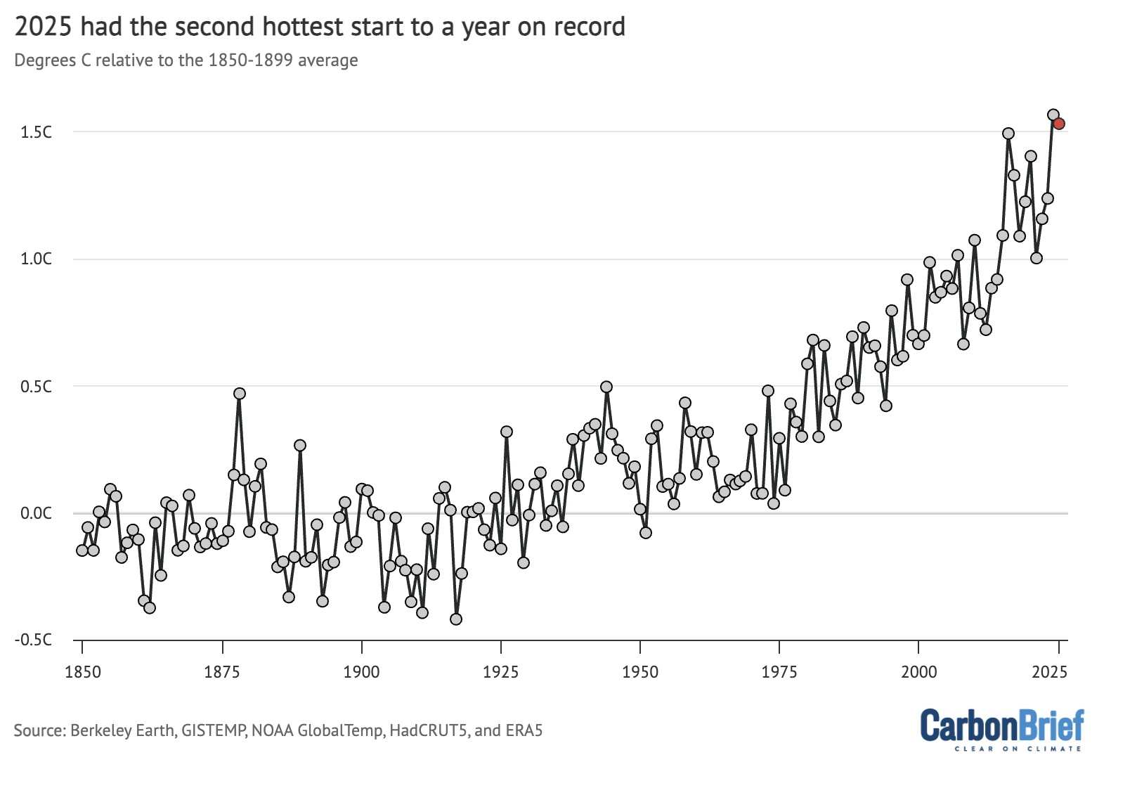
Second-warmest start to the year
In this quarterly state of the climate assessment, Carbon Brief analyses records from five different research groups that report global surface temperature records: NASA, NOAA, Met Office Hadley Centre/UEA, Berkeley Earth and Copernicus/ECMWF.
The figure below shows the annual temperatures from each of these groups since 1970, along with the average over the first three months of 2025.
(It is worth noting that the first three months may not be representative of the year as a whole, as greater historical warming rates mean that temperatures relative to pre-industrial levels tend to be larger in the northern hemispheric winter months of December, January and February.)
Annual global average surface temperatures from NASA GISTEMP, NOAA GlobalTemp, Hadley/UEA HadCRUT5, Berkeley Earth and Copernicus/ECMWF (lines), along with 2025 temperatures so far (January-March, coloured dots). Anomalies plotted with respect to the 1981-2010 period, and shown relative to pre-industrial based on the average pre-industrial temperatures in the Hadley/UEA, NOAA and Berkeley datasets that extend back to 1850. Chart by Carbon Brief.
Starting with this state of the climate update, Carbon Brief will be showing a World Meteorological Organization (WMO) aggregate of the five surface temperature records, rather than highlighting any particular one, reflecting a single best-estimate across the different groups.
The WMO aggregate is calculated by averaging the different records using a common 1981-2010 baseline period, before adding in the average warming since the pre-industrial period (1850-1900) across the datasets – NOAA, Hadley, and Berkeley – that extend back to 1850.
The figure below shows how global temperature so far in 2025 (black line) compares to each month in different years since 1940 (with lines coloured by the decade in which they occurred) in the WMO aggregate of surface temperature dataset.

Temperatures for each month from 1940 to 2025 from the WMO aggregate of temperature records. Anomalies plotted with respect to a 1850-1900 baseline. Chart by Carbon Brief.
The first three months of 2025 have been unusually warm, coming in in the top-three warmest on record across all the different scientific groups that report on global surface temperatures. This is despite the presence of moderate La Niña conditions in the tropical Pacific, which typically suppress global temperatures.
January 2025 was the warmest January on record in the WMO aggregate, February was the third warmest and March was tied with 2016 as the second warmest.
When combined, the first three months of the year in 2025 were the second-warmest Q1 period in the historical record, just 0.035C below the record set in 2024 after the peak of a strong El Niño event, as shown in the figure below.
Q1 temperature anomalies from 1850 through 2025 from the WMO aggregate of temperature records. Anomalies plotted with respect to a 1850-1900 baseline. Chart by Carbon Brief.
The persistence of warmth after the end of the 2023-24 El Niño event – and through a weak La Niña – has been highly unusual by historical standards. In most prior cases, global temperatures returned closer to the long-term temperature trend following the return to neutral El Niño Southern Oscillation (ENSO) conditions in the tropical Pacific.
Weak La Niña conditions have faded over the past month, with ENSO-neutral conditions returning and expected to persist for most models through the remainder of the year. However, predictions of ENSO status are particularly uncertain at this time of year due to a phenomenon known as the “spring predictability barrier”.
The figure below shows a range of different forecast models for the ENSO for the rest of this year, produced by different scientific groups. The values shown are sea surface temperature variations in the tropical Pacific – known as the El Niño 3.4 region – for overlapping three-month periods.
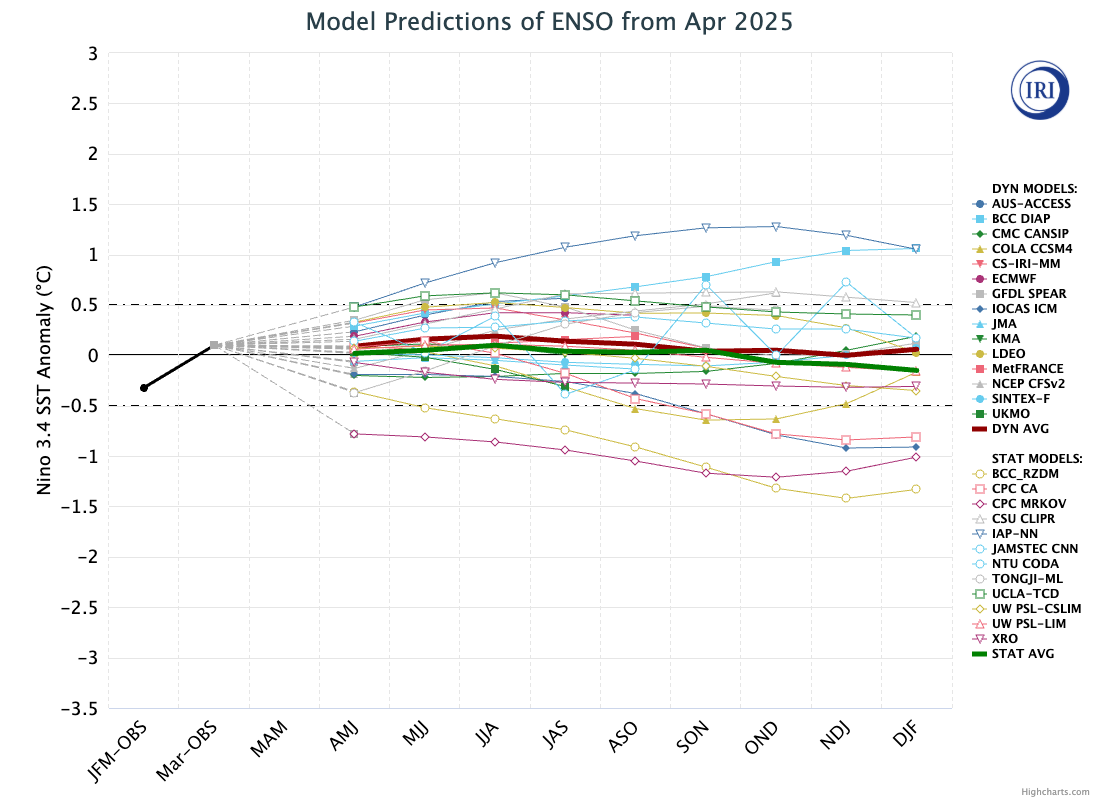
ENSO forecast models for overlapping three-month periods in the Niño3.4 region (January, February, March – JFM – and so on) for the remainder of 2025. Credit: Image provided by the International Research Institute for Climate and Society at Columbia Climate School.
On track to be a top-three warmest year
By looking at the relationship between the first three months and the annual temperatures for every year since 1970 – as well as ENSO conditions for the first three months of the year and the projected development of El Niño conditions for the remaining nine months – Carbon Brief has created a projection of what the final global average temperature for 2025 will likely be.
The analysis includes the estimated uncertainty in 2025 outcomes, given that temperatures from only the first quarter of the year are available so far.
The chart below shows the expected range of 2025 temperatures using the WMO aggregate – including a best-estimate (red) and year-to-date value (yellow). Temperatures are shown with respect to the pre-industrial baseline period (1850-1900).
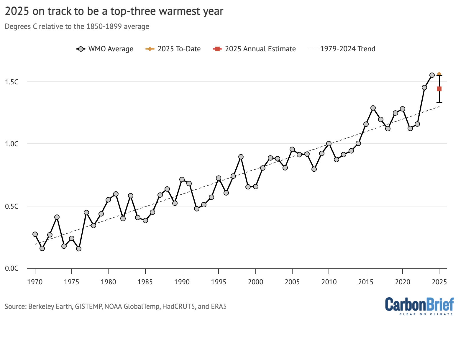
Annual global average surface temperature anomalies from the WMO aggregate plotted with respect to a 1850-1900 baseline. To-date 2025 values include January-March. The estimated 2025 annual value is based on the relationship between the January-March temperatures and annual temperatures between 1970 and 2024. Chart by Carbon Brief.
Carbon Brief’s projection suggests that 2025 is virtually certain to be one of the top-three warmest years, with a best-estimate approximately equal to global temperatures in 2023.
However, this model assumes that 2025 follows the type of climate patterns seen in the past – patterns that were notably broken in 2023 – and to a lesser extent in 2024. Other recent estimates – such as one published by Berkeley Earth – give a higher probability of around 34% that 2025 will set a new temperature record.
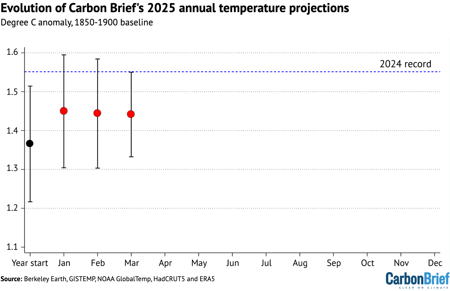
The figure below shows Carbon Brief’s estimate of 2025 temperatures using the WMO aggregate, both at the beginning of the year and once each month’s data has come in. The estimate jumped notably after t2025 saw the warmest January on record, but has been relatively stable over the past three months.
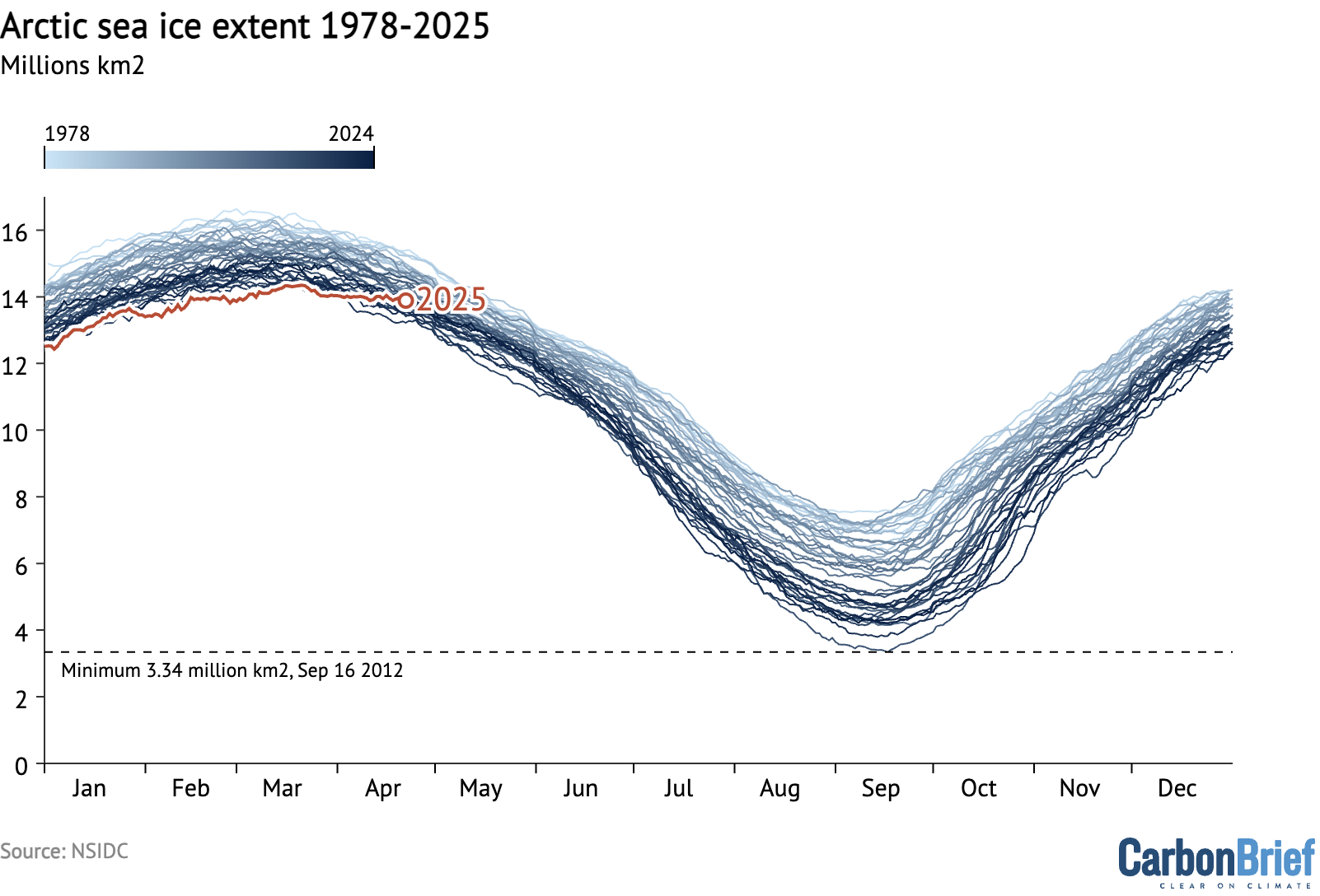
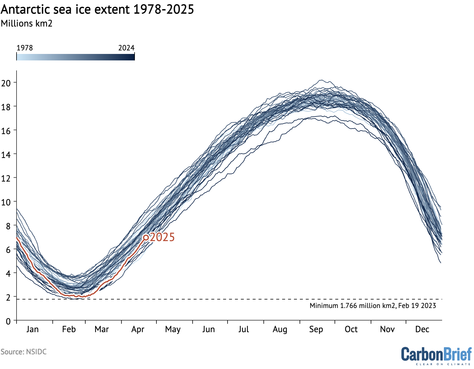
Record-low Antarctic and Arctic sea ice
Both Arctic and Antarctic sea ice extent spent much of early 2025 at record, or near-record, lows.
The figure below shows both Arctic and Antarctic sea ice extent in 2025 (solid red and blue lines), the historical range in the record between 1979 and 2010 (shaded areas) and the record lows (dotted black line).
(Unlike global temperature records, which only report monthly averages, sea ice data is collected and updated on a daily basis, allowing sea ice extent to be viewed up to the present.)
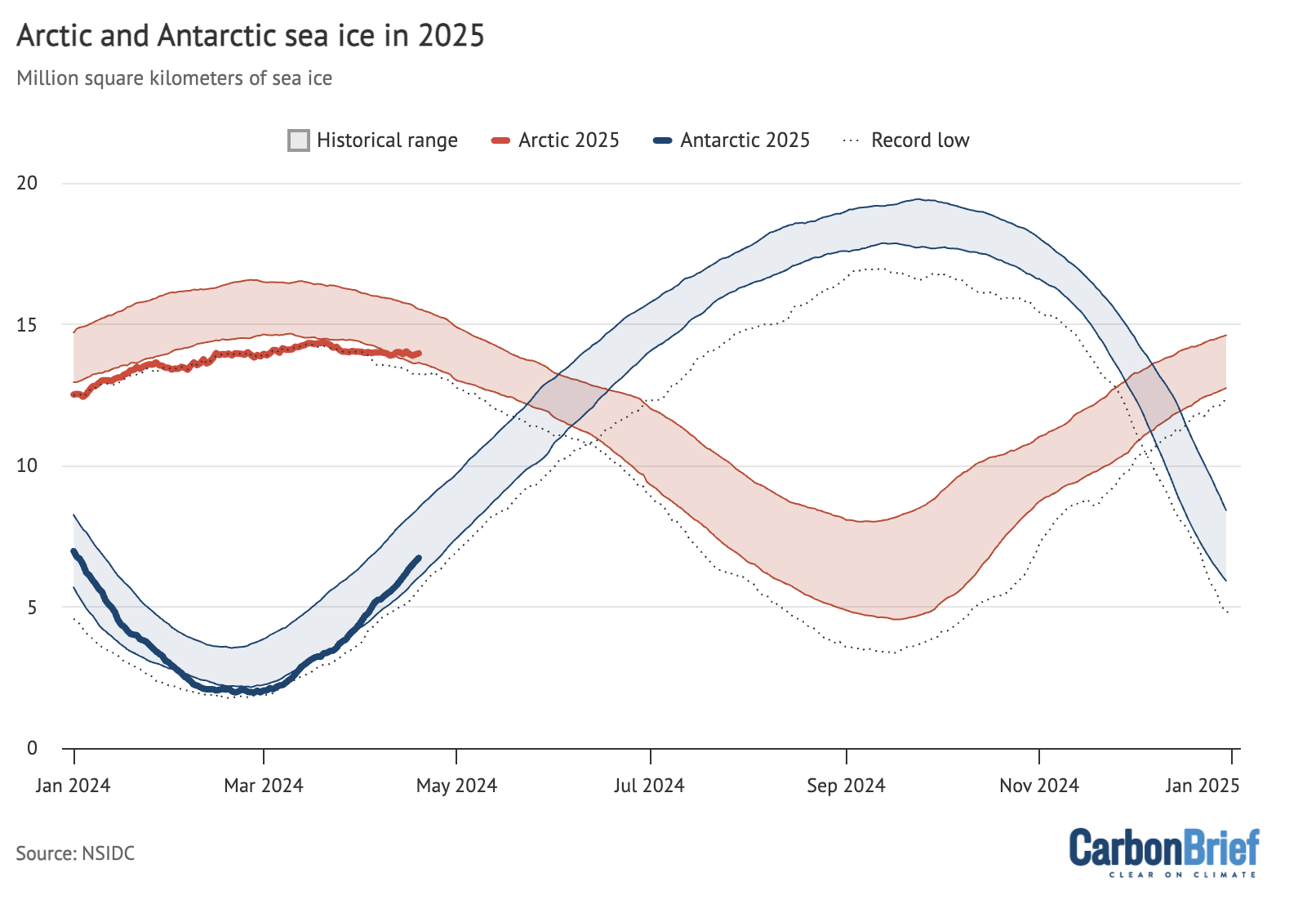
Arctic and Antarctic daily sea ice extent from the US National Snow and Ice Data Center (NSIDC). The bold lines show daily 2025 values, the shaded area indicates the two standard deviation range in historical values between 1979 and 2010. The dotted black lines show the record lows for each pole. Chart by Carbon Brief.
Arctic sea ice saw a new record low nearly each day between January and March, recording a record-low winter peak extent in late March. Ice extent subsequently moved out of record-low territory in April.
It is worth noting that, as northern hemisphere winter conditions remain cold enough to refreeze sea ice, there tends to be less variability in extent year-to-year in the winter than in the summer, as the chart below illustrates.
Antarctic sea ice started the year within the historical range (1979-2010), before plunging to tie for the second-lowest minimum on record in late February. It has since recovered in April, and is currently on the low end of the historical range.
The post State of the climate: 2025 close behind 2024 as the hottest start to a year appeared first on Carbon Brief.
State of the climate: 2025 close behind 2024 as the hottest start to a year
Climate Change
“Next year is too late for regulations”: Beetaloo Energy’s 2GW gas-powered AI data centre a “disaster proposal” destined to cause climate chaos
SYDNEY, Wednesday 22 July 2026 — Beetaloo Energy has secured land from the NT Government for a massive $40 billion “hyperscale” AI data centre near Darwin, which would be powered by 2 gigawatts (GW) of gas power fracked directly from the Beetaloo basin, prompting calls from Greenpeace for urgent federal legislation.
The proposal marks a dangerous escalation in the AI data centre industry’s expansion, which threatens to entrench fossil fuel infrastructure for decades and put immense pressure on the region’s fragile water resources — while continuing to be unregulated.
Joe Rafalowicz, Head of Climate and Energy at Greenpeace Australia Pacific, said: “This disaster proposal for a 2GW gas-powered AI data centre in the NT is a shocking example of the unchecked expansion of hyperscale data centres in Australia. It is also, critically, more evidence for the urgent need for a moratorium on all new data centres until strong, binding regulations are put in place to protect our communities and climate.
“This proposal mirrors the frenzied, unchecked expansion currently wreaking havoc on communities in the US. We are seeing cowboy data centre operators treat Australia like a playground, steam-rolling ahead with projects that would lock down precious water resources and spike emissions, despite the overwhelming community opposition.
“Every day, more councils, communities and environmental groups are joining Greenpeace’s call for a moratorium on data centres, yet as of today there is still no system of safeguards or rules in place to regulate these companies.
“While Beetaloo Energy and the NT Government prepare to bulldoze ahead with this climate and water disaster, the Prime Minister is asleep at the wheel, promising to legislate a vague set of standards next year.
“Next year is too late, and anything less than mandating data centres cover their own energy demand, and then some, with new renewable energy is not enough.”
-ENDS-
Media contact
Lucy Keller on 0491 135 308 or lucy.keller@greenpeace.org
Reports of human rights and environmental abuses linked to Chinese companies’ overseas investments in the mining and refining of minerals needed for the clean energy transition are on the rise, research by a monitoring group has found.
The number of recorded allegations of harm at projects tied to Chinese firms have increased every year since 2021, rising to 148 in 2025, according to the Business and Human Rights Centre (BHRC). On Wednesday it released new data showing that a total of 434 allegations of abuse were made against Chinese-backed projects over the five-year period in projects across the world.
The world’s top cleantech manufacturer, China is also the leading financier of critical minerals projects worldwide. The country has committed more than $120 billion in foreign direct investment into mineral mining and processing since 2023, Australian think-tank Climate Energy Finance recently found.
“China plays a central role in global transition mineral supply chains, and as such has a unique opportunity to raise the bar on human rights and community engagement at every stage of mining,” said Michael Clements, BHRC’s executive director.
“While there have been encouraging developments, from stronger regulations to more company engagement, there remains a gap between human rights commitment and action,” he said.
The report comes as communities affected by Chinese-backed mineral projects have filed the first two cases to a Beijing-based mediation mechanism intended to bring willing Chinese companies to the discussion table with affected communities.
Allegations of harms on the rise
BHRC’s latest analysis – including data for the period 2023-2025 – covered mining, smelting and refining projects for 11 minerals considered key to manufacturing clean energy technologies such as batteries, EVs and solar panels needed to move away from climate-heating fossil fuels.
The highest number of abuses was recorded in Indonesia, the world’s largest producer of nickel, which is used to make EV batteries. After the Indonesian government banned exports of raw nickel, Chinese firms invested billions of dollars to develop a large-scale nickel smelting and processing industry in the Southeast Asian country, largely powered by coal.
Other countries with a high number of recorded harms include the Democratic Republic of Congo, where Chinese firms dominate cobalt and copper production; Myanmar, where unregulated rare earths mining has caused widespread environmental destruction; Serbia, where Chinese-backed mining of some of Europe’s most significant copper and gold deposits is swallowing land and homes, and Zimbabwe, where Chinese investments have turned the nation into Africa’s top lithium producer.
Growing risks for people and nature
Allegations tracked by BHRC included negative impacts on local livelihoods, health and land rights, workers’ health and safety and work-related deaths, as well as water pollution and environmental contamination. In addition, 18 people were attacked for raising concerns about Chinese transition mineral projects between 2023 and 2025.
The report shows that 10 Chinese companies, including Zijin Mining, Tsingshan Group and Zhejiang Huayou Cobalt, accounted for nearly two-thirds of all allegations recorded in the last five years. It found that some Chinese companies “still appear to turn a blind eye to these issues” but noted that several others have been more responsive to allegations of abuse. However, even among companies with human rights policies, implementation remains a challenge, BHRC warned.
-
India looks to untapped graphite riches for slice of critical minerals boom
Clean energy demand for battery-grade graphite is surging, but India faces hurdles as it positions itself to compete with China’s grip on the supply chain -
Indonesia turns traditional Indigenous land into nickel industrial zone
Indonesia supplies the EV industry with critical battery materials but the sector’s rapid expansion is infringing the rights of Indigenous peoples -
Recycling could meet half of Europe’s critical mineral needs by 2050
A new report by an EU-funded research project says the bloc could harness its “urban mines” to reduce its dependence on China for energy transition minerals


Zijin Mining and Zhejiang Huayou Cobalt repeatedly responded to the allegations of harm by saying they take environmental and social risks seriously and adhere to international standards. Tsingshan Group never responded to BHRC’s requests for comment.
Platform for dialogue between communities and Chinese firms
At the same time, Chinese authorities have made “significant progress” on introducing a more specific framework for managing environmental and social risks in overseas investment, BHRC said.
This includes global consultation on a draft Sustainable Mining Code, adherence to UN guiding principles on business and human rights, and greater emphasis on oversight of companies operating overseas.
The China Chamber of Commerce of Metals, Minerals & Chemicals Importers & Exporters (CCCMC) set up a mediation and consultation mechanism intended to provide a platform for dialogue between affected communities or civil society groups that have raised concerns and Chinese companies.
More than three years since its launch, the mechanism has now received its first two complaints from local communities and many more are considering filing a case, Margaux Day, executive director at the nonprofit Accountability Counsel, told an event hosted by Climate Home News last month.
“This is incredibly exciting in that it fills a governance and accountability gap where often communities who are seeking to protect their rights and the environment can’t reach someone who will respond to them,” she told the panel discussion at London Climate Action Week.
Climate Home News understands that the complaints were filed by communities in Latin America and Southeast Asia over labour rights and resettlement issues. No information about the cases has yet been made public. The mechanism’s secretariat did not respond to Climate Home News’ questions.
The mechanism was set up after the Chinese regulator for banks and insurers called on investor-level institutions to establish complaints bodies to hear from communities outside of China. But whether the new initiative will prove effective in tackling grievances remains an open question.
“Real potential” for better mining practices
Participation in the mechanism is voluntary for Chinese firms and it doesn’t have a fact-finding function, nor can it impose provisions for compensation or compliance with human rights standards.
But Day told Climate Home News that, if successful, it could bring companies to negotiate an outcome that is better for people and the planet and leads to more sustainable mining practice.
Chen Yu, an independent China advisor for campaign group Global Witness, agreed that the mechanism holds “real potential”.
“There exists nothing else at a similar level to promote dialogue between communities and Chinese mining companies in particular,” she said.
For companies, the mechanism opens “a channel for problem-solving and dialogue with communities”, she added, as “Chinese companies often remain cautious of approaching affected communities directly, afraid of making the problem bigger”.
However, Chen said the mechanism remains at an early stage of development, faces resourcing challenges and is not yet sufficiently understood by communities in mining areas or Chinese firms.
To help it address some of these challenges, the secretariat is currently seeking technical support from a range of organisations, including civil society groups. But, Chen said, “it will take time for the mechanism to show its value”.
The post Allegations of harms at China-backed transition minerals projects rise appeared first on Climate Home News.
Allegations of harms at China-backed transition minerals projects rise
Andreas Sieber is head of political strategy at 350.0g. Cat Abreu is director of the International Climate Politics Hub.
From the US abduction of Venezuela’s president at the start of this year to the Iran war which rumbles on, disruption is the new normal for global geopolitics, more often than not linked to conflict over supplies of oil and gas.
Events so far in 2026 – driven largely by the desire of the Trump administration to grab control of fossil fuels around the world – show that the climate community’s approach to energy diplomacy will have to evolve if we are to operate effectively and push for climate action in such a volatile landscape.
Today’s climate and energy governance must be able to cope with trade wars, genocide, fascism, spiralling inequality and challenges to multilateralism. The increasingly dominant paradigms of economic competitiveness, energy security and green industrialisation can help drive the transition but they also challenge our collective mission to deliver an equitable green shift.
US-China rivalry dominates
Longer-term geopolitical trends that are seeing power move from West to East and North to South have fuelled a US–China “superpower rivalry”, which is pulling the global economy apart and reining in trade.
A key question will be how the fracture “lines” are drawn: by the US and China, or also by other countries or blocs? Many governments will try to remain “in the middle” between the two giants to capture economic gains from both sides. Yet despite the language of “strategic autonomy”, Washington and Beijing may be in a position to force choices via market access, export controls and sanctions.
-
Top maritime court rejects bid to halt UN deep-sea mining inquiry
Two subsidiaries of The Metals Company sought to block the probe into potential contract breaches launched after the firm’s application for US-sponsored permits

At first glance, this may not seem particularly relevant for climate and energy politics. But Huawei’s exclusion from 5G operations across the political West and India following the so-called Clean Network Campaign by the US government serves as a warning of what could happen to climate green tech.
And the recent debate to cut out Chinese inverters from European markets follows the same pattern – US security forces perceive a risk and start encouraging their allies to drop Chinese technology.
The new drivers: competition and security
Despite this fracturing geopolitical and economic context, energy transition is still happening. To ensure it is effective and equitable, we need to understand what is driving it and how to adapt climate politics so that it better responds to these drivers.
Put simply, China is supplying the world with low-cost renewables (roughly 60% of critical wind and 80% of solar components), batteries, EVs and other key elements. Other countries now also want their piece of the green tech pie and are forming industrial policies to get it.
It is this new competitiveness-driven logic that will shape the quest for decarbonisation, which has shifted from cooperating around the cost of tackling climate change to rivalry for the benefits of climate action.
Over 90% of new renewables projects are now cheaper than fossil alternatives. Gas-fired power is 3–4 times more expensive than solar and wind. In 2015, most decarbonisation policies were “traditional” emissions-cutting strategies like carbon pricing or net zero dates, whereas green industrial policies now underpin the majority.
Iran war could boost fossil fuel phase-out push, says Colombian minister
Meanwhile, security has become a central driver of energy politics. We are living through the second major fossil fuel crisis in just four years. Elevated oil and gas prices will impose up to $1 trillion in additional costs on the global economy by the end of the year if disruption continues in the Strait of Hormuz. Fossil fuel supply chains have exposed countries to conflict, coercion and brutal price shocks.
Fossil fuel volatility destabilises whole economies – higher fuel costs drive up food prices, increase political instability, and push millions into poverty and hunger. This incentivises governments to shield themselves from global shocks, especially in countries that are net fossil fuel importers and home to roughly three-quarters of the world’s population.
Yet security fears can cut both ways. The same instability that makes fossil fuel dependence untenable is also sharpening concern over China’s dominance of critical clean technologies and supply chains.
Equity, cooperation and the opportunity for change
Developing countries benefit from the rapid uptake of renewables enabled by low-cost Chinese technologies. But significant fiscal space and public investment is needed for the electricity grids and infrastructure required to fully unleash the energy transition, as well as for green industrialisation to diversify revenue streams.
Despite this, industrial-scale domestic production and ownership often remain out of reach for too many countries that lack the fiscal space to allow green supply chains to flourish and compete with their traditional industrial base. But more just and diversified green tech supply chains could be achieved with concomitant support.
Can giant batteries unlock Africa’s green industrial future?
For the first time in decades, the international order is being substantially reshaped. If within this context, decarbonisation is increasingly driven by green industrial policy, energy security and competitiveness, the climate policy community must better anticipate where these debates are moving. We must speak the same language, and enter the forums where decisions are made, including security, trade and bilateral or trilateral spaces.
We should build on an enlightened self interest recognising that cooperation remains essential and beneficial. This includes using the UN climate process differently: less as an ever-expanding negotiation machine, and more as a space for norm-setting, political alignment and deal-making. In an age of fragmentation, effective cooperation must not only be framed as necessary but thought of as a strategically compelling source of resilience and shared advantage.
The post Energy transition policymaking must evolve to fit an age of rupture appeared first on Climate Home News.
Energy transition policymaking must evolve to fit an age of rupture

“Next year is too late for regulations”: Beetaloo Energy’s 2GW gas-powered AI data centre a “disaster proposal” destined to cause climate chaos

Allegations of harms at China-backed transition minerals projects rise

Plant-Based Meat Takes Unusual Marketing Tack
-
Climate Change11 months ago
Guest post: Why China is still building new coal – and when it might stop
-
Greenhouse Gases11 months ago
Guest post: Why China is still building new coal – and when it might stop
-

 Greenhouse Gases2 years ago
嘉宾来稿:满足中国增长的用电需求 光伏加储能“比新建煤电更实惠”
-

 Climate Change2 years ago
嘉宾来稿:满足中国增长的用电需求 光伏加储能“比新建煤电更实惠”
-
Climate Change2 years ago
Bill Discounting Climate Change in Florida’s Energy Policy Awaits DeSantis’ Approval
-

 Renewable Energy9 months ago
Sending Progressive Philanthropist George Soros to Prison?
-

 Carbon Footprint2 years ago
US SEC’s Climate Disclosure Rules Spur Renewed Interest in Carbon Credits
-
Greenhouse Gases1 year ago
嘉宾来稿:探究火山喷发如何影响气候预测