

Greenland is closing in on three decades of continuous annual ice loss, with 1995-96 being the last year in which the giant ice sheet grew in size.
With another melt season over, Greenland lost 105bn tonnes of ice in 2024-25.
The past year has seen some notable events, including ongoing ice melt into the month of September – well beyond the end of August when Greenland’s short summer typically draws to a close.
In a hypothetical world not impacted by human-caused climate change, ice melt in Greenland would rarely occur in September – and, if it did, it would generally be confined to the south.
In this article, we explore how Greenland’s ice sheets fared over the 12 months to August 2025, including the evidence that the territory’s summer melting season is lengthening.
(For our previous analyses of Greenland’s ice cover, see coverage in 2024, 2023, 2022, 2021, 2020, 2019, 2018, 2017, 2016 and 2015.)
Surface mass balance
The seasons in Greenland are overwhelmingly dominated by winter.
The bitterly cold, dark winter lasts up to ten months, depending on where you are. In contrast, the summer period is generally rather short, starting in late May in southern Greenland and in June in the north, before ending in late August.
Greenland’s annual ice cycle is typically measured from 1 September through to the end of August.
This is because the ice sheet largely gains snow on the surface from September, accumulating ice through autumn, winter and into spring.
Then, as temperatures increase, the ice sheet begins to lose more ice through surface melt than it gains from snowfall, generally from mid-June. The melt season usually continues until the middle or end of August.
Over this 12-month period, scientists track the “surface mass balance” (SMB) of the ice sheet. This is the balance between ice gains and losses at the surface.
To calculate ice gain and losses, scientists use data collected by high-resolution regional climate models and Sentinel satellites.
The SMB does not consider all ice losses from Greenland – we will come to that later – but instead provides a gauge of changes at the surface of the ice sheet.
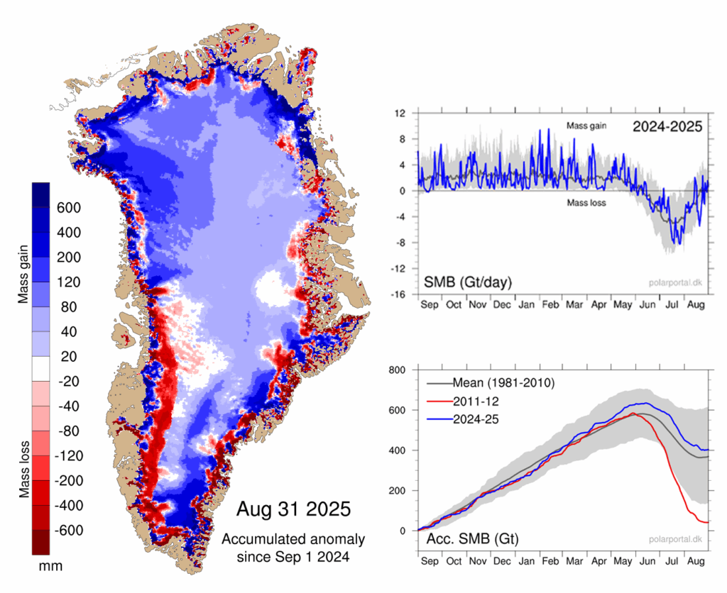
According to our calculations, Greenland ended the year 2024-25 with an overall SMB of about 404bn tonnes. This is the 15th highest SMB in a dataset that goes back 45 years, exceeding the 1981-2010 average by roughly 70bn tonnes.
This year’s SMB is illustrated in the maps and charts below, based on data from the Polar Portal.
The blue line in the upper chart shows the day-to-day SMB. Large snowfall events become visible as “spikes”. The blue line in the lower chart depicts the accumulated SMB since 1 September 2024. In grey, the long-term average and its variability are shown. For comparison, the red line shows the record-low year of 2011-12.
The map shows the geographic spread of SMB gains (blue) and losses (red) for 2024-25, compared to the long-term average.
It illustrates that southern and north-western Greenland had a relatively wet year compared to the long-term average, while there was mass loss along large sections of the coast, in particular in the south-west. The spikes of snow and melt are clearly visible in the graphs on the right.
Lengthening summer
Scientists have traditionally pinned the start of the “mass balance year” in Greenland to 1 September, given that this is when the ice sheet typically starts to gain mass.
However, evidence has started to emerge of a lengthening of the summer season in Greenland – as predicted some time ago by climate models.
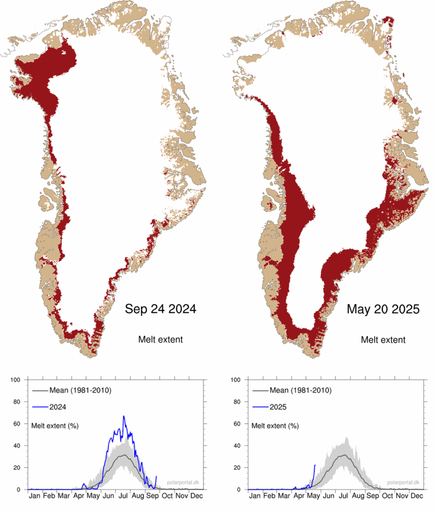
The start of the 2024-25 mass balance year in Greenland saw ice melt continuing into September. This included a particularly unusual spike in ice melt in the northern part of the territory in September as well as all down the west coast.
In a world without human-caused climate change, ice melt in September would be very rare – and generally confined to the south.
Greenland also saw an early start to the summer melt season in 2025. The onset of the melting season, defined as the first of at least three days in a row with melting over more than 5% of the ice sheet, was on 14 May. This is 12 days earlier than the 1981-2025 average.
The maps below show the extent of melt (red shading) across the ice sheet on 24 September 2024 (left) and 20 May 2025 (right). The blue lines in charts beneath show the percentage melt in 2024 (left) and 2025 (right), up to these dates, compared to the 1981-2010 average (grey).
The melt season began with a significant spike of melting across the southern part of the ice sheet. This happened in combination with sea ice breaking up particularly early in north-west Greenland, allowing the traditional narwhal hunt to start much earlier than usual.
Surface melt
The ablation season, which covers the period in the year when Greenland is losing ice, started a little late. The onset of the season – defined as the first of at least three days in a row with an SMB below -1bn tonnes – began on 15 June, which is two days later than the 1981-2010 average.
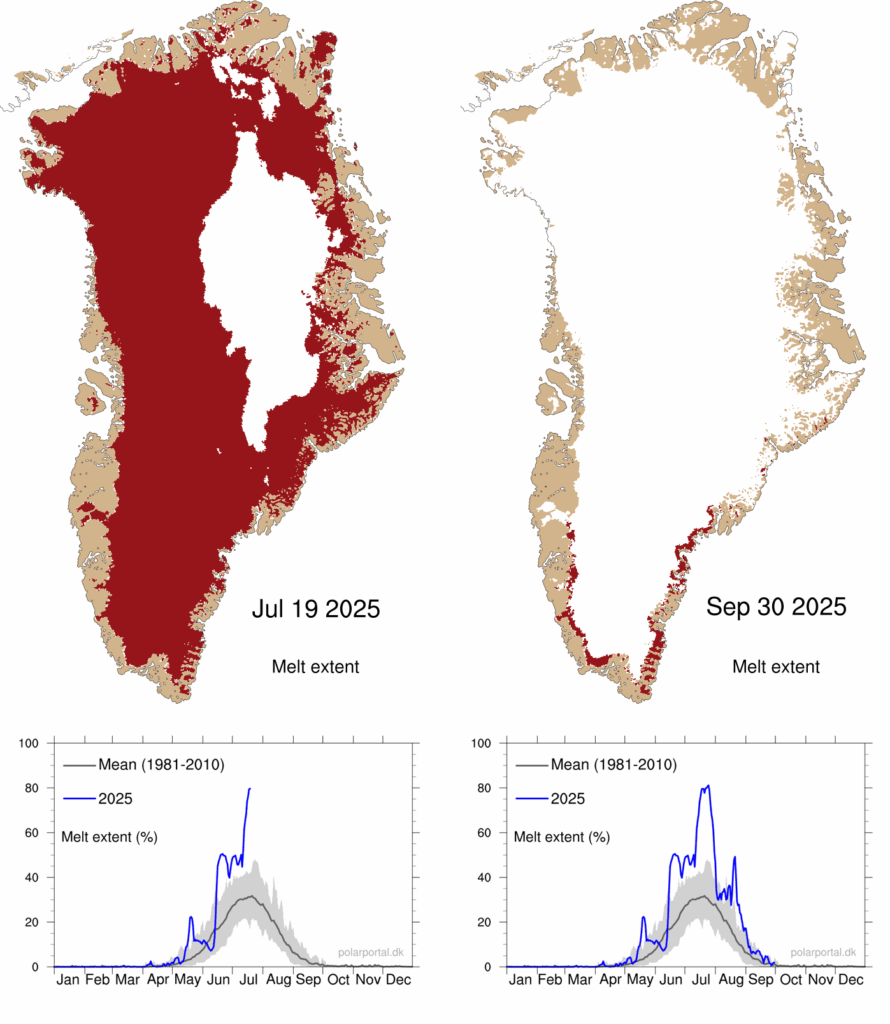
Overall, during the 2025 summer, a remarkably large percentage of the ice sheet was melting at once. This area was larger than the 1981-2010 average for three and a half months (mid-June to end of September).
In mid-July, melting occurred over a record area. For three days in a row, melting was present over more than 80% of the area of the ice sheet – peaking at 81.2%. This is the highest value in our dataset, which started in 1981.
The red shading in the maps below shows the extent of melting across Greenland on 19 July (left) and 30 September (right) 2025. The charts beneath show the daily extent of melting through 2025 (blue line), up to these dates, compared to the 1981-2010 average.
Snowfall
However, the SMB is not just about ice melt.
There was a lack of snowfall in the early winter months (September to January), particularly in south-east Greenland, which is typically the wettest part of the territory. The months that followed then saw abundant snow, which brought snowfall totals up closer to average by the start of summer.
A cold period at the end of May and in June protected the ice sheet from excessive ice loss. Melt then continued rather weakly until mid-July.
This was followed by strong melting rates in the second half of July and again in mid-August.
Overall, with both ice melt and snowfall exceeding their historical averages for the year as a whole, the SMB of the Greenland ice sheet ended above the 1981-2010 average.
These increases in snowfall and melt are in line with what scientists expect in a warming climate. This is because air holds more water vapour as it warms – leading to more snowfall and rain. Warmer temperatures also lead to more ice melt.
Total mass balance
The surface mass balance is just one component of the “total” mass balance (TMB) of the Greenland ice sheet.
The total mass balance of Greenland is the sum of the SMB, the marine mass balance (MMB) and basal mass balance (BMB). In other words, it brings together calculations from the surface, sides and base of the ice sheet.
The MMB measures the impact of the breaking off – or “calving” – of icebergs, as well as the melting of the front of glaciers where they meet the warm sea water. The MMB is always negative and has increased towards more negative values over the last decades.
BMB refers to ice losses from the base of the ice sheet. This makes a small negative contribution to the TMB.
(The only way for the ice sheet to gain mass is through snowfall.)
The continued mass loss observed in Greenland is primarily due to a weakening of the SMB – caused by rising melt combined with insufficient compensation of lost ice through snowfall.
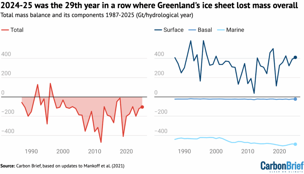
The figure below shows how much ice the Greenland ice sheet has lost (red) going back to 1987, which includes the SMB (dark blue), MMB (mid blue) and BMB (light blue). The analysis, which uses data from three models, is based on 2021 research published in Earth System Science.
Despite a relatively high SMB, high calving rates meant that Greenland lost 105bn tonnes of ice over the 12-month period.
This means that 2024-25 was the 29th year in a row with a Greenland ice sheet overall mass loss. As the chart shows, Greenland last saw an annual net gain of ice in 1996.
Satellite data
The mass balance of the Greenland ice sheet can also be measured by looking at the Earth’s gravitational field, using data captured by the Grace and Grace-FO satellite missions – a joint initiative from NASA and the German Aerospace Center.
The Grace satellites are twin satellites that follow each other closely at a distance of about 220km, which is why they are nicknamed “Tom and Jerry”. The distance between the two depends on gravity – which is, in turn, related to changes in mass on Earth, including ice loss.
Therefore, the distance between the two satellites, which can be measured very precisely, can be used to calculate loss of mass from the Greenland ice sheet.
Overall, the satellite data reveals that Greenland’s ice sheet lost around 55bn tonnes of ice over the 2024-25 season.
There is reasonably good agreement between the Grace satellite data and the model data, which, as noted above, finds that 105bn tonnes of ice was lost in Greenland over the same period.
However, the alignment of the two datasets – which are fully independent of each other – becomes more clear once a longer time period is considered.
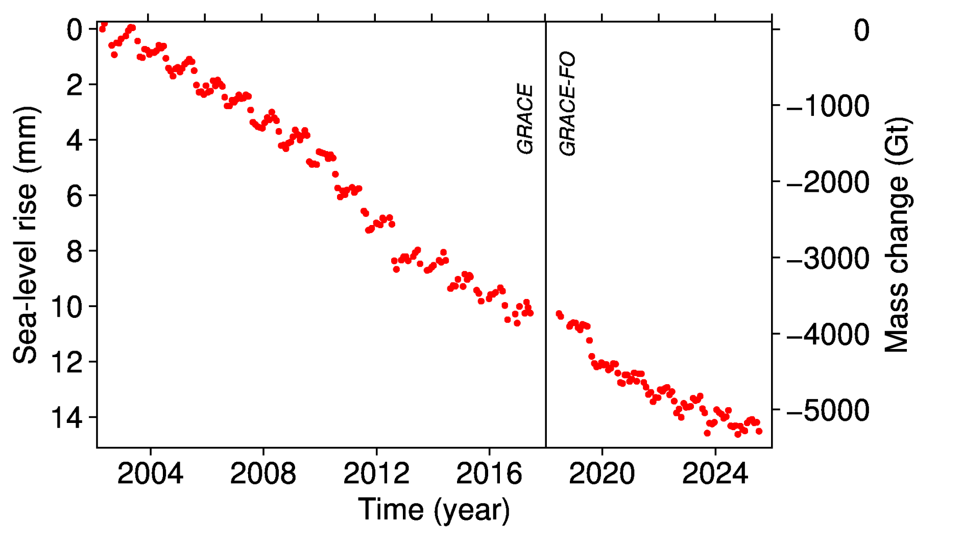
In the 22-year period between April 2002 and May 2024, the Grace data shows that Greenland lost 4,911bn tonnes of ice. The modelling approach, on the other hand, calculates that 4,766bn tonnes of ice was lost.
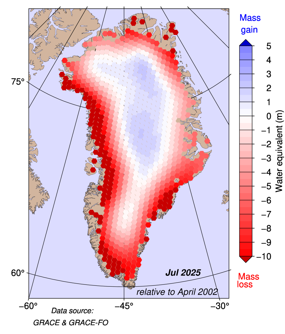
The figure below shows gain and loss in the total mass of ice of the Greenland ice sheet, calculated using Grace satellite measurements. It reveals that, over the past 23 years, there has been mass loss in the order of several metres along the coasts of Greenland, with the most significant losses seen on the western coast. Over the central parts of the ice sheet, there has been a small mass gain.
The lower figure shows the contribution of Greenland mass change to sea level rise over the last 23 years, according to the satellite data. It illustrates that more than 5,000bn tonnes of ice have been lost over the time period – contributing to roughly 1.5cm of sea level rise.
Warm over Europe and North America, cool over Greenland
As always, the weather systems across the northern hemisphere play a key role in the melt and snowfall that Greenland sees each year.
As in previous years, multiple heatwaves were observed in southern Europe and North America over the summer of 2025.
And, just like in 2024, there was only modest heat in northern Europe – with the notable exception of Arctic Scandinavia – with a comparably cool and rainy July followed by a warmer and sunnier August.
The high-pressure weather systems that bring heatwaves have a wide-ranging impact on weather extremes across the northern hemisphere.
Strong blocking patterns over North America and Europe were repeatedly present in the course of the summer of 2025. In such a blocked flow, the jet stream – fast-moving winds that blow from west to east high in the atmosphere – is shaped like the Greek capital letter Omega (Ω).
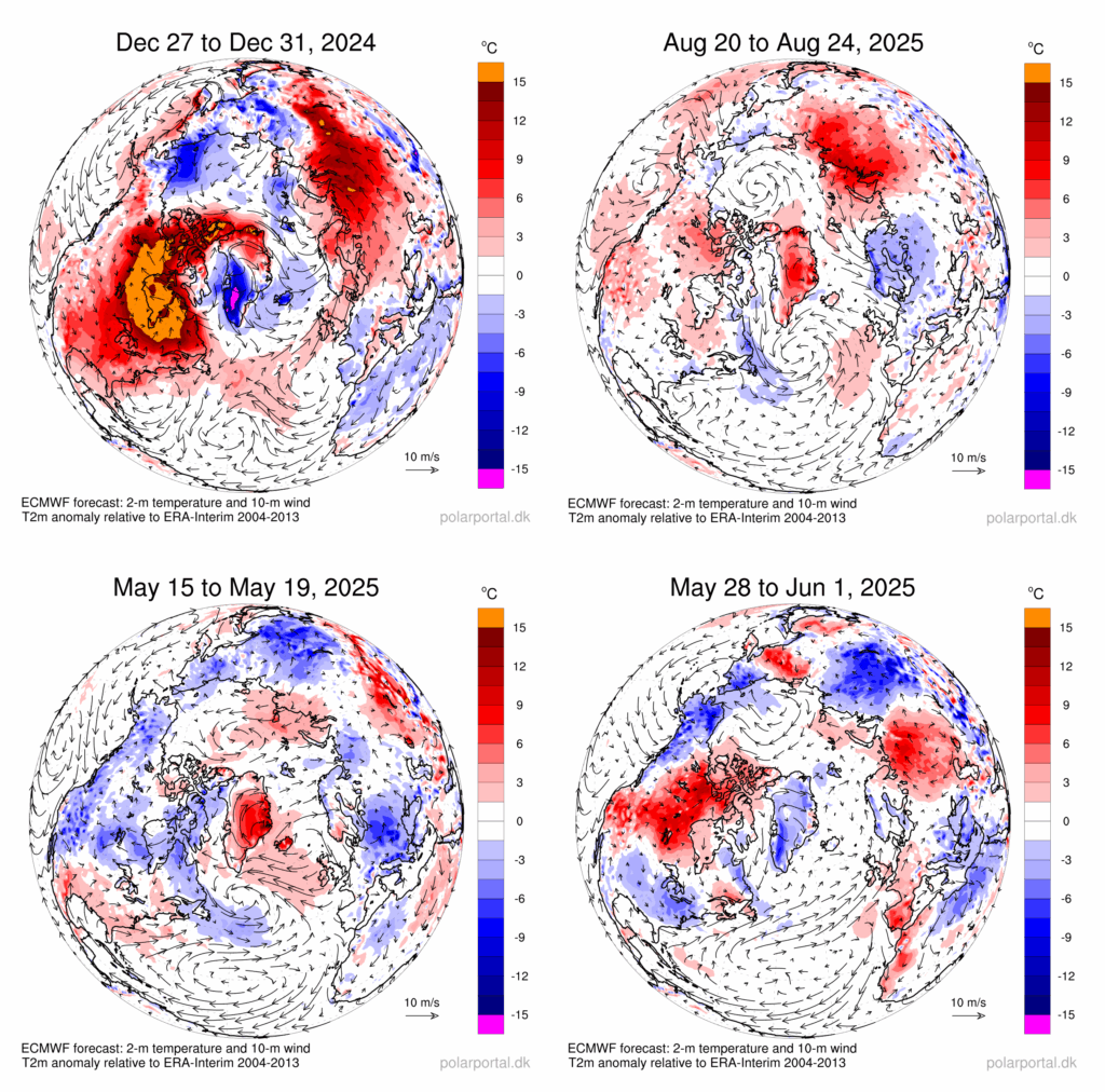
The jet stream bulged up to the north over Canada and northern Europe. West and east of these ridges, low pressure troughs were found at both “feet” of the Omega. One of these troughs was located over Greenland (top left panel in next figure).
This resulted in widespread heat near the cores of these high-pressure systems, fuelling fires in several countries, including large wildfires in Canada. Smoke from these wildfires reached Greenland and Europe in late May.
Unlike in previous years, no heavy precipitation events were observed near the “feet” of the Omega.
If the Omega pattern is displaced by half a wavelength, the opposite – warm over Greenland, with cool continents – is also possible.
This circulation pattern occurred in August 2025 and is shown in the top right panel of the figure below. The bottom panel depicts the large temperature variability in May 2025.



The post Guest post: How the Greenland ice sheet fared in 2025 appeared first on Carbon Brief.

Several major banks that helped set up the UN’s now-defunct Net-Zero Banking Alliance (NZBA) in 2021 have since continued to lend money to coal companies, a new report has revealed.
Bank of America, Barclays, Citibank, Deutsche Bank and Santander were heavily involved in the NZBA and the associated Glasgow Financial Alliance for Net Zero (GFANZ) when it was launched by Mark Carney, then a UN climate envoy and now Canada’s leader, in the run-up to the COP26 climate summit in Glasgow.
Despite their involvement, data released this week shows those banks and some others did not reduce the amount of money they lent, nor the value of their underwriting, to coal activities between 2022 and 2025. Around half of the NZBA members who were engaged in coal financing over that time increased it and half cut it, according to the report by German environmental research group Urgewald.
Ana Botín, executive chair of Santander, was a member of the GFANZ CEO principals’ group and said at the time of the NZBA launch that her Spanish bank was “proud to be part of the founding members of this new alliance and to accelerate progress towards net zero”.
Since then, the report’s data documents that Santander has provided loans and underwriting worth hundreds of millions of dollars each year to coal companies, particularly American coal-power plant operators Duke Energy and the Southern Company. Santander did not respond to a request for comment.
Urgewald’s research adjusts the value of loans and underwriting provided to coal companies based on how much of a company’s revenues come from the most polluting fossil fuel. So a hypothetical $100 million loan to German utility RWE is valued at $21 million, as 21% of RWE’s revenue is from coal.
The research does not take account of whether companies are expanding their coal business or phasing it out for greener alternatives. Some banks have said their coal clients need to put in place transition plans by a certain date. Some also say that, by a certain date, they will stop lending money to clients that get more than a set percentage of their revenue from coal.
-
What’s on the climate calendar for October 2026?
Brazilians are heading to the polls, diplomats are gathering in the Pacific for Pre-COP, and it’s crunch time for the IPCC -
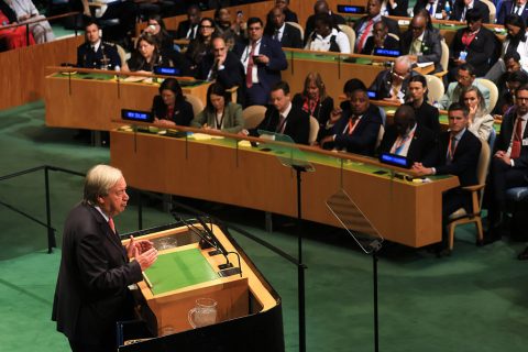
UN chief urges countries to adopt fossil fuel transition plans with timelines
In his last speech to the UN General Assembly, António Guterres for the first time called on every nation to deliver a plan to phase out coal, oil and gas while protecting workers

Most companies expanding coal are in Asian nations like China, India and Indonesia and are largely financed by banks from their own countries. But there are examples of NZBA founding members supporting companies that are actively prolonging the life of their coal businesses.
For example, Glencore, a Switzerland-based multinational that gets 4% of its revenue from coal, has just won preliminary regulatory approval to keep on coal mining in Australia’s Hunter Valley until 2045. Last year, the company was supported by loans and underwriting from Bank of America, Citigroup, Santander, Barclays, Deutsche Bank, HSBC and Standard Chartered.
Good and bad news
Some NZBA founding members like Swiss giant UBS have reduced their loans and underwriting for coal companies, the data suggests. Others – like Triodos and Kenya Commercial Bank – have provided no support for coal companies since at least 2021.
Urgewald researcher Hannah O’Neill told Climate Home News that “the banking sector is not moving in one direction. There is a growing divide between banks that are tightening their coal policies and reducing their exposure, and those where coal policies remain weak or where financing continues.”
Unlike the UN’s Race to Zero campaign, with which it partnered, the NZBA did not require its members to end financing for fossil fuels like coal, leading to accusations by climate campaigners that its rules were too weak.
Despite this, after Donald Trump’s re-election as US president in November 2024, several North American banks quit the alliance and the NZBA’s requirements were diluted in April 2025. After further withdrawals, the group shut itself down in October 2025.
Globally, the Urgewald report found that many banks in the European Union, Thailand, Malaysia, India and Taiwan have reduced their coal finance since governments agreed at COP26 to phase down coal power.
But with Chinese, American, Indonesian and South Korean banks increasing their support, total bank financing for the coal industry has remained broadly the same each year since 2022.
“Coal financing is not disappearing – but it is concentrating in banks and markets where coal policies are either missing or weak,” said Heffa Schücking, director of Urgewald.
Urgewald’s definition of coal companies includes firms and their subsidiaries that explore for, process, trade, transport and mine coal, or burn it in power plants to produce electricity, or manufacture equipment for the coal industry. It does not include companies that use coal to make cement or steel – and an adjustment is made to account for how much of the business model is coal-related.
Banks defend delays
At the time of publication, most of the banks named in the report for increasing their coal finance had not responded to requests for comment. But a spokesperson for Deutsche Bank pointed Climate Home News to its May 2026 announcement that it was delaying its requirement for existing clients to present it with transition plans and cut their coal exposure.
Instead of having to present these plans by the end of 2025, the bank has given them until the end of 2027. They will also have to ensure that their revenue share from thermal coal falls below half by then, the bank added. New clients need energy transition plans to access finance.
Deutsche Bank said at the time it was delaying its requirements because of the “increasingly complex regulatory environment as well as differing speeds of energy transition in various regions beyond what was anticipated by Deutsche Bank in 2023”.
Big banks’ lending to coal backers undermines Indonesia’s green plans
A spokesperson for Barclays told Climate Home News: “Many companies in this report are diversified energy or mining companies. We do not provide financing to companies that generate more than 30% of revenues from thermal coal mining or power generation, and we will phase out all financing by 2035.”
The Barclays spokesperson added: “Barclays is financing an energy sector in transition, providing finance to meet current energy needs and also financing the scaling of clean energy. Over the past three years, we have facilitated more than $300 billion of sustainable and transition finance, including billions to cleaner energy projects, and invested millions into climate tech.”
The post Big banks behind “net zero” alliance continued lending to coal firms appeared first on Climate Home News.
Big banks behind “net zero” alliance continued lending to coal firms
Harjeet Singh is the global convenor of the Fill the Fund campaign and founding director of the Satat Sampada Climate Foundation. Julie-Anne Richards is strategic campaign lead for the Make Big Polluters Pay campaign in Australia.
This year, a glacier collapse in Nepal’s Himalayan valleys swept away the lives of at least 1,500 people, with recovery costs of US$5 billion, or 10% of national GDP. But this was not a tragedy for which no one can be blamed. This was a crime with a balance sheet – one whose costs are paid by people who did nothing to cause it, and whose profits are booked by polluting corporations that did everything.
Across the Pacific, the calculation of injustice is now brutally clear. According to Oxfam Australia, the average yearly GDP loss of Pacific countries from climate disasters has increased four-fold over the last decade, reaching 14.3% of GDP. The number of Pacific people battered by climate disasters has risen by 700% in a decade. Whole villages are being packed up and moved as the sea takes the land beneath them.
-
What’s on the climate calendar for October 2026?
Brazilians are heading to the polls, diplomats are gathering in the Pacific for Pre-COP, and it’s crunch time for the IPCC

Let’s look at the other ledger. This year, as climate change and an oil shock drove up the cost of living for ordinary families, Woodside – touted as “one of Australia’s biggest winners” from the war in the Middle East – reported revenues jumping nearly 30% to AUD$6 billion in just three months.
In Australia, Oxfam finds that in 2023-2024, fossil fuel corporations paid only AUD$22.8 billion in corporate income tax – just 5% of their AUD$436 billion in total reported income – while 26 out of 80, or one in every three large fossil fuel corporations, did not pay corporate income tax at all.
The polluters are not struggling to pay for the damage they cause. They are choosing not to.
This is the moral obscenity at the heart of the climate crisis: the money exists. It is simply flowing in the wrong direction. And nowhere is that clearer than in the funds the world built to protect the vulnerable, now left to languish.
Funds struggle to fill their coffers
The Fund for Responding to Loss and Damage (FRLD) has received US$2.8 billion in requests from 119 countries. And Nepal has sought an urgent US$20 million for immediate needs. Yet the Fund has only US$342 million in total to give.
The Pacific Resilience Facility – a fund the Pacific designed for itself, to prepare its own communities – sits well short of even its modest US$500 million capitalisation target. And the Adaptation Fund is running on empty. While adaptation needs in developing countries could reach US$387 billion a year by 2030, according to the latest UNEP Adaptation Gap report, the Fund’s resource mobilisation target of a modest US$300 million for 2025 fell far short, with only US$135 million pledged.
This is a matter of priorities, not of resources. For decades, the world has accepted a simple principle – the polluter pays principle – whether through the OECD, of which Australia is a member, or Europe’s carbon pricing. New York and Vermont have already passed laws to make Big Oil pay into climate superfunds, and ten more US states are moving to follow.
The idea is neither radical nor new. It’s time to make big polluters pay.
Comment: After Hormuz, Nepal and wildfires, people want action to make polluters pay
What is urgently needed is the courage to apply it to the fossil fuel corporations that have spent decades avoiding it. In November, Australia takes up the presidency of the COP31 negotiations, committing to stand shoulder to shoulder with its Pacific neighbours.
Australia, together with the Turkish COP31 Presidency, must guide and inspire progress at the upcoming climate conference, including on new climate finance pledges by developed countries (which agreed to mobilise at least $300 billion by 2035) and triple the funds available to the FRLD, the Adaptation Fund and the other UN climate funds.
Rich countries agreed to these goals two years ago at COP29. Yet, the reality is that developing countries’ need for climate finance is in the trillions annually, while developed countries continue to delay providing even what they have already committed. A clear signal recognising the importance of delivering the promised climate finance must come at next week’s Pre-COP in the Pacific, and COP31 in Antalya must go on to deliver against existing promises or risk an irreparable breakdown in trust.
Time for a climate pollution levy
Countries must also ensure funding for loss and damage takes its rightful place as the third pillar of climate finance, alongside mitigation and adaptation, in negotiations regarding the UNFCCC climate finance work programme and Article 9 on shifting finance flows towards a low-carbon, resilient world.
Australia, as President of Negotiations and as a Pacific nation, cannot ask the world to fill these funds while it lets its own coal and gas giants off the hook. Australia should not only stop approving new and expanded coal and gas mines, it should also introduce a Climate Pollution Levy on big coal, oil and gas corporations – a charge on every tonne of carbon pollution they extract and profit from. Independent analysis shows such a levy could raise tens of billions of dollars a year, and can be designed so the cost falls on the corporations, not on households.
This is not charity – it is compensation. It is the beginning of accountability. And the public is far ahead of its leaders: eight in 10 people worldwide, and a clear majority of Australians, want fossil fuel firms taxed to pay for the damage they cause.
Fossil fuel expansion threatens COP31 hosts’ credibility, experts warn
The money must go where the harm lands. A Climate Pollution Levy should feed the funds frontline communities are relying on – fully capitalising the Pacific Resilience Facility this year, replenishing the Adaptation Fund, and delivering the billions the loss and damage fund needs.
It is essential for these funds to be able to provide grant-based finance that reaches communities directly, not more loans that push drowning nations deeper into debt. With Nepal’s recovery costs estimated at around 10% of the country’s GDP, if we leave it to fend for itself without loss and damage funding, Nepal will likely be saddled with debt and could fail to recover adequately, increasing poverty and inequality.
We have heard enough empty pledges. We have watched enough funds announced with fanfare, only then to be starved in silence. The era of asking polluters politely is over. Australia, as COP31 president, has a rare chance to prove that the polluter pays principle means something and apply it to those who have profited the most.
The post As COP31 co-host, Australia should make its polluters pay for climate damage appeared first on Climate Home News.
As COP31 co-host, Australia should make its polluters pay for climate damage
This is a republication of October’s edition of The Climate Agenda – a subscriber-only newsletter designed to keep you informed of the key events, negotiations and announcements happening every month. If you want to receive The Climate Agenda straight to your inbox at the start of each month, sign up as a subscriber today.
This month, we’ll be on the ground reporting from the Convention on Biological Diversity summit in Yerevan, Armenia later this month and following all the developments as we build towards COP31 in Antalya, Türkiye next month. Here’s what you need to know for October, why it matters and what to expect.
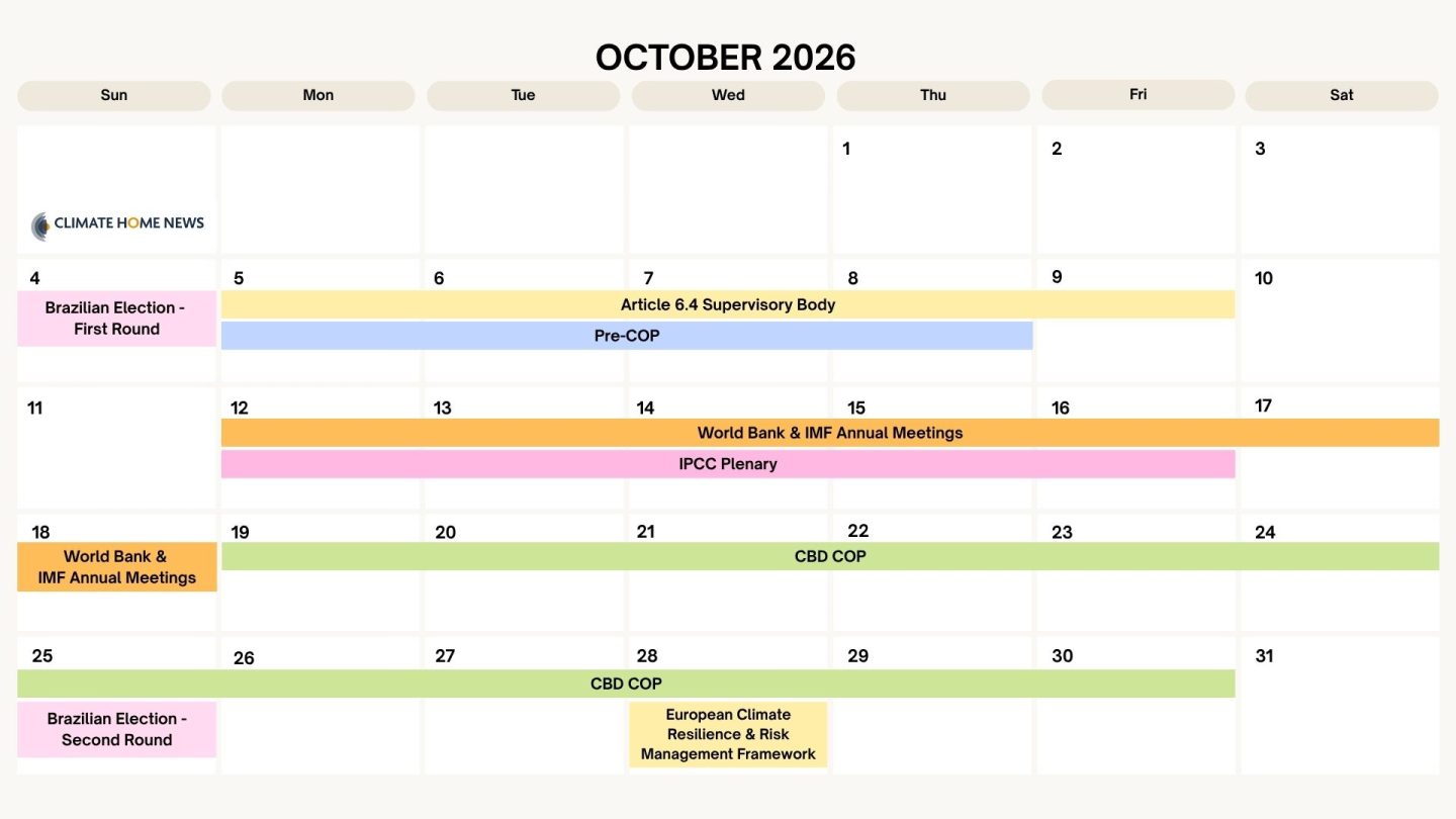
Brazilian Election
First round: Sunday 4 October – Second round: Sunday 25 October
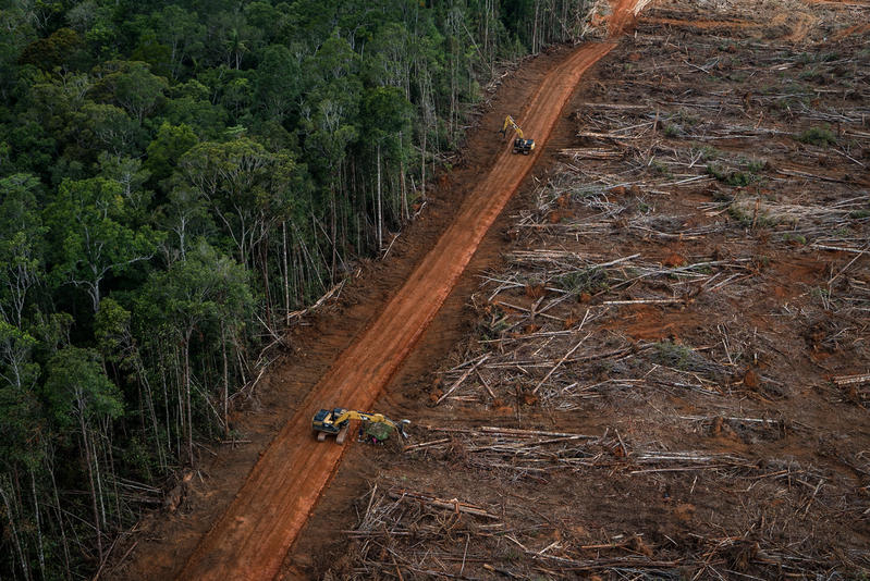
This poll is being closely watched by Brazilian environmentalists as it’s likely to make a big difference to Brazil’s international climate politics and the health of the Amazon rainforest.
The two clear front-runners are current left-wing President Lula and right-wing Flávio Bolsonaro. Flávio is the son of Jair Bolsonaro, who ruled from 2019 to 2023 but was declared ineligible to hold public office because of his attacks on the electoral system and is now under house arrest.
In the unlikely event that either candidate wins more than half the votes in the first round, they will be elected as the country’s leader. Latest polls have Lula on 39% and Bolsonaro on 35% (though the numbers are shifting) with several minor candidates in the single-digits. If none of them get a majority, there will be a one-on-one run-off on October 25.
The Latin American nation is set to record its lowest-ever level of deforestation, as efforts to rein in illegal clearing and restore Indigenous rights progressed under Lula. But Brazilian experts are warning that the huge agribusiness lobby in Congress, whose interests shape what happens in the Amazon, will be emboldened if Bolsonaro takes power, with the Supreme Court also risking a turn to the right.
As for climate politics, some seasoned watchers fear that Flávio – a climate change denier like his dad – could even try to pull Brazil out of the Paris Agreement. That would leave other countries to take forward Brazil’s COP30 global roadmaps on transitioning away from fossil fuels (TAFF) and ending deforestation – both of which are due to be delivered by COP31.
For Brazil’s own TAFF roadmap – commissioned earlier this year but so far nowhere to be seen – the election may have less of an impact, given Lula is as keen as any other politician to extract oil and gas from the Amazon, amid cross-party support for fossil fuel production.
Read more: Brazil leads “encouraging” decline in global rainforest destruction in 2025

Pre-COP
Monday 5 October – Thursday 8 October – Fiji and Tuvalu
The annual Pre-COP meeting is usually a business-like gathering of government negotiators, sounding out each other’s positions and laying the groundwork for deals at the main COP summit. But this year’s “pre” has been jazzed up by Australia’s partnership with Pacific governments keen to elevate their climate issues on the international stage.
“We will bring the eyes of the world to our region, highlight the threat that climate change poses to it, and show how Pacific voices are shaping global action to counter it,” Australian PM Anthony Albanese said of the event.
On Monday, before the Pre-COP officially starts, a group of senior government figures – including a handful of leaders – will visit the world’s second lowest-lying nation Tuvalu, as UN boss Antonio Guterres did in 2019.
They will visit areas affected by sea level rise, see climate resilience projects and meet local communities before flying 2.5 hours south to Fiji to join up with the Pre-COP – which starts on Tuesday – and speak at a “Leaders’ plenary session” that evening.
The Pre-COP runs until Thursday. Governments are expected to try to advance on some kind of a roadmap for protecting oceans from climate change, while Fiji says Pacific nations will emphasise the need to follow science and step up efforts to limit warming to 1.5C.
Australia is also due to present an action plan to improve access to climate finance for small island nations and least-developed countries, so that governments, development banks and climate funds can endorse it ahead of the Antalya summit.
Alongside the official Pre-COP discussions, a “green zone” will host talks organised by civil society on topics like public transport, carbon markets and the International Court of Justice advisory opinion. Unfortunately, these events won’t be available to follow online.
Read more: Threatened by rising seas, small islands secure right to keep their statehood
Read more: At regional summit, Pacific islands ask for COP31 support for clean energy and finance
Article 6.4 Supervisory Body
Monday 5 October – Friday 9 October – Bonn, Germany
The UN carbon market’s rule-making body meets for one last jam-packed session ahead of COP31, with decisions pending on several high-stakes issues that could shape the future of the new crediting mechanism.
Top of the agenda is a rulebook for clean cooking projects, which aim to cut greenhouse gas emissions by distributing more efficient cookstoves. These projects generate some of the most popular carbon credits but have also drawn some of the heaviest criticism for overstating their climate benefits through lax accounting.
Technical experts have recommended the Supervisory Body tighten the rules compared to existing crediting programmes, including by forcing cookstove project developers for the first time to guard against the risk of the climate benefits of their credits – the trees saved from becoming cooking fuel – being wiped out by fire, drought or logging.
The proposal on the so-called reversal risk assessment has sparked a “coordinated” lobbying campaign from the industry, some conservation NGOs and UNEP, arguing that stronger protections could hike project costs and restrict the supply of credits.
Read more: Industry and NGOs lobby to weaken UN carbon credit rules in “coordinated” push
Intergovernmental Panel on Climate Change (IPCC) plenary
Monday 12 October – Friday 16 October – Addis Ababa, Ethiopia
Scientists and government officials will try, once again, to agree on a timeline to produce the highly influential AR7 assessment report from the UN’s climate science body.
The faultlines that have blocked a deal at several previous sessions are well established: a large group of predominantly developed countries, small island and progressive Latin American states and the poorest nations want the reports to be ready in time to inform the UN’s next global assessment of climate action, due to be completed in November 2028.
A small group of primarily big emerging economies disagree, claiming this timeline would put a burden on developing countries with limited resources and restrict their ability to provide scientific input into the process.
Three options will be on the table in Addis Ababa. Two of them would see all three flagship assessment reports approved by July 2028 and September 2028 respectively, just in time to feed into the second Global Stocktake.
The third, based on proposals from Saudi Arabia and India, would deliver only the Working Group 1 report, on the physical science of climate change, by May 2028. The reports from Working Groups 2 and 3, covering climate impacts and ways to cut emissions, would not be approved until mid-2029, well after the stocktake concludes at COP33.
Delegates are also expected to discuss the IPCC’s increasingly strained budget, made worse by a funding gap left by the withdrawal of the United States. The panel has warned that, without a sustained increase in contributions, its trust fund’s cash balance would run out by the end of 2028, putting the delivery of the AR7 set of reports at risk and forcing cuts to in-person meetings, translation and outreach.
Read more: Science ‘under attack’ from fossil fuel interests at UN climate talks
Read more: As science comes under attack at UN talks, climate movement splits over how to respond
World Bank & IMF Annual Meetings
Tuesday 12 October – Sunday 18 October – Bangkok, Thailand
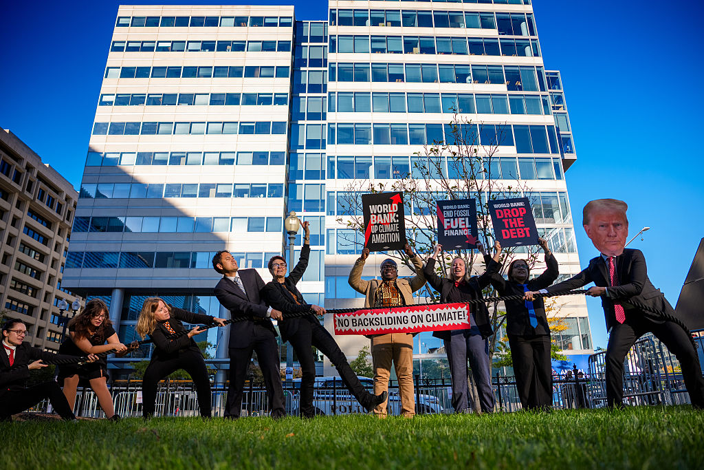
With their biggest shareholder – the US – resolutely opposed to climate action, the World Bank and International Monetary Fund (IMF) are likely to try to avoid mentioning climate change at their annual meetings in Bangkok – and there are no headline events on the subject.
But they aren’t in complete control of the agenda. Thailand will host a discussion on financing a green resilient economy and World Bank President Ajay Banga is likely to be challenged on climate at a live-streamed civil society townhall on October 12.
With tricky negotiations on the World Bank’s climate finance target concluded earlier this year (it was dropped), talks are moving on to the sustainability framework of the World Bank’s International Finance Corporation, which invests in the private sector. Civil society is calling for its rules on protecting people and the planet to be maintained and strengthened.
The IMF’s guidance note to staff – which shapes the circumstances under which climate can be included in IMF programmes – will also be negotiated. Longer term, the Resilience and Sustainability Trust, which channels funding to green projects, will be reviewed but not before 2028 at the earliest.
Read more: World Bank’s climate work can endure without finance target, experts say
Convention on Biological Diversity (CBD) COP17
Monday 19 October – Friday 30 October – Yerevan, Armenia
The biodiversity COP – a sister convention to the UN climate process – will for the first time take stock of progress towards key goals in its 2022 landmark agreement, the Global Biodiversity Framework (GBF). These include a headline target to protect and conserve at least 30% of the planet’s land and marine ecosystems by 2030.
A draft report prepared by a scientific panel warns that “unless collective implementation accelerates rapidly, the 2030 targets and mission will not be achieved”. In fact, governments are failing on 22 out of 23 targets. The final report is expected to be published ahead of COP17, where governments are expected to react strongly.
UN biodiversity chief Astrid Schomaker told journalists earlier this month that the most significant progress is expected to occur towards the end of the decade, as 174 countries took the first four years to develop national targets.
Finance, meanwhile, is set to become a contentious issue, as the draft report says developed countries fell short on a target to provide $20bn per year in international public finance for nature protection, reaching only about $17bn per year from 2020 to 2023. They have also yet to meet a wider goal to mobilise $200bn per year counting all kinds of finance.
Much like in climate talks, the EU has proposed to broaden the base of donors to include emerging economies who want to “voluntarily assume the obligations” of developed countries. Saudi Arabia and Qatar want nothing to do with this proposal. China has said bringing in new contributors should not weaken the obligations of developed countries. Expect a fight in Yerevan.
A preliminary meeting in Nairobi in August resulted in a heavily bracketed text that delegates will have to unravel in Armenia. One observer said countries had “overall missed the level of urgency” needed.
Keep an eye out for our webinar live from Yerevan later this month, where we’ll provide an update on the talks and how governments are responding to science’s demands for quicker action.
Read more: Mombasa ocean summit drives progress on marine protection, but threats persist
Read more: UN biodiversity talks agree finance roadmap, postponing decision on a new fund
European Climate Resilience & Risk Management Framework
Wednesday 28 October – Brussels, Belgium
Following a torrid summer beset by recurring heatwaves, drought and outbreaks of forest fires across the continent, the European Commission will present its keenly awaited climate resilience and risk management framework to help member states protect their populations from worsening climate change impacts.
As part of the policy package, the Commission will identify 100 of Europe’s most climate-vulnerable territories. And alongside an assessment of the risks, there will be guidance at which level they should be managed – regional, national or by the EU. Currently, confusion often arises over who is responsible for preventing, preparing for and managing disasters across the bloc.
The framework will also aim to make Europe a “champion in adaptation technologies” – such as drought-resistant crops, flood prevention or energy-efficient cooling – which have been described by EU President Ursula von der Leyen as “a huge emerging market”.
With only around a quarter of catastrophe losses in Europe covered by private insurance, the Commission also plans to set up a Climate Insurance Alliance to boost that figure.
READ MORE: WHO issues new guidance on heat-health action plans, as El Niño sets in
The post What’s on the climate calendar for October 2026? appeared first on Climate Home News.



-
Climate Change1 year ago
Guest post: Why China is still building new coal – and when it might stop
-

 Greenhouse Gases2 years ago
嘉宾来稿:满足中国增长的用电需求 光伏加储能“比新建煤电更实惠”
-
Greenhouse Gases1 year ago
Guest post: Why China is still building new coal – and when it might stop
-

 Climate Change2 years ago
嘉宾来稿:满足中国增长的用电需求 光伏加储能“比新建煤电更实惠”
-

 Renewable Energy11 months ago
Sending Progressive Philanthropist George Soros to Prison?
-
Climate Change2 years ago
Bill Discounting Climate Change in Florida’s Energy Policy Awaits DeSantis’ Approval
-
Greenhouse Gases1 year ago
嘉宾来稿:探究火山喷发如何影响气候预测
-

 Climate Change2 years ago
Analysis: China’s CO2 falls 1% in Q2 2024 in first quarterly drop since Covid-19