

Record numbers of delegates have been registered for this year’s COP28 climate summit in the United Arab Emirates (UAE), making it potentially the largest in COP history by some distance.
More than 80,000 participants have badges for this year’s Conference of the Parties (COP) in Dubai.
This is 30,000 more than travelled to Sharm El-Sheikh in Egypt for COP27 last year, the previous largest in an almost 30-year history of summits.
For the first time in COP history, every single delegate has been named in the participant lists.
Previous COPs have typically seen thousands of “overflow” participants in which countries and UN agencies could nominate delegates without their names appearing on their official lists.
Also named this year are “host country guests” – those receiving badges as guests of the UAE.
Recipients include former UK prime ministers Boris Johnson and Tony Blair, Microsoft co-founder Bill Gates, CEO and chairman of French energy giant EDF Luc Rémont and NATO secretary general Jens Stoltenberg.
This year, 3,000 “virtual” participants are also named, which takes the overall provisional delegate total for COP28 to around 84,000.
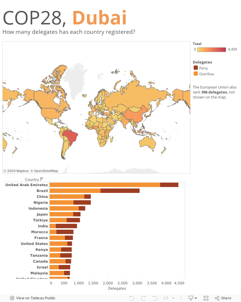
Unsurprisingly, the UAE has the largest-ever registered delegation of any country, with 4,409 badges. This is followed by Brazil with 3,081 and then China and Nigeria, who both have issued 1,411 badges.
Record numbers
For the first time in COP history, the participant lists have been published by the United Nations Framework Convention on Climate Change (UNFCCC) in spreadsheet format, rather than as pdf documents.
The provisional total for COP28 suggests that 81,027 delegates have registered to attend the summit in person. With a further 3,074 attending virtually, this takes the overall total to 84,101.
As the chart below shows, this comfortably makes the Dubai event the largest COP in history. For comparison, the first climate COP – held in Berlin in 1995 – had 3,969 delegates.
Last year’s COP in Sharm El-Sheikh received almost 50,000 delegates, which put it some distance ahead of the 38,000 that attended COP26 in Glasgow in 2021. It highlights a trend of increasing participation at climate COPs following a dip in attendance after the peak of COP21 in Paris in 2015.
It should be noted that these are provisional figures, based on the delegates that have registered for the summit. The UNFCCC will release the final figures – based on participants collecting a physical badge at the venue – after the summit has closed.

Overall totals for delegates from parties, observers and the media for all COPs, as published by the UNFCCC (see this article for more details on the data). Data for COPs 1-27 are the “final” figures, while COP28 data is “provisional”. Chart by Carbon Brief.
As usual, the lists are divided between the different types of groups and organisations attending the summit. The largest group at COP28 is for delegates representing parties. These are nation states, plus the European Union, that have ratified the convention and play a full part in negotiations. This group adds up to 24,488 delegates – more than double the number at COP27 last year.
Unusually, the participant lists for this year also name the “overflow” badges that have been given out. For the UK delegation, examples include 21 members of Prime Minister Rishi Sunak’s press delegation, 16 members of King Charles’s royal household and 18 members of parliament.
For consistency with Carbon Brief’s analysis of previous COPs, the above chart includes this group separately, but the participant lists this year do divide the overflow delegates between groups. Including the overflow numbers takes the total for party representatives to 51,695 – by itself, more than the total number of delegates at any previous COP.
As at COP27, there are no longer any “observer” states now that the Holy See – the government of the Roman Catholic Church, which operates from Vatican City State and is led by the pope as the bishop of Rome – has become a full party to the Convention.
The next-largest group is that of observers from non-governmental organisations (NGOs), which totals 14,338 delegates – again, comfortably the largest for this group in COP history.
Along with the NGOs, there are several other groups that fall into the category of “observer organisations” – such as those participants representing UN bodies, intergovernmental organisations, other agencies and business representatives. These total 3,623 registered delegates – or 4,754 when overflow badges are included.
Finally, another record-breaking group is the number of media delegates – clocking in at 3,972. This total potentially tops the 3,712 media representatives at COP3 in Kyoto in 1997.
UAE largest delegation
The UAE has registered the largest delegation of any party, totalling 4,409 participants – including overflow badges. Even without overflow badges – which hugely swell delegation size – UAE’s group of 620 would be its largest in COP history.
The UAE’s registered delegation at COP27 last year was potentially larger at 1,073 people, but just 436 attended, according to the final lists, putting it second-largest behind Brazil’s delegation of 467.
Brazil has again registered a large delegation for this year’s COP – 3,081 participants including overflow badges – meaning it is only behind UAE for overall delegation size.
Other delegations surpassing 1,000 include China and Nigeria who have both registered 1,411 people, followed by Indonesia with 1,229, Japan 1,067 and Turkey with 1,045.
(It is worth noting that some countries allocate some of their party badges to NGOs, which can artificially inflate the size of their official delegation.)
At the other end of the scale, the smallest delegations have been registered by North Korea (two), Nicaragua (six), Eritrea (seven) and Liechtenstein and Moldova (both eight).
For the third year in a row, both Afghanistan and Myanmar have not registered a delegation to the COP, while San Marino is also not present on the provisional lists this year.
The map and chart below present the delegation size – split between party and overflow badges – for all the countries registered for COP27. The darker the shading, the more delegates that country has signed up. Mouse over the countries to see the number of delegates and the population size.
Gender balance
Along with the names in the participant lists, the UNFCCC also typically provides a title – such as Mr, Ms, Sr or Sra – for each registered participant. In the past, this has allowed Carbon Brief to work out the balance of men to women in the delegations that each country has sent to a COP.
(This analysis always carries the caveat that the titles are designated by UNFCCC and not by Carbon Brief. In addition, Carbon Brief recognises that gender is not best categorised using a binary “male” or “female” label and appreciates that the UNFCCC’s lists may not be wholly accurate.)
However, this year’s lists are slightly different. First, there are a number of participants – particularly, for no obvious reason, in the Canadian delegation – that have not been given a title at all. And other titles that do not indicate gender – such as Dr, Prof, Ambassador and Honourable – have also been used frequently.
Therefore, for this COP28 analysis, these non-gendered titles – which make up around 330 names of more than 24,000 in the list of party delegates – have been excluded.
This gives an average gender balance of party delegations of 62% male to 38% female. The chart below shows how this compares with previous COPs – note that, for consistency, the COP28 figure only includes those on party badges, not overflow ones.
There is just one all-male party delegation this year, which is the two-strong group representing North Korea.

The average size of named party delegations (not including overflows) for each COP, divided by male (orange) and female (purple) participants. The lines show what percentage of the average delegation is male (orange) and female (purple). Data for COPs 1-27 collated from “final” participant lists published by the UNFCCC, while COP28 data is based on the “provisional” list. Note that around 330 delegates in the COP28 provisional list are not included because there is no information on their gender. Chart by Carbon Brief.
The full list of COP28 party delegation sizes can be found here.


The post Analysis: Which countries have sent the most delegates to COP28? appeared first on Carbon Brief.
Analysis: Which countries have sent the most delegates to COP28?

For the first time, new-energy vehicles (NEVs) made up 67% of new car sales in China in September, according to the latest data from the China Passenger Car Association (CPCA).
The figures show that NEVs, which include battery electric cars and plug-in hybrids, captured a record share of sales, even though fewer were sold than last year.
This is because sales of combustion-engine cars are falling steeply, a trend that the CPCA has attributed to rising petrol prices following the start of the Hormuz crisis.
Indeed, sales of fuel-only cars were down 31% year-on-year in the first nine months of 2026, with plug-in hybrid sales down 26% – whereas battery EV sales were only down 4%.
One analyst tells Carbon Brief that China’s rapidly growing EV fleet has offset demand for 143m barrels of oil since the start of the Hormuz crisis.
Another says that the crisis is “reinforcing China’s electrification of road transport”.
Meanwhile, amid slowing domestic sales, Chinese carmakers’ exports of NEVs more than doubled [in 2026 to date / in September] from a year earlier.
NEV record
A record two out of every three cars sold in September in China were NEVs, according to CPCA data, as shown in the figure below.
(NEVs predominantly include battery electric vehicles – BEVs – and plug-in hybrids – PHEVs. BEVs only run on electricity, whereas PHEVs also have a combustion engine.)
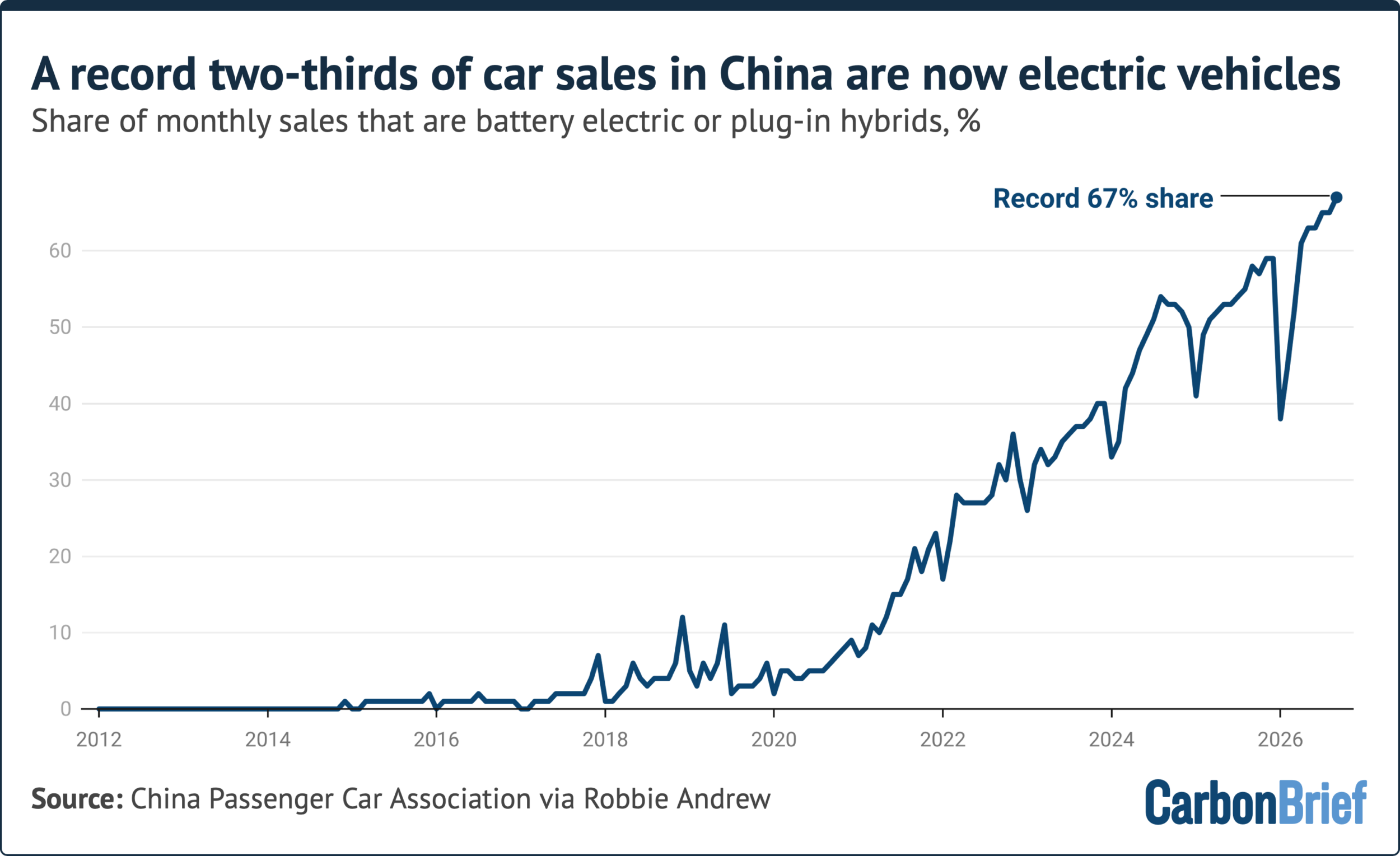
This marks a rapid rise for NEVs from just 6% of new car sales in 2020 up to 58% in 2026 to date – and a record 67% in the month of September.
This year, NEVs’ share of sales has also bounced back from a low of 39% in January, after the full purchase tax exemption that had been in place for more than a decade came to an end in December 2025.
The gain in NEV share in 2026 has come amid a slowdown across the wider domestic passenger-car market, which has hit sales of combustion-engine vehicles particularly hard.
This September, passenger-car retail sales across all categories declined, with overall sales volumes falling 28% year-on-year.
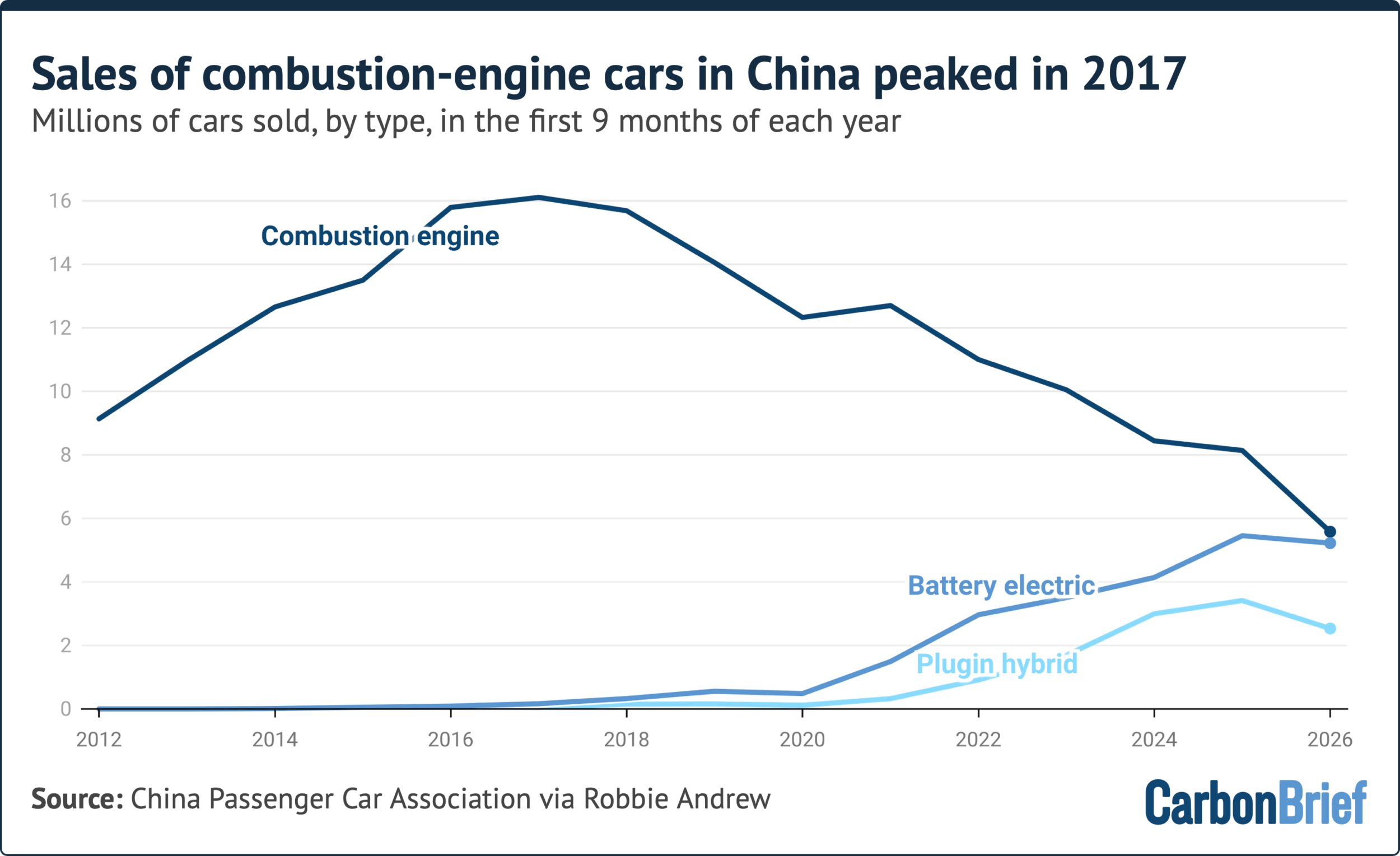
The contraction was led by combustion-engine vehicles, which saw sales fall 43% year-on-year in September and 31% in 2026 to date.
However, sales of PHEVs also fell by 36% year-on-year in September and by 26% in 2026 to date. By comparison, BEVs performed better, although sales still declined 8.5% from a year earlier in September and 4% in 2026 to date.
As a result, NEV sales overall fell by 17% in September and 13% in 2026 to date.
While the market changes in 2026 to date were particularly dramatic, they reflect a broad continuation of trends seen over the past decade.
Indeed, sales of combustion-engine cars in China peaked in 2017 and they have been declining ever since, shown in the figure below.
Impact of Hormuz
Part of the reason for the advance of NEVs in 2026, said Chinese technology news outlet OFweek, was petrol cars “giving up market share” as they were outperformed by electric alternatives.
Cui Dongshu, secretary-general of the CPCA, cited higher petrol prices as an explanation for September’s weak combustion-car sales, in comments to financial news outlet National Business Daily.
Imports of oil into China in January-September have fallen 15% compared to 2025, equivalent to 470m barrels, as ongoing conflict tightened supply and drove up prices.
China’s passenger-car NEV fleet has displaced 143m barrels of oil so far during the strait of Hormuz crisis, Euan Graham, senior energy analyst at thinktank Ember, tells Carbon Brief.
EVs “accounted for 12% of the decrease in China’s oil use post-Hormuz”, according to an estimate provided to thinktank the Brookings Institute by an unnamed analyst.