Connect with us

Published

on

The past three years have been exceptionally warm globally.

In 2023, global temperatures reached a new high, after they significantly exceeded expectations.

This record was surpassed in 2024 – the first year where average global temperatures were 1.5C above pre-industrial levels.

Now, 2025 is on track to be the second- or third-warmest year on record.

What has caused this apparent acceleration in warming has been subject to a lot of attention in both the media and the scientific community.

Dozens of papers have been published investigating the different factors that could have contributed to these record temperatures.

In 2024, the World Meteorological Organization (WMO) discussed potential drivers for the warmth in a special section of its “state of the global climate” report, while the American Geophysical Union ran a session on the topic at its annual meeting.

In this article, Carbon Brief explores four different factors that have been proposed for the exceptional warmth seen in recent years. These are:

Carbon Brief’s analysis finds that a combination of these factors explains most of the unusual warmth observed in 2024 and half of the difference between observed and expected warming in 2023.

However, natural fluctuations in the Earth’s climate may have also played a role in the exceptional temperatures, alongside signs of declining cloud cover that may have implications for the sensitivity of the climate to human-caused emissions.

An unusually warm three years

Between 1970 and 2014, average surface temperatures rose at a fairly steady rate of around 0.18C per decade.

Set against this long-term trend, temperature increases during the period from 2015 to 2022 were on the upper end of what would be expected.

The increases seen in 2023, 2024 and 2025 were well outside of that range.

The high temperatures of the past three years reflect a broader acceleration in the rate of warming over the past decade.

However, the past three years were unusually warm, even when compared to other years in the 2010s and 2020s.

Record-breaking warmth in 2023 meant that it beat the prior warmest year of 2016 by 0.17C – the largest magnitude of a new record in the past 140 years.

The year 2024 then swiftly broke 2023’s record, becoming the first year where average global temperatures exceeded 1.5C above pre-industrial levels.

The 10 months of data available for 2025 indicates that the year is likely to be slightly cooler than 2023 – though it is possible it may tie or be slightly warmer.

The figure below shows global surface temperatures between 1970 and 2025. (The figures for 2025 include uncertainty based on the remaining three months of the year.)

It includes a smoothed average based on temperature data for 1970-2022 that takes into account some acceleration of warming – and then extrapolates that smoothed average forward to 2023-25 to determine what the expected temperature for those years would have been. (This follows the approach used in the WMO’s “state of the global climate 2024” report.)

Chart showing annual global surface temperatures and the long-term average warming
Global average surface temperature changes between 1970 and 2024 using the WMO average of six groups that report global surface temperature records (dark blue), estimated 2025 temperatures and uncertainties (red) based on the first nine months of the year and a long-term average locally linear smooth (light blue).

This approach calculates how much warmer the past three years were than would be expected given the long-term trend in temperatures.

It shows that 2023 was around 0.18C warmer than expected, 2024 was a massive 0.25C warmer and 2025 is likely to be 0.11C warmer.

Researchers have identified a number of potential drivers of unexpected warmth over 2023-25. Here, Carbon Brief looks at the evidence for each one.

A weirdly behaving El Niño event

El Niño is a climate pattern of unusually warm sea surface temperatures (SSTs) in the tropical Pacific that naturally occurs every two to seven years. Strong El Niño years generally have warmer global temperatures, with the largest effect generally occurring in the months after El Niño conditions peak (when SSTs reach their highest levels in the tropical Pacific).

A relatively strong El Niño event developed in the latter half of 2023, peaking around November before fading in the spring of 2024.

This event was the fourth-strongest El Niño ever recorded, as measured according to SSTs in the Niño 3.4 region in the central tropical Pacific. However, it was notably weaker than the El Niño events in both 1998 and 2016.

This can be seen in the chart below, which shows the strength of El Niño events (red shading) since the 1980s. (The blue shading indicates La Niña events – the opposite part of the cycle to El Niño, which results in cooler SSTs in the tropical Pacific.)
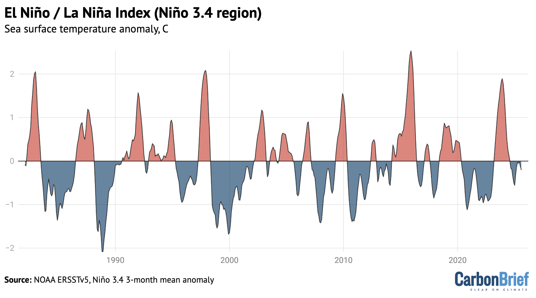
Char showing El Niño and La Niña Index (Niño 3.4 region)
NOAA’s Niño 3.4 region Oceanic Niño Index using detrended data from ERSSTv5.

(It is worth noting that measuring the strength of El Niño events is not entirely straightforward. Other tools used by scientists to monitor changes to El Niño – such as the US National Oceanic and Atmospheric Administration’s (NOAA’s) multivariate ENSO index – show the 2023-24 event was much weaker than indicated in the Niño 3.4 dataset.)

Global surface air temperatures tend to be elevated by around 0.1-0.2C in the six months after the peak of a strong El Niño event – defined here as when SSTs in the Niño 3.4 region reach 1.5C above normal.

The figure below shows the range of global temperature change for the 12 months before and 22 months after the peak of all 10 strong El Niño events since 1950. The light line represents the average of past strong El Niño events, the dark blue line the temperature change observed during the 2023-24 event and the shaded blue area the 5-95th percentile range.
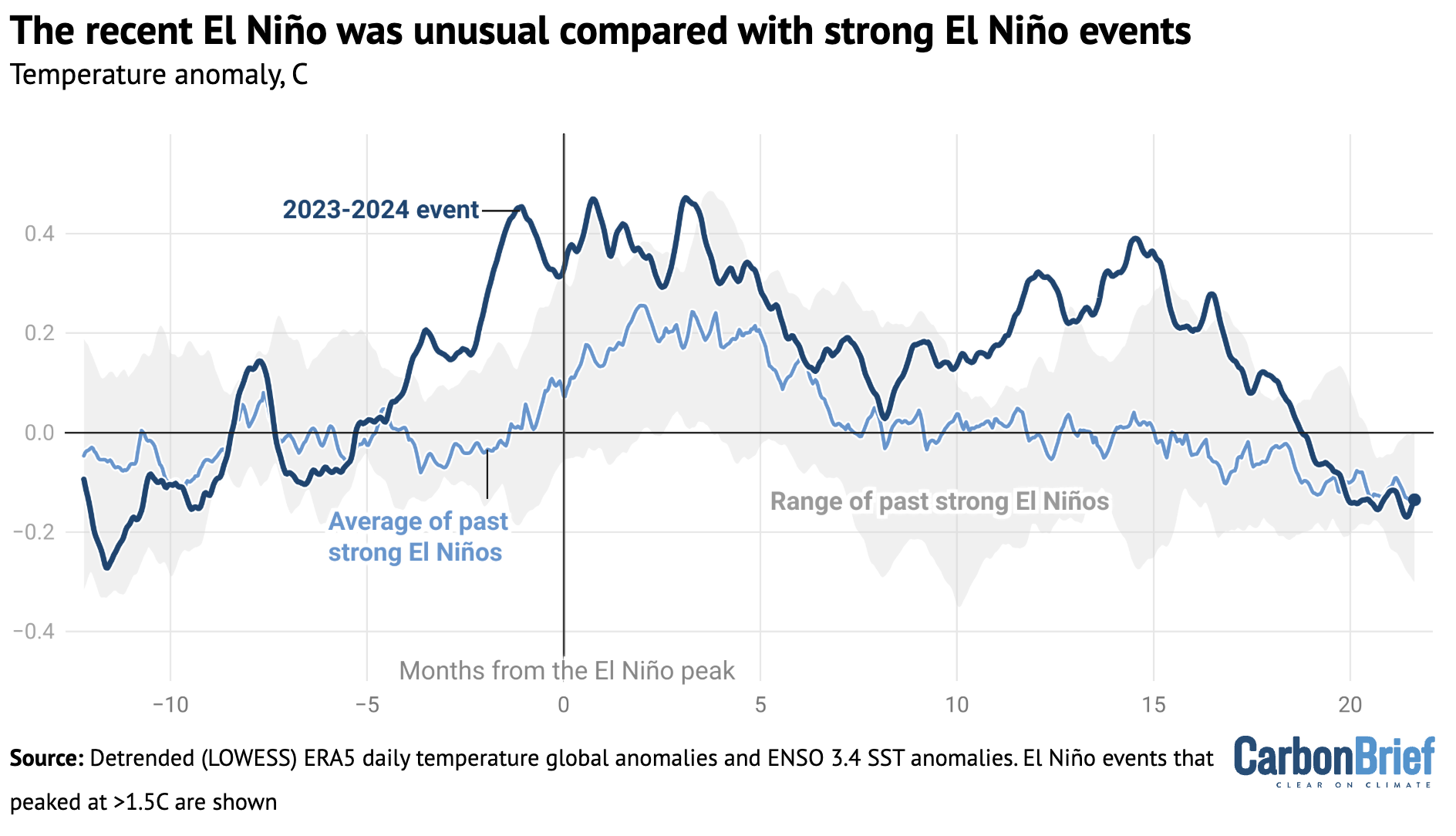
Chart showing that the recent El Niño was unusual compared with strong El Niño events
Global mean surface temperatures for the 12 months prior to peak El Niño conditions and the 22 months following for strong El Niño events. Calculations by Carbon Brief using data from Copernicus/ECMWF’s ERA5 and NOAA’s Oceanic Niño Index.

The figure shows the 2023-24 El Niño was quite unusual compared to other strong El Niño events since 1970. Global temperatures rose to around 0.4C above expected levels – which is on the high side of previous El Niños.

The heat also came early, with high temperatures showing up around four months before the El Niño event peaked. This early heat is unlike any other El Niño event in modern history and is one of the reasons why 2023’s global temperatures were so unexpectedly warm.

Global temperatures remained elevated for a full 18 months after the El Niño peaked, well after conditions in the tropical Pacific shifted into neutral conditions – and even after mild La Niña conditions developed at the end of 2024 and into early 2025.

This figure does not explain how much of this unusual heat was actually caused by El Niño, compared to other factors, but it does suggest that El Niño behaviour alone does not fully explain unusually high temperatures in recent years.

Based on the historical relationship between El Niño and global temperatures, Carbon Brief estimates that El Niño contributed a modest 0.013C to 2023 temperatures and a more substantial 0.128C to 2024 temperatures, albeit with large uncertainties. (See “methodology” section at the end for details.)

However, it is possible that this 2023 estimate is too low. There are some suggestions in the literature that 2023-24 El Niño’s early warmth may have been caused by the rapid transition out of a particularly extended La Niña event. There are indications that temperatures have spiked in similar situations further back in the historical temperature record.

Falling sulphur dioxide emissions

Sulphur dioxide (SO2) is an aerosol that is emitted into the lower atmosphere by the burning of coal and oil. It has a powerful climate cooling effect – Carbon Brief analysis shows that global emissions of SO2 have masked about one-third of historical warming.

Global SO2 emissions have declined around 40% over the past 18 years, as countries have increasingly prioritised reducing air pollution, including through the installation of scrubbers at coal plants.

These declines have been particularly concentrated in China, which has seen a 70% decline in SO2 emissions since 2007. In addition, a rule introduced for international shipping in 2020 by the International Maritime Organization (IMO) has resulted in an 80% decline in the sulphur content of shipping fuel used around the world.

The decline of SO2 emissions is shown in the figure below.

Chart showing that China and international shipping are large drivers of recent SO2 emissions decline
Annual SO2 emissions from China, international shipping and the rest of the world. Data from the Community Earth atmospheric Data System (CEDS).

Shipping in particular has been suggested as a potential culprit for recent temperatures, given that ships emit SO2 over oceans where the air tends to be cleaner and so emissions have a bigger effect.

Seven of the eight studies that have explored the temperature impact of the IMO regulations have suggested a relatively modest effect, in the range of 0.03-0.08C. However, one study – led by former NASA scientist Dr James Hansen – calculated a much stronger effect of 0.2C that would explain virtually all the unusual warmth of recent years.

The figure below shows Carbon Brief’s estimate of the global average surface temperature changes caused by the low-sulphur shipping fuel rules, using the estimates produced by all eight studies. The central estimate (dark blue line) is relatively low, at around 0.05C, but the uncertainty range (light blue shading) across the studies remains large.
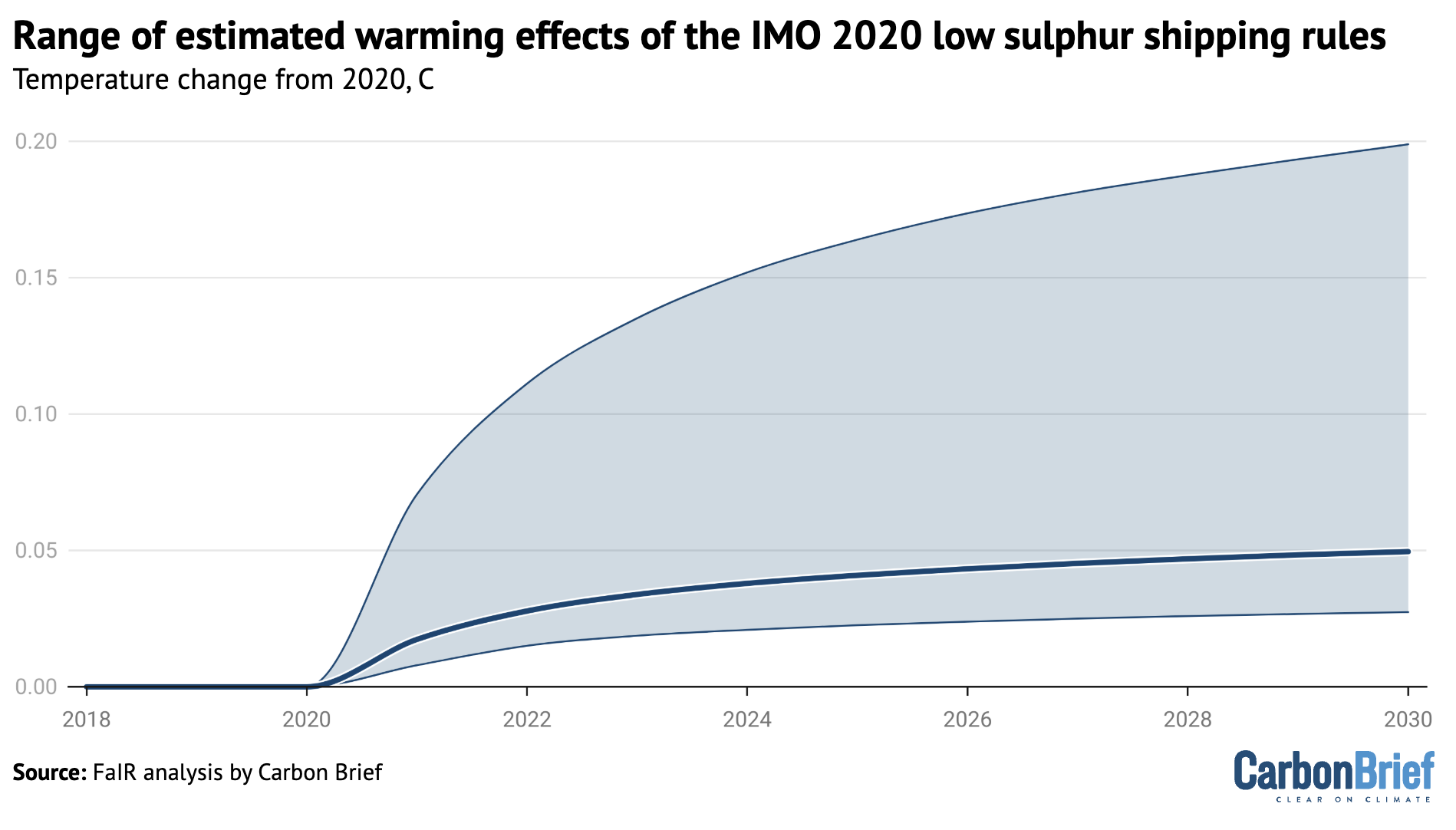
Chart showing the range of estimated warming effects of the IMO 202 low sulphur shipping rules
Range (5th to 95th percentile) and central estimate (50th percentile) of simulated global average surface temperature responses to the IMO 2020 regulations across the radiative forcing estimates in the literature. Analysis by Carbon Brief using the FaIR model.

Overall, Carbon Brief’s analysis finds that around 0.04C of warming over 2020-23 and 0.05C of warming over 2020-24 can be attributed to SO2 declines from shipping and other sources.

However, this approach might slightly overstate the effects of SO2 on the exceptional temperatures of the past three years, as shipping and other SO2 declines would have had some effect on 2021 and 2022 as well.

It is also worth noting that the total effects of SO2 declines on global temperatures have been considerably larger and are estimated to be responsible for around one-quarter of all warming since 2007.

However, these SO2 decreases occurred over a long period of time and do not clearly explain the recent spike in temperatures.

An unusual volcanic eruption in Tonga

In early 2022, the Hunga Tonga-Hunga Ha’apai underwater volcano erupted spectacularly, sending a plume 55km into the atmosphere. This was by far the most explosive volcanic eruption since Mount Pinatubo erupted in 1991.

This was a highly unusual volcanic eruption, which vaporised vast amounts of sea water and lofted it high into the atmosphere. Overall, around 146m metric tonnes of water vapour ended up in the stratosphere, which is the layer of the atmosphere above the troposphere.

Water vapour is a powerful greenhouse gas. While it is short-lived in the lower atmosphere, it can stick around for years in the stratosphere, where it has a significant warming effect on the climate.

The figure below shows the concentration of water vapour in the stratosphere between 2005 and mid-2025. It shows how the 2022 eruption increased atmospheric concentrations of the greenhouse gas by around 15%. More than half the added water vapour has subsequently fallen out of the upper atmosphere.
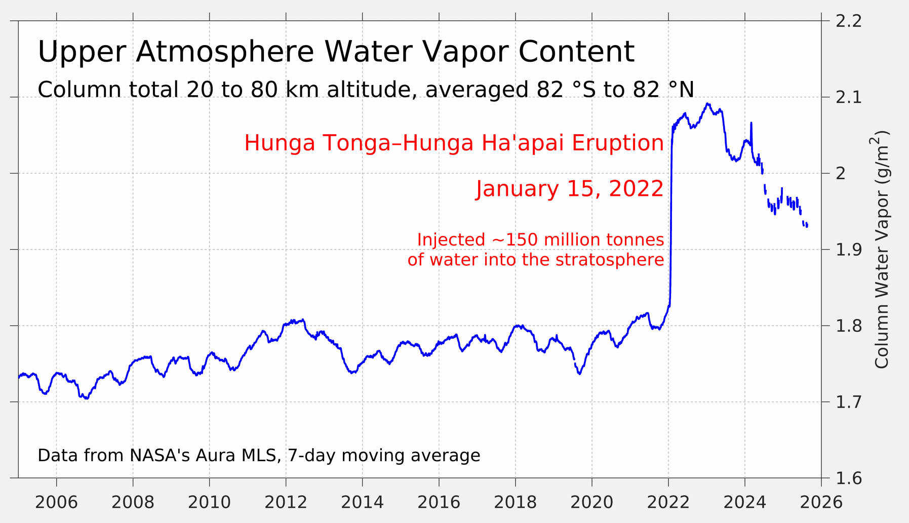
Chart showing upper atmosphere water vapour content
Upper atmosphere water vapor content from NASA’s Aura MLS satellite. Figure from Dr Robert Rohde.

Most early studies of the Hunga Tonga-Hunga Ha’apai volcano focused specifically on the effects of stratospheric water vapour. These tended to show strong warming in the lower stratosphere and cooling in the middle-to-upper stratosphere, but only a slight warming effect on global surface temperatures of around 0.05C.

Hunga Tonga-Hunga Ha’apai had much lower sulphur emissions than prior explosive eruptions, such as Pinatubo and El Chichon. However it put 0.51.5m tonnes of sulphur into the stratosphere – the most from an eruption since Pinatubo.

Studies that included both sulphur and water vapour effects tend to find that the net effect of the eruption on surface temperatures was slight global cooling, concentrated in the southern hemisphere.

By using the estimates published in a 2024 study published in Geophysical Research Letters, which used the FaIR climate emulator model, Carbon Brief estimates that the Hunga Tonga-Hunga Ha’apai eruption cooled global surface temperatures by -0.01C in 2023 and -0.02C in 2024.

This suggests that the eruption was likely only a minor contributor to recent global surface temperatures.

A stronger-than-expected solar cycle

The source of almost all energy on Earth is the sun. Over hundreds of millions of years, variations in solar output have a big impact on the global climate.

Thankfully, over shorter periods of time the sun is remarkably stable, helping keep the Earth’s climate habitable for life. (Big changes – such as ice ages – have more to do with variations in the Earth’s orbit than changes in solar output.)

However, slight changes in solar output do occur – and when they do, they can influence climate change over shorter periods of time. The most important of these is the roughly 11-year solar cycle, which is linked with the sun’s magnetic field and results in changes in the number of sunspots and amount of solar energy reaching Earth.

The figure below shows a best-estimate of changes in total solar irradiance since 1980, based on satellite observations. Total solar irradiance is a measure of the overall amount of solar energy that reaches the top of the Earth’s atmosphere and is measured in watts per metre squared.
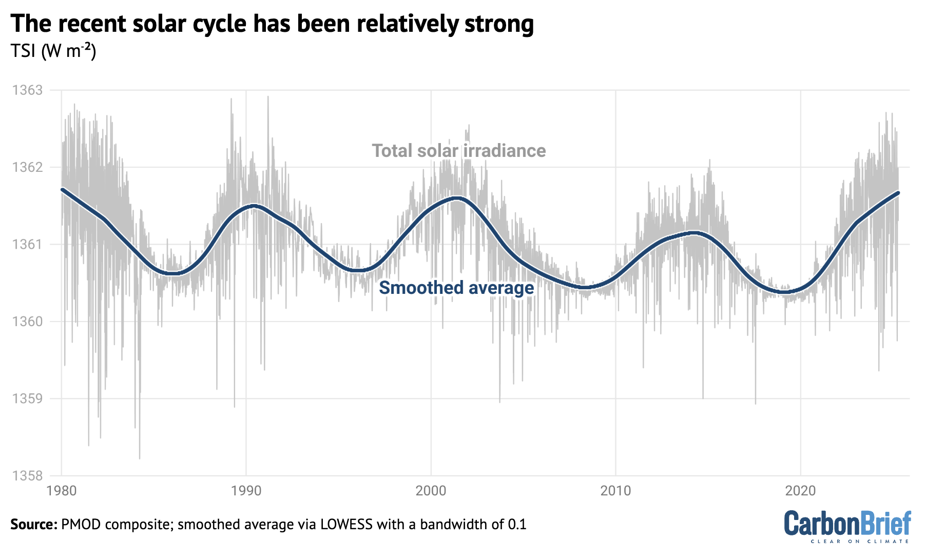
Chart showing the recent solar cycle has been relatively strong
Total solar irradiance from the PMOD composite (blue) along with a smoothed average (red) from 1980 to 2025.

The 11-year solar cycle is relatively modest compared to the sun’s total output, varying only a few watts per metre squared between peak and trough – amounting to around 0.01% of solar output. However, these changes can result in variations of up to 0.1C in global temperatures within a decade.

The most recent solar cycle – solar cycle 25 – began around 2020 and has been the strongest solar cycle measured since 1980. It was stronger than most models had anticipated and likely contributed to around 0.04C global warming in 2023 and 0.07C in 2024.

Putting together the drivers

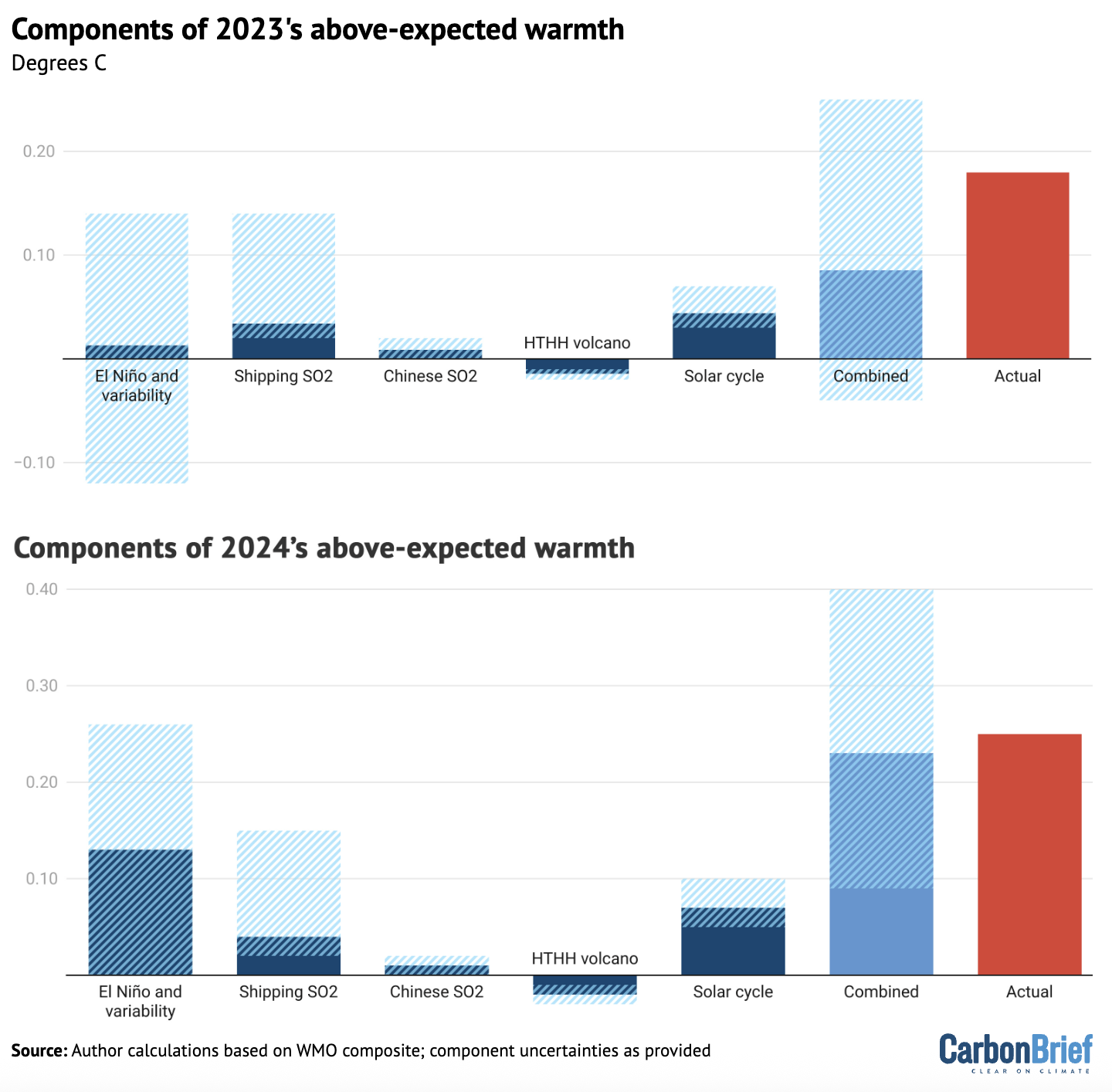
By combining earlier estimates of different factors contributing to 2023 and 2024 global surface temperatures, about half of 2023’s unusual warmth and almost all of 2024’s unusual warmth can be effectively explained.

This is illustrated in the figure below, which shows the five different factors discussed earlier – El Niño, shipping SO2, Chinese SO2, the Hunga Tonga-Hunga Ha’apai volcano and solar cycle changes – along with their respective uncertainties.

The sum of all the factors is shown in the “combined” bar, while the actual warming compared to expectations is shown in red.

The upper chart shows 2023, while the lower one shows 2024.
Charts showing the components of 2023 and 2024's above-expected warmth
Attribution of 2023 and 2024 anomalous warmth. Blue bars show individual factors and their uncertainties, the orange bar shows the combined effects and combination of uncertainties and the green bar shows the actual warming compared with expectations. Adapted from Figure 12 in WMO’s state of the global climate 2024 report.

It is important to note that the first bar includes both El Niño and natural year-to-year variability; the height of the bar reflects the best estimate of El Niño’s effects, while the uncertainty range encompasses year-to-year variability in global temperatures that may be – at least in part – unrelated to El Niño.

The role of natural climate variability

Large natural variability to the Earth’s climate is one of the main reasons why the combined value of the different drivers of expected warmth in 2023 has an uncertainty range that exceeds the observed warming – even though the best-estimate of combined factors only explains half of temperatures.

Or, to put it another way, there is up 0.15C difference in global temperatures year-on-year that cannot be explained solely by El Niño, human-driven global warming, or natural “forcings” – such as volcanoes or variations in solar output.

The figure below shows the difference between actual and expected warming in the global temperature record for every year in the form of a histogram. The vertical zero line represents the expectation given long-term global warming and the other vertical lines indicate the warming seen in 2023, 2024 and 2025.

The height of each blue bar represents the number of years over 1850-2024 when the average global temperature was that far (above or below) the expected level of warming. 
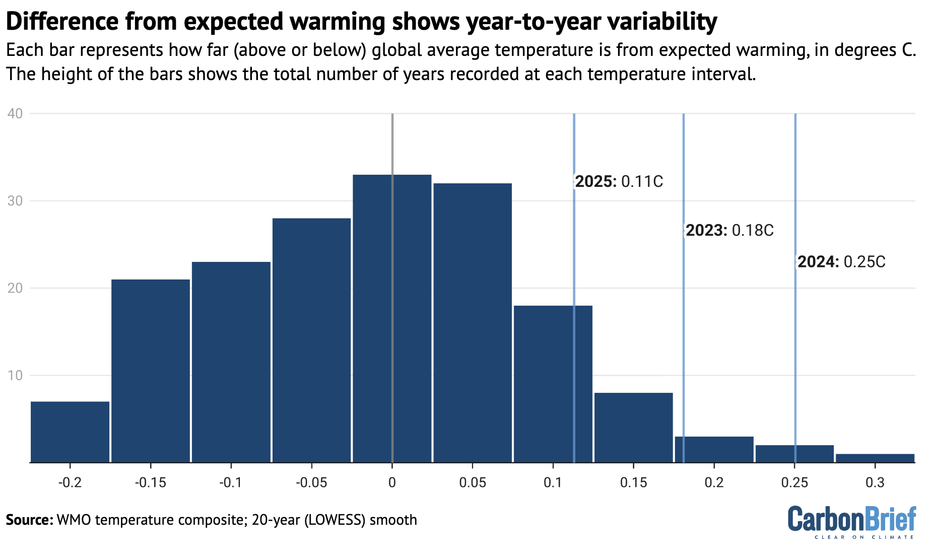
Chart showing that the difference from expected warming shows year-to-year variability
Histogram of residuals between actual and expected warming for all years since 1850, with the values for the past three years highlighted. Expected warming based on a 20-year locally linear smooth of the data.

Based on the range of year-to-year variability, temperatures would be expected to spike as far above the long-term trend as they did in 2023 once every 25 years, on average. The year 2024 would be a one-in-88 year event, whereas 2025 would be a less-unusual, one-in-seven year event.

These likelihoods for the past three years are sensitive to the approach used to determine what the longer-term warming level should be.

In this analysis, Carbon Brief used a local smoothing approach (known as locally estimated scatterplot smoothing) to determine the expected temperatures, following the approach used in the WMO “state of the climate 2024” report.

This approach results in a warming of 1.28C in 2023 and 1.30C in 2024, against which observed temperatures are compared.

Other published estimates put the longer-term warming in 2024 notably higher.

Earlier this year, the scientists behind the “Indicators of Global Climate Change” (IGCC) report estimated that human activity caused 1.36C of recent warming in 2024. They also found a slightly lower overall warming level for 2024 – 1.52C, as opposed to the WMO’s 1.55C – because they looked exclusively at datasets used by IPCC AR6. (This meant estimates from the Copernicus/ECMWF’s ERA5 dataset were not included.)

Based on climate simulations, the IGCC report finds the likelihood of 2024’s warmth to be a one-in-six year event and 2023’s a one-in-four event.

Using the same assumptions as the IGCC, Carbon Brief’s approach calculates that 2024 would be a less-common, one-in-18 year event.

However, the IGCC estimate of current human-induced warming is based on the latest estimates of human and natural factors warming the climate. That means that it already accounts for additional warming from low-sulphur shipping fuel, East Asian aerosols and other factors discussed above.

Therefore, the results from these two analyses are not necessarily inconsistent: natural climate variability (including El Niño) played a key role – but this came in addition to other factors. Natural fluctuations in the Earth’s climate alone would have been unlikely to result in the extreme global temperatures seen in 2023, 2024 and 2025.

A cloudy picture

Even if unusual recent global warmth can be mostly attributed to a combination of El Niño, falling SO2 emissions, the Hunga Tonga-Hunga Ha’apai volcano, solar cycle changes and natural climate variability, there are a number of questions that remain unanswered.

Most important is what the record warmth means for the climate going forward. Is it likely to revert to the long-term average warming level, or does it reflect an acceleration in the underlying rate of warming – and, if so, what might its causes be?

As explained by Carbon Brief in a 2023 article, climate models have suggested that warming will speed up. Some of this acceleration is built into the analysis presented here, which includes a slightly faster rate of warming in recent years than has characterised the period since 1970.

But there are broader questions about what – beyond declining SO2 and other aerosols – is driving this acceleration.

Research recently published in the journal Science offered some potential clues. It found a significant decline in planetary reflectivity – known as albedo – over the past decade, associated with a reduced low-level cloud cover that is unprecedented in the satellite record.

The authors suggest it could be due to a combination of three different factors: natural climate variability, changing SO2 and other aerosol emissions and the effects of global warming on cloud reflectivity.

Natural climate variability seems unlikely to have played a major role in reduced cloud cover, given that it was relatively stable until 2015. However, it is hard to fully rule it out given the relatively short satellite record.

Reductions in SO2 emissions are expected to reduce cloud reflectivity, but the magnitude of the observed cloud reflectivity changes are much larger than models simulate.

Models might be underestimating the impact of aerosols on the climate. But, if this were the case, it would indicate that climate sensitivity might be on the higher end of the range of model estimates, because models that simulate stronger aerosol cooling effects tend to have higher climate sensitivity.

Finally, cloud cover might be changing and becoming less reflective as a result of warming. Cloud responses to climate change are one of the largest drivers of uncertainty in future warming. One of the main reasons that some climate models find a higher climate sensitivity is due to their simulation of less-reflective clouds in a warming world.

The Science study concludes that the 2023 heat “may be here to stay” if the cloud-related albedo decline was not “solely” caused by natural variability. This would also suggest the Earth’s climate sensitivity may be closer to the upper range of current estimates, it notes.

Methodology

Carbon Brief built on work previously published in the IGCC 2024 and WMO state of the global climate 2024 reports that explores the role of different factors in the extreme temperatures in 2023, 2024 and 2025.

The impact of El Niño Southern Oscillation (ENSO) on the temperatures was estimated using a linear regression of the annual mean global temperature anomaly on the Feb/Mar Niño 3.4 index. This resulted in an impact of −0.07C, 0.01C and 0.13C for 2022, 2023 and 2024 respectively (with a 95% confidence interval of ±0.13 ºC).

It is important to note that the uncertainties in the ENSO response estimated here also incorporate other sources of unforced internal (modes of variability in other basins such as AMV), and potentially some forced variability. The bar in the combined figure is labelled “El Niño and variability” to reflect this.

For details on calculations of the temperature impact of shipping and Chinese SO2 declines, see Carbon Brief’s explainer on the climate impact of changing aerosol emissions.

Solar cycle 25 was both slightly earlier and slightly stronger than prior expectations with a total solar irradiance anomaly of 0.97 watts per metre squared in 2023 relative to the mean of the prior 20 years. This resulted in an estimated radiative forcing of approximately 0.17 watts per metre squared and an estimated global surface temperature increase of 0.07C (0.05C to 0.10C) with a one- to two-year lag based on a 2015 study. Thus, the impact on 2023 and 2024 is around 0.04C and 0.07C, respectively (+/- 0.025C). This is a bit higher warming than is given by the FaIR model, as the 2015 study is based on global models that have ozone responses to the UV changes, which amplifies the temperature effects a bit.

The Hunga Tonga-Hunga Haʻapai volcanic eruption added both SO2 and water vapour to the stratosphere (up to 55km in altitude). The rapid oxidation of SO2 to sulphate aerosol dominated the radiative forcing for the first two years after the eruption. As a result, the net radiative forcing at the tropopause was likely negative; −0.04 watts per metre squared and −0.15 watts per metre squared in 2022 and 2023, respectively, implying a temperature impact of -0.02C (-0.01C to -0.03C) calculated using the FaIR model.


The post Analysis: What are the causes of recent record-high global temperatures? appeared first on Carbon Brief.

Analysis: What are the causes of recent record-high global temperatures?

Continue Reading

Climate Change

Analysis: The two largest reservoirs in the US have hit record-low levels

Published

on

The second-largest reservoir in the US reached a record-low water height on Saturday – just days after the country’s largest reservoir broke its own record. 

Both Lake Mead and Lake Powell are located on the Colorado River.

They provide water for populations across seven US states in the south-western US, with around 40 million people getting some or all of their municipal water from the Colorado River.

The river also provides water for around 5.5m acres (22,258 square kilometres) of farmland across Colorado, Arizona, California and the other states in the river basin.

Experts tell Carbon Brief that climate change, population growth and over-consumption are all contributing to the current record-low levels of the reservoirs.

Record lows

At full capacity, Lakes Mead and Powell can hold a combined 68 cubic kilometres of water – enough to supply all household consumption in the contiguous US for nearly 1.5 years. However, the water level in both reservoirs has been declining for decades.

The chart below shows the water level of Lake Mead, in metres above mean sea level. The reservoir, which began to fill in 1935 following the construction of the Hoover Dam, has a “full pool” maximum capacity of 347.60 metres. The water level in Lake Mead reached a record low of 317.11 metres on 7 August.

Lake Mead, the larges reservoir in the US, reached record-low water levels in early August.

The following chart shows the water level of Lake Powell, in metres above mean sea level. Lake Powell’s full-pool level is 1,127.76 metres.

While the reservoir reached its maximum capacity several times in the 1980s, it has not done so since. On 15 August, the water level in Lake Powell was recorded at a new record-low of 1,072.87 metres.

Lake Powell, the second-largest reservoir in the US, reached record-low water levels in mid-August

Both reservoirs have continued to decline in the days since breaking their respective records. The downward trend will largely continue in both lakes until next spring, when the snowpack in the mountains of the Upper Colorado River Basin begins to melt, says Dr Jack Schmidt, a senior research scientist at Utah State University’s Center for Colorado River Studies. He tells Carbon Brief:

“The big dilemma of the moment is that we’re only in the middle of August, and we have no assurance of what the coming winter will be. The only thing we can be sure of is that we will be depleting overall total basin reservoir storage from now until, roughly, early April.”

Compounding factors

The record lows across the two reservoirs are the result of several compounding factors, experts tell Carbon Brief.

Since the turn of the 20th century, the amount of water flowing along the Upper Colorado River has declined by about 20%. Research suggests that half of this decline can be attributed to human-induced climate change.

Most of the river’s streamflow comes from the snowpack of the Upper Colorado River Basin, which stretches across five western US states but is primarily located in Colorado and Utah.

This region has been gripped by a historic “megadrought” for more than a quarter of a century. Nearly half of the megadrought’s intensity over 2000-18 is attributable to climate change, according to a 2020 study.

At the same time, the increasing population in the US south-west has put added pressure on the Colorado River’s water supply. The number of people obtaining some or all of their water from the Colorado system has grown by 15 million (around 60%) since 1992.

Schmidt tells Carbon Brief:

“There’s an ultimate cause of the present water crisis, and there’s a proximate cause. The ultimate cause is a warming climate, a warming planet and a pretty clear correlation between warming conditions and decreased runoff in the Colorado River Basin.

“The proximate cause is that in this messy democratic republic of ours, big policy decisions that match the variability of the climate occur painfully slowly – with intense political negotiations – and only incrementally.”

On 31 July, the US Bureau of Reclamation, which manages water resources in the western US, released an environmental impact statement on its proposed post-2026 strategy for managing Lakes Powell and Mead. The strategy itself has not been released yet.

Schmidt notes that the statement does appear to give the Bureau flexibility to “respond to crisis” by reducing the delivery of water to several states. However, he adds:

“They acknowledge it won’t work if we just stay critically dry, and of course every climate model for the 21st century, especially with a continually warming planet, says that that’s exactly what’s going to happen.”

The post Analysis: The two largest reservoirs in the US have hit record-low levels appeared first on Carbon Brief.

Analysis: The two largest reservoirs in the US have hit record-low levels

Continue Reading

Climate Change

“Dangerous consequences” – how AI’s climate framing lets Big Tech off the hook

Published

on

As tech giants race to build out AI and the sprawling infrastructure it depends on, climate concerns have tended to focus on one thing: power-hungry data centres.

Their electricity use is growing so fast that by 2030, it’s projected to be nearly three times more than the combined annual consumption of Pakistan, Bangladesh and Nigeria. With the explosion in the construction of data centres driving new investment in fossil fuels, especially in the US, greenhouse gas emissions generated by data centres – now standing at less than 1% of the global total – are set to soar.

But this narrow focus on electricity has let AI’s supporters and the International Energy Agency (IEA) make a convenient case: that rising emissions can be more than offset by the technology’s green applications, like optimising renewables or boosting efficiency. That story conceals how AI’s real climate danger lies elsewhere: in the oil fields, where it’s helping fossil fuel companies extract planet-heating oil and gas faster and more cheaply.

As a senior manager at Microsoft, Holly Alpine was shocked by this blind spot. In 2024, she and her husband Will – also a Microsoft manager – quit their jobs and launched a campaign to hold Big Tech accountable for the emissions its technology enables.

Over the past two years, they have teamed up with two researchers to quantify just how deep the fossil fuel industry’s embrace of AI tools runs.

Their peer-reviewed study, published last week, found that when AI is adopted at similar rates across the fossil fuel and renewable energy sectors, the net effect is a rise in emissions of 0.47–1.8 gigatonnes of CO2 annually. That’s equivalent to Mexico’s annual emissions at the low end, and to Russia’s – the world’s fourth-largest emitter – at the high end. It is also 3.3 to 13.3 times higher than the emissions currently generated by powering AI data centres.

We spoke with Alpine about the risks of overlooking this side of the AI climate story and what can be done to shift the focus.

Q: Why has the climate conversation focused so heavily on data-centre power use when your modelling suggests that’s the smaller part of the AI emissions story?

A: It’s been quite unfortunate that it has been framed that way and that it has stuck so much because that framing is wholly incomplete, very misleading and is leading to very dangerous consequences.

It’s in the fossil fuel industry and the technology companies’ favour to frame the equation in this way because it leaves out any responsibility and accountability of the tech’s use by fossil fuel companies, which is a large part of their business. They’re some of their largest customers and they have teams of engineers and sales folks who are dedicated to the fossil fuel industry.

Simply comparing the power needed to run the technology and its [clean energy] applications is also kind of apples to oranges. On the one hand, you have real-world actual emissions and, on the other, hypothetical future avoidance of emissions as a result of potential future use cases for renewables.

What we are saying is that we need to look at both sides of the ledger for AI applications, renewables versus fossil fuels, and then also add the emissions generated by running data centers on top of it.

    Q: How do AI applications help fossil fuel companies in a way that drives up emissions?

    A: It’s everything from finding more oil and gas underground by processing hundreds of terabytes of seismic and well data that would otherwise have to be done manually. These AI models can process this data extremely quickly and create high-resolution images of what is underground. It helps companies pinpoint the oil and gas reserves that are most likely to be commercially recoverable.

    Fossil fuel companies can identify and develop fossil fuel deposits with a lot more certainty, allowing them to move forward with projects that would otherwise have been too risky or too slow to pursue. AI makes them viable.

    We’ve seen that rig counts [number of active drilling rigs] have dropped dramatically, so they need fewer resources to get out even more fossil fuels. Their costs are decreasing, while their production is increasing.

    Q: How deep do these relationships run between Big Tech and fossil fuel companies? How do they compare with equivalent relationships with renewable energy companies?

    A: I have to caveat that I have not worked for Microsoft for about two years. But what we saw at the time was that the fossil fuel-dedicated teams were much larger in terms of the number of employees, the size of the contracts, and the long-standing relationships.

    This is not new. Microsoft has worked with the fossil fuel industry for many years and has deep partnerships, starting with the humble machine-learning going back many years. AI is just the latest wave of technology being applied in this way.

    UN asks AI companies to reveal full environmental impacts

    There are also relationships between the tech companies and renewables companies [and] battery storage developers. There are definitely sustainability-related applications of the technology.

    One of the recommendations that we had given the company [Microsoft] was to shift the ratio of engineering resources from fossil to low and no-carbon energy sectors within the company. When they came out with their principles for engagement with the fossil fuel industry in 2023, they committed to shifting engineering resources. But then we did not see any actual change in business practices.

    Visitors crowd the Microsoft exhibition stand at the 2026 Hannover Messe industrial trade fair on April 20, 2026 in Hanover, Germany. (Photo by Sean Gallup/Getty Images)

    Visitors crowd the Microsoft exhibition stand at the 2026 Hannover Messe industrial trade fair on April 20, 2026 in Hanover, Germany. (Photo by Sean Gallup/Getty Images)

    Q: Tech companies are now quietly scaling back some of their climate commitments, but there was a point, not long ago, when they wanted to be seen as climate leaders. Was there ever a genuine commitment to do that, or was it just an image they were projecting?

    A: It depends on how you evaluate a company for its climate impact. If all we are looking is its own operational emissions, then in that case, Microsoft was and, still is to some extent, a climate leader.

    But if we evaluate a company based on what it is producing, then I would say it’s a very different story. Back in 2019, ExxonMobil said it was able to produce an extra 50,000 barrels [of oil] per day purely thanks to Microsoft technology. There was also another public and quantified deal with Chevron.

    We calculated that those emissions alone from just two deals among dozens were 300% of Microsoft’s entire operational emissions, including data centres. So, how do you want to evaluate your company?

    If you look at other sectors and, say, evaluate a weapons manufacturer on its violence footprint, you don’t just look at their supply chain and the violence within it to create the weapons. You look at the real-world impact of the weapons they’re manufacturing. Yet we completely left technology companies off the hook.

    Q: You make some recommendations as well in the paper. They include the idea of putting some supply-side constraints on this AI-enabled productivity for fossil fuel companies. What would that look like in practice?

    A: Ultimately, our goal would be to have disclosure and governance measures that limit AI’s role in increasing fossil fuel productivity. The first thing would be a recognition of “enabled emissions” even as a measurable category because, at the moment, they are not included in any emissions disclosure or accountability frameworks.

    Then we should require transparency around these fossil fuel contracts and constrain some of these specific mechanisms that the research identifies.

    We are not trying to have a blanket ban on AI or even a blanket ban on AI use in the fossil fuel industry. There are some great applications, like methane leak detection, for example. But we just want to align applications with climate science and ensure that any contracts that move forward have been evaluated against a 1.5C future.

    AI governance debate silent on risks to nature, campaigners warn

    The easy thing would be for companies to voluntarily put guardrails on how their tech can be used, which is not new. There just currently are none for climate. But we do think that… policy is what needs to be implemented.

    We also think that if we can change the market structure and incentives, then this kind of restriction will follow. If we look at ESG investing and how sustainable investing is defined, if we include what these companies are doing into that evaluation, then that can move capital flows.

    Q: What do you think are the most promising avenues where you can shift the AI narrative and drive the change you are seeking to achieve?

    A: We are now building off the study and there are various governance frameworks that we are attempting to incorporate this sort of evaluation into like the Greenhouse Gas Protocol or the Science Based Targets initiative (SBTi)

    Luckily, we have seen some very promising drafts for the future of those frameworks that do include evaluations and disclosures of this work, which is really exciting.

    The vote that stopped a data center: US communities query resource-hungry AI

    We also need to look at companies for impacts in order to evaluate their sustainability metrics, and there could be potential greenwashing concerns that we could address on the legal side of things.

    And then [there are] different policy workstreams. In the EU, we were quite hopeful about the AI Act,and the various use cases that were classified as high risk and would go through additional scrutiny. Unfortunately, with the Omnibus passing [in July], that opportunity is a little restrained.

    But now with the Cloud and AI Development Act (CADA) coming out with various European frameworks around evaluating tech’s impacts, we hope to inform those discussions with this research.

    The post “Dangerous consequences” – how AI’s climate framing lets Big Tech off the hook appeared first on Climate Home News.

    “Dangerous consequences” – how AI’s climate framing lets Big Tech off the hook

    Continue Reading

    Climate Change

    Why land-use emissions have fallen by a third this century – in six charts

    Published

    on

    Emissions from land-use change – including deforestation, loss of peatland and forest degradation – have been falling over the course of the 21st century.

    The latest Global Carbon Budget report, formally published in May in the journal Earth System Science Data, notes a “statistically significant decrease” in land-use change emissions since the late 1990s.

    The 21st-century decline in land-use emissions has accelerated in recent years, with the report highlighting a “steep drop” after 2015.

    Writing for Carbon Brief in November 2025, climate scientists Dr Zeke Hausfather and Prof Pierre Friedlingstein noted that land-use emissions in 2025 had decreased by “around 32% compared to their average in the 2000s”.

    Via six charts, Carbon Brief explores how – and why – land-use emissions have fallen over the past quarter of a century as fossil-fuel emissions have continued to climb.

    Article Contents

    How have land-use emissions changed?

    Deforestation, forest degradation, loss of peatlands and harvesting trees for wood all release carbon into the atmosphere.

    Collectively, these emissions are known as land-use, land-use change and forestry (LULUCF) emissions, referred to here as land-use emissions.

    Each year, global land-use emission trends are analysed in the Global Carbon Budget report. The report, produced by dozens of scientists, documents how human-caused greenhouse gas emissions are changing over time.

    Key findings from the annual report are released each year in the autumn, before being published formally in an academic journal the following year following a peer-review process.

    (For more on the findings of the 2025 report, read Carbon Brief’s summary.)

    The latest edition of the Global Carbon Budget report notes that, in the four decades to 1999, net CO2 emissions from land-use change remained “relatively constant”, sitting at around 6.6bn tonnes of carbon dioxide (GtCO2) per year.

    However, since the late 1990s, global land-use emissions have been falling.

    The 2025 report estimates that land-use emissions over 2015-24 averaged at 5GtCO2 a year. This is around 23% lower than the average over 1995-2004 and 19% lower than 2005-14, it says.

    In contrast, global emissions from fossil fuels and cement have increased every decade since 1959, rising from an average of 11GtCO2 in the 1960s to 35.9GtCO2 over 2015-24, it says.

    “Preliminary data” included in the report suggests that land-use emissions in 2025 clocked in lower than their 2014-25 average, at 4.1GtCO2, as fossil-fuel and cement emissions reached a new high of 38.1GtCO2.

    (For more on how land-use emissions are calculated, see: Why are estimates of land-use emissions uncertain?)

    The chart below shows how land-use emissions have been falling in the 21st century and have helped to temper the overall rise of human-caused emissions.

    Line chart showing that global land-use emissions have fallen as fossil-fuel emissions have risen
    Global CO2 emissions separated out into fossil and land-use change components between 1980-2025. Data from Friedlingstein et al (2026). Chart by Carbon Brief.

    Why have land-use emissions fallen?

    The Global Carbon Budget attributes falling land-use emissions since the late 1990s to decreasing emissions from deforestation, in particular “permanent deforestation”.

    Permanent deforestation refers to the complete removal of trees for the conversion of forest to another land use, such as agriculture, mining or the construction of towns and cities. This sets it apart from other forms of deforestation, such as logging and rotational farming, where the canopy is removed on a more temporary basis.

    The Global Carbon Budget also points to “increasing [CO2] removals” from forest regrowth as a reason for falling land-use emissions since the turn of the century.

    (For more on the countries and policies that have driven these changes, see: Which countries are behind falling land-use emissions? and: Which countries are leading on forest regrowth?)

    Looking at more recent trends, the report attributes a “steep drop” in land-use emissions in the decade since 2015 to the “combined effect” of a “peak” in peat fire emissions in 2015, as well as a “long-term decline” in deforestation emissions in many countries over 2010-20.

    The chart below shows how deforestation and forest growth have been responsible for the bulk of change to land-use emissions over the 21st century.

    Line chart showing that carbon removals by forests and falling deforestation have driven down global land-use emissions in recent years.
    Global deforestation and forest growth, 1980-2020, split into emissions from deforestation, including permanent deforestation and deforestation in shifting cultivation cycles; emissions from peat drainage and peat fires; removals from forest growth, including afforestation, reforestation and shifting cultivation cycles; fluxes from wood harvest and other forest management; and, finally, emissions and removals related to other land-use transitions. Data from Friedlingstein et al (2026). Chart by Carbon Brief.

    Over 2015-24, the sequestration of CO2 through reforestation and afforestation efforts offset two-thirds of deforestation emissions, according to the Global Carbon Budget report.

    Specifically, it notes that deforestation was responsible for an average of 6.96GtCO2 of emissions each year over 2015-24. Forest growth, on the other hand, removed 4.76GtCO2 a year.

    Just under half – 2.2GtCO2 – of carbon removals over 2015-24 was from afforestation and reforestation efforts and the remaining 2.56GtCO2 were driven by forest regrowth from shifting cultivation cycles, it says.

    Forest regrowth from shifting cultivation refers to the recovery of a forest after a plot has been farmed for a short period and then abandoned.

    This is shown in the chart below below, which shows how carbon removals from forest regrowth have offset emissions from deforestation.

    Chart showing that carbon sequestration by forests compensates for two-thirds of global deforestation emissions
    Global deforestation and forest regrowth, 1980-2020, split into four sub-components. Data from Friedlingstein et al (2026). Chart by Carbon Brief.

    In the near-term, the Global Carbon Budget attributes its projection of a drop in land-use emissions between 2024 and 2025 to the “end of El Niño conditions”.

    (The naturally occurring weather phenomenon typically leads to the drying out of peatlands in the tropics and causes more planned deforestation fires to burn out of control.)

    Prof Pierre Friedlingstein, director of the Global Carbon Budget office and a professor at the University of Exeter, tells Carbon Brief there is “no indication” of what might happen in the future, but adds that land-use emissions trends over the 21st century are “going in the right direction”. He says:

    “If you are optimistic, you hope the trend will not reverse and start increasing again. But we don’t know for sure. The assumption, given current land policies across the world, is that deforestation should continue to decline.”

    Which countries are behind falling land-use emissions?

    The countries that contributed the most to land-use emissions over 2015-24 were Brazil, the Democratic Republic of the Congo (DRC) and Indonesia, according to the Global Carbon Budget.

    It notes that these three countries together contributed more than half – 57% – of global land-use emissions.

    Over the first quarter of the 21st century, falling land-use emissions in Brazil and Indonesia have combined with increased afforestation and reforestation in China to drive down overall land-use emissions, according to the Global Carbon Budget.

    This is illustrated in the chart below, which shows how China’s land-use emissions have dropped below zero, as Brazil and Indonesia’s emissions have declined.

    Chart showing that Brazil, DRC and Indonesia are the biggest contributors to global land-use emissions
    Land-use emissions by country, 1980-2025. Data from Friedlingstein et al (2026). Chart by Carbon Brief.

    Friedlingstein says that the decline in land-use emissions since the 2000s has been “primarily driven by a decline in deforestation in Brazil”.

    He tells Carbon Brief that tree clearance in the South American country rose in the 1990s then started to fall after a peak in the 2000s:

    “There was a bit of up and down – mainly due to politics and who was in charge in Brazil – [whether the president] was [Luiz Inácio] Lula [da Silva] or [Jair] Bolsonaro. But the long-term trend in Brazil is a decline in deforestation due to forest protection policies.”

    Bar chart showing that deforestation has fallen in Brazil's Amazon since the 2000s
    Rates of deforestation in Brazil’s “legal Amazon” states of Acre, Amapá, Amazonas, Mato Grosso, Pará, Rondônia, Roraima and Tocantins, as well as more than half of Maranhão. Data from INPE / PRODES (TerraBrasilis). Chart by Carbon Brief.

    These policies included a 2004 “action plan” for the prevention and control of deforestation in the Amazon, a 2006 soy moratorium, which banned the purchasing and financing of soya produced in deforested areas of the Amazon, as well as the expansion of protected areas across Brazil during the second half of the 2000s.

    Prof Julia Pongratz, a professor of physical geography and land-use systems at the University of Munich and contributor to the Global Carbon Budget, says Brazil is the “single most important contributor to the early-2000s global land-use change emissions peak and subsequent decline”.

    She says that the largest contributor to an “acceleration” in the decline of global land-use emissions in the past decade has been Indonesia, which she notes has “rewetted more peatland area since 2017 alone than Europe in its entire history”.

    Around the world, peatlands are exploited and damaged by humans for a range of purposes, including converting the land for agriculture and peat extraction for horticulture and fuel. Peatland wetting refers to the process of restoring water levels in drained peatlands in order to return them to their natural, waterlogged conditions, which allows for peat formation and carbon storage.

    Another reason for Indonesia’s downward trend in land-use emissions is that there have been fewer spikes in emissions caused by fires related to human land-use activities over the last decade, says Pongratz.

    Emissions from ecosystem fires are not always counted towards national and regional land-use emissions budgets, which estimate the sum of human-caused emissions. Deforestation fires and those related to peatland drainage are included, whereas fires caused by droughts and heatwaves are not.

    Pongratz says it is “hard to separate natural and land-use drivers completely”, given that deforestation and peatland fires often “get out of control and cause spikes in emissions” during dry El Niño conditions.

    (For more on uncertainties in land-use emissions data, see: Why are estimates of land-use emissions uncertain?)

    Pongratz notes that international trade regulations that have helped to drive down land-use emissions in Brazil and Indonesia have had a lesser effect in the DRC, where the root drivers of deforestation are different:

    “Emissions in the DRC have increased, then stayed high in the last two decades. This is partly related to population growth and expanding smallholder and subsistence farming.

    “The picture is different in Brazil and Indonesia, which are much more driven by export; international regulations aiming at curbing deforestation thus have larger effects in these countries.”

    Which countries are leading on forest regrowth?

    Reforestation and afforestation schemes that draw down carbon from the atmosphere have helped to reduce the overall emissions from land-use change over the course of the 21st century.

    As noted above, the 2025 Global Carbon Budget report highlights how the removal of carbon from forests offset two-thirds of deforestation emissions over 2015-24. 

    The report says that China, the EU and US account for the highest levels of carbon sequestration from reforestation and afforestation, collectively drawing 1.1GtCO2 per year over the 2015-24 period.

    This, it says, is “partly related to expanding forest area as a consequence of the forest transition in the 19th and 20th centuries and subsequent regrowth of forest”.

    The chart below, which draws from the latest edition of the “state of carbon dioxide removal” report, shows how carbon uptake by forests has increased over the last 20 years in a number of countries, most notably in China.

    Chart showing that China removes more carbon through its forests than any other nation
    Current levels of carbon dioxide removal from afforestation and reforestation
    by country, 2005-24. Data from 3rd “state of carbon dioxide removal” report (2026). Chart by Carbon Brief.

    In China, a raft of reforestation and improved land management policies were introduced in the 1990s which have led to the rehabilitation of tens of millions of hectares of forests. Research has shown the schemes have significantly increased the country’s uptake of carbon and switched its land from a carbon source to a carbon sink.

    The Global Carbon Budget highlights that substantial carbon removal from reforestation and afforestation occurred in other regions, such as Brazil, Russia and Indonesia. However, in these regions, emissions from deforestation and other land-use changes “dominate”, it says.

    Why are estimates of land-use emissions uncertain?

    Tallying the world’s emission from land-use change is complex.

    The Global Carbon Budget estimates an uncertainty range of 2.6GtCO2 per year for its average annual global land-use emissions figure for 2015-24 – more than half the overall figure of 5GtCO2.

    To calculate overall land-use emissions for the annual Global Carbon Budget report, researchers create an average from three land-use models: BLUE, OSCAR and LUCE.

    These models combine satellite and statistical information on land cover and land-use changes from global and regional datasets.

    Pongratz, who is involved in the LUCE model, explains that scientists can measure the exchange of CO2 between land and atmosphere, but are not able to determine whether CO2 is being released or sequestered from a managed area as a result of human activities or other climate or environmental factors. She continues:

    “For this, you need to turn to modelling, where you can isolate drivers – and, again, models are uncertain and the land-use input imperfect. This is why we use all available model estimates – three at the moment.”

    The Global Carbon Budget highlights that its three different models treat different components of the land-use emissions “budget” differently.

    While models agree “relatively well” about emissions from permanent deforestation, they take different approaches in their approach to shifting cultivation patterns, which increases both emissions and removals, as well as wood harvesting, it says.

    Moreover, it notes that land-use emissions and removals occur on different timelines. While carbon removals generated by forest growth and soil recovery are “slow”, there is an “instantaneous component” to emissions from deforestation, it says.

    (For more on the challenges in analysing changes to the global carbon cycle, see Carbon Brief’s recent in-depth interview with Prof Philippe Ciais, one of the world’s leading experts on land-use emissions.)

    The Global Carbon Budget notes that its confidence in its 2025 projection for overall land-use emissions remains “low” given that the figure is based on deforestation, degradation and peat fire emissions, which are “only a proxy” for land-use change.

    The report notes that 2023 is the final year in which it calculates land-use emissions directly from land-use statistics across all three bookkeeping models. For more recent years, full statistics are not yet available across the models and scientists instead turn to short-term proxies.

    The post Why land-use emissions have fallen by a third this century – in six charts appeared first on Carbon Brief.

    Why land-use emissions have fallen by a third this century – in six charts
    Continue Reading

    Trending

    Copyright © 2022 BreakingClimateChange.com