Connect with us

Published

on

The year 2025 was in the top-three warmest years on record, with average surface temperatures reaching around 1.44C above pre-industrial levels across eight independent datasets.

The different temperature records confirm that last year was either the second or third warmest since observations began in the mid-1800s, with razor-thin margins between 2025 and 2023.

Last year also set a new record for ocean heat content, with the oceans absorbing more than 90% of the heat trapped by increasing greenhouse gas concentrations in the atmosphere.

Here, Carbon Brief examines the latest data across the Earth’s oceans, atmosphere, cryosphere and surface temperature. (Use the links below to navigate between sections.)

Noteworthy findings from this 2025 review include…

  • Ocean heat content: It was the warmest year on record for ocean heat content and one of the largest year-over-year increases in ocean heat content. In 2025, the oceans added 35 times more heat than all annual human energy use.
  • Global surface temperatures: The year 2025 is effectively tied with 2023 as the second-warmest year on record – coming in at between 1.33C and 1.53C above pre-industrial levels across different temperature datasets and 1.44C in the synthesis of all groups.
  • Second warmest over land: Global temperatures over the world’s land regions – where humans live and primarily experience climate impacts – were 2C above pre-industrial levels, just below the record set in 2024.
  • Third warmest over oceans: Global sea surface temperatures were 1C above pre-industrial levels, dropping from 2024 record levels due to fading El Niño conditions.
  • Regional warming: It was the warmest year on record in areas where, collectively, more than 9% of the global population lives. 
  • Unusual warmth: The exceptionally warm, record-setting temperatures over the past three years (2023-25) were driven by continued increases in human emissions of greenhouse gases, reductions in planet-cooling sulphur dioxide aerosols, variability related to a strong El Niño event and a strong peak in the 11-year solar cycle.
  • Comparison with climate models: Observations for 2025 were nearly identical to the central estimate of climate model projections in the Intergovernmental Panel on Climate Change (IPCC) sixth assessment report (AR6).
  • Heating of the atmosphere: It was the second warmest year in the lower troposphere – the lowest part of the atmosphere.
  • Sea level rise: Sea levels reached record highs, continuing a notable acceleration over the past three decades.
  • Shrinking glaciers and ice sheets: Cumulative ice loss from the world’s glaciers and from the Greenland ice sheet reached a new record high in 2025, contributing to sea level rise.
  • Greenhouse gases: Concentrations reached record levels for carbon dioxide (CO2), methane and nitrous oxide.
  • Sea ice extent: Arctic sea ice saw its lowest winter peak on record as well as its 10th-lowest summer minimum extent, while Antarctic sea ice saw its third-lowest minimum extent.
  • Looking ahead to 2026: Carbon Brief predicts that global average surface temperatures in 2026 are likely to be between the second and fourth warmest on record, similar to 2023 and 2025, at around 1.4C above pre-industrial levels.

Ocean heat content sets a new record

The year 2025 was the warmest on record for the heat content of the world’s oceans.

Ocean heat content (OHC) increased by around 500 zettajoules – billion trillion joules – since the 1940s.

The heat increase in 2025 alone compared to 2024 – about 23 zettajoules – is around 39 times as much as the total energy produced by all human activities on Earth in 2023 (the latest year in which global primary energy statistics are available). It was also the largest increase in ocean heat content since 2017 (following the strong El Niño event of 2016).

Human-emitted greenhouse gases trap extra heat in the atmosphere. While some of this warms the Earth’s surface, the vast majority – around of 93% – goes into the oceans. About two-thirds of this accumulates in the top 700 metres, but some also ends up in the deep oceans.

The figure below shows annual OHC estimates from the Chinese Institute for Atmospheric Physics (IAP) between 1950 and present for the upper 700 metres (light blue shading) and 700-2,000 metres (dark blue) of the ocean.
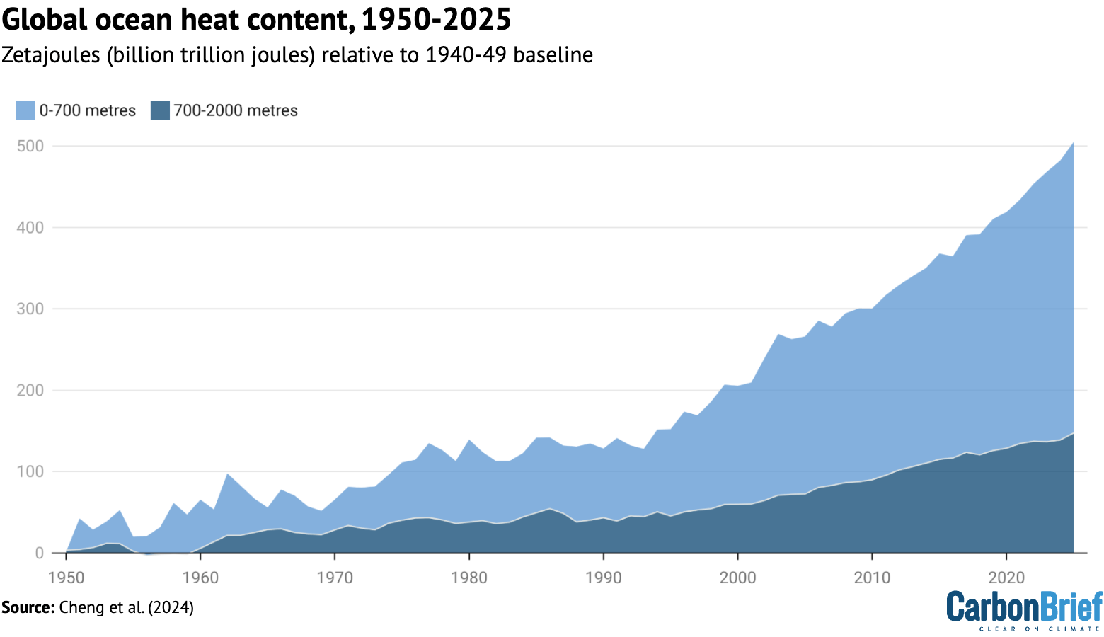
Chart showing global ocean heat content 1950-2025
Annual global ocean heat content (in zettajoules – billion trillion joules, or 10^21 joules) for the 0-700 metre and 700-2,000 metre layers. Data updated from Cheng et al. (2024). Chart by Carbon Brief.

In a new paper published last week, researchers found that the rate of OHC increase over the past 15 years is unprecedented over the observational record in the IAP dataset. More broadly, there has been a distinct acceleration in OHC after 1991 – and recent OHC growth rates are generally consistent with satellite measurements of Earth energy imbalance (EEI).

(Energy imbalance is a measure of how much surplus heat there is in the Earth’s climate system. It is the difference between how much energy enters Earth’s atmosphere from the sun and how excess heat is radiated back into space as the world warms.)

In many ways, OHC represents a much better measure of climate change than global average surface temperatures, because it is where most of the extra heat ends up and is much less variable on a year-to-year basis than surface temperatures.

Surface temperatures tied at second warmest

To assess global surface temperatures in 2025, Carbon Brief uses eight independent datasets: NASA, NOAA, the Met Office Hadley Centre/University of East Anglia’s (UEA) HadCRUT5, Berkeley Earth, Copernicus ERA5, Japan’s JRA-3Q, DCENT and China-MST.

The analysis reveals that global surface temperatures were between the second and third warmest since records began in the mid-1800s. Temperatures effectively tied with 2023 within the margin of uncertainty, below the record set last year in 2024.

The figure below shows global surface temperature records from the eight datasets.

Chart showing global surface temperature records, 1850-2025
Annual global average surface temperatures over 1850-2025. Data from NASA GISTEMP, NOAA GlobalTemp, Hadley/UEA HadCRUT5, Berkeley Earth, Copernicus ERA5, JRA-3Q, DCENT, and China-MST. Temperature records are aligned over the 1981-2010 period and use the WMO approach to calculate warming relative to the pre-industrial (1850-1900) baseline. Chart by Carbon Brief.

Global surface temperature records can be calculated back to 1850, though some groups such as NASA GISTEMP choose to start their records in 1880 when more data was available.

Prior to 1850, records exist for some specific regions, but are not sufficiently widespread to calculate global temperatures with high accuracy (though newly published research has attempted to extend this back to 1781).

These longer surface temperature records are created by combining ship- and buoy-based measurements of ocean sea surface temperatures with temperature readings of the surface air temperature from weather stations on land. (Copernicus ERA5 and JRA-3Q are an exception, as they use weather model-based reanalysis to combine lots of different data sources over time.)

Some differences between temperature records are apparent early in the record, particularly prior to 1900 when observations are more sparse and results are more sensitive to how different groups fill in the gaps between observations. However, there is strong agreement between the different temperature records for the period since 1970, as shown in the figure below.

Chart showing global surface temperature records, 1970-2025
Annual global average surface temperatures as in the prior chart, but showing the period from 1970-2025. Chart by Carbon Brief.

Global temperatures over the past three years clearly stand out as much warmer than anything that has come before, well above the prior record set in 2016. More broadly, the 11 warmest years on record all happened in the past 11 years.

Two of the eight datasets analysed by Carbon Brief – NASA and DCENT – had 2025 as the second-warmest year behind 2024, while six of the datasets had 2025 as the third-warmest year behind both 2023 and 2024.

However, in nearly all cases the difference between 2023 and 2025 falls within each dataset’s published uncertainty range, making it effectively a tie between the two years.

The table below shows the reported 2025 global temperature anomalies (relative to each group’s 1850-1900 pre-industrial baseline), as well as a normalised 2025 value using a common pre-industrial baseline between the 1850-1900 and 1981-2010 periods across the five groups with data back to 1850 (NOAA, Hadley/UAE, Berkeley Earth, DCENT and China-MST).

Dataset 2025 Reported 2025 Normalised Ranking
NASA GISTEMP 1.39 1.45 Second
Hadley/UAE HadCRUT5 1.41 1.39 Third
NOAA GlobalTemp 1.33 1.41 Third
Berkeley Earth 1.44 1.44 Third
Copernicus ERA5 1.47 1.47 Third
JRA-3Q 1.46 1.46 Third
DCENT 1.53 1.44 Second
China-MST 1.39 1.42 Third

Reported temperature anomalies range from as low as 1.33C (NOAA) to as high as 1.53C (DCENT), primarily reflecting differences in the early part of the record. The normalised 2025 values have a much smaller range, from 1.41C (NOAA) to 1.47C (Copernicus).

Separate land and ocean temperatures are not available yet from all of these groups. However, Berkeley Earth reports that global land temperatures in 2025 were the second warmest on record, at 2.03C above pre-industrial levels, while ocean temperatures were the third warmest at 1.03C.

Land and ocean temperature rise since the pre-industrial 1850-1900 period. Figure from Berkeley Earth.

Global land regions – where the global human population lives – has generally been warming around 70% faster than the oceans and 40% faster than the global average since 1970.

The year started off quite hot, with January 2025 setting a new record as the warmest January. All other months of the year ended up being either the second or third warmest on record after 2024 and 2023.

The figure below shows each month of 2025 in dark red, compared to all prior years since 1850. Each year is coloured based on the decade in which it occurred, with the clear warming over time visible, as well as the margin by which both 2023, 2024 and 2025 exceeded past years.

Chart showing monthly global temperature since 1850
Monthly global surface temperatures for each year since 1850, using the average of the eight different temperature datasets assessed by Carbon Brief. Anomalies are shown relative to the pre-industrial 1850-1900 period.

Extreme regional temperatures

While the globe as a whole was tied as the second warmest on record, many different regions of the planet set new records in 2025. 

The figure below shows how global temperature deviated from the average in 2025 across the world. Areas shaded in red were warmer than the baseline period (1951-80) used by Berkeley Earth, whereas the few blue areas experienced cooler temperatures.
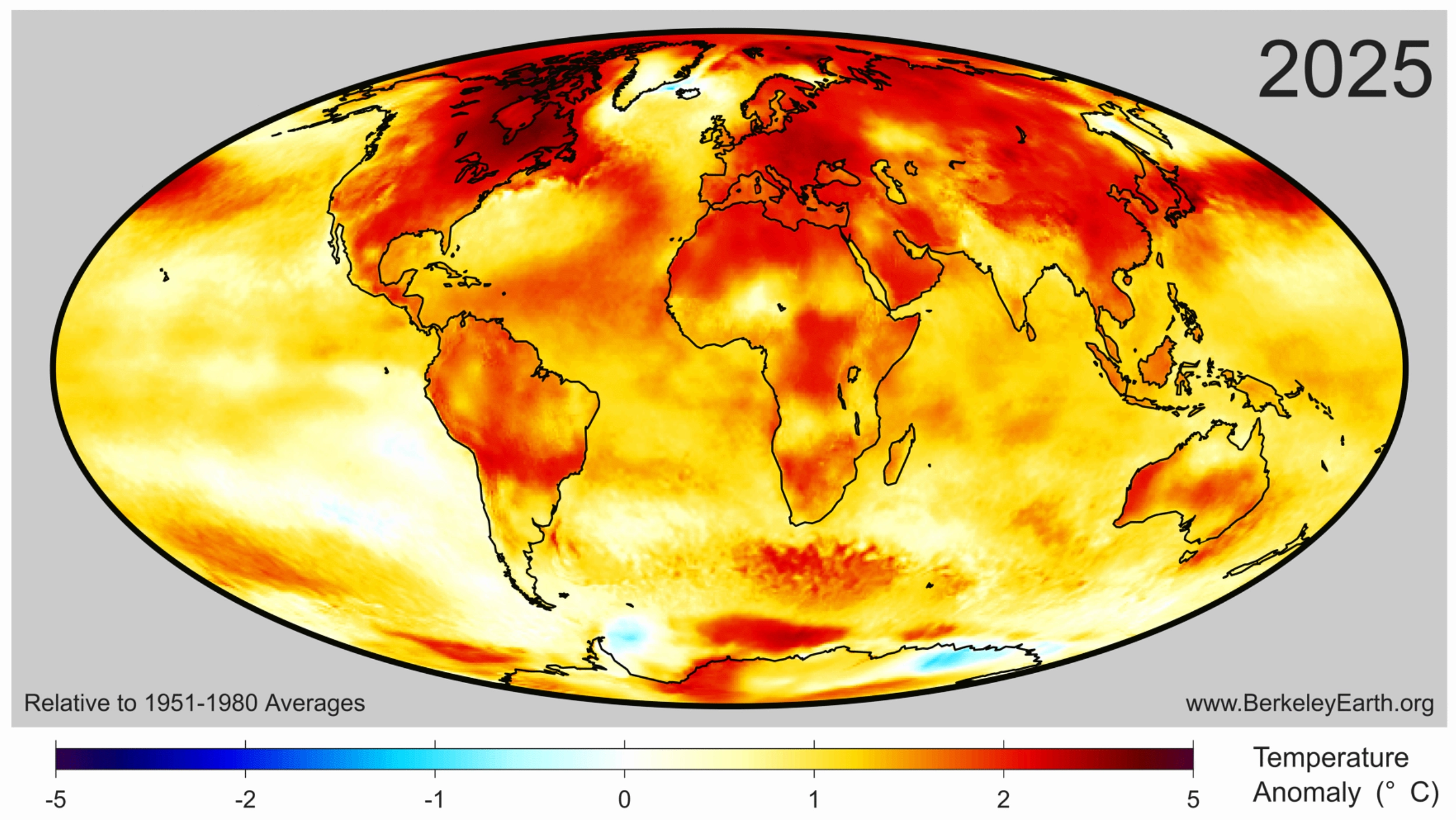
Surface temperature anomalies for 2025 from Berkeley Earth. Note that Berkeley uses a 1951-80 baseline here to show anomalies.

Collectively, approximately 770 million people – 9.3% of Earth’s population – live in places that experienced their warmest year on record in 2025. This was mostly concentrated in Asia, including around 450 million people in China.

The figure below highlights regions of the planet that experienced their top-five warmest (red shading) or coldest (blue) temperatures on record in 2025. Overall, around 9% of the planet set a new record, including 11% of the land and 8% of the ocean. No location on the planet experienced record cold temperatures – or even top-five record cold temperatures – for the year as a whole.
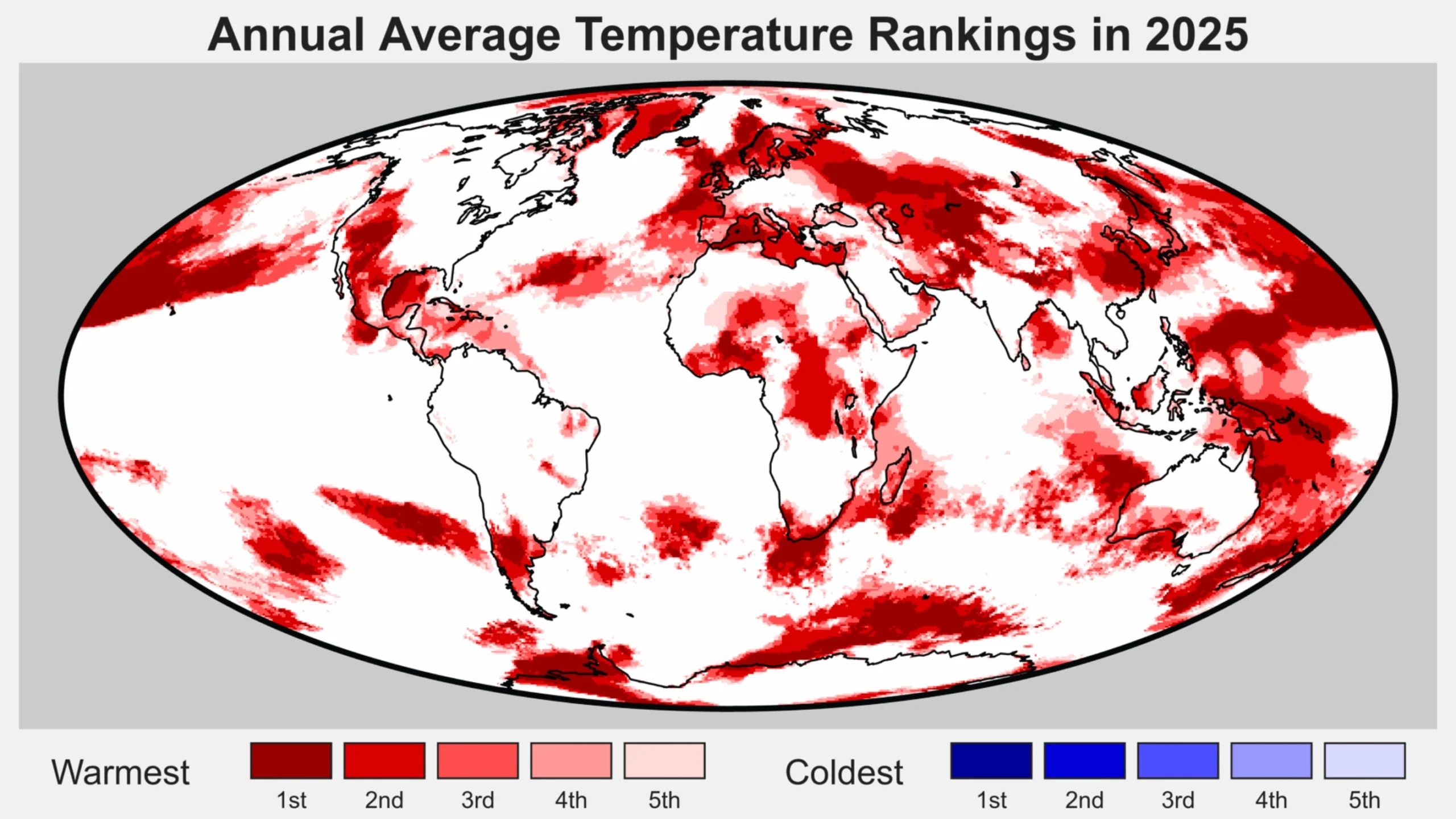
Regions of the world among the five warmest (reds) of five coolest (blues) on record for average annual temperatures in 2025. Figure from Berkeley Earth.

Drivers of recent record warmth

Global temperatures over the past three years have been unusually warm, well above what would be expected given the long-term warming trend of around 0.2C per decade since the 1970s.

Recent research has found that global warming has accelerated in recent years to around 0.27C per decade, though this acceleration is largely in-line with climate model projections under scenarios where greenhouse gas emissions continue to rise while emissions of planet cooling aerosols are reduced.

According to analysis from Berkeley Earth, the odds of global temperatures over 2023-25 occurring as a result of greenhouse gas emissions and natural variations in the Earth’s climate alone “is less than one-in-100” and “likely indicates that recent years have been impacted by additional warming factor(s)”.

The figure below shows how the exceptional warming spike of 2023-25 compares to the longer-term warming trend and historical climate variability.
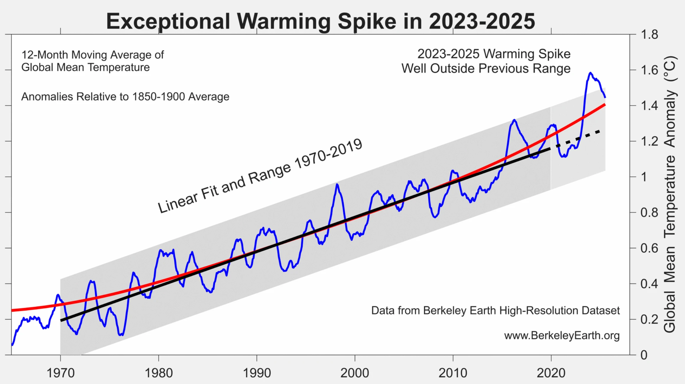
Global surface temperatures between 1965 and 2025 (blue) along with the linear trend (black) and range (grey) from 1970-2019. The red line shows a locally linear regression that captures recent acceleration. Figure from Berkeley Earth.

Carbon Brief recently explored the drivers of recent warmth in more detail, finding that it is likely to have been driven by a combination of:

This is illustrated in the figure below, which provides an estimate of the impact of each of these different factors on 2023 and 2024 temperatures, along with their respective uncertainties.

The sum of all the factors is shown in the “combined” bar, while the actual warming compared to expectations is shown in red. The upper chart shows 2023, while the lower one shows 2024.

Chart showing components of 2023's above-expected warmth
Attribution of 2023 and 2024 unusual warmth. Light blue bars show individual factors and their uncertainties, the dark blue bar shows the combined effects and combination of uncertainties and the red bar shows the actual warming compared with expectations. HTHH refers to the Hunga Tonga-Hunga Ha’apai volcano. Adapted from Figure 12 in WMO’s state of the global climate 2024 report.

The first bar includes both El Niño and natural year-to-year climate variability; the height of the bar reflects the best estimate of El Niño’s effects, while the uncertainty range encompasses year-to-year variability in global temperatures that may be – at least in part – unrelated to El Niño.

While a similar analysis has yet to be undertaken for 2025, the end of El Nino conditions and the development of a modest La Nina would have driven temperatures down, while the warming impact of shipping, Chinese aerosol declines would have slightly increased. The warming effect of the solar cycle would likely have remained flat or slightly declined as solar cycle 25 passed its peak.

Finally, a World Meteorological Organization (WMO) assessment of the Hunga Tonga-Hunga Ha’apai volcano found that “the record-high global surface temperatures in 2023-24 were not due to the Hunga eruption”.

The report suggested that the volcano had a small cooling effect (-0.03C) globally in 2023 and 2024. This might switch to a small warming effect (+0.03C) in 2025 and 2026 as the planet-cooling aerosols from the volcano fall back down to the surface but some of the stratospheric water vapour remains, it noted.

However, it added, these effects are “indistinguishable from background variability in the current climate”.

El Niño and La Niña are generally the largest drivers of year-to-year variability in global temperatures. The figure below shows the El Niño (red shading) and La Niña (blue) conditions over the past 40 years (collectively referred to as the El Niño-Southern Oscillation, or “ENSO”).

Chart showing El Nino / La Nina index (nino 3.4 region)
NOAA’s Niño 3.4 region Oceanic Niño Index using detrended data from ERSSTv5.

Carbon Brief has used the historical relationship between ENSO conditions and temperature to effectively remove the effects of El Niño and La Niña events from global temperatures, as shown in the figure below.

This analysis indicates that El Niño cooled global temperatures in 2025 around -0.05C, following a boost to global temperatures of around 0.12C in 2024, compared to the estimate of global temperatures with both El Niño and La Niña events removed.

Chart showing effects of El Niño and La Niña on global temperatures
Annual global average surface temperatures from the average of the eight datasets, as well as Carbon Brief’s estimate of global temperatures with the effect of El Niño and La Niña (ENSO) events removed using the Foster and Rahmstorf (2011) approach. Chart by Carbon Brief.

This suggests that the shift from El Nino to La Nina conditions can fully explain the decline in global temperatures between 2024 and 2025 and that 2025 would have likely been the warmest year in the observational record if it had not been for the effects of ENSO.

Scientists provided estimates of where they expected 2025 temperatures to end up at the start of the year.

The figure below shows estimates by four different groups that provided temperature predictions for the year prior to any data being collected – the Met Office, NASA’s Dr Gavin Schmidt, Berkeley Earth and Carbon Brief’s own estimate — compared to what actually transpired.

Chart comparing different 2025 temperature projections
Temperature predictions for 2025 from UK Met Office, NASA’s Dr Gavin Schmidt, Berkeley Earth and Carbon Brief’s estimate relative to pre-industrial (1850-1900) temperatures and compared to the historical average of the eight observational datasets. Chart by Carbon Brief.

Unlike in 2023 –and, to a lesser extent, 2024 –when start-of-year predictions were notably low, 2025 fell reasonably in-line with what was expected. The Met Office estimate was nearly exactly on target, with Berkeley Earth’s being close as well. Carbon Brief and Schmidt’s estimates were a little on the low side, but actual temperatures were well within the estimated error bars.

Observations in-line with climate model projections

Climate models provide physics-based estimates of future warming given different assumptions about future emissions, greenhouse gas concentrations and other climate-influencing factors.

Here, Carbon Brief examines a collection of climate models – known as CMIP6 – used in the 2021 science report of the IPCC’s sixth assessment.

In CMIP6, model estimates of temperatures prior to 2015 are a “hindcast” using known past climate influences, while temperatures projected from 2015 onward are a “forecast” based on an estimate of how things might change.

The figure below shows how observations compare to the full ensemble of 37 CMIP6 models under the middle-of-the-road SSP2-4.5 emissions scenario for future projections. The red line represents the average of all the models and the red areas showing the 5th to 95th percentile range. The average of the eight observational temperature datasets are plotted as dots on top of the climate model data.

The chart illustrates how observations have generally been a bit below the model average over the past two decades, were slightly above model average in 2024 and are more or less dead on in 2025.

Chart showing global surface temperatures from 1950 to 2025: CMIP6 models and observations
Annual global average surface temperatures from CMIP6 models and observations between 1950 and 2030 (through 2025 for observations). Models use the SSP2-4.5 scenario after 2015. Anomalies plotted with respect to a 1850-1900 baseline. Chart by Carbon Brief.

However, the ensemble of CMIP6 models differs from the main projection of future warming in the recent IPCC AR6 report. A subset of CMIP6 models have unrealistically high climate sensitivity and they reproduce historical observations poorly.

To account for this, rather than simply averaging all the models – as had been done in prior assessments – the IPCC employed an approach that effectively weights models by their performance. As a result, the models align better with the range of climate sensitivity derived from multiple different lines of evidence.

The chart below shows the assessed warming projections from the IPCC AR6 report in red, with historical observations since 1850 as black dots.
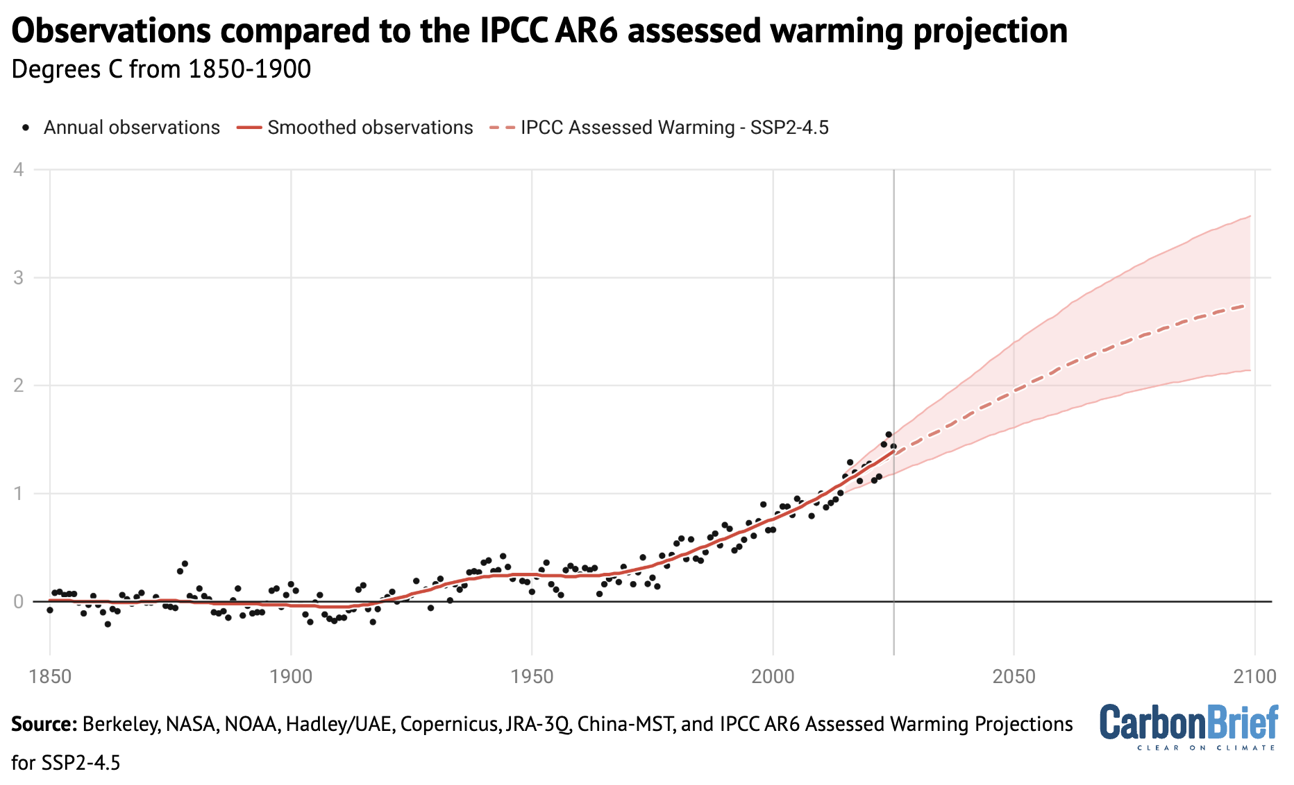
Chart showing observations compared to the IPCC AR6 assessed warming projection
Annual global average surface temperatures from the average of eight datasets (black dots) along the 30-year LOWESS fit (red line), combined the AR6 assessed warming projection for SSP2-4.5 as published and without any baseline alignment. Chart by Carbon Brief.

The chart reveals that observed global surface temperatures (black dots) are further above the modeled central estimate 2023-25, but generally remain within the IPCC assessed range.

Climate models broadly expect an acceleration of warming in the current period in a scenario like SSP2-4.5 where emissions of CO2 and other greenhouse gases continue to modestly increase, but emissions of planet-cooling aerosols like sulphur dioxide are rapidly reduced.

Second-warmest atmospheric temperatures

In addition to surface measurements over the world’s land and oceans, satellite microwave sounding units have been providing estimates of temperatures at various layers of the atmosphere since 1979.

The lowest layer of the atmosphere that satellite microwave units provide temperature estimates for is the lower troposphere. This data reflects temperatures a few kilometres above the Earth’s surface. It reveals a pattern of warming in the lowest troposphere that is similar – though not identical – to surface temperature changes.

The records produced by Remote Sensing Systems (RSS), the University of Alabama, Huntsville (UAH) and NOAA show 2025 as the second warmest year on record in the lower troposphere, after 2024. The chart below shows the three records for the lower troposphere, using a more recent baseline period (1981-2010) given the absence of satellite data before 1979.

Chart showing satellite lower tropospheric temperature records
Global average lower-troposphere temperatures from RSS version 4 (blue), UAH version 6 (red) and NOAA STAR version 5 (grey) for the period from 1979-2025, relative to a 1981-2010 baseline. Chart by Carbon Brief.

The lower troposphere tends to be influenced more strongly by El Niño and La Niña events than the surface. Therefore, satellite records show correspondingly larger warming or cooling spikes during these events. This explains why there was both a bigger increase between 2023 and 2024 and a bigger decline between 2024 and 2025 in the satellite record than in surface records.

The lower-tropospheric temperature records show large differences after the early 2000s. RSS shows an overall rate of warming quite similar to surface temperature records, while UAH and NOAA show considerably slower warming in recent years than has been observed on the surface.

Greenhouse gas concentrations reach new highs

Greenhouse gas concentrations reached a new high in 2025, driven by human-caused emissions from fossil fuels, land use and agriculture.

Three greenhouse gases – CO2, methane (CH4) and nitrous oxide (N2O) – are responsible for the bulk of additional heat trapped by human activities. CO2 is by far the largest factor, accounting for roughly 42% of the increase in global surface temperatures since the pre-industrial era (1850-1900).

Methane accounts for 28%, while nitrous oxide accounts for around 5%. The remaining 25% comes from other factors including carbon monoxide, black carbon and halocarbons, such as chlorofluorocarbons (CFCs).

Human emissions of greenhouse gases have increased atmospheric concentrations of CO2, methane and nitrous oxide to their highest levels in at least a few million years – if not longer.

The figure below shows concentrations of these greenhouse gases – in parts per million (ppm) for CO2 and parts per billion (ppb) for methane and nitrous oxide – from the early 1980s through to October 2025 for CO2 and September 2025 for CH4 and N2O (the most recent data currently available).
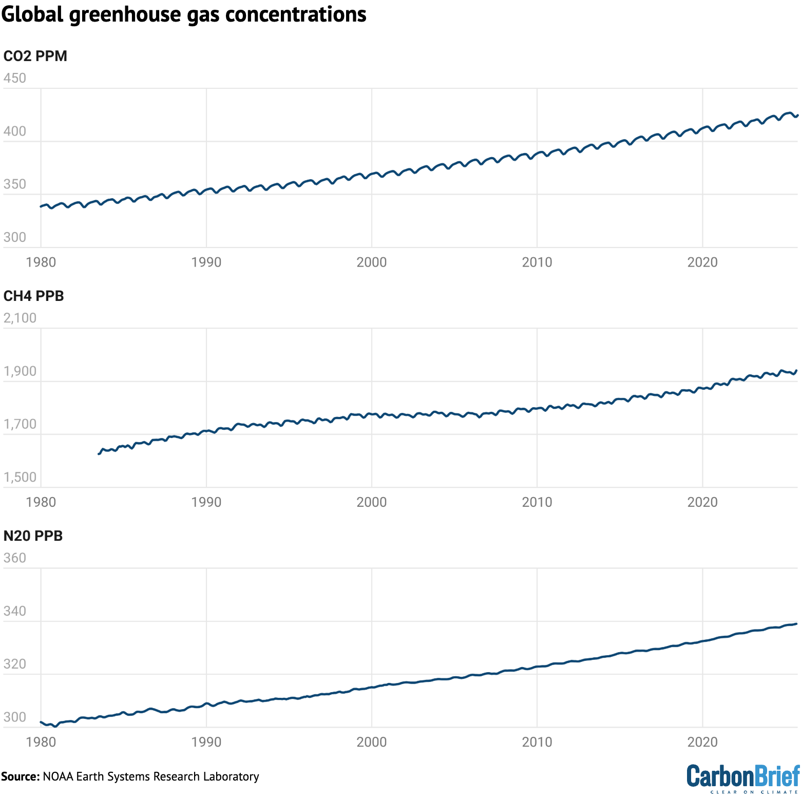
Chart showing global greenhouse gas concentrations
Global concentrations of CO2, methane (CH4) and nitrous oxide (N2O). Based on data from NOAA’s Earth Systems Research Laboratory. Note that the y-axes do not start at zero. Chart by Carbon Brief.

Sea level is rising rapidly

Modern-day sea levels have risen to a new high, due to a combination of melting land ice (such as glaciers and ice sheets), the thermal expansion of water as it warms and changes in land water storage.

In recent years, there have been larger contributions to sea level rise from melting ice sheets and glaciers, as warmer temperatures accelerate ice sheet losses in Greenland and Antarctica.

Since the early 1990s, the increase in global sea level has been estimated using altimeter data from satellites. Earlier global sea levels have been reconstructed from a network of global tide gauge measurements. This allows researchers to estimate how sea level has changed since the late 1800s.

The chart below shows five different modern sea level rise datasets (blue lines), along with satellite altimeter measurements as assessed by AVISO (in black) after 1993. (As sea level rise data has not yet been released for the whole year, the 2025 value is estimated based on data through to November.)

Chart showing global mean sea level rise between 1880 and 2025
Global average sea level rise reconstructed from tide gauge data between 1880 and 2025 from Frederikse et al. (2020), Dangendorf et al. (2019), Hay et al. (2015), Church and White (2011), and Palmer et al. (2021). Satellite altimeter data from 1993 (black) to present is taken from AVISO. Chart by Carbon Brief.

Sea levels have risen by over 0.2 metres (200mm) since 1900. While sea level rise estimates mostly agree in recent decades, larger divergences are evident before 1980. There is also evidence of accelerating sea level rise over the post-1993 period when high-quality satellite altimetry data is available.

(To understand more on how climate change is accelerating sea level rise, read Carbon Brief’s explainer.)

Shrinking glaciers and ice sheets

A significant portion of global sea level rise is being driven by melting glaciers on land.

Scientists measure the mass of glaciers around the world using a variety of remote-sensing techniques, as well as through GRACE measurements of the Earth’s gravitational field. The balance between snow falling on a glacier and ice loss through melting and the breaking off – or “calving” – of icebergs determines if glaciers grow or shrink over time.

The World Glacier Monitoring Service is an international consortium that tracks more than 130 different glaciers in 19 different regions around the world. The figure below shows the change in global average glacier mass from 1950 through to the end of 2024. (2025 values are not yet available.) Note that glacier melt is reported in metres of water equivalent, which is a measure of how much mass has been lost on average.
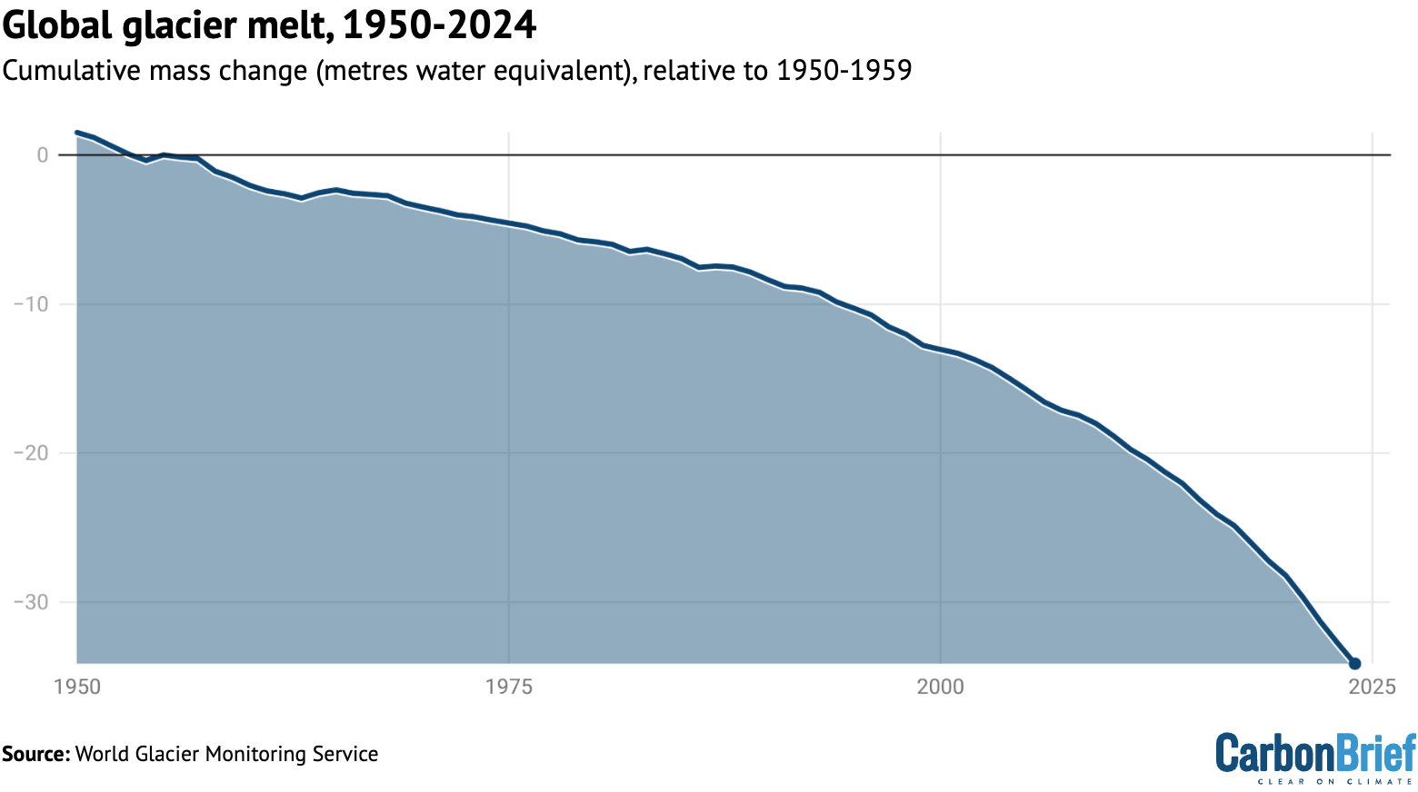
Chart showing global glacier melt, 1950-2024
Global average glacier melt over the 1950-2024 period from the World Glacier Monitoring Service, in metres of water equivalent. Carbon Brief.

Greenland ice sheets have become a larger contributor to sea level rise in recent years due to accelerating loss of mass. The year 2025 was the 29th in a row where Greenland lost ice overall, with 105bn tonnes of ice lost over the 12 months from September 2024 to August 2025. Greenland last saw an annual net gain of ice in 1996.

The figure below shows the cumulative mass balance change – that is, the net ice loss – from Greenland between 1970 and 2025. The authors find that Greenland has lost around 6tn tonnes of ice over the past 50 years – more than 700 tonnes lost per person for every person on the planet.

Chart showing greenland ice sheet mass balance, 1970-2025
Cumulative ice loss from Greenland in billion metric tonnes (gigatonnes) between 1970 and 2025 from Mankoff et al 2021. Chart by Carbon Brief.

Lowest winter Arctic sea ice extent

Arctic sea ice saw its lowest winter peak on record as well as its 10th-lowest summer minimum extent, while Antarctic sea ice saw its third-lowest minimum extent.

Both the Arctic and Antarctic were at the low end of the historical (1979-2010) range for most of 2025, with new daily lows recorded for Arctic sea ice extent in January, February, March, June and December.

The figure below shows both Arctic (red line) and Antarctic (blue line) sea ice extent for each day of the year, along with how it compares to the historical range (corresponding shading).

Chart showing Arctic and Antarctic sea ice in 2025
Arctic and Antarctic daily sea ice extent from the US National Snow and Ice Data Center. The bold lines show daily 2025 values, the shaded area indicates the two standard deviation range in historical values between 1979 and 2010. The dotted black lines show the record lows for each pole. Chart by Carbon Brief.

Looking ahead to 2026

There is reason for caution when estimating likely temperatures for 2026.

In 2023, temperatures were significantly higher than predictions made at the start of the year, while 2024 temperatures were towards the high end of annual predictions. Temperatures in 2025 were more in-line with predictions, albeit still on the higher side for three out of the four predictions included above.

There are currently weak La Niña conditions currently present in the tropical Pacific, which are expected to extend through February. This would somewhat suppress temperatures in the first half of the year. However, the latest forecasts suggest a growing likelihood of El Niño conditions developing by June, which may lead to warmer temperatures in late 2026 – and potentially much warmer temperatures in 2027.

Carbon Brief predicts that global average surface temperatures in 2026 are likely to be between the second and fourth warmest on record, similar to 2023 and 2025, at around 1.4C above pre-industrial levels.

This is the fourth published temperature prediction for 2026, after those already produced by the Met Office, NASA’s Dr Gavin Shmidt and Berkeley Earth.

The figure below shows the four different 2026 predictions compared to the average of eight different temperature records explored in this article. (These have been “normalised” to show 2026 warming relative to the 2023-25 average to allow a clear comparison, given that each of the predictions was originally presented for a different temperature record.)

Carbon Brief’s prediction of likely 2026 temperatures is based on a statistical model using the average temperature of the past year, the latest monthly temperature and projections of ENSO conditions over the first three months of 2026.

Chart comparing different 2026 temperature projections
Temperature projections for 2026 from the Met Office, NASA’s Dr Gavin Schmidt, Berkeley Earth and Carbon Brief, relative to pre-industrial (1850-1900) temperatures and compared to the historical average of eight different surface temperature datasets. Chart by Carbon Brief.

The Met Office, Dr Schmidt, Berkeley Earth and Carbon Brief estimates all have 2026 ending up as somewhere between the second- and fourth-warmest year on record, with the best estimate as being more or less tied with 2023 and 2025.

There is a very small chance that 2026 could end up beating 2024 as the warmest year on record, or end up below 2016 as the fifth or sixth warmest year.

However, with the growing likelihood of El Niño conditions developing in the second half of 2026, it is increasingly likely that 2027 will challenge 2024 for the title of the warmest year on record. The rate of warming has notably accelerated over the past 15 years and the period of exceptionally warm years that started in 2023 shows no signs of abating.

The post State of the climate: 2025 in top-three hottest years on record as ocean heat surges appeared first on Carbon Brief.

State of the climate: 2025 in top-three hottest years on record as ocean heat surges

Continue Reading

Climate Change

Q&A: Europe’s May and June heatwave deaths – and how they were counted

Published

on

Recent weeks have seen a flurry of reports from public health authorities and scientists that estimate the deaths caused by Europe’s record-breaking summer heatwaves.

In France, the national public health agency reported 2,025 excess deaths over the week where the heatwave peaked in June.

Authorities in Germany and Netherlands put the excess death toll during the same seven-day period at 5,753 and 533, respectively.

An analysis from climate scientists in Carbon Brief found that France saw more than 2,700 heat-related deaths over 17 days in June.

Separate research estimated there had been 2,700 heat-related deaths in the UK’s May and June heatwaves – 42% of which had been caused by human-caused climate change.

There are a number of methods for how academics and governments tally deaths caused by extreme heat, each with their own advantages and drawbacks.

Here, Carbon Brief looks at the different ways scientists and public health authorities have calculated the death toll of Europe’s record-breaking summer heat.

How established is the science of calculating heat deaths?

Economists and epidemiologists have been studying the relationship between heat and mortality for nearly a century.

A pioneering study published in 1923 by geographer Ellsworth Huntington and economist Margaret Justin that looked at mortality data for New York City over 1882-88 found that deaths increased rapidly as temperatures rose above 17C.

As global temperatures have risen in response to human-caused carbon emissions, scientists have increasingly sought to understand how warming could impact mortality.

The study of mortality caused by specific heatwave events dates back a few decades, with a 1995 heatwave in Chicago among the earliest events to be studied in detail.

Image showing an academic article titled "Heat-Related Death during the July 1995 Heat Wave in Chicago"

Over the past decade, a growing number of studies have gone a step further, by estimating the number of deaths caused by a specific heatwave event and then attributing a percentage or number of those deaths to human-caused climate change.

Carbon Brief covered the first study of this type, which was published in Environmental Research Letters in 2016 and focused on a 2003 summer heatwave that caused tens of thousands of deaths across Europe.

The study estimated that 506 of the 735 summer fatalities in Paris and 64 of the 315 in London were a result of human influence on the climate.

More recently, a study in Climatic Change found that 27% of deaths in a 2018 heatwave in Zurich, Switzerland were linked to human-caused climate change and a paper in Science Advances estimated that 11-15% of deaths in a 2021 heatwave in British Columbia were attributable to global warming.

Dr Christopher Callahan, assistant professor at the O’Neill School of Public and Environmental Affairs at Indiana University, tells Carbon Brief this type of “two-step” study has “really exploded” in recent years:

“It is really only in the last five to 10 years that we have seen this, partly because it does require interdisciplinary expertise. You need people who know how to run the epidemiological models and you need a climate analysis of the counterfactual [world] without climate change, which is its own effort.”

What are the different approaches to counting heat deaths?

A central challenge in estimating deaths from a heatwave is that heat is rarely recorded as the primary cause of death on death certificates.

However, exposure to high temperatures has wide-ranging effects on the human body, including the strain of keeping cool. This effort places pressure on the heart and kidneys.

As a result, heat extremes can worsen health risks from chronic conditions and cause acute kidney injury. Researchers have linked heat to increased mortality from respiratory and cardiovascular diseases, as well as dementia and Alzheimer’s.

As a result, public health authorities and scientists cannot depend on death certificates for a full count of heat-related deaths. They instead estimate heat deaths using a number of different approaches, each with assumptions baked into their calculations.

Dr Garyfallos Konstantinoudis, who researches methods for calculating excess mortality due to extreme events at the Grantham Institute for Climate Change and the Environment at Imperial College, tells Carbon Brief there is “no ground truth” when it comes to tallying heat-related deaths:

“We don’t know what the heat-related deaths are, so we rely on different models to describe the picture.”

This makes the study of deaths from heatwaves similar to those from air pollution, he says:

“This sort of health-impact assessment has been done for years on studies related to deaths from air pollution, which have the same problem. Air pollution, until very recently, was not recorded on death certificates.

“[However], for air pollution, the [scientific] literature is much larger, so no one questions that air pollution is toxic and kills. This sort of messaging for heat is more recent.”

There are, broadly speaking, two approaches to calculating deaths during a heatwave.

The first involves counting the number of excess deaths relative to a period in the past.

This method – often referred to as an “excess deaths” approach – looks at how many people died during a particular time period compared to a baseline period where there was no heatwave.

To do this, public health authorities and researchers rely on official death figures reported by country authorities.

The heat death tolls published in recent weeks by public health agencies in Belgium, France, Germany and the Netherlands relied on this approach.

(For more, see: What are the pros and cons of the ‘excess deaths’ method?)

The second method uses long-term mortality data to understand the statistical relationship between temperature and mortality in a given place. The model that emerges can be used to infer the number of deaths from a heatwave in that place.

In a rapid analysis published this week, researchers at Imperial College London, the London School of Hygiene and Tropical Medicine (LSHTM) and the Met Office used this approach to estimate that the May and June heatwaves in the UK caused the deaths of 2,700 people.

Dr Callahan – working with Prof Andrew Dessler, director of the Texas Center for Extreme Weather at Texas A&M University – used this method to estimate that more than 2,700 people had died in France over a 17-day period in June in an analysis for Carbon Brief.

(For more: see: What are the pros and cons of the ‘statistical modelling’ method?)

The majority of the figures released in the wake of Europe’s June heatwave have relied on these two methods.

There is a third way to calculate heat deaths, which is to look at official counts of deaths attributed on death certificates to heatstroke.

Callahan tells Carbon Brief that the “death-certificate coding” appears to have fallen out of favour in Europe – which he says is a “smart move” given that it does not provide a “full accounting”.

Nevertheless, some public health authorities are still using this method. For example, in the wake of the heatwave in the US earlier this month, public health data showed 29 people in New Jersey and three people in New York had died from “heat-related illnesses”.

Scientists tell Carbon Brief the excess deaths and statistical modelling approaches both have advantages and drawbacks. These are explored below.

What do the latest figures show for Europe’s May and June heatwaves?

The table below shows the death numbers that have been reported by governments and researchers for Europe’s May and June heatwaves, including the approach used to reach the figures.

It suggests that multiple countries in Europe experienced more than 1,000 heat-related deaths during the late June heatwave, with authorities in Germany counting more than 5,000.

Meanwhile, the EuroMoMo mortality monitoring system estimated there were more than 10,500 excess deaths across 27 countries during the June heatwave.

Reported Source Country / region Dates Days Deaths Link Approach
28/06/2026 Public Health France ​ France 22-27 June 6 1,000 santepubliquefrance.fr Excess deaths
29/06/2026 World Health Organization Europe 21-28 June 8 1,300 x.com/DrTedros/status Excess deaths
01/07/2026 Carlos III Health Institute (MoMo) Spain 1-30 June 30 1,033 dw.com Excess deaths (all-cause and temperature-attributable)
02/07/2026 National Institute for Public Health and the Environment Netherlands 22-28 June 7 480 rivm.nl Excess deaths
03/07/2026 Public Health France ​ France 22-28 June 7 2,025 santepubliquefrance.fr Excess deaths
07/07/2026 Chris Callahan/Andrew Dessler France 12-29 June 18 2,766 carbonbrief.org Statistical modelling
08/07/2026 Chris Callahan Europe 15-28 June 14 13,975 zenodo.org Statistical modelling
08/07/2026 Sciensano Belgium 18 June – 1 July 14 1,747 brusselstimes.com

Excess deaths
09/07/2026 Robert Koch Institute Germany 22-28 June 7 5,120 rki.de Statistical modelling
13/07/2026 Met Office/LSHTM/Imperial England and Wales 22-27 June 6 2,183 drive.google.com Statistical modelling
13/07/2026 Met Office/LSHTM/Imperial England and Wales 24-26 May 3 553 drive.google.com

Statistical modelling
13/07/2026 EURO Mo/Mo 27 European countries 22-28 June 7 10,650 reuters.com Excess deaths
07/07/2025 National Institute for Public Health and the Environment Netherlands 22-28 June 7 577 archive.ph

Excess deaths
14/07/2026 Germany Federal Statistical Office (Destatis) Germany 22-28 June 7 5,753 destatis.de Excess deaths

In most instances, Carbon Brief has linked to the figures published by public health authorities, where numbers were first reported. In some instances, figures were released on dashboards or webpages that are updated weekly. In these cases, Carbon Brief has linked to media reports or archived web content.

What are the pros and cons of the ‘excess deaths’ method?

The excess deaths approach looks at how many more people died during a particular time period compared to a baseline period of the same length.

For instance, on 14 July, Germany’s federal statistics agency, Destatis, published figures showing Germany saw 32% more deaths than the average in the week of 22-28 June, which was dominated by the heatwave.

Specifically, the agency said that 23,932 deaths had been recorded that week, compared to an average of 18,179 in that calendar week across the years 2022-25.

This suggests there were 5,753 excess deaths during the heatwave week. (This was a slight increase from preliminary Destatis figures released a week earlier, covered by Bloomberg.)

The Netherlands similarly calculates excess deaths by comparing death figures against an average of deaths in a similar period during unspecified “previous years”.

Data published by the country’s National Institute for Public Health and the Environment (RIVM) shows that, during the week of 22-28 June, an estimated 3,626 people died in total in the northern European country.

This is 577 more deaths than the 3,049 expected at that time of year, it said. (This is a slight revision upwards from the 480 excess deaths reported on 4 July by NL Times based on preliminary figures from NVIM.)

Callahan says that the excess deaths approach has the benefit of being rapid and relatively uncomplicated:

“It is something that public health authorities can put out fairly quickly without having to run a fancy model and do coding like the academic scientists do. It is a short-term, high-impact, rapid estimate of mortality.”

The drawback to the approach is that it is impossible to decipher what percentage of these “all-mortality” excess deaths are, in fact, heat-related.

Imperial College’s Konstantinoudis notes that the public often “feels more comfortable” with the excess deaths approach over the statistical modelling approach because the data it is using – the official death numbers – is based on real-world data.

However, he stresses that excess deaths figures are based on a series of assumptions, including the reference period picked by researchers and how the numbers are interpreted.

Statisticians and researchers have to make a series of decisions, including what period to use as a comparative baseline. For example, the baseline period could be the week before a heatwave, the same week a year before – or an average of the same week across multiple years in the past. If averaging mortality of a similar period across a number of previous years, they must decide how much “weight”, or influence, each year should have.

They must also decide how to account for spikes in deaths during the Covid-19 pandemic years, as well as the gradual rise in average temperatures due to global warming.

During the pandemic, many governments and the World Health Organization (WHO) used the excess deaths approach to count deaths. The WHO said this metric was more “comparable” and “objective” than relying on national reports of Covid-19 deaths, given that different countries used different criteria for this classification.

A notable example of how assumptions can skew excess death figures came during this period, when the WHO estimated in 2022 that Germany had seen 195,000 excess deaths over two years of pandemic.

However, after statisticians and epidemiologists pointed out the assumptions in the model were not suited to Germany’s demographics, the WHO retracted the figure and eventually reduced it to 122,000 and then later to 102,000.

Konstantinoudis explains:

“Covid taught us that it is complicated. Depending on the different assumptions used in the excess-mortality approach, you get different results…There is a scientific basis, but we should acknowledge the assumptions.”

What are the pros and cons of the ‘statistical modelling’ method?

In the statistical modelling approach, researchers use models to determine the specific relationship between mortality and temperature for a particular location and then apply it to temperatures observed during a heatwave.

This allows them to estimate the overall number of deaths that were caused by a heatwave.

Previous research has revealed that, in most places of the world, there is a U-shaped response of mortality to temperature – where deaths increase rapidly in cold or hot conditions as daily maximum temperatures depart further from an “optimum temperature”.

For example, research published in Proceedings of the National Academy of Sciences in 2025 found that mortality rates in France rise as daily maximum temperatures move away from approximately 20C. This is shown in the chart below.

Chart showing extreme heat and mortality in France
Relationship between daily high temperature and all-cause mortality rates in France, estimated using data over 2004-19. Credit: Dr Christopher Callahan, based on data and methods in Callahan et al. (2025)

Indiana University’s Callahan say this approach allows scientists to “formally establish a relationship between the temperature and the mortality”, adding:

“If you do these calculations right, you can credibly say your entire estimate of mortality is heat-related.”

Prof Antonio Gasparrini, biostatistician and epidemiologist at LSHTM, explains the method relies on “timeseries models that apply relatively sophisticated statistical methods in which you ‘smooth’ trends occurring in time, so you control for long-term trends and seasonality”.

He says that these models also allow researchers to “remove” trends affecting mortality that are unrelated to heat – for instance, the impacts of the pandemic. They can also “add” other information, such as around how air pollution combines with heat to threaten vulnerable populations.

Gasparrini adds:

“What statistical modelling can bring is that it is more refined. It can link specific temperatures to specific impacts rather than just looking at the event [in the whole]. And also, it can be localised – [data] can be stratified at a fine scale and we can look at impacts at different scales.

“So, it is more informative. But, at the same time, of course, it’s based on more assumptions than the [excess deaths approach] and, of course, needs to be checked and compared.”

The approach depends on a number of judgment calls from scientists and statisticians, including the years picked to underpin the model and how to capture the lag in deaths in the days and weeks after a heatwave event.

They must also decide at what threshold to start counting deaths – in other words, whether to count all deaths above the “optimum temperature” or set a higher, more extreme value – and whether and how to account for any adaptation to heat extremes that may have been put in place in the study area.

A benefit of the statistical modelling approach is that it opens the door for being able to attribute a specific number of deaths to human-caused climate change.

By applying the temperature-mortality curve to both the temperatures of the recent heatwave and a counterfactual world without climate change, scientists can estimate what proportion of estimated deaths only occurred because the world is warming.

For instance, Imperial College, LSHTM and Met Office researchers found that 59% and 38% of heat-related deaths in the UK’s May and June heatwaves, respectively, could be attributed to climate change. Their findings are shown in the chart below.

Chart showing that climate change drove 42% of death in England and Wales during the May and June heatwaves
Number of heat deaths in England and Wales over 21-29 May and 18-28 June attributable to climate change. Source: Barnes et al (2026).

Some climate-sceptic commentators have argued that modelled estimates are hypotheses and should therefore be treated with caution.

On 13 July, climate-sceptic news website GB News covered a blog post by Oxford academics that argued the figure that 2,700 people had died in the UK’s May and June heatwaves was not reflected in the provisional “all-mortality” data put out by the UK’s Office for National Statistics (ONS). Quoting the blog, GB News said:

“Modelling tells us nothing. Models explore possibilities; surveillance tells us what happened. When the two disagree, our instinct should be to investigate the data rather than simply trust the model.”

However, Imperial’s Konstantinoudis – who worked on the models behind the 2,700 figure – says it is important to await the UK Health and Security Agency (UKHSA)’s annual heat mortality report before arriving at any conclusions. He explains:

“While we are entirely clear that our current findings are modelled estimates, this methodology has consistently delivered comparable results to the UKHSA’s own official analyses of observed deaths for past heat events.”

(The UKHSA report will include updated figures and estimate excess deaths from heat based on specific periods of heat in different regions, whereas the provisional ONS figures cover all national deaths during a full-week period.)

Konstantinoudis says both the excess deaths and statistical modelling approaches have been the subject of extensive peer-reviewed scientific study and can provide a “holistic view of what is happening” when used together.

Studies that have compared statistical modelling approaches for estimating heatwave deaths with excess death figures in the UK have found they yield broadly similar results.

The post Q&A: Europe’s May and June heatwave deaths – and how they were counted appeared first on Carbon Brief.

Q&A: Europe’s May and June heatwave deaths – and how they were counted

Continue Reading

Climate Change

Africa can lead the Age of Electrification

Published

on

Mohamed Adow is the founder and director of Power Shift Africa.

At London Climate Action Week, electrification moved from the margins of climate policy to the centre of the road to COP31. The launch of the Electrify Now campaign gave fresh momentum to a target floated at the Bonn climate talks: by 2035, electricity should provide 35% of the world’s final energy consumption, up from just over 20% today.

That makes electrification one of the defining tests for this year’s climate summit in Türkiye. If COP31 is to be more than another exercise in negotiating text, it must show how the world can replace fossil fuels in transport, heating, industry and everyday life with clean electricity.

For Africa, this agenda presents both an extraordinary opportunity and an immense challenge.

For decades, the continent has been viewed primarily through the lens of energy poverty. More than 600 million Africans still lack access to electricity. Yet that very deficit also means many African countries are not locked into ageing fossil-fuel infrastructure in the way industrialised economies are. They have the chance to build cleaner energy systems from the outset.

    The case for electrification is compelling. Transport, industry and heating account for much of the world’s fossil-fuel consumption. Replacing combustion engines with electric vehicles, diesel generators with renewable power and fossil-fuel heating with electric alternatives is one of the fastest ways to cut emissions while improving energy security. Electric technologies are also far more efficient, and renewable electricity is now the cheapest source of new power across much of the world.

    Africa also possesses one of the greatest renewable energy endowments on Earth. The continent possesses some of the world’s best solar resources. Vast wind corridors stretch across North, East and Southern Africa. Geothermal energy is already powering much of Kenya’s electricity system. Hydropower resources remain significant in several regions.

    But potential is not the same as progress.

    The biggest obstacle is not a lack of sunshine or wind. It is a shortage of investment.

    Financial barriers

    African countries pay some of the highest borrowing costs in the world despite contributing the least to climate change. Projects that would be commercially viable elsewhere become prohibitively expensive because of high interest rates and perceptions of financial risk. Until the cost of capital falls, many countries will struggle to build the renewable power stations, transmission lines and battery storage needed to electrify their economies.

    The electricity itself is another challenge. It is difficult to persuade people to buy electric vehicles or industries to electrify production if power supplies remain unreliable. Many national grids require major investment to expand access, improve reliability and accommodate growing volumes of renewable energy. In rural areas, decentralised solar and battery systems will often provide the quickest route to universal electricity access, but they too require finance and supportive policy frameworks.

    Industrial policy matters just as much.

    Africa is rich in many of the minerals needed for batteries and clean technologies, yet too often it exports raw materials and imports finished products. If electrification simply creates new markets for imported batteries, electric vehicles and solar equipment, much of the economic opportunity will be lost. The transition should also become a strategy for building African manufacturing, creating skilled jobs and capturing more value from the continent’s own resources.

    There are encouraging signs. Ethiopia has pushed aggressively to promote electric mobility while seeking to reduce its dependence on imported oil. Kenya has become a global leader in geothermal electricity and is seeing rapid growth in electric motorcycles. Morocco is building an industrial base around renewable energy and battery supply chains.

    Electrification is happening

    These examples show that electrification is no longer a distant prospect. But they also remain outliers rather than the norm. For most African countries, unreliable grids, high borrowing costs and limited access to finance still stand in the way of a much broader transformation. That is precisely why the emerging electrification agenda matters.

    If the world wants electricity to account for 35% of final energy demand by 2035, then success cannot be measured simply by announcing a global target. It must be measured by whether developing countries have the finance, technology and policy support to make that transition possible.

    For Africa, electrification is not only about reducing emissions. It is about determining what kind of development path the world’s youngest and fastest-growing continent will follow.

    More than a billion people live in Africa today. By mid-century, that number will be closer to 2.5 billion. This is a continent on the cusp of sweeping economic transformation, with cities expanding, industries growing and hundreds of millions of people rightly demanding the energy, mobility and prosperity long enjoyed elsewhere.

    Campaigners oppose Dangote’s planned Kenya refinery over climate and ecological risks

    That development will require vast amounts of power. The question is whether it will be delivered through the old fossil-fuel model of imported oil, gas infrastructure and polluting combustion, or through clean electricity generated from Africa’s own renewable resources.

    This matters for Africa. But it also matters for the world. A global transition to electrification cannot succeed if a continent of this scale is locked into a new generation of fossil-fuel dependence. Nor can it be just if Africa is told to decarbonise without being given the finance and technology to build something better.

    The choice facing COP31 is therefore not simply whether electrification will happen. It is whether Africa is helped to become an electro-state continent, powering its development through clean electricity, or pushed by neglect into repeating the fossil-fuel pathway that has already destabilised the climate.

    For the age of electrification to be a success, COP31 needs to ensure Africa is equipped to shape and accelerate it. If Africa is left behind, the global energy transition will fall behind with it.

    The post Africa can lead the Age of Electrification appeared first on Climate Home News.

    Africa can lead the Age of Electrification

    Continue Reading

    Climate Change

    UK withdraws millions in funding from world’s second-largest rainforest in Congo 

    Published

    on

    The UK has abandoned projects worth tens of millions of pounds that were meant to help protect Congo rainforests and support local people.

    Together, these initiatives would have made up around half of the £200m that the UK pledged to support conservation in the Congo basin – the world’s second-largest rainforest.

    When it hosted COP26 in Glasgow, the UK led a new initiative to end forest loss, which included a collective pledge by 12 donors of “at least” $1.5bn (£1.1bn) for Congo rainforest nations by 2025.

    Development minister Jenny Chapman revealed last week that, as of 2024, the UK had only provided £39.8m towards this goal.

    Alongside the US and much of Europe, the UK has significantly cut its aid budget in recent years, leading to much of its Congo rainforest spending being cancelled or reappraised.

    The government says it still plans to “prioritise” rainforest regions, including the Congo basin, but civil society groups and MPs are concerned about the lack of “ring-fenced” forest funding in the UK’s new aid strategy.

    COP pledge

    At COP26, the UK – led by then prime minister Boris Johnson – launched the “Glasgow leaders’ declaration”, with a goal to “halt and reverse forest loss” by 2030. This was backed by more than 140 nations.

    The UK also made various funding pledges, including £200m to protect the Congo basin, £350m for tropical forests in Indonesia and “up to £300m” for the Amazon.

    These commitments target the world’s three largest rainforests, all of which face major forest loss due to threats such as agriculture, logging and climate change.

    The Congo basin is the planet’s largest forested carbon sink. Yet, its six host nations are among the poorest in the world and face significant funding barriers.

    This has global ramifications. An official UK assessment warned that “degradation or collapse” of the Amazon or Congo rainforests “threaten UK national security and prosperity”.

    Forest cuts

    Following successive aid cuts introduced by both the Conservative and then Labour governments – tracking a global trend – the UK’s Congo funding is under threat.

    The Congo basin forest action programme (CBFA) was launched by the UK at COP27. It was explicitly set up to provide “roughly half” of the UK’s £200m Congo pledge.

    CBFA set out to “empower central African nations”, such as the Democratic Republic of the Congo (DRC), with support for “community forests” and other measures to curb forest loss.

    Now, after reporting delays, the UK has slashed the CBFA as part of the Labour government’s recent aid cuts, intended to free up money for defence spending.

    Its original £90m budget has now been reduced to £18.8m. Government data shows that £15m of this has already been spent.

    This is not the only Congo project that has been dropped due to this latest round of aid cuts.

    The Congo part of the biodiverse landscapes fundchampioned by the previous government and worth at least £12.3m – has been closed, just two years into its seven-year schedule.

    Government documents reveal more Congo forest funding is at risk as the UK scales back its aid budget, including the UK’s two largest remaining projects in the region.

    One initiative, intended to “incubate forest-friendly enterprises” in DRC, faces “reduc[ed] budgets”. Officials working on the other, while more optimistic, reported that the project may be forced to operate in fewer countries as the cuts set in.

    Documents also reveal the difficulties that come when operating in the Congo, including “complex political economies and, in Gabon, a military coup – which “complicated matters”.

    ‘Breaking promises’

    Damian Fleming, a senior director of forests at WWF International tells Carbon Brief:

    “Tropical forest countries are making long-term policy and development choices in expectation that international partners will honour their commitments.”

    In a series of recent parliamentary responses, Chapman revealed that the UK had only spent £39.8m on Congo forest finance, as of 2024. (She declined to provide any information on the Indonesia and Amazon regional goals.)

    Despite being presented as the UK’s “contribution” to the £1.1bn-by-2025 global goal agreed at COP26, the £200m target has a deadline of 2029.

    Therefore, while the collective goal has been met, the UK’s contribution so far has been relatively small.

    Zac Goldsmith, a former Conservative minister who oversaw the forest targets at COP26, tells Carbon Brief that, in his view, the UK has “discarded” its regional pledges:

    “We have gone from being perhaps the leader on protecting nature internationally to breaking promises to countries around the world for whom the environment is an existential issue.”

    Future targets

    The Labour government says it has met the five-year “climate finance” target of £11.6bn that expires this year.

    Ministers also say the government has met “and exceeded” the £3bn and £1.5bn sub-goals for “preserving nature” and forests, respectively, within the £11.6bn. These are the funding streams that include support for the Congo basin and other rainforests.

    The UK has funded a variety of projects in line with its forest goals, including mangrove restoration in Indonesia, support for carbon-offsetting projects in Brazil and promoting “forest stewardship” among farmers in Cameroon.

    Chapman has stated that the UK will continue to “prioritise” the Congo rainforest, in line with its new plan for aid spending in Africa. The UK even helped to launch a new “call to action” for Congo basin funding at COP30 last year.

    The UK government also says it supported the creation of Brazil’s flagshipTropical Forest Forever Facility” (TFFF). However, so far it has not provided any funding for the facility.

    When the government announced a new climate finance pledge for 2026 onwards, it stressed that nature would still be a “focus” and said it would also generate billions in “climate and nature positive investments”. Nevertheless, it dropped the “ring-fenced” amounts for nature and forests that had appeared in its previous pledge.

    The UK, alongside other developed countries, has pledged to provide biodiversity finance to developing countries, under the Kunming-Montreal Global Biodiversity Framework (GBF) – a non-binding global pact to halt and reverse nature loss by 2030.

    Sarah Champion, chair of the international development committee of MPs, says “sub-pledges” for nature and forests are a “cost-effective and impactful” way to ensure this finance is provided, alongside climate finance. She tells Carbon Brief that she was “concerned” about the move away from this approach:

    “When the minister recently appeared before the international development committee, I was concerned to hear her characterise this shift as a ‘gamble’.”

    A government spokesperson tells Carbon Brief:

    “We remain committed to providing finance for forests, including in the Congo basin, as a core element of our overall climate funding.”

    A shorter version of this article was first published in Cropped, Carbon Brief’s fortnightly newsletter that provides a digest of food, land and nature news, on 15 July 2026. Subscribe for free.

    The post UK withdraws millions in funding from world’s second-largest rainforest in Congo  appeared first on Carbon Brief.

    UK withdraws millions in funding from world’s second-largest rainforest in Congo 

    Continue Reading

    Trending

    Copyright © 2022 BreakingClimateChange.com