
Last year was the hottest the Earth has experienced since the start of global temperature records in the mid-1800s – and likely for many thousands of years before.
The year 2024 was the first in which average global temperatures at the surface of the planet exceeded 1.5C above pre-industrial levels in the majority of leading datasets.
While reaching 1.5C in an individual year is not equivalent to a breach of the Paris Agreement’s 1.5C limit – which refers to long-term warming – it nevertheless indicates that the world is quickly approaching this internationally agreed threshold.
Here, Carbon Brief examines the latest data across the Earth’s oceans, atmosphere, cryosphere and surface temperature. (Use the links below to navigate between sections.)
Noteworthy findings from this 2024 review include…
- Global surface temperatures: It was the warmest year on record by a large margin – at between 1.46C and 1.62C above pre-industrial levels across different temperature datasets and 1.55C in the World Meteorological Organization (WMO) synthesis.
- Exceptional monthly temperatures: Global temperatures set a new record each month between January and June, extending a 15-month record-setting stretch which began in 2023.
- Warmest over land: Global temperatures over the world’s land regions – where humans live and primarily experience climate impacts – were a record 2.3C above pre-industrial levels.
- Warmest over oceans: Global sea surface temperatures set a new record at 1.1C above pre-industrial levels.
- Ocean heat content: It was the warmest year on record for ocean heat content. In 2024, the oceans added 25 times more heat than all annual human energy use.
- Regional warming: It was the warmest year on record in more than 100 countries – including China, Canada, Mexico, Germany, Brazil, Greece, Malaysia and South Korea – and in areas where a total of 3.3 billion people live.
- Unusual warmth: The specific causes behind the exceptionally warm, record-setting temperatures in both 2023 and 2024 remain an open scientific question, with human-caused greenhouse gases, variability in El Niño and changes in the reflectivity of clouds all playing a role.
- Comparison with climate models: Observations for 2024 are above the central estimate of climate model projections in the Intergovernmental Panel on Climate Change (IPCC) sixth assessment report, but well within the model range.
- Heating of the atmosphere: It was the warmest year in the lower troposphere – the lowest part of the atmosphere – by a large margin.
- Sea level rise: Sea levels reached new record highs, with notable acceleration over the past three decades.
- Shrinking glaciers and ice sheets: Cumulative ice loss from the world’s glaciers and from the Greenland ice sheet reached a new record high in 2024, contributing to sea level rise.
- Greenhouse gases: Concentrations reached record levels for carbon dioxide (CO2), methane and nitrous oxide.
- Sea ice extent: Arctic sea ice saw its seventh-lowest minimum extent on record, while Antarctic sea ice was at the second-lowest level on record for much of the year.
- Looking ahead to 2025: Carbon Brief predicts that global average surface temperatures in 2025 are likely to be the third warmest on record after 2024 and 2023, at around 1.4C above pre-industrial levels. However, large uncertainties remain given how exceptionally and unexpectedly warm the past two years have been.
Record warm surface temperatures
Global surface temperatures set a new record in 2024, surpassing the record set in 2023 by around 0.11C. It was unambiguously the warmest year since records began in the mid-1800s. 2024 was far warmer than any year prior to 2023, exceeding the previous record (set in 2016) by a massive 0.26C.
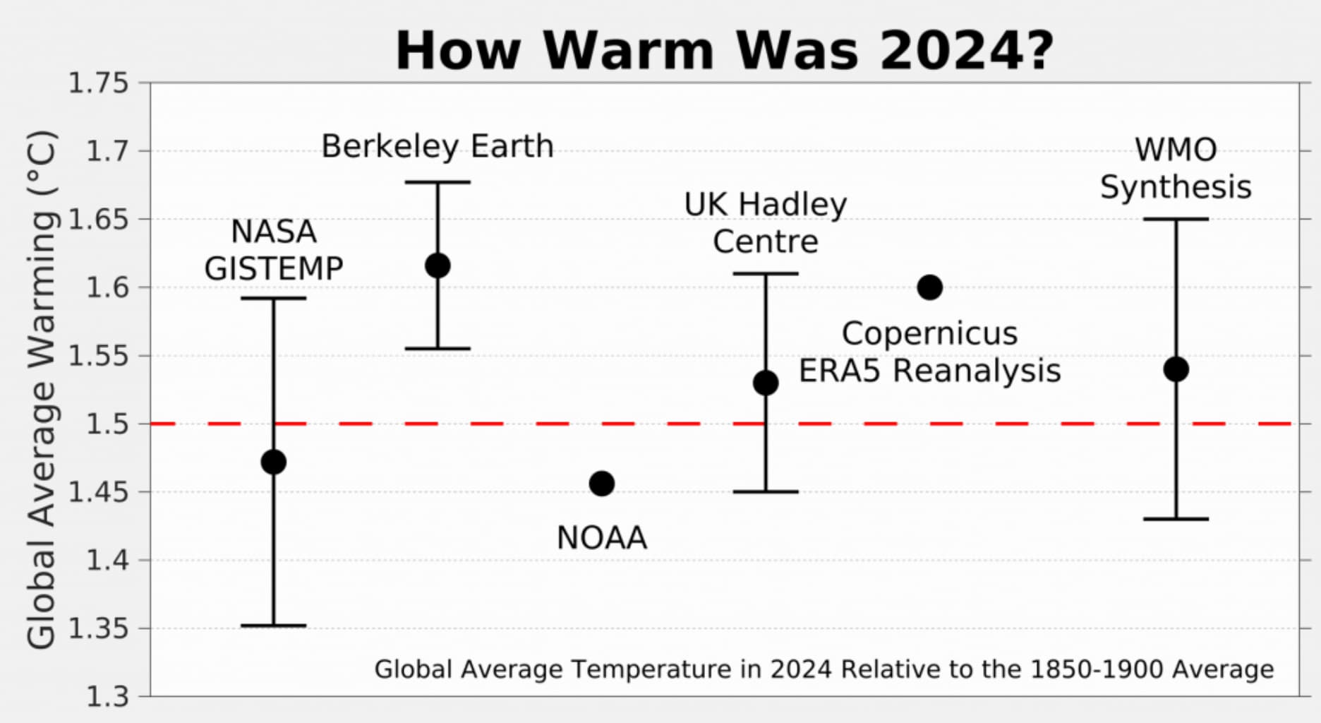
The figure below shows global surface temperature records from five different datasets: NASA, NOAA, the Met Office Hadley Centre/University of East Anglia’s (UEA) HadCRUT5, Berkeley Earth and Copernicus ERA5.
Other surface temperature datasets not shown – including JRA-3Q, the AIRS satellite data and the Japanese Meteorological Agency – also show 2024 as the warmest year on record.

Annual global average surface temperatures over 1850-2024. Data from NASA GISTEMP, NOAA GlobalTemp, Hadley/UEA HadCRUT5, Berkeley Earth and Copernicus ERA5. Temperature records are aligned over the 1981-2010 period and use the WMO approach to calculate warming relative to the pre-industrial (1850-1900) baseline. Chart by Carbon Brief.
Global surface temperature records can be calculated back to 1850, though some groups such as NASA GISTEMP choose to start their records in 1880 when more data was available.
Prior to 1850, records exist for some specific regions, but are not sufficiently widespread to calculate global temperatures with high accuracy (though work is ongoing to identify and digitise additional records to extend these further back in time).
These longer surface temperature records are created by combining ship- and buoy-based measurements of ocean sea surface temperatures with temperature readings of the surface air temperature from weather stations on land. (Copernicus ERA5 and JRA-3Q are an exception, as they use weather model-based reanalysis to combine lots of different data sources over time.)
Some differences between temperature records are apparent early in the record, particularly prior to 1900 when observations are more sparse and results are more sensitive to how different groups fill in the gaps between observations. However, there is strong agreement between the different temperature records for the period since 1970, as shown in the figure below.

Annual global average surface temperatures as in the prior chart, but showing the period from 1970-2024. Chart by Carbon Brief.
Global temperatures in 2024 clearly stand out as much warmer than anything that has come before, above even the exceptionally warm temperatures of 2023. This can be seen in the figure below from Berkeley Earth. Each shaded curve represents the annual average temperature for that year. The further that curve is to the right, the warmer it was.
The width of each year’s curve reflects the uncertainty in the annual temperature values, which is caused by factors such as changes in measurement techniques and the fact that some parts of the world have fewer measurement locations than others.

The year 2024 was the warmest on record for both the world’s land and ocean regions. Global average land temperatures were around 2.3C above pre-industrial levels in the Berkeley Earth dataset, while global ocean temperatures exceeded 1.1C.
The figure below shows land (red) and ocean (blue) temperatures along with their respective confidence intervals, relative to pre-industrial levels, in the Berkeley Earth surface temperature record.

Global land regions – where the global human population lives – has been warming around 70% faster than the oceans – and 40% faster than the global average in the years since 1970.
2024 started off quite hot, boosted by an El Niño event that peaked at the start of the year. The first six months of the year set new all-time monthly records, extending a run of 15 record-setting months that started in July 2023. The latter part of the year remained warm, and was only slightly exceeded by the exceptionally hot temperatures experienced in the second half of 2023.
The figure below shows each month of 2024 in black, compared to all prior years since 1940. Each year is coloured based on the decade in which it occurred, with the clear warming over time visible, as well as the margin by which both 2023 and 2024 exceeded past years.

Monthly global surface temperatures for each year since 1940, with anomalies shown relative to the pre-industrial 1850-1900 period using data from Copernicus/ECMWF ERA5. Chart by Carbon Brief.
First year above 1.5C in most records
In the 2015 Paris Agreement, countries agreed to work to limit global temperatures to “well below 2C” and to pursue efforts to limit the temperature increase to 1.5C above pre-industrial levels”.
While the agreement did not specifically define how to measure the breach of these climate targets, the goals have been widely interpreted (including by the IPCC) to refer to temperature averages over 20 years.
In other words, the limits refer to long-term warming, rather than an individual year that includes the short-term influence of natural fluctuations in the climate, such as El Niño.
However, a single year exceeding 1.5C still represents a grim milestone and a sign that the world is quickly approaching the target. And, in the majority of datasets in 2024, global surface temperatures exceeded 1.5C for the first time. (In the Berkeley Earth dataset, 2023 was actually the first year above 1.5C.)
| Temperature record | 2024 temperatures relative to preindustrial |
|---|---|
| NASA GISTEMP | 1.47C |
| Hadley/UAE HadCRUT5 | 1.53C |
| NOAA GlobalTemp | 1.46C |
| Berkeley Earth | 1.62C |
| Copernicus/ECMWF | 1.60C |
| JRA-3Q | 1.59C |
| Japanese Meteorological Agency | 1.52C |
Global temperature anomalies for 2024 relative to pre-industrial temperatures (1850-1900).
NOAA and NASA were the only organisations to report global temperatures below 1.5C – and by just a few hundredths of a degree. Berkeley Earth, Copernicus and JRA-3Q all estimated that temperatures were around 1.6C.
This year, the World Meteorological Organization (WMO) provided a synthesis of the different global surface temperature records – incorporating NASA, Hadley, NOAA, Berkeley, Copernicus and JRA-3Q data – which is a useful tool to provide a best-estimate across the different groups. It finds that 2024 was the first year above 1.5C, coming in at 1.55C compared to 1.45C in 2023.
The figure below shows various temperature records along with their published uncertainty range (where available), alongside the WMO synthesis estimate.
As noted earlier, these datasets are nearly identical over the past 50 years. Differences in warming relative to pre-industrial levels emerge earlier in the record, particularly prior to 1900 when observations are more sparse and the choice of how to fill in the gaps between observations has a large impact on the resulting temperature estimate.
The figure below shows how different temperature records look if each is calculated relative to its own pre-industrial baseline, rather than using an average pre-industrial baseline as shown in the prior section. Focusing on warming since pre-industrial levels – rather than more recent warming – magnifies differences between groups, with the variation in warming across groups largely due to the most uncertain early part of the record.

Ocean heat content sets another record
Last year was the warmest on record for the heat content of the world’s oceans. Ocean heat content (OHC) has increased by around 484 zettajoules – a billion trillion joules – since the 1940s. The heat increase in 2024 alone compared to 2023 – about 16 zettajoules – is around 25 times as much as the total energy produced by all human activities on Earth in 2023 (the latest year in which global primary energy statistics are available).
Human-emitted greenhouse gases trap extra heat in the atmosphere. While some of this warms the Earth’s surface, the vast majority – around of 93% – goes into the oceans. About two-thirds of this accumulates in the top 700 metres, but some also ends up in the deep oceans.
The figure below shows annual OHC estimates between 1950 and present for the upper 700 metres (light blue shading) and 700-2,000 metres (dark blue) of the ocean.
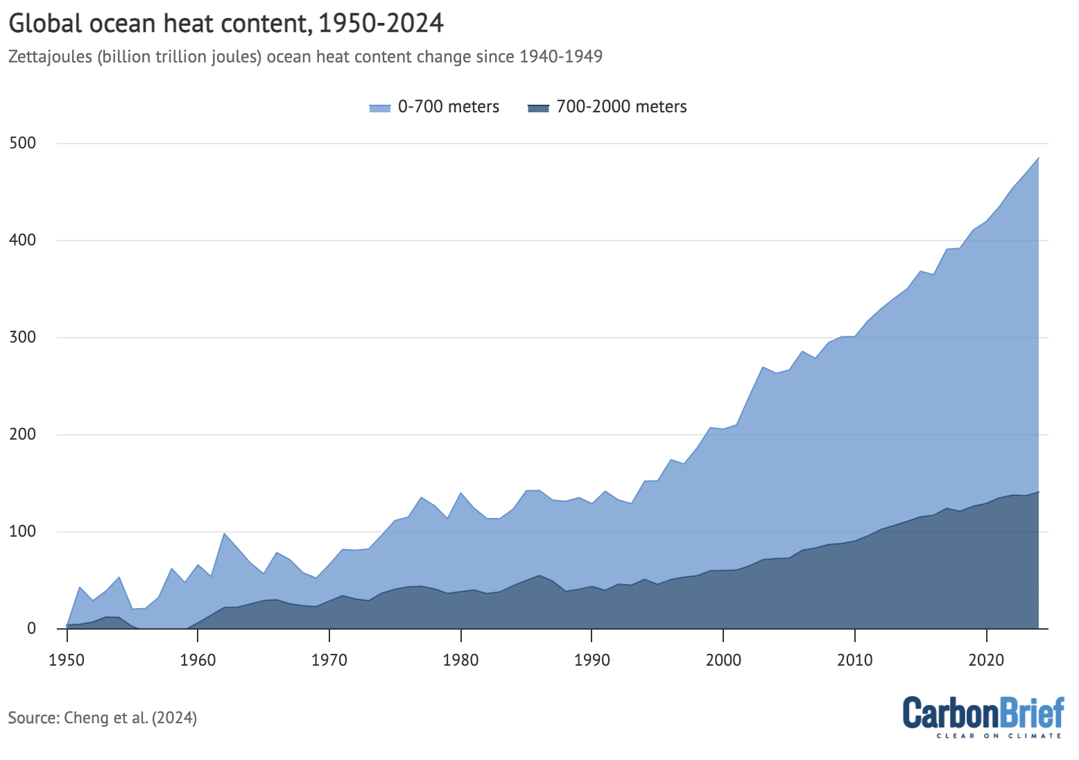
Annual global ocean heat content (in zettajoules – billion trillion joules, or 10^21 joules) for the 0-700 metre and 700-2,000 metre layers. Data from Cheng et al. (2024). Chart by Carbon Brief.
In many ways, OHC represents a much better measure of climate change than global average surface temperatures, because it is where most of the extra heat ends up and is much less variable on a year-to-year basis than surface temperatures.
The graph above shows a distinct acceleration in OHC after 1991, matching the increased rate of greenhouse gas emissions and other radiative forcing elements over the past few decades.
A year of climate extremes
While media coverage of 2024 temperatures has largely focused on the global average, many different regions of the planet experienced climate extremes.
The figure below shows global temperature anomalies in 2024 across the world, with the red areas warmer than the baseline period (1951-80) used by Berkeley Earth and the (few) blue areas experiencing cooler temperatures.
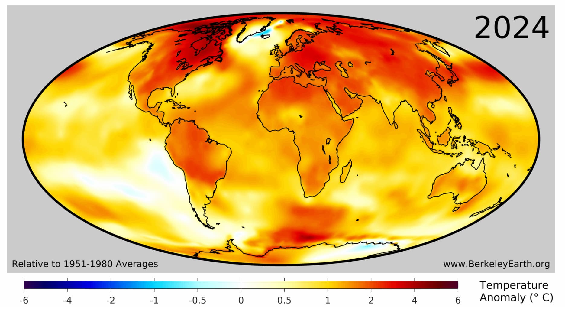
Approximately 3.3 billion people – 40% of Earth’s population – live in places that experienced their warmest year on record in 2024. This was concentrated in Asia, South and Central America, Africa, and Eastern Europe. It also includes two-thirds of the population of China, as well as most of the population of Brazil, Nigeria, Ethiopia, Mexico and one-third of the population of the US.
The figure below highlights regions of the planet that experienced their top-five warmest (red shading) or coldest (blue) temperatures on record in 2024. Overall, around 24% of the planet set a new record, including 32% of the land and 21% of the ocean. No location on the planet experienced record cold temperatures (or even top-five record cold temperatures) for the year as a whole.
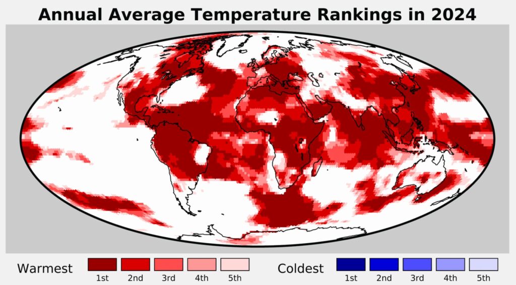
In 2024, more than 100 countries saw their warmest year on record, as listed in the table below.
| Africa | Asia | Europe | North America | Oceania | South America |
|---|---|---|---|---|---|
| Algeria Cameroon Central African Republic Chad Comoros Democratic Republic of the Congo Djibouti Equatorial Guinea Eritrea Ethiopia Gabon Ghana Guinea Guinea-Bissau Ivory Coast Kenya Liberia Libya Malawi Mozambique Republic of the Congo Sao Tome and Principe Seychelles Sierra Leone Somalia South Sudan Togo Tunisia Uganda Zambia Zimbabwe |
Brunei Cambodia China Indonesia Laos Malaysia Mongolia North Korea Oman Palau Philippines Singapore South Korea Sri Lanka Taiwan Thailand Vietnam Yemen |
Albania Austria Belarus Bosnia and Herzegovina Bulgaria Croatia Cyprus Czechia Germany Greece Hungary Italy Kosovo Liechtenstein Lithuania Malta Moldova Montenegro Netherlands Poland San Marino Republic of Serbia Romania Slovakia Slovenia Ukraine |
Antigua and Barbuda Barbados Belize Canada Dominica El Salvador Grenada Guatemala Haiti Honduras Jamaica Mexico Nicaragua Saint Kitts and Nevis Saint Lucia Saint Vincent and the Grenadines Trinidad and Tobago |
Federated States of Micronesia Fiji Kiribati Samoa Solomon Islands |
Brazil Colombia Guyana Paraguay Suriname Venezuela |
While the contiguous US saw record warmth, 2024 was the country’s second-warmest year on record once Alaska and Hawaii temperatures are included.
Furthermore, the continents of North America, South America, Asia, Africa and Europe each set new annual average records in 2024.
Untangling the drivers of spiking global temperatures
Global temperatures spiked in both 2023 and 2024 in a manner that scientists had not anticipated. Projections of 2023 temperatures were far below what actually occurred, and even 2024 projections ended up being on the lower end, despite incorporating 2023’s extremes.
The figure below shows estimates by four different groups that provided temperature predictions for the year prior to any data being collected – the UK Met Office, NASA’s Dr Gavin Schmidt, Berkeley Earth and Carbon Brief’s own estimate.
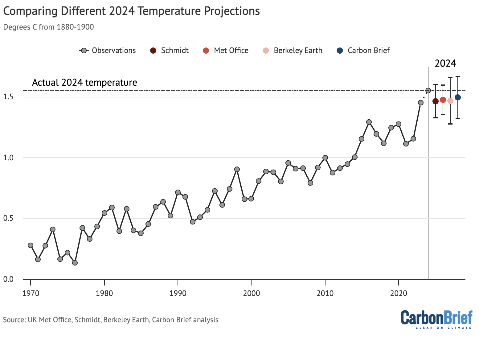
Temperature predictions for 2024 from the UK Met Office, NASA’s Dr Gavin Schmidt, Berkeley Earth, and Carbon Brief relative to pre-industrial (1850-1900) temperatures and compared to the historical average of six different datasets produced by the WMO. Chart by Carbon Brief.
Unusually high global temperatures in 2023 and 2024 have sparked a slew of new studies by scientists attempting to explain the excessive heat. A range of possible causes has been proposed, including:
- The possibility that El Niño behaved unusually as it followed a rare extended triple-dip La Niña event. A 2024 paper found that when El Niño followed an extended La Niña in climate model simulations, it produced a temperature spike commensurate to what was observed in 2023-24 around 10% of the time.
- A decline in emissions of sulphur dioxide, reducing atmospheric aerosol concentrations and “unmasking” additional warming from past human greenhouse gas emissions. Multiple different papers have looked at the effects of a 2020 low-sulphur marine shipping fuel regulation, and ongoing research is looking at the effects of a sharp drop in sulphur emissions in China.
- An unusual 2022 eruption of the Hunga-Tonga Hunga Ha’apai volcano that put around 150m tonnes of water vapour into the stratosphere, as well as some sulphur dioxide. Papers have been mixed on whether the water vapour warming or the sulphur dioxide cooling would be larger.
- Other factors include an uptick in the 11-year solar cycle, and unusually low Saharan dust concentrations in early summer 2023.
One notable paper, published in the journal Science in early December 2024, found a substantial decline in reflective low-cloud cover in the northern mid-latitudes and tropics. They noted that this has the effect of increasing the amount of solar radiation that reaches the Earth’s surface and is re-radiated as heat.
The finding by itself does not reveal what caused a decline in cloud reflectivity, and the authors note that it could be a combination of natural variability, declining atmospheric aerosol concentrations associated with falling sulfur emissions, or – more worryingly – a sign of a strong positive cloud feedback associated with warming.
The figure below, created by Dr Robert Rohde at Berkeley Earth, synthesises the main drivers of temperature change over the past decade. It includes estimates of the warming contribution from human greenhouse gas emissions, El Niño and La Niña, changes in the solar cycle, the Hunga-Tonga eruption, and the 2020 low-sulphur marine fuel regulations. For the latter two elements, it includes a range of six published estimates of the eruption and five published estimates of the low sulphur fuel rules.
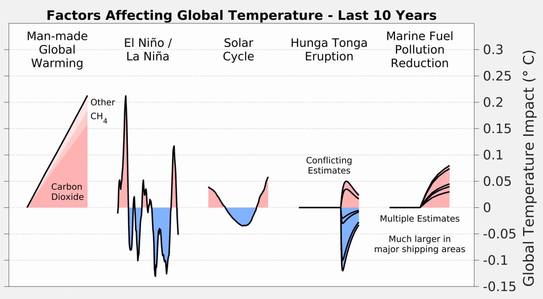
Over the longer-term, human emissions of CO2 and other greenhouse gases alongside planet-cooling aerosols are the main driver of global temperatures. Global temperatures have risen by more than 1.3C since pre-industrial times as a result of human activity.
However, on top of long-term warming, global temperatures vary year-to-year by up to 0.2C.
These variations are primarily driven by El Niño and La Niña events that redistribute heat between the atmosphere and oceans. However, other factors such as volcanic eruptions, the 11-year solar cycle and changes in short-lived climate forcers can influence year-to-year temperature changes.
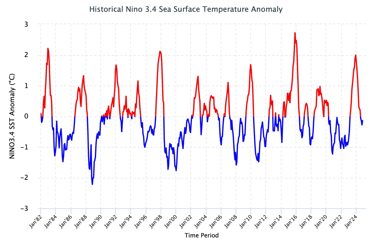
The figure below shows the El Niño (red shading) and La Niña (blue) conditions over the past 40 years (collectively referred to as the El Niño-Southern Oscillation, or “ENSO”). While not unprecedented, the extended La Niña conditions since the latter half of 2020 have extended for an unusually long period of time.
Carbon Brief has used this historical relationship between ENSO conditions and temperature to effectively remove the effects of El Niño and La Niña events from global temperatures, as shown in the figure below.
This analysis indicates that El Niño boosted global temperatures in 2024 by around 0.16C compared to the estimate of global temperatures with both El Niño and La Niña events removed. This was a much larger effect than the 0.04C estimated for 2023, when El Niño emerged relatively late in the year and peaked in November.
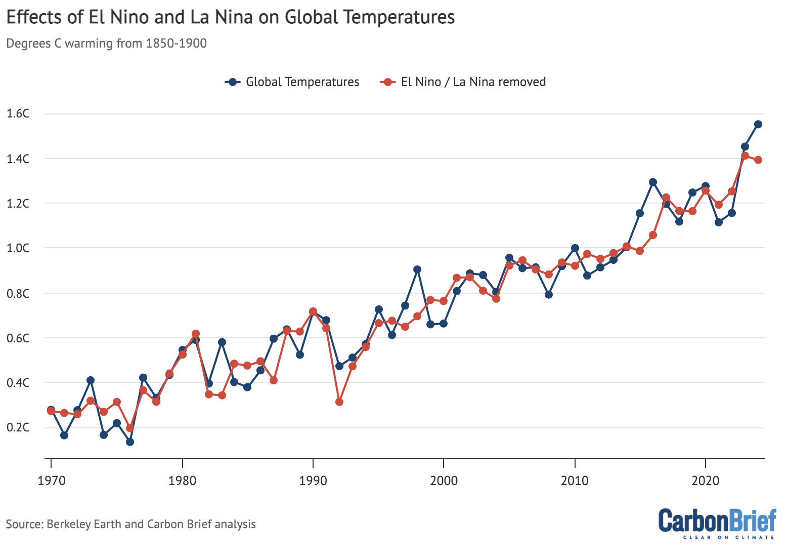
Annual global average surface temperatures from the WMO average of six different datasets , as well as Carbon Brief’s estimate of global temperatures with the effect of El Niño and La Niña (ENSO) events removed using the Foster and Rahmstorf (2011) approach. Chart by Carbon Brief.
However, this approach – which relies on a historical lag of around three months between peak ENSO conditions in the tropical Pacific and global surface temperature response – may not fully reflect El Niño effects on 2023. As discussed earlier, the fact that El Niño occurred on the heels of unusually-long La Niña conditions may have contributed to an earlier global temperature response than has been seen in other recent strong El Niño events.
Observations broadly in line with climate model projections
Climate models provide physics-based estimates of future warming given different assumptions about future emissions, greenhouse gas concentrations and other climate-influencing factors.
Here, Carbon Brief examines a collection of climate models – known as CMIP6 – used in the 2021 science report of the IPCC’s sixth assessment. In CMIP6, model estimates of temperatures prior to 2015 are a “hindcast” using known past climate influences, while temperatures projected from 2015 onward are a “forecast” based on an estimate of how things might change.
The figure below shows how observations compare to the full ensemble of 37 CMIP6 models (under the middle-of-the-road SSP2-4.5 emissions scenario for future projections). The blue line represents the average of all the models and the grey areas showing the 5th to 95th percentile range. Observational temperatures are plotted on top of the climate model data, with individual observational records represented by red lines of different shades.
The chart illustrates how observations have generally been below the model average over the past two decades and are slightly above model average in 2024.
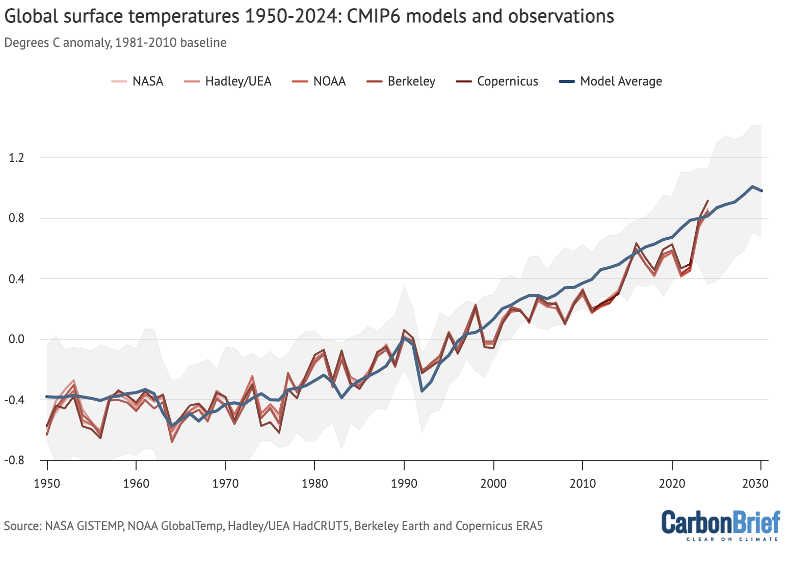
Annual global average surface temperatures from CMIP6 models and observations between 1950 and 2030 (through 2024 for observations). Models use the SSP2-4.5 scenario after 2015. Anomalies plotted with respect to a 1981-2010 baseline. Chart by Carbon Brief.
The CMIP6 ensemble is marginally more challenging for this comparison than past generations of CMIP because a subset of its models have unrealistically high climate sensitivity and they reproduce historical observations poorly. To account for this, rather than simply averaging all the models – as had been done in prior assessments – the IPCC employed an approach that effectively weights models by their performance. As a result, the models align better with the range of climate sensitivity derived from multiple different lines of evidence.
In the chart below, the blue line shows the average of 22 different models whose transient climate response (TCR) falls within the IPCC’s “likely” range (which results in temperature projections nearly identical to the IPCC-assessed warming). The grey area shows the 95% (two standard deviation) range of the TCR-screened model projections.
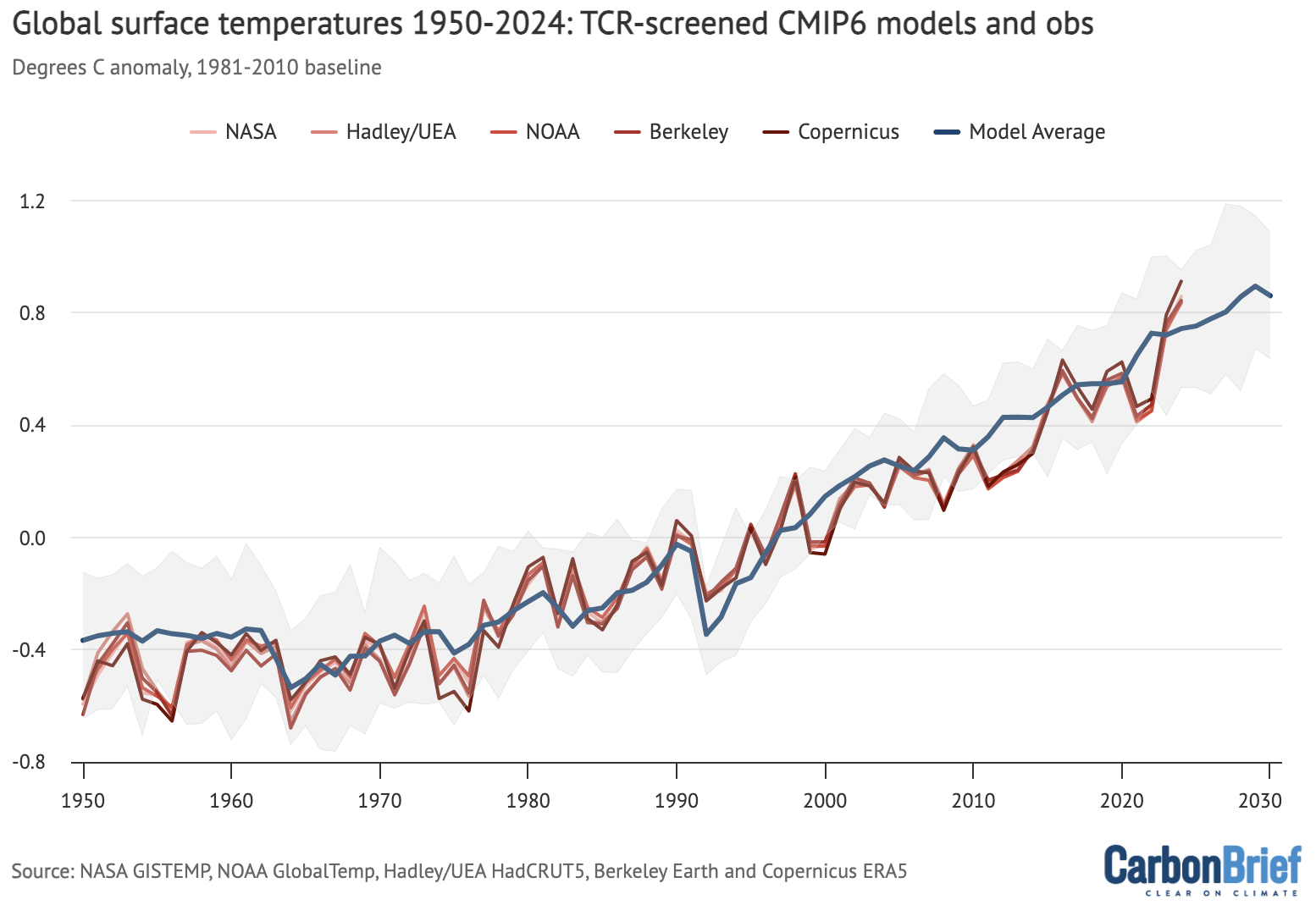
CMIP6 models compared to observations as in the prior chart, but models are screened to only include those models with a transient climate response (TCR) in-line with the IPCC’s “likely” range as discussed in Hausfather et al (2022). Anomalies plotted with respect to a 1981-2010 baseline. Chart by Carbon Brief.
The chart reveals that observed global surface temperatures (red lines) are further above the multimodal average, but remain well within the range of TCR-screened model runs.
This might be surprising given the focus on 2023 and 2024 being unusually warm. However, climate models broadly expect an acceleration of warming in the current period in a scenario like SSP2-4.5 where emissions of CO2 and other greenhouse gases continue to modestly increase, but emissions of planet-cooling aerosols like sulphur dioxide are rapidly reduced.
Record atmospheric temperatures
In addition to surface measurements over the world’s land and oceans, satellite microwave sounding units have been providing estimates of temperatures at various layers of the atmosphere since 1979.
The lowest layer of the atmosphere that satellite microwave units provide temperature estimates for is the lower troposphere. This data reflects temperatures a few kilometres above the Earth’s surface. It reveals a pattern of warming in the lowest troposphere that is similar – though not identical – to surface temperature changes.
The records produced by Remote Sensing Systems (RSS), the University of Alabama, Huntsville (UAH) and NOAA show 2024 as the warmest year on record in the lower troposphere. The chart below shows the three records for the lower troposphere.
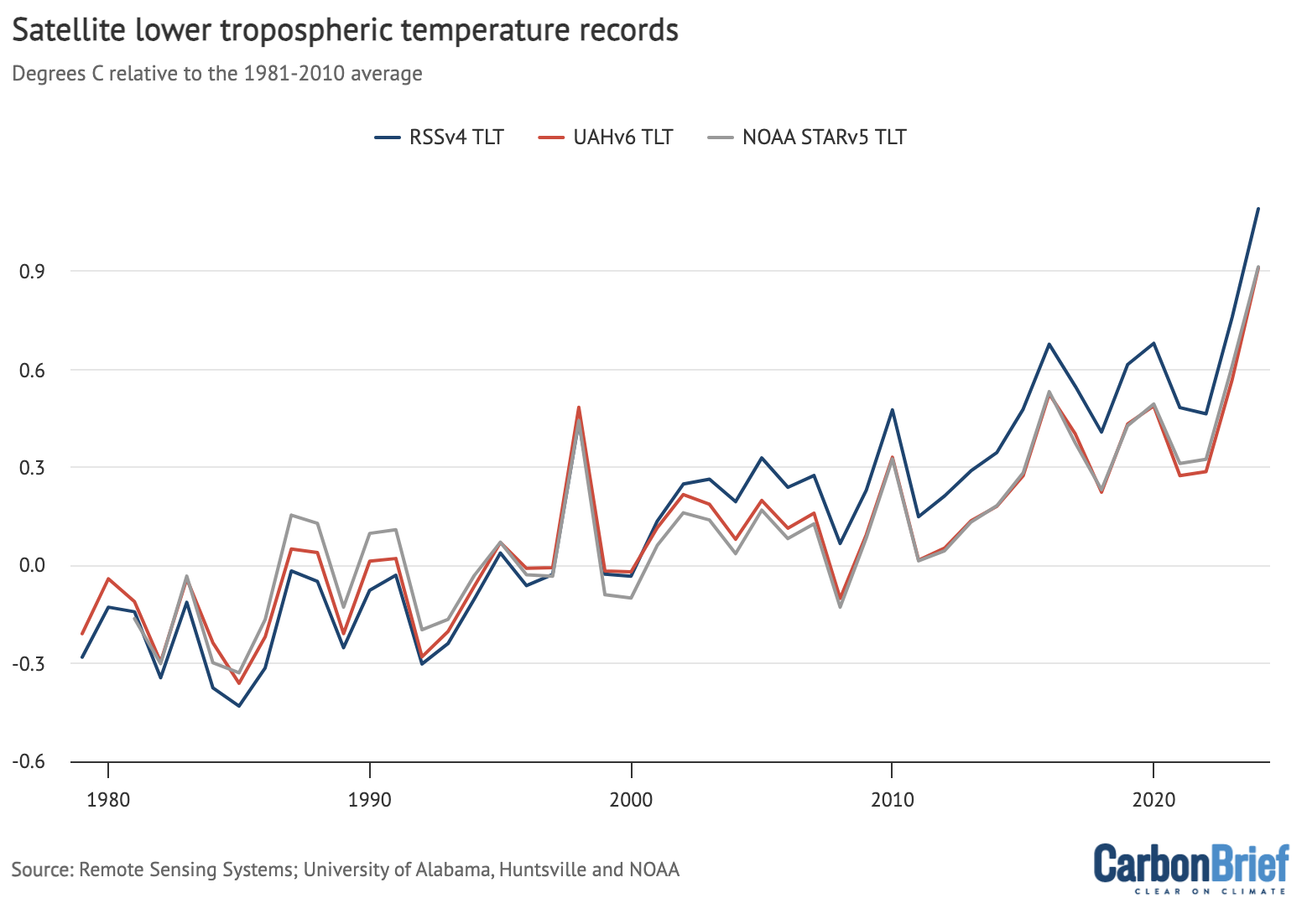
Global average lower-troposphere temperatures from RSS version 4 (blue), UAH version 6 (red) and NOAA STAR version 5 (grey) for the period from 1979-2024, relative to a 1981-2010 baseline. Chart by Carbon Brief.
The lower troposphere tends to be influenced more strongly by El Niño and La Niña events than the surface. Therefore, satellite records show correspondingly larger warming or cooling spikes during these events. This explains why the year-on-year increase in lower-troposphere temperature – of around 0.3C – seen in 2024 is larger than the ~0.1C increase in surface records.
The lower-tropospheric temperature records show large differences after the early 2000s. RSS shows an overall rate of warming quite similar to surface temperature records, while UAH and NOAA show considerably slower warming in recent years than has been observed on the surface.
Greenhouse gas concentrations reach new highs
Greenhouse gas concentrations reached a new high in 2024, driven by human emissions from fossil fuels, land use and agriculture.
Three greenhouse gases – CO2, methane (CH4) and nitrous oxide (N2O) – are responsible for the bulk of additional heat trapped by human activities. CO2 is by far the largest factor, accounting for roughly 42% of the increase in global surface temperatures since the pre-industrial era (1850-1900).
Methane accounts for 28%, while nitrous oxide accounts for around 5%. The remaining 25% comes from other factors including carbon monoxide, black carbon and halocarbons, such as CFCs.
Human emissions of greenhouse gases have increased atmospheric concentrations of CO2, methane and nitrous oxide to their highest levels in at least a few million years – if not longer.
The figure below shows concentrations of these greenhouse gases – in parts per million (ppm) for CO2 and parts per billion (ppb) for methane and nitrous oxide – from the early 1980s through to October 2024 for CO2 and September 2024 for CH4 and N2O (the most recent data currently available).

Global concentrations of CO2, methane (CH4) and nitrous oxide (N2O). Based on data from NOAA’s Earth Systems Research Laboratory. Note that the y-axes do not start at zero. Chart by Carbon Brief.
Sea level rise is speeding up
Modern-day sea levels have risen to a new high, due to a combination of melting land ice (such as glaciers and ice sheets), the thermal expansion of water as it warms and changes in land water storage.
In recent years, there have been larger contributions to sea level rise from melting ice sheets and glaciers, as warmer temperatures accelerate ice sheet losses in Greenland and Antarctica.
Since the early 1990s, the increase in global sea level has been estimated using altimeter data from satellites. Earlier global sea levels have been reconstructed from a network of global tide gauge measurements. This allows researchers to estimate how sea level has changed since the late 1800s.
The chart below shows five different modern sea level rise datasets (blue lines), along with satellite altimeter measurements as assessed by NASA (in black) after 1993. (As sea level rise data has not yet been released for the whole year, the 2024 value is estimated based on data through to October.)

Global average sea level rise reconstructed from tide gauge data between 1880 and 2024 from Frederikse et al 2020, Dangendorf et al 2019, Hay et al 2015, Church and White 2011, and Palmer et al 2021. Satellite altimeter data from 1993 (black) to present is taken from NASA. Chart by Carbon Brief.
Sea levels have risen by over 0.2 metres (200mm) since 1900. While sea level rise estimates mostly agree in recent decades, larger divergences are evident before 1980. There is also evidence of accelerating sea level rise over the post-1993 period when high-quality satellite altimetry data is available. (See Carbon Brief’s explainer on how climate change is accelerating sea level rise.)
Shrinking glaciers and ice sheets
A significant portion of global sea level rise is being driven by melting glaciers on land. Scientists measure the mass of glaciers around the world using a variety of remote-sensing techniques, as well as through GRACE measurements of the Earth’s gravitational field. The balance between snow falling on a glacier and ice loss through melting and the breaking off – or “calving” – of icebergs determines if glaciers grow or shrink over time.
The World Glacier Monitoring Service is an international consortium that tracks more than 130 different glaciers in 19 different regions around the world. The figure below shows the change in global average glacier mass from 1950 through to the end of 2023. (2024 values are not yet available.) Note that glacier melt is reported in metres of water equivalent, which is a measure of how much mass has been lost on average.

Global average glacier melt over the 1950-2023 period from the World Glacier Monitoring Service, in metres of water equivalent. Carbon Brief.
Greenland ice sheets have become a larger contributor to sea level rise in recent years due to accelerating loss of mass. The year 2024 was the 28th in a row where Greenland lost ice overall, with 80bn tonnes of ice lost over the 12 months from September 2023 to August 2024. Greenland last saw an annual net gain of ice in 1996.
The figure below shows the cumulative mass balance change – that is, the net ice loss – from Greenland between 1970 and October 2024. The authors find that Greenland has lost around 6tn tonnes of ice over the past 50 years – more than 700 tonnes lost per person for every person on the planet.

Cumulative ice loss from Greenland in billion metric tonnes (gigatonnes) between 1970 and 2024 from Mankoff et al 2021, updated through December 2024. Chart by Carbon Brief.
Near-record low Antarctic sea ice extent
Arctic sea ice was at the low end of the historical (1979-2010) range for most of 2024, but did not set any new all-time low records apart from a few individual days at the end of the year.
The summer minimum extent – the lowest recorded level for the year – was the seventh-lowest since records began in the late 1970s.
Antarctic sea ice, on the other hand, was the second lowest on record – after 2023 – for much of the year. Taken together, 2023 and 2024 Antarctic sea ice extent was “way outside anything we have witnessed in our satellite record for their winter months”, an expert told Carbon Brief in October last year.
While long-term trends in Antarctic sea ice have been ambiguous in the past (unlike in the Arctic where there is a consistent long-term decline), there is increasing evidence that human-driven warming is starting to drive significant loss of sea ice in the region.
The figure below shows both Arctic (red line) and Antarctic (blue line) sea ice extent for each day of the year, along with how it compares to the historical range (corresponding shading).
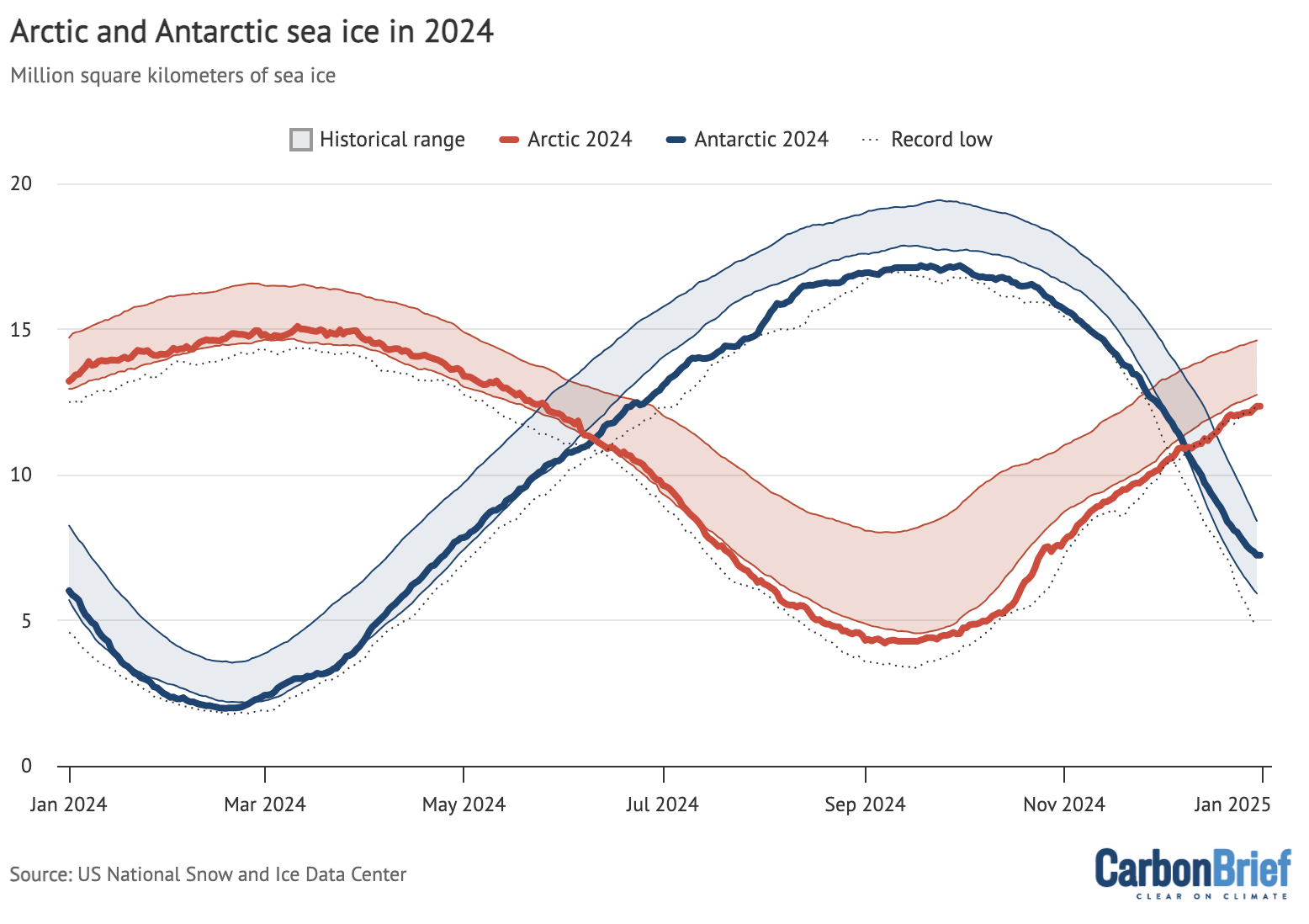
Arctic and Antarctic daily sea ice extent from the US National Snow and Ice Data Center. The bold lines show daily 2024 values, the shaded area indicates the two standard deviation range in historical values between 1979 and 2010. The dotted black lines show the record lows for each pole. Chart by Carbon Brief.
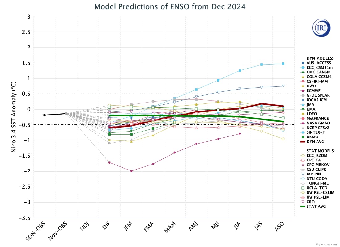
Looking ahead to 2025
There is reason for caution when estimating likely temperatures for 2025. In 2023, temperatures were significantly higher than predictions made at the start of the year, while 2024 temperatures were towards the high end of annual predictions.
At the same time, there is strong reason to expect that 2025 will be cooler than 2024. As noted earlier, 2024 temperatures were boosted by more than 0.1C by a strong El Niño event that has largely faded by the start of 2025. While global land temperatures remain quite elevated, sea surface temperatures have begun to fall in recent months, and weak La Niña conditions are starting to develop in the tropical Pacific.
It seems unlikely that a strong La Niña will develop in 2025, and it is quite possible that the world remains in ENSO neutral conditions with no formal La Niña being declared for the first half of the year. There is even a small chance that the world will re-enter El Niño conditions by the latter part of 2025 – though most models forecast neutral conditions to persist, as shown in the figure below.
There have been four published predictions – from the UK Met Office, NASA’s Dr Gavin Schmidt, Berkeley Earth and Carbon Brief (in this article) – of what temperatures might look like in 2025.
The figure below shows the four different 2025 predictions compared to the average of six different temperature records (NASA, NOAA, Hadley, Berkeley, Copernicus and the Japanese JRA-3Q reanalysis) used by the World Meteorological Organization (WMO). These have been “normalised” to show 2025 warming relative to 2024 in the WMO dataset. This is to remove any differences in predictions due to divergences in the baselines used by different temperature records.
Carbon Brief’s prediction of likely 2025 temperatures is based on a statistical model using the average temperature of the past year, the latest monthly temperature and projections of ENSO conditions over the first three months of 2025.
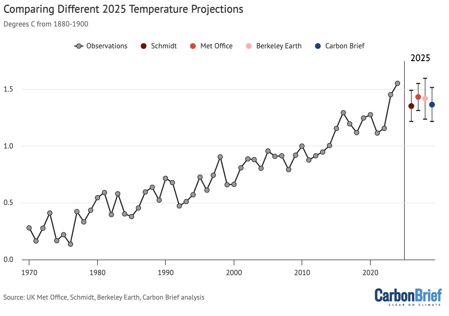
Temperature projections for 2025 from the UK Met Office, NASA’s Dr Gavin Schmidt, Berkeley Earth and Carbon Brief, relative to pre-industrial (1850-1900) temperatures and compared to the historical average of six different datasets produced by the WMO. Chart by Carbon Brief.
The Met Office, Dr Schmidt, Berkeley Earth and Carbon Brief estimates all have 2025 most likely ending up as the third-warmest year on record, after 2024 and 2023. However, it is still possible that it could be as high as the second-warmest year or as low as the sixth-warmest year, depending on how global temperatures evolve in the coming months.
Against a 1880-99 pre-industrial baseline, the central estimate of all four forecasts for 2025 is around 1.4C warming, with the world relatively unlikely to top 1.5C again next year.
Ultimately, what matters for the climate is not the leaderboard of individual years. Rather, it is the long-term upward trend in global temperatures driven by human emissions of greenhouse gases. Until the world reduces emissions down to net-zero, the planet will continue to warm.
If global emissions remain on the current trajectory, the world will likely firmly pass 1.5C in the late 2020s or early 2030s, as shown in the figure below.
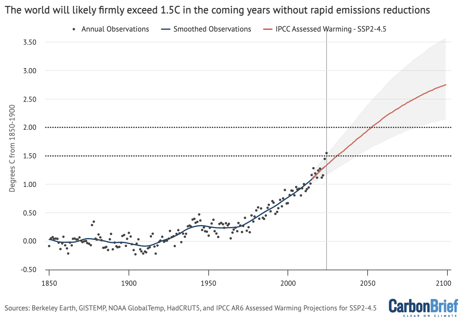
Annual global average surface temperatures from the composite average (black dots) along the 30-year LOWESS fit (red line), combined the AR6 assessed warming projection for SSP2-4.5 as published and without any baseline alignment. Chart by Carbon Brief.


The post State of the climate: 2024 sets a new record as the first year above 1.5C appeared first on Carbon Brief.
State of the climate: 2024 sets a new record as the first year above 1.5C
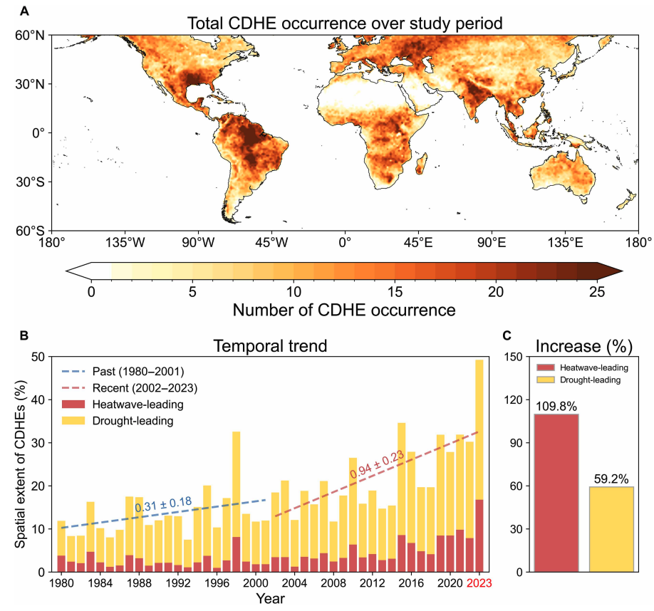
Drought and heatwaves occurring together – known as “compound” events – have “surged” across the world since the early 2000s, a new study shows.
Compound drought and heat events (CDHEs) can have devastating effects, creating the ideal conditions for intense wildfires, such as Australia’s “Black Summer” of 2019-20 where bushfires burned 24m hectares and killed 33 people.
The research, published in Science Advances, finds that the increase in CDHEs is predominantly being driven by events that start with a heatwave.
The global area affected by such “heatwave-led” compound events has more than doubled between 1980-2001 and 2002-23, the study says.
The rapid increase in these events over the last 23 years cannot be explained solely by global warming, the authors note.
Since the late 1990s, feedbacks between the land and the atmosphere have become stronger, making heatwaves more likely to trigger drought conditions, they explain.
One of the study authors tells Carbon Brief that societies must pay greater attention to compound events, which can “cause severe impacts on ecosystems, agriculture and society”.
Compound events
CDHEs are extreme weather events where drought and heatwave conditions occur simultaneously – or shortly after each other – in the same region.
These events are often triggered by large-scale weather patterns, such as “blocking” highs, which can produce “prolonged” hot and dry conditions, according to the study.
Prof Sang-Wook Yeh is one of the study authors and a professor at the Ewha Womans University in South Korea. He tells Carbon Brief:
“When heatwaves and droughts occur together, the two hazards reinforce each other through land-atmosphere interactions. This amplifies surface heating and soil moisture deficits, making compound events more intense and damaging than single hazards.”
CDHEs can begin with either a heatwave or a drought.
The sequence of these extremes is important, the study says, as they have different drivers and impacts.
For example, in a CDHE where the heatwave was the precursor, increased direct sunshine causes more moisture loss from soils and plants, leading to a drought.
Conversely, in an event where the drought was the precursor, the lack of soil moisture means that less of the sun’s energy goes into evaporation and more goes into warming the Earth’s surface. This produces favourable conditions for heatwaves.
The study shows that the majority of CDHEs globally start out as a drought.
In recent years, there has been increasing focus on these events due to the devastating impact they have on agriculture, ecosystems and public health.
In Russia in the summer of 2010, a compound drought-heatwave event – and the associated wildfires – caused the death of nearly 55,000 people, the study notes.

The record-breaking Pacific north-west “heat dome” in 2021 triggered extreme drought conditions that caused “significant declines” in wheat yields, as well as in barley, canola and fruit production in British Columbia and Alberta, Canada, says the study.
Increasing events
To assess how CDHEs are changing, the researchers use daily reanalysis data to identify droughts and heatwaves events. (Reanalysis data combines past observations with climate models to create a historical climate record.) Then, using an algorithm, they analyse how these events overlap in both time and space.
The study covers the period from 1980 to 2023 and the world’s land surface, excluding polar regions where CDHEs are rare.
The research finds that the area of land affected by CDHEs has “increased substantially” since the early 2000s.
Heatwave-led events have been the main contributor to this increase, the study says, with their spatial extent rising 110% between 1980-2001 and 2002-23, compared to a 59% increase for drought-led events.
The map below shows the global distribution of CDHEs over 1980-2023. The charts show the percentage of the land surface affected by a heatwave-led CDHE (red) or a drought-led CDHE (yellow) in a given year (left) and relative increase in each CDHE type (right).
The study finds that CDHEs have occurred most frequently in northern South America, the southern US, eastern Europe, central Africa and south Asia.
Threshold passed
The authors explain that the increase in heatwave-led CDHEs is related to rising global temperatures, but that this does not tell the whole story.
In the earlier 22-year period of 1980-2001, the study finds that the spatial extent of heatwave-led CDHEs rises by 1.6% per 1C of global temperature rise. For the more-recent period of 2022-23, this increases “nearly eightfold” to 13.1%.
The change suggests that the rapid increase in the heatwave-led CDHEs occurred after the global average temperature “surpasse[d] a certain temperature threshold”, the paper says.
This threshold is an absolute global average temperature of 14.3C, the authors estimate (based on an 11-year average), which the world passed around the year 2000.
Investigating the recent surge in heatwave-leading CDHEs further, the researchers find a “regime shift” in land-atmosphere dynamics “toward a persistently intensified state after the late 1990s”.
In other words, the way that drier soils drive higher surface temperatures, and vice versa, is becoming stronger, resulting in more heatwave-led compound events.
Daily data
The research has some advantages over other previous studies, Yeh says. For instance, the new work uses daily estimations of CDHEs, compared to monthly data used in past research. This is “important for capturing the detailed occurrence” of these events, says Yeh.
He adds that another advantage of their study is that it distinguishes the sequence of droughts and heatwaves, which allows them to “better understand the differences” in the characteristics of CDHEs.
Dr Meryem Tanarhte is a climate scientist at the University Hassan II in Morocco, and Dr Ruth Cerezo Mota is a climatologist and a researcher at the National Autonomous University of Mexico. Both scientists, who were not involved in the study, agree that the daily estimations give a clearer picture of how CDHEs are changing.
Cerezo-Mota adds that another major contribution of the study is its global focus. She tells Carbon Brief that in some regions, such as Mexico and Africa, there is a lack of studies on CDHEs:
“Not because the events do not occur, but perhaps because [these regions] do not have all the data or the expertise to do so.”
However, she notes that the reanalysis data used by the study does have limitations with how it represents rainfall in some parts of the world.
Compound impacts
The study notes that if CDHEs continue to intensify – particularly events where heatwaves are the precursors – they could drive declining crop productivity, increased wildfire frequency and severe public health crises.
These impacts could be “much more rapid and severe as global warming continues”, Yeh tells Carbon Brief.
Tanarhte notes that these events can be forecasted up to 10 days ahead in many regions. Furthermore, she says, the strongest impacts can be prevented “through preparedness and adaptation”, including through “water management for agriculture, heatwave mitigation measures and wildfire mitigation”.
The study recommends reassessing current risk management strategies for these compound events. It also suggests incorporating the sequences of drought and heatwaves into compound event analysis frameworks “to enhance climate risk management”.
Cerezo-Mota says that it is clear that the world needs to be prepared for the increased occurrence of these events. She tells Carbon Brief:
“These [risk assessments and strategies] need to be carried out at the local level to understand the complexities of each region.”


The post Heatwaves driving recent ‘surge’ in compound drought and heat extremes appeared first on Carbon Brief.
Heatwaves driving recent ‘surge’ in compound drought and heat extremes
Greenhouse Gases
DeBriefed 6 March 2026: Iran energy crisis | China climate plan | Bristol’s ‘pioneering’ wind turbine
Welcome to Carbon Brief’s DeBriefed.
An essential guide to the week’s key developments relating to climate change.
This week
Energy crisis
ENERGY SPIKE: US-Israeli attacks on Iran and subsequent counterattacks across the Middle East have sent energy prices “soaring”, according to Reuters. The newswire reported that the region “accounts for just under a third of global oil production and almost a fifth of gas”. The Guardian noted that shipping traffic through the strait of Hormuz, which normally ferries 20% of the world’s oil, “all but ground to a halt”. The Financial Times reported that attacks by Iran on Middle East energy facilities – notably in Qatar – triggered the “biggest rise in gas prices since Russia’s full-scale invasion of Ukraine”.
‘RISK’ AND ‘BENEFITS’: Bloomberg reported on increases in diesel prices in Europe and the US, speculating that rising fuel costs could be “a risk for president Donald Trump”. US gas producers are “poised to benefit from the big disruption in global supply”, according to CNBC. Indian government sources told the Economic Times that Russia is prepared to “fulfil India’s energy demands”. China Daily quoted experts who said “China’s energy security remains fundamentally unshaken”, thanks to “emergency stockpiles and a wide array of import channels”.
‘ESSENTIAL’ RENEWABLES: Energy analysts said governments should cut their fossil-fuel reliance by investing in renewables, “rather than just seeking non-Gulf oil and gas suppliers”, reported Climate Home News. This message was echoed by UK business secretary Peter Kyle, who said “doubling down on renewables” was “essential” amid “regional instability”, according to the Daily Telegraph.
China’s climate plan
PEAK COAL?: China has set out its next “five-year plan” at the annual “two sessions” meeting of the National People’s Congress, including its climate strategy out to 2030, according to the Hong Kong-based South China Morning Post. The plan called for China to cut its carbon emissions per unit of gross domestic product (GDP) by 17% from 2026 to 2030, which “may allow for continued increase in emissions given the rate of GDP growth”, reported Reuters. The newswire added that the plan also had targets to reach peak coal in the next five years and replace 30m tonnes per year of coal with renewables.
ACTIVE YET PRUDENT: Bloomberg described the new plan as “cautious”, stating that it “frustrat[es] hopes for tighter policy that would drive the nation to peak carbon emissions well before president Xi Jinping’s 2030 deadline”. Carbon Brief has just published an in-depth analysis of the plan. China Daily reported that the strategy “highlights measures to promote the climate targets of peaking carbon dioxide emissions before 2030”, which China said it would work towards “actively yet prudently”.
Around the world
- EU RULES: The European Commission has proposed new “made in Europe” rules to support domestic low-carbon industries, “against fierce competition from China”, reported Agence France-Presse. Carbon Brief examined what it means for climate efforts.
- RECORD HEAT: The US National Oceanic and Atmospheric Administration has said there is a 50-60% chance that the El Niño weather pattern could return this year, amplifying the effect of global warming and potentially driving temperatures to “record highs”, according to Euronews.
- FLAGSHIP FUND: The African Development Bank’s “flagship clean energy fund” plans to more than double its financing to $2.5bn for African renewables over the next two years, reported the Associated Press.
- NO WITHDRAWAL: Vanuatu has defied US efforts to force the Pacific-island nation to drop a UN draft resolution calling on the world to implement a landmark International Court of Justice (ICJ) ruling on climate, according to the Guardian.
98
The number of nations that submitted their national reports on tackling nature loss to the UN on time – just half of the 196 countries that are part of the UN biodiversity treaty – according to analysis by Carbon Brief.
Latest climate research
- Sea levels are already “much higher than assumed” in most assessments of the threat posed by sea-level rise, due to “inadequate” modelling assumptions | Nature
- Accelerating human-caused global warming could see the Paris Agreement’s 1.5C limit crossed before 2030 | Geophysical Research Letters covered by Carbon Brief
- Future “super El Niño events” could “significantly lower” solar power generation due to a reduction in solar irradiance in key regions, such as California and east China | Communications Earth & Environment
(For more, see Carbon Brief’s in-depth daily summaries of the top climate news stories on Monday, Tuesday, Wednesday, Thursday and Friday.)
Captured
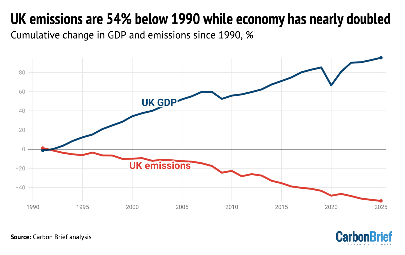
UK greenhouse gas emissions in 2025 fell to 54% below 1990 levels, the baseline year for its legally binding climate goals, according to new Carbon Brief analysis. Over the same period, data from the World Bank shows that the UK’s economy has expanded by 95%, meaning that emissions have been decoupling from growth.
Spotlight
Bristol’s ‘pioneering’ community wind turbine
Following the recent launch of the UK government’s local power plan, Carbon Brief visits one of the country’s community-energy success stories.
The Lawrence Weston housing estate is set apart from the main city of Bristol, wedged between the tree-lined grounds of a stately home and a sprawl of warehouses and waste incinerators. It is one of the most deprived areas in the city.
Yet, just across the M5 motorway stands a structure that has brought the spoils of the energy transition directly to this historically forgotten estate – a 4.2 megawatt (MW) wind turbine.
The turbine is owned by local charity Ambition Lawrence Weston and all the profits from its electricity sales – around £100,000 a year – go to the community. In the UK’s local power plan, it was singled out by energy secretary Ed Miliband as a “pioneering” project.
‘Sustainable income’
On a recent visit to the estate by Carbon Brief, Ambition Lawrence Weston’s development manager, Mark Pepper, rattled off the story behind the wind turbine.
In 2012, Pepper and his team were approached by the Bristol Energy Cooperative with a chance to get a slice of the income from a new solar farm. They jumped at the opportunity.
“Austerity measures were kicking in at the time,” Pepper told Carbon Brief. “We needed to generate an income. Our own, sustainable income.”
With the solar farm proving to be a success, the team started to explore other opportunities. This began a decade-long process that saw them navigate the Conservative government’s “ban” on onshore wind, raise £5.5m in funding and, ultimately, erect the turbine in 2023.
Today, the turbine generates electricity equivalent to Lawrence Weston’s 3,000 households and will save 87,600 tonnes of carbon dioxide (CO2) over its lifetime.

‘Climate by stealth’
Ambition Lawrence Weston’s hub is at the heart of the estate and the list of activities on offer is seemingly endless: birthday parties, kickboxing, a library, woodworking, help with employment and even a pop-up veterinary clinic. All supported, Pepper said, with the help of a steady income from community-owned energy.
The centre itself is kitted out with solar panels, heat pumps and electric-vehicle charging points, making it a living advertisement for the net-zero transition. Pepper noted that the organisation has also helped people with energy costs amid surging global gas prices.
Gesturing to the England flags dangling limply on lamp posts visible from the kitchen window, he said:
“There’s a bit of resentment around immigration and scarcity of materials and provision, so we’re trying to do our bit around community cohesion.”
This includes supper clubs and an interfaith grand iftar during the Muslim holy month of Ramadan.
Anti-immigration sentiment in the UK has often gone hand-in-hand with opposition to climate action. Right-wing politicians and media outlets promote the idea that net-zero policies will cost people a lot of money – and these ideas have cut through with the public.
Pepper told Carbon Brief he is sympathetic to people’s worries about costs and stressed that community energy is the perfect way to win people over:
“I think the only way you can change that is if, instead of being passive consumers…communities are like us and they’re generating an income to offset that.”
From the outset, Pepper stressed that “we weren’t that concerned about climate because we had other, bigger pressures”, adding:
“But, in time, we’ve delivered climate by stealth.”
Watch, read, listen
OIL WATCH: The Guardian has published a “visual guide” with charts and videos showing how the “escalating Iran conflict is driving up oil and gas prices”.
MURDER IN HONDURAS: Ten years on from the murder of Indigenous environmental justice advocate Berta Cáceres, Drilled asked why Honduras is still so dangerous for environmental activists.
TALKING WEATHER: A new film, narrated by actor Michael Sheen and titled You Told Us To Talk About the Weather, aimed to promote conversation about climate change with a blend of “poetry, folk horror and climate storytelling”.
Coming up
- 8 March: Colombia parliamentary election
- 9-19 March: 31st Annual Session of the International Seabed Authority, Kingston, Jamaica
- 11 March: UN Environment Programme state of finance for nature 2026 report launch
Pick of the jobs
- London School of Economics and Political Science, fellow in the social science of sustainability | Salary: £43,277-£51,714. Location: London
- NORCAP, innovative climate finance expert | Salary: Unknown. Location: Kyiv, Ukraine
- WBHM, environmental reporter | Salary: $50,050-$81,330. Location: Birmingham, Alabama, US
- Climate Cabinet, data engineer | Salary: hourly rate of $60-$120 per hour. Location: Remote anywhere in the US
DeBriefed is edited by Daisy Dunne. Please send any tips or feedback to debriefed@carbonbrief.org.
This is an online version of Carbon Brief’s weekly DeBriefed email newsletter. Subscribe for free here.
The post DeBriefed 6 March 2026: Iran energy crisis | China climate plan | Bristol’s ‘pioneering’ wind turbine appeared first on Carbon Brief.
China’s leadership has published a draft of its 15th five-year plan setting the strategic direction for the nation out to 2030, including support for clean energy and energy security.
The plan sets a target to cut China’s “carbon intensity” by 17% over the five years from 2026-30, but also changes the basis for calculating this key climate metric.
The plan continues to signal support for China’s clean-energy buildout and, in general, contains no major departures from the country’s current approach to the energy transition.
The government reaffirms support for several clean-energy industries, ranging from solar and electric vehicles (EVs) through to hydrogen and “new-energy” storage.
The plan also emphasises China’s willingness to steer climate governance and be seen as a provider of “global public goods”, in the form of affordable clean-energy technologies.
However, while the document says it will “promote the peaking” of coal and oil use, it does not set out a timeline and continues to call for the “clean and efficient” use of coal.
This shows that tensions remain between China’s climate goals and its focus on energy security, leading some analysts to raise concerns about its carbon-cutting ambition.
Below, Carbon Brief outlines the key climate change and energy aspects of the plan, including targets for carbon intensity, non-fossil energy and forestry.
Note: this article is based on a draft published on 5 March and will be updated if any significant changes are made in the final version of the plan, due to be released at the close next week of the “two sessions” meeting taking place in Beijing.
- What is China’s 15th five-year plan?
- What does the plan say about China’s climate action?
- What is China’s new CO2 intensity target?
- Does the plan encourage further clean-energy additions?
- What does the plan signal about coal?
- How will China approach global climate governance in the next five years?
- What else does the plan cover?
What is China’s 15th five-year plan?
Five-year plans are one of the most important documents in China’s political system.
Addressing everything from economic strategy to climate policy, they outline the planned direction for China’s socio-economic development in a five-year period. The 15th five-year plan covers 2026-30.
These plans include several “main goals”. These are largely quantitative indicators that are seen as particularly important to achieve and which provide a foundation for subsequent policies during the five-year period.
The table below outlines some of the key “main goals” from the draft 15th five-year plan.
| Category | Indicator | Indicator in 2025 | Target by 2030 | Cumulative target over 2026-2030 | Characteristic |
|---|---|---|---|---|---|
| Economic development | Gross domestic product (GDP) growth (%) | 5 | Maintained within a reasonable range and proposed annually as appropriate. | Anticipatory | |
| ‘Green and low-carbon | Reduction in CO2 emissions per unit of GDP (%) | 17.7 | 17 | Binding | |
| Share of non-fossil energy in total energy consumption (%) | 21.7 | 25 | Binding | ||
| Security guarantee | Comprehensive energy production capacity (100m tonnes of standard coal equivalent) |
51.3 | 58 | Binding |
Select list of targets highlighted in the “main goals” section of the draft 15th five-year plan. Source: Draft 15th five-year plan.
Since the 12th five-year plan, covering 2011-2015, these “main goals” have included energy intensity and carbon intensity as two of five key indicators for “green ecology”.
The previous five-year plan, which ran from 2021-2025, introduced the idea of an absolute “cap” on carbon dioxide (CO2) emissions, although it did not provide an explicit figure in the document. This has been subsequently addressed by a policy on the “dual-control of carbon” issued in 2024.
The latest plan removes the energy-intensity goal and elevates the carbon-intensity goal, but does not set an absolute cap on emissions (see below).
It covers the years until 2030, before which China has pledged to peak its carbon emissions. (Analysis for Carbon Brief found that emissions have been “flat or falling” since March 2024.)
The plans are released at the two sessions, an annual gathering of the National People’s Congress (NPC) and the Chinese People’s Political Consultative Conference (CPPCC). This year, it runs from 4-12 March.
The plans are often relatively high-level, with subsequent topic-specific five-year plans providing more concrete policy guidance.
Policymakers at the National Energy Agency (NEA) have indicated that in the coming years they will release five sector-specific plans for 2026-2030, covering topics such as the “new energy system”, electricity and renewable energy.
There may also be specific five-year plans covering carbon emissions and environmental protection, as well as the coal and nuclear sectors, according to analysts.
Other documents published during the two sessions include an annual government work report, which outlines key targets and policies for the year ahead.
The gathering is attended by thousands of deputies – delegates from across central and local governments, as well as Chinese Communist party members, members of other political parties, academics, industry leaders and other prominent figures.
What does the plan say about China’s climate action?
Achieving China’s climate targets will remain a key driver of the country’s policies in the next five years, according to the draft 15th five-year plan.
It lists the “acceleration” of China’s energy transition as a “major achievement” in the 14th five-year plan period (2021-2025), noting especially how clean-power capacity had overtaken fossil fuels.
The draft says China will “actively and steadily advance and achieve carbon peaking”, with policymakers continuing to strike a balance between building a “green economy” and ensuring stability.
Climate and environment continues to receive its own chapter in the plan. However, the framing and content of this chapter has shifted subtly compared with previous editions, as shown in the table below. For example, unlike previous plans, the first section of this chapter focuses on China’s goal to peak emissions.
| 11th five-year plan (2006-2010) | 12th five-year plan (2011-2015) | 13th five-year plan (2016-2020) | 14th five-year plan (2021-2025) | 15th five-year plan (2026-2030) | |
|---|---|---|---|---|---|
| Chapter title | Part 6: Build a resource-efficient and environmentally-friendly society | Part 6: Green development, building a resource-efficient and environmentally friendly society | Part 10: Ecosystems and the environment | Part 11: Promote green development and facilitate the harmonious coexistence of people and nature | Part 13: Accelerating the comprehensive green transformation of economic and social development to build a beautiful China |
| Sections | Developing a circular economy | Actively respond to global climate change | Accelerate the development of functional zones | Improve the quality and stability of ecosystems | Actively and steadily advancing and achieving carbon peaking |
| Protecting and restoring natural ecosystems | Strengthen resource conservation and management | Promote economical and intensive resource use | Continue to improve environmental quality | Continuously improving environmental quality | |
| Strengthening environmental protection | Vigorously develop the circular economy | Step up comprehensive environmental governance | Accelerate the green transformation of the development model | Enhancing the diversity, stability, and sustainability of ecosystems | |
| Enhancing resource management | Strengthen environmental protection efforts | Intensify ecological conservation and restoration | Accelerating the formation of green production and lifestyles | ||
| Rational utilisation of marine and climate resources | Promoting ecological conservation and restoration | Respond to global climate change | |||
| Strengthen the development of water conservancy and disaster prevention and mitigation systems | Improve mechanisms for ensuring ecological security | ||||
| Develop green and environmentally-friendly industries |
Title and main sections of the climate and environment-focused chapters in the last five five-year plans. Source: China’s 11th, 12th, 13th, 14th and 15th five-year plans.
The climate and environment chapter in the latest plan calls for China to “balance [economic] development and emission reduction” and “ensure the timely achievement of carbon peak targets”.
Under the plan, China will “continue to pursue” its established direction and objectives on climate, Prof Li Zheng, dean of the Tsinghua University Institute of Climate Change and Sustainable Development (ICCSD), tells Carbon Brief.
What is China’s new CO2 intensity target?
In the lead-up to the release of the plan, analysts were keenly watching for signals around China’s adoption of a system for the “dual-control of carbon”.
This would combine the existing targets for carbon intensity – the CO2 emissions per unit of GDP – with a new cap on China’s total carbon emissions. This would mark a dramatic step for the country, which has never before set itself a binding cap on total emissions.
Policymakers had said last year that this framework would come into effect during the 15th five-year plan period, replacing the previous system for the “dual-control of energy”.
However, the draft 15th five-year plan does not offer further details on when or how both parts of the dual-control of carbon system will be implemented. Instead, it continues to focus on carbon intensity targets alone.
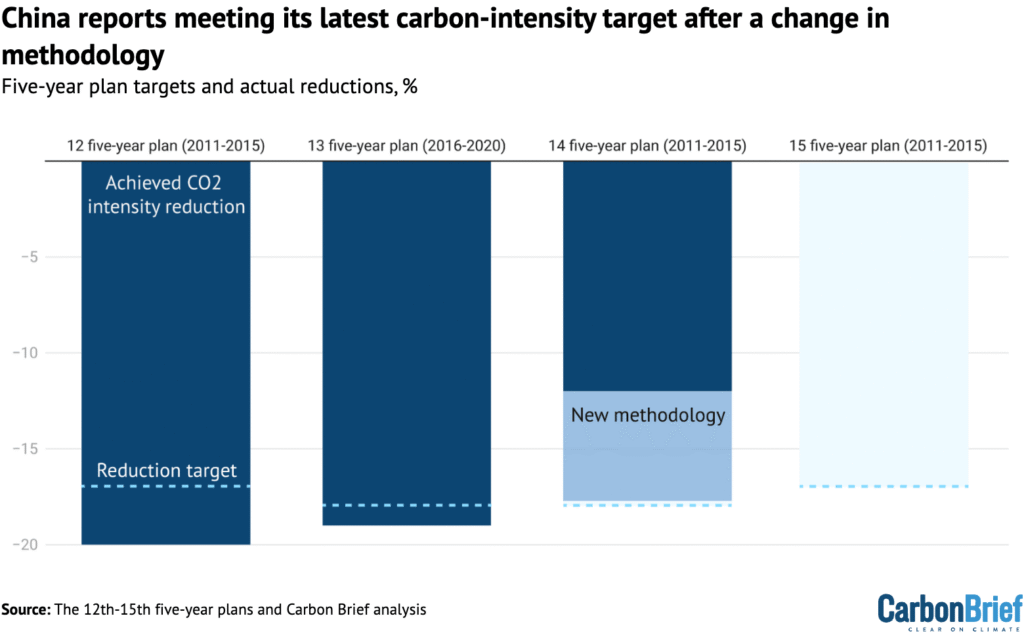
Looking back at the previous five-year plan period, the latest document says China had achieved a carbon-intensity reduction of 17.7%, just shy of its 18% goal.
This is in contrast with calculations by Lauri Myllyvirta, lead analyst at the Centre for Research on Energy and Clean Air (CREA), which had suggested that China had only cut its carbon intensity by 12% over the past five years.
At the time it was set in 2021, the 18% target had been seen as achievable, with analysts telling Carbon Brief that they expected China to realise reductions of 20% or more.
However, the government had fallen behind on meeting the target.
Last year, ecology and environment minister Huang Runqiu attributed this to the Covid-19 pandemic, extreme weather and trade tensions. He said that China, nevertheless, remained “broadly” on track to meet its 2030 international climate pledge of reducing carbon intensity by more than 65% from 2005 levels.
Myllyvirta tells Carbon Brief that the newly reported figure showing a carbon-intensity reduction of 17.7% is likely due to an “opportunistic” methodological revision. The new methodology now includes industrial process emissions – such as cement and chemicals – as well as the energy sector.
(This is not the first time China has redefined a target, with regulators changing the methodology for energy intensity in 2023.)
For the next five years, the plan sets a target to reduce carbon intensity by 17%, slightly below the previous goal.
However, the change in methodology means that this leaves space for China’s overall emissions to rise by “3-6% over the next five years”, says Myllyvirta. In contrast, he adds that the original methodology would have required a 2% fall in absolute carbon emissions by 2030.
The dashed lines in the chart below show China’s targets for reducing carbon intensity during the 12th, 13th, 14th and 15th five-year periods, while the bars show what was achieved under the old (dark blue) and new (light blue) methodology.
The carbon-intensity target is the “clearest signal of Beijing’s climate ambition”, says Li Shuo, director at the Asia Society Policy Institute’s (ASPI) China climate hub.
It also links directly to China’s international pledge – made in 2021 – to cut its carbon intensity to more than 65% below 2005 levels by 2030.
To meet this pledge under the original carbon-intensity methodology, China would have needed to set a target of a 23% reduction within the 15th five-year plan period. However, the country’s more recent 2035 international climate pledge, released last year, did not include a carbon-intensity target.
As such, ASPI’s Li interprets the carbon-intensity target in the draft 15th five-year plan as a “quiet recalibration” that signals “how difficult the original 2030 goal has become”.
Furthermore, the 15th five-year plan does not set an absolute emissions cap.
This leaves “significant ambiguity” over China’s climate plans, says campaign group 350 in a press statement reacting to the draft plan. It explains:
“The plan was widely expected to mark a clearer transition from carbon-intensity targets toward absolute emissions reductions…[but instead] leaves significant ambiguity about how China will translate record renewable deployment into sustained emissions cuts.”
Myllyvirta tells Carbon Brief that this represents a “continuation” of the government’s focus on scaling up clean-energy supply while avoiding setting “strong measurable emission targets”.
He says that he would still expect to see absolute caps being set for power and industrial sectors covered by China’s emissions trading scheme (ETS). In addition, he thinks that an overall absolute emissions cap may still be published later in the five-year period.
Despite the fact that it has yet to be fully implemented, the switch from dual-control of energy to dual-control of carbon represents a “major policy evolution”, Ma Jun, director of the Institute of Public and Environmental Affairs (IPE), tells Carbon Brief. He says that it will allow China to “provide more flexibility for renewable energy expansion while tightening the net on fossil-fuel reliance”.
Does the plan encourage further clean-energy additions?
“How quickly carbon intensity is reduced largely depends on how much renewable energy can be supplied,” says Yao Zhe, global policy advisor at Greenpeace East Asia, in a statement.
The five-year plan continues to call for China’s development of a “new energy system that is clean, low-carbon, safe and efficient” by 2030, with continued additions of “wind, solar, hydro and nuclear power”.
In line with China’s international pledge, it sets a target for raising the share of non-fossil energy in total energy consumption to 25% by 2030, up from just under 21.7% in 2025.
The development of “green factories” and “zero-carbon [industrial] parks” has been central to many local governments’ strategies for meeting the non-fossil energy target, according to industry news outlet BJX News. A call to build more of these zero-carbon industrial parks is listed in the five-year plan.
Prof Pan Jiahua, dean of Beijing University of Technology’s Institute of Ecological Civilization, tells Carbon Brief that expanding demand for clean energy through mechanisms such as “green factories” represents an increasingly “bottom-up” and “market-oriented” approach to the energy transition, which will leave “no place for fossil fuels”.
He adds that he is “very much sure that China’s zero-carbon process is being accelerated and fossil fuels are being driven out of the market”, pointing to the rapid adoption of EVs.
The plan says that China will aim to double “non-fossil energy” in 10 years – although it does not clarify whether this means their installed capacity or electricity generation, or what the exact starting year would be.
Research has shown that doubling wind and solar capacity in China between 2025-2035 would be “consistent” with aims to limit global warming to 2C.
While the language “certainly” pushes for greater additions of renewable energy, Yao tells Carbon Brief, it is too “opaque” to be a “direct indication” of the government’s plans for renewable additions.
She adds that “grid stability and healthy, orderly competition” is a higher priority for policymakers than guaranteeing a certain level of capacity additions.
China continues to place emphasis on the need for large-scale clean-energy “bases” and cross-regional power transmission.
The plan says China must develop “clean-energy bases…in the three northern regions” and “integrated hydro-wind-solar complexes” in south-west China.
It specifically encourages construction of “large-scale wind and solar” power bases in desert regions “primarily” for cross-regional power transmission, as well as “major hydropower” projects, including the Yarlung Tsangpo dam in Tibet.
As such, the country should construct “power-transmission corridors” with the capacity to send 420 gigawatts (GW) of electricity from clean-energy bases in western provinces to energy-hungry eastern provinces by 2030, the plan says.
State Grid, China’s largest grid operator, plans to install “another 15 ultra-high voltage [UHV] transmission lines” by 2030, reports Reuters, up from the 45 UHV lines built by last year.
Below are two maps illustrating the interlinkages between clean-energy bases in China in the 15th (top) and 14th (bottom) five-year plan periods.
The yellow dotted areas represent clean energy bases, while the arrows represent cross-regional power transmission. The blue wind-turbine icons represent offshore windfarms and the red cooling tower icons represent coastal nuclear plants.

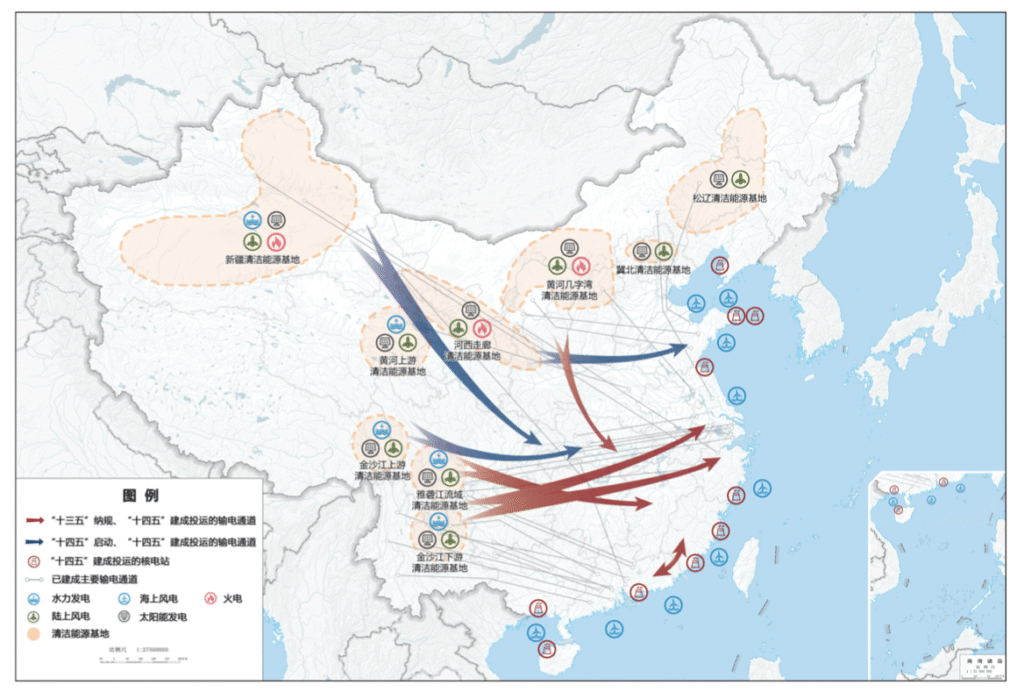
The 15th five-year plan map shows a consistent approach to the 2021-2025 period. As well as power being transmitted from west to east, China plans for more power to be sent to southern provinces from clean-energy bases in the north-west, while clean-energy bases in the north-east supply China’s eastern coast.
It also maps out “mutual assistance” schemes for power grids in neighbouring provinces.
Offshore wind power should reach 100GW by 2030, while nuclear power should rise to 110GW, according to the plan.
What does the plan signal about coal?
The increased emphasis on grid infrastructure in the draft 15th five-year plan reflects growing concerns from energy planning officials around ensuring China’s energy supply.
Ren Yuzhi, director of the NEA’s development and planning department, wrote ahead of the plan’s release that the “continuous expansion” of China’s energy system has “dramatically increased its complexity”.
He said the NEA felt there was an “urgent need” to enhance the “secure and reliable” replacement of fossil-fuel power with new energy sources, as well as to ensure the system’s “ability to absorb them”.
Meanwhile, broader concerns around energy security have heightened calls for coal capacity to remain in the system as a “ballast stone”.
The plan continues to support the “clean and efficient utilisation of fossil fuels” and does not mention either a cap or peaking timeline for coal consumption.
Xi had previously told fellow world leaders that China would “strictly control” coal-fired power and phase down coal consumption in the 15th five-year plan period.
The “geopolitical situation is increasing energy security concerns” at all levels of government, said the Institute for Global Decarbonization Progress in a note responding to the draft plan, adding that this was creating “uncertainty over coal reduction”.
Ahead of its publication, there were questions around whether the plan would set a peaking deadline for oil and coal. An article posted by state news agency Xinhua last month, examining recommendations for the plan from top policymakers, stated that coal consumption would plateau from “around 2027”, while oil would peak “around 2026”.
However, the plan does not lay out exact years by which the two fossil fuels should peak, only saying that China will “promote the peaking of coal and oil consumption”.
There are similarly no mentions of phasing out coal in general, in line with existing policy.
Nevertheless, there is a heavy emphasis on retrofitting coal-fired power plants. The plan calls for the establishment of “demonstration projects” for coal-plant retrofitting, such as through co-firing with biomass or “green ammonia”.
Such retrofitting could incentivise lower utilisation of coal plants – and thus lower emissions – if they are used to flexibly meet peaks in demand and to cover gaps in clean-energy output, instead of providing a steady and significant share of generation.
The plan also calls for officials to “fully implement low-carbon retrofitting projects for coal-chemical industries”, which have been a notable source of emissions growth in the past year.
However, the coal-chemicals sector will likely remain a key source of demand for China’s coal mining industry, with coal-to-oil and coal-to-gas bases listed as a “key area” for enhancing the country’s “security capabilities”.
Meanwhile, coal-fired boilers and industrial kilns in the paper industry, food processing and textiles should be replaced with “clean” alternatives to the equivalent of 30m tonnes of coal consumption per year, it says.
“China continues to scale up clean energy at an extraordinary pace, but the plan still avoids committing to strong measurable constraints on emissions or fossil fuel use”, says Joseph Dellatte, head of energy and climate studies at the Institut Montaigne. He adds:
“The logic remains supply-driven: deploy massive amounts of clean energy and assume emissions will eventually decline.”
How will China approach global climate governance in the next five years?
Meanwhile, clean-energy technologies continue to play a role in upgrading China’s economy, with several “new energy” sectors listed as key to its industrial policy.
Named sectors include smart EVs, “new solar cells”, new-energy storage, hydrogen and nuclear fusion energy.
“China’s clean-technology development – rather than traditional administrative climate controls – is increasingly becoming the primary driver of emissions reduction,” says ASPI’s Li. He adds that strengthening China’s clean-energy sectors means “more closely aligning Beijing’s economic ambitions with its climate objectives”.
Analysis for Carbon Brief shows that clean energy drove more than a third of China’s GDP growth in 2025, representing around 11% of China’s whole economy.
The continued support for these sectors in the draft five-year plan comes as the EU outlined its own measures intended to limit China’s hold on clean-energy industries, driven by accusations of “unfair competition” from Chinese firms.
China is unlikely to crack down on clean-tech production capacity, Dr Rebecca Nadin, director of the Centre for Geopolitics of Change at ODI Global, tells Carbon Brief. She says:
“Beijing is treating overcapacity in solar and smart EVs as a strategic choice, not a policy error…and is prepared to pour investment into these sectors to cement global market share, jobs and technological leverage.”
Dellatte echoes these comments, noting that it is “striking” that the plan “barely addresses the issue of industrial overcapacity in clean technologies”, with the focus firmly on “scaling production and deployment”.
At the same time, China is actively positioning itself to be a prominent voice in climate diplomacy and a champion of proactive climate action.
This is clear from the first line in a section on providing “global public goods”. It says:
“As a responsible major country, China will play a more active role in addressing global challenges such as climate change.”
The plan notes that China will “actively participate in and steer [引领] global climate governance”, in line with the principle of “common,but differentiated responsibilities”.
This echoes similar language from last year’s government work report, Yao tells Carbon Brief, demonstrating a “clear willingness” to guide global negotiations. But she notes that this “remains an aspiration that’s yet to be made concrete”. She adds:
“China has always favored collective leadership, so its vision of leadership is never a lone one.”
The country will “deepen south-south cooperation on climate change”, the plan says. In an earlier section on “opening up”, it also notes that China will explore “new avenues for collaboration in green development” with global partners as part of its “Belt and Road Initiative”.
China is “doubling down” on a narrative that it is a “responsible major power” and “champion of south-south climate cooperation”, Nadin says, such as by “presenting its clean‑tech exports and finance as global public goods”. She says:
“China will arrive at future COPs casting itself as the indispensable climate leader for the global south…even though its new five‑year plan still puts growth, energy security and coal ahead of faster emissions cuts at home.”
What else does the plan cover?
The impact of extreme weather – particularly floods – remains a key concern in the plan.
China must “refine” its climate adaptation framework and “enhance its resilience to climate change, particularly extreme-weather events”, it says.
China also aims to “strengthen construction of a national water network” over the next five years in order to help prevent floods and droughts.
An article published a few days before the plan in the state-run newspaper China Daily noted that, “as global warming intensifies, extreme weather events – including torrential rains, severe convective storms, and typhoons – have become more frequent, widespread and severe”.
The plan also touches on critical minerals used for low-carbon technologies. These will likely remain a geopolitical flashpoint, with China saying it will focus during the next five years on “intensifying” exploration and “establishing” a reserve for critical minerals. This reserve will focus on “scarce” energy minerals and critical minerals, as well as other “advantageous mineral resources”.
Dellatte says that this could mean the “competition in the energy transition will increasingly be about control over mineral supply chains”.
Other low-carbon policies listed in the five-year plan include expanding coverage of China’s mandatory carbon market and further developing its voluntary carbon market.
China will “strengthen monitoring and control” of non-CO2 greenhouse gases, the plan says, as well as implementing projects “targeting methane, nitrous oxide and hydrofluorocarbons” in sectors such as coal mining, agriculture and chemicals.
This will create “capacity” for reducing emissions by 30m tonnes of CO2 equivalent, it adds.
Meanwhile, China will develop rules for carbon footprint accounting and push for internationally recognised accounting standards.
It will enhance reform of power markets over the next five years and improve the trading mechanism for green electricity certificates.
It will also “promote” adoption of low-carbon lifestyles and decarbonisation of transport, as well as working to advance electrification of freight and shipping.


The post Q&A: What does China’s 15th ‘five-year plan’ mean for climate change? appeared first on Carbon Brief.
Q&A: What does China’s 15th ‘five-year plan’ mean for climate change?

A Hunger Strike Ends, but an ‘Unreasonable’ Woman’s Battle Against Corporate Polluters Marches On
Cancer Rates Are Higher Near Large Livestock Feeding Operations in 3 States, a New Study Finds
The Extraordinary Sensory Worlds of Animals
-
Climate Change8 months ago
Guest post: Why China is still building new coal – and when it might stop
-
Greenhouse Gases8 months ago
Guest post: Why China is still building new coal – and when it might stop
-

 Greenhouse Gases2 years ago
嘉宾来稿:满足中国增长的用电需求 光伏加储能“比新建煤电更实惠”
-
Climate Change2 years ago
Bill Discounting Climate Change in Florida’s Energy Policy Awaits DeSantis’ Approval
-

 Climate Change2 years ago
嘉宾来稿:满足中国增长的用电需求 光伏加储能“比新建煤电更实惠”
-
Climate Change Videos2 years ago
The toxic gas flares fuelling Nigeria’s climate change – BBC News
-

 Renewable Energy6 months ago
Sending Progressive Philanthropist George Soros to Prison?
-

 Carbon Footprint2 years ago
US SEC’s Climate Disclosure Rules Spur Renewed Interest in Carbon Credits