Connect with us

Published

on

There is a “mismatch” between the importance of peatlands and their current level of protection, a new study warns.

The paper, published in Conservation Letters, combines maps showing global peatlands, protected areas and human impact in the year 2020, to provide a snapshot of the current level of global peatland protection.

The authors stress that peatlands are crucial carbon stores, holding more carbon than all the world’s forest biomass combined.

However, they find that only 17% of peatlands fall within protected areas – a “substantially lower” proportion than other “high-value ecosystems”, such as mangroves, saltmarshes and tropical forests, they say.

The study finds that 22% of global peatlands are under “high human pressure”, with regions in Europe and the east coast of the US under particular threat.

Furthermore, one-third of the global peatlands in protected areas and Indigenous people’s lands still experience “medium to high human pressure”, the paper finds.

‘Disproportionate’ carbon stores

Despite peatlands’ relatively small footprint – they cover only 3% of the Earth’s land surface – the ecosystems store a “disproportionate amount” of carbon. 

Research has shown that there is more carbon contained in peatlands than in all of the world’s forests combined – around 600bn tonnes (GtC). 

They also provide myriad other “ecosystem services”, such as regulating air temperatures, storing water and creating habitat for many species.

Peatlands are wetland ecosystems that form slowly over time. When plant matter in one of these habitats dies, the high water content of the soils prevents it from decomposing completely.

As a result, plant matter accumulates, building up as carbon-rich peat over time. Peatlands are found on every inhabited continent, primarily in the high latitudes of the northern hemisphere and in the tropics.

The degradation and destruction of peatlands is a significant carbon source, contributing 2-4% of human-driven greenhouse gas emissions each year. Peatlands are often drained or degraded during use for agriculture, and about 16% of peatlands globally have been drained to date. In some places, peat is intentionally removed to be used as fuel or fertile soil.

Prof Chris Evans, a biogeochemist at the UK Centre for Ecology & Hydrology, who was not involved in the study, tells Carbon Brief:

“Peatland degradation is second only to tropical deforestation as a source of greenhouse gas emissions from land use, yet peatlands are often overlooked in conservation and climate policy.”

At the same time, climate change itself is putting peatlands at risk.

Increased temperatures are causing permafrost thaw, allowing the once-frozen peat to decompose and release CO2 into the atmosphere. Warmer temperatures also increase microbial activity, leading to faster rates of decomposition, while warmer, drier peatlands are more susceptible to fires.

Losing peatlands has “cascading effects on local water supplies, agriculture and fisheries, disproportionately affecting Indigenous and rural communities”, says Dr Michelle Kalamandeen, a geospatial scientist at McMaster University in Ontario, who was not involved in the study.

Protected areas

This study centres on an existing map of global peatland. The map divides the world into grid cells and, using a machine learning model trained on data collected on the ground, estimates the proportion of each cell that contains peatland at least 30cm deep.

The map identifies around 4m square kilometres (km2) of peatland globally. More than 60% of this is “boreal peatland” – found in the high-latitude northern regions, such as Canada, Russia and Scandinavia – and the rest is found in temperature or tropical regions, according to the study.

The authors then cross-reference the map with a database of global protected areas. The database encompasses both “strict” protection areas, such as national parks and nature reserves, as well as less strict land-management regimes where some human activity is permitted.

The database also shows Ramsar sites, a subset of protected areas designated to be of international importance under the Ramsar convention – also known as the “Convention on Wetlands”. (The convention seeks to promote “the wise use of all wetlands” in participating countries and encourage international co-operation with other countries.)

The authors find that only 17% of peatlands are located in protected areas. This is “substantially lower than other high-value ecosystems such as mangroves, 42% of which are within official protected areas globally, saltmarshes (50%) and tropical forests (38%)”, the study says.

Dr Kemen Austin is the director of science at the Wildlife Conservation Society‘s forests and climate change programme, and lead author of the new study. In a press release, she says that the study “reveals that these vital ecosystems don’t have anywhere near the level of protection they need”.

The authors also present case studies of individual countries. For example, they find that nearly 90% of peatland in the Republic of the Congo is protected. However, they warn that “most of this falls within a designated Ramsar site that has not yet been backed-up by strong government commitments”.

The study identifies a large body of literature showing that “Indigenous land rights and community-based management result in positive environmental outcomes, such as reduced deforestation and forest degradation”. The authors analyse data on Indigenous stewardship and find that one-quarter of global peatlands sit on land owned by Indigenous groups.

Human impact

The authors assess human pressures on peatland using the Human Impact Index (HII). This metric quantifies the “cumulative anthropogenic pressures” on a region, using a scale of 0-50 that incorporates factors such as accessibility, land use and population density.

The map below shows human pressure in areas that contain more than 5% peatland by area. Light pink shows “low-pressure” regions, medium pink shows “medium-pressure” regions and dark pink shows “high-pressure” regions.

The top map shows the whole planet, while the three inset maps below highlight chosen case studies in Peru, the Congo Basin and Indonesia.
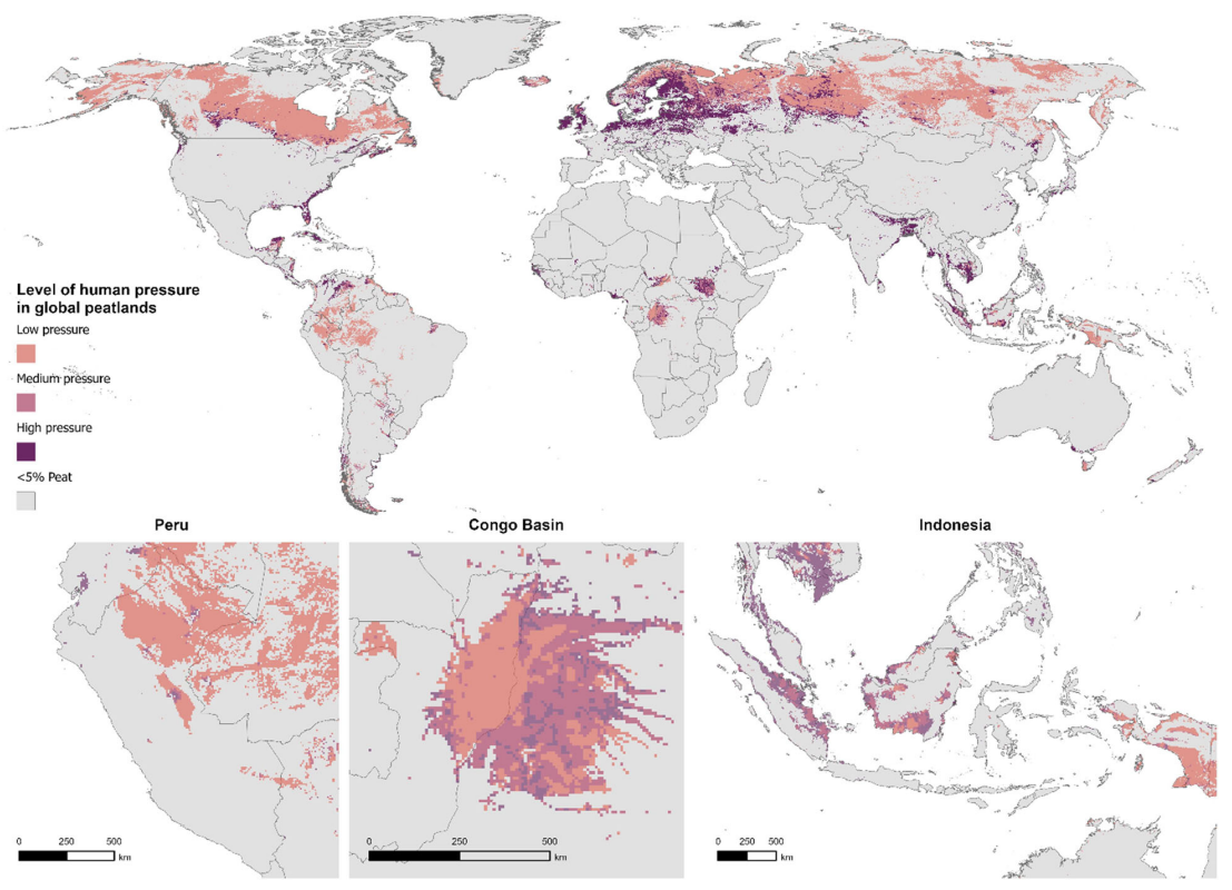
Map of human pressure in global peatlands
Human pressure in areas which contain more than 5% peatlands, where light pink shows “low-pressure” values, mid pink shows “medium-pressure” and dark pink shows “high-pressure” regions. Source: Austin et al. (2025).

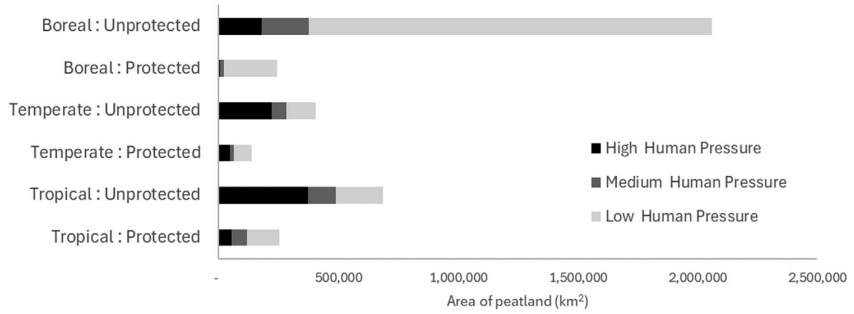
The authors find that globally, 22% percent of peatlands are under high human pressure, 12% are under medium pressure and 61% are under low pressure. The remaining 5% are in areas without reported HII data.

The authors find that almost half of peatlands in temperate regions are facing high human pressure, adding that Europe and the US east coast are under particular stress. At the other end of the scale, they estimate that human pressure is low in Brazil, the lowlands of Peru, the Republic of the Congo and eastern Indonesia.

The study says that, as expected, human pressure is “somewhat higher” in unprotected peatlands than protected peatlands. However, it adds:

“Nearly one-third of global peatlands, and nearly half of temperate and tropical peatlands in protected areas and Indigenous people’s lands, still experience medium-to-high human pressure.”

The chart below shows the area of peatland in protected and unprotected boreal, temperate and tropical regions that is facing high (black) medium (grey) and low (light grey) human pressure.
Peatlands in protection chart
Peatlands in protected and unprotected boreal, temperate and tropical regions that are facing high (black) medium (grey) and low (light grey) human pressure. Source: Austin et al. (2025).

Kalamandeen tells Carbon Brief that the study “underscores a fundamental disconnect between conservation priorities and real-world climate needs”.

However, she notes that there are some limitations to the methodology. For example, she tells Carbon Brief that the underlying peatland map “performs well in data-rich regions”, but says that “its accuracy drops where ground-truth data is lacking, notably in Africa, South America and boreal regions”.

Furthermore, the map only recognises peatlands deeper than 30cm, meaning that “shallower, but still ecologically valuable peatlands, are ignored”.

She continues:

“This study is an excellent starting point, but if we are serious about peatland protection, countries need to invest in better mapping and monitoring technologies such as using Earth observations and improving ground surveys to help refine conservation strategies.”

Peatland conservation

The new research “quantifies an issue that was previously known: that peatlands are under-protected when compared to other critical ecosystem types”, Dr Julie Loisel, a palaeoecologist at the University of Nevada, Reno, tells Carbon Brief. Loisel, who was not involved in the study, adds:

“In the face of rapid environmental change, ensuring that peatlands can ‘do their job’ of storing CO2 into their soils for the next few thousands of years is very important and any policy or land management effort that is enabling this simple goal should be put forth and prioritised.”

The study notes that several international policy frameworks, such as the global stocktake process under the Paris Agreement and the Kunming-Montreal Global Biodiversity Framework, can be applied to further the protection of wetlands. 

For example, the authors note that Peru’s nationally determined contribution includes strategies for improving peatland management, such as establishing new conservation areas and recognising Indigenous peoples’ knowledge about peatlands.

However, Peru is one of the few countries with plans for the preservation of peatlands, alongside the UK, according to the study. Austin adds:

“Based on the nationally determined contributions countries have submitted to date, the continued disturbance and damage to global peatlands is getting very little attention as a significant and avoidable source of greenhouse gas emissions.”   

In addition to protection of intact peatlands, peatland restoration “will be necessary for managing peat fires and meeting climate targets nationally”, the study says. Restoration typically involves altering the wetland’s water flows to “rewet” drained peat. It can also encompass controls on pollution, protection from burning and grazing and regrowing plants.

Lango Bai in Odzala-Kokoua National Park, Republic of the Congo.
Lango Bai in Odzala-Kokoua National Park, Republic of the Congo. Credit: Danita Delimont / Alamy Stock Photo

But while restoration can slow the release of CO2 and promote some ecosystem services, it is not an adequate substitute for peatland protection. The study notes:

“Notably, once emitted to the atmosphere, the carbon lost from peatlands cannot be restored on timescales that matter for preventing dangerous climate change.”

Promoting Indigenous peoples’ land rights is one way to support the protection of peatlands, Loisel says. She tells Carbon Brief:

“Conservation efforts do not necessarily imply ‘protection from use’, but are rather meant to ensure their ‘proper use’, or ‘sustainable use’. Indigenous community uses of peatlands have been known to be sustainable.”

Kalamandeen tells Carbon Brief that, while legal protections are “crucial”, their impact “depends on enforcement, management capacity and local engagement”. Meanwhile, she says that “Indigenous and community-managed lands, even without formal protection, often demonstrate strong conservation outcomes”.

Dr Adam Todd Hastie is the leader of the carbon and wetlands group at Charles University, and was not involved in the study. He agrees, calling Indigenous stewardship “often the best and most simple solution” to protecting peatlands.

However, he adds that global-north countries “need to be thoughtful in our calls for less economically developed countries to protect their peatlands”. He tells Carbon Brief:

“If we want less economically developed countries to take a different path of protecting their peatlands – and peat carbon – and to forgo short-term economic benefits, such as revenue from plantations or mining, we (especially Europe and North America) must contribute in real terms to developing alternative sustainable solutions, both environmentally and economically.”

The post Just 17% of world’s peatlands are protected, new study warns appeared first on Carbon Brief.

Just 17% of world’s peatlands are protected, new study warns

Continue Reading

Climate Change

Factcheck: No, Europe’s heatwaves are not being ‘caused’ by declining air pollution

Published

on

This summer has seen Europe suffer through a series of record-breaking heatwaves.

Amid widespread media coverage of the number of deaths and the influence of climate change, the UK’s Daily Telegraph reported on new research with the incorrect headline: “Heatwaves caused by fall in pollution.”

The article was shared on social media by Richard Tice – deputy leader of the hard-right, climate-sceptic Reform UK party – along with a number of prominent rightwing commentators.

Tice claimed that “net stupid zero is contributing to rising temperatures, not helping”, adding that “we have been gaslit and lied to”.

GB News followed up with its own article, incorrectly headlined: “Britain’s scorching heatwaves caused by falling pollution levels, researchers find.”

Scientists tell Carbon Brief that the framing of heatwaves being “caused” by declining air pollution is “wrong”.

While a drop in pollution has reduced the cooling impact it has had in the past, the scientists say, Europe’s summer heatwaves are primarily becoming more extreme “as a result of greenhouse-gas-induced warming”.

Another scientist adds that “any attempt” to link this research to net-zero policies is “simply wrong”.

Fast warming

The extensive reporting around Europe’s heatwaves in recent months has often mentioned that Europe is the world’s fastest-warming continent.

Europe has warmed rapidly since the 1980s

The new study in question aims to unpack why Europe’s summer temperatures are rising more quickly than other regions of the northern hemisphere’s mid and high latitudes.

The research – published in Geophysical Research Letters – explores the role of air pollution and, specifically, how it affects circulation patterns in the atmosphere.

(The study focuses on long-term trends in European summers and does not include the very recent heatwaves.)

Human-caused emissions of aerosols – tiny, light‑scattering particles produced mainly by burning fossil fuels – have long acted to “mask” global warming. This is largely because they absorb or reflect incoming sunlight and influence the formation and brightness of clouds.

To understand how the climate of Europe – or any region – is changing, scientists need to take into account a whole range of factors, says Prof Bjørn Samset, a research professor at Norway’s Center for International Climate Research (CICERO), who was not involved in the work.

This includes “greenhouse gases, aerosols, land-use change, natural variability and how they all interact”, he says, adding:

“The effects of air pollution on circulation, which is the topic here, has long been difficult to pin down.”

As European countries improved their air quality through the second half of the 20th century, the cooling effect of aerosols has gradually been removed.

This can boost heatwaves in two ways – directly, by letting more sunlight reach the land surface and, indirectly, by influencing the jet stream.

Using hundreds of simulations from nine climate models, the new study finds that a decline in aerosols is resulting in more frequent “quasi-stationary Rossby waves”.

Rossby waves are huge meanders in the jet stream. Occasionally, they become slow-moving – or “quasi-stationary” – which allows weather systems to get stuck over one region, leading to prolonged heatwaves.

These circulation changes have contributed to Europe’s rapidly warming summers.

However, while Europe’s heatwaves are being influenced by declining aerosols, it is “wrong” to say they are being “caused” by them, says Prof Erich Fischer, a climate scientist at ETH Zurich.

Headline in the Daily Telegraph, 22 July 2026.

Fischer, who was not involved in the study, tells Carbon Brief:

“Heatwaves are caused by high-pressure systems and are now much more frequent and intense because they are happening in a climate that is much warmer than 100 years ago as a result of greenhouse-gas-induced warming.

“The paper shows that the greenhouse-gas-induced summer warming had been temporarily masked by air-polluting aerosols. The full extent for European summers only becomes visible now as the air-polluting aerosols have declined.”

Samset adds:

“Air pollution never causes or removes global warming, it only temporarily moderates it.”

Study lead author Dr Pedro Roldán‐Gómez, an associate researcher at the Barcelona Supercomputer Centre, is quoted in the Daily Telegraph saying that “most” of the “excess warming” in Europe, beyond that of comparable regions in the northern hemisphere, can be linked to declining aerosols.

But, earlier in the article, the newspaper interprets this as, simply, “most of the extra heat experienced in Britain and Europe” is down to air pollution.

GB News uses a similar phrasing, reporting that “much of the additional warming across Britain and western Europe since the 1980s is linked to the sharp decline in airborne particles known as aerosols”.

This is “misleading”, says Fischer, while Roldan-Gomez tells Carbon Brief that this is a “tricky point”, which “could lead to wrong interpretations if not properly explained”. He adds:

“The contribution of greenhouse gases is, in any case, the most important factor.”

Headline on GB News, 23 July 2026.

Cleaner air

The Daily Telegraph’s article was seized upon by Reform’s Richard Tice to claim that “cleaner air” was causing higher temperatures, rather than CO2.

This continued his position – refuted by long-established climate science – that CO2 does not drive global warming.

Richard Tice on X on 23 July 2026

Tice also claimed in his post that net-zero policies are “contributing to rising temperatures”. Tice appears to be linking declining air pollution to a shift from fossil fuels to renewable energy.

Samset points out that net-zero became a goal “decades later” than the cumulative efforts to reduce air pollution since the 1980s and that it is “simply wrong” to link it to the study.

“The scientific community will keep working to understand how greenhouse gas warming and air pollution interact,” he says, but “nothing we do will change the fact that the consequences of global warming are due to human-induced CO2 emissions”.

Fischer adds:

“Let us not forget that cleaning up air-polluting aerosols is highly desirable. According to the World Health Organisation, 7 million people still die prematurely every year due to air pollution.”

Clean air legislation

Finally, the Daily Telegraph article and the study itself both attribute Europe’s declining air pollution from the 1980s onwards to the Montreal Protocol.

This is a “glaring error”, Samset says, and it is “surprising that it wasn’t picked up” in the peer-review process for the study. He explains:

“The Montreal Protocol did not deal with air pollution. It dealt with ozone-depleting gases and has been an extremely successful multi-national effort against environmental damage. “

Clean air legislation was already in place in many European countries by the time the Montreal Protocol was signed in 1987, says Samset.

In response, Roldán‐Gómez says that while the protocol did not target aerosols specifically, it “boosted the clean air policies”.

The post Factcheck: No, Europe’s heatwaves are not being ‘caused’ by declining air pollution appeared first on Carbon Brief.

Factcheck: No, Europe’s heatwaves are not being ‘caused’ by declining air pollution

Continue Reading

Climate Change

Access to finance ‘strengthens climate resilience’ among sub-Saharan women

Published

on

Empowering women through greater access to finance could “strengthen” households’ resilience to “climate shocks”, according to a new study.

Published in Climate Risk Management, it analyses the impact of financial access on “women-headed households” in sub-Saharan Africa.

The study finds that where women had formal financial access – such as through owning a bank account – households were more able to withstand short-term shocks.

It adds that “climate shocks”, such as extreme weather events and the impacts of climate change, can cause economic crises, which destabilise communities and households.

However, the authors say that in order to protect households from long-term climate vulnerabilities – including “droughts, floods and sea-level rise” – financial access would need to be paired with wider efforts to tackle gender inequality.

They add that the findings could have important implications for policy in sub-Saharan Africa, where many countries and households are vulnerable to climate disasters.

Financial inclusion

The study highlights that entrenched gender disparities mean many women still have unequal access to financial services in sub-Saharan Africa

For example, women are still less likely to have their own bank accounts and instead are often dependent on male relatives for access to finance.

The number of women with access to an account in the region had risen to 52% as of 2024, according to data from World Bank Group.

However, as shown in the chart below, the gap between men and women has also increased, rising from just under 5 percentage points in 2011 to 12 in 2024.

Chart showing that more sub-Saharan women now have bank accounts, but the gap to men has widened from 2011-2024
Share of population with bank accounts by gender over 2011-2024, %. Source: Global Findex Database, World Bank Group

Using survey data from Afrobarometer, the new study analyses 25,511 women-headed households across 37 sub-Saharan countries.

The authors use the Organisation for Economic Co-operation and Development’s (OECD) framework to measure “financial inclusion”. This looks at factors such as having a bank account, owning a mobile phone and having internet access.

Francis Anaisie, a co-author on the study, tells Carbon Brief the researchers were motivated by the UN’s sustainable development goals (SDGs). Anaisie, an economist at the University of Cape Coast, Ghana, says the study specifically looked at SDGs five and 13, on gender equality and addressing climate issues. He adds:

“Financial inclusion is one of the key policy tools for empowering women or for empowerment. But as to whether this actually translates into better climate outcomes for women is not known or is limited; this study seeks to address that gap.”

The study finds households with higher levels of financial access for women had higher levels of women’s empowerment, when this is defined as the ability to make choices and have control over economic and social outcomes.

This was checked by cross-comparing financial access against different measures of women’s empowerment, such as financial security, voting rights and connection to communities.

In particular, the study found that “financially included” women had greater political and economic empowerment, such as financial security and voting rights. On some measures of social empowerment, however, the link was weaker – financial access alone was not enough to erase cultural and social barriers to gender equality.

Women and climate change

It has been well documented that women are more vulnerable to the impacts of climate change than men.

Environmental shocks affect women disproportionately due to a range of factors. These include income disparities, higher rates of displacement and unequal access to land.

Financial inequality and barriers to economic resources, such as needing internet access to make digital payments, play a key role in climate vulnerability, says Tracy Kajumba. She is director for the Least Developed Countries initiative for Effective Adaptation and Resilience (LIFE-AR) interim secretariat at the International Institute for Environment and Development (IIED).

Kajumba, who was not involved in the study, explains to Carbon Brief:

“Women are on the front line doing farming, planting, harvesting and these things that are all impacted [by climate change]. If they don’t have the income to invest either in drought-resistant crops or water-saving technologies, it becomes difficult for households to adapt.”

Calculating climate resilience

The new study measures the impact of financial inclusion on women’s empowerment and, in turn, on climate resilience.

It evaluates a household’s ability to withstand and recover from “shocks and stressors” by using a UN Food and Agriculture Organization metric for “resilience index measurement and analysis” (RIMA).

For example, questionnaires are used to gather information about households in certain areas. The data is then used, together with key indicators, to quantify a household’s resilience to food insecurity, climate variability and economic crisis, amongst other risks.

The 25,511 households surveyed across sub-Saharan Africa were found to be relatively resilient overall and had a high capacity to bounce back from climate shocks. However, they had much lower ability to adapt, in order to build protective capacity in advance of extreme events.

In addition, the study finds that women’s financial empowerment had a positive impact on a household’s ability to “absorb” a climate shock, suggesting that financial access is critical for responding to climate change.

Community garden and climate adaption project, focusing on women's empowerment, Niger.
Community garden and climate adaption project, focusing on women’s empowerment, Niger. Credit: Joerg Boethling / Alamy Stock Photo

Increased empowerment through financial access enables women to make decisions about planting crops, to access credit in emergencies and to buy or sell food at a better price, the study notes.

For example, it says increased financial access and women’s empowerment help households to deal with the immediate consequences of an extreme weather event, such as a drought. This could be through building community mutual-support networks and by enabling access to savings, to keep the household running.

Anaisie says the study shows women’s empowerment has a significant impact on climate resilience. He tells Carbon Brief:

“If we include women in the financial system, in the case of any climate issue they can save, they can be independent, they can rely on investment to absorb these shocks. This empowerment will help them to be more resilient to climate shocks…We can make progress because SDG goals are all about inclusiveness. It’s all about inclusive growth.”

However, the study notes that financial access does not necessarily create long-term change, which would make the household less vulnerable to extreme weather in the first place.

The authors suggest that lasting structural and cultural change is important for bringing about long-term resilience. They say that policies to address gender inequalities would help bring this about.

They say such policies could include gender-sensitive agricultural credit schemes, subsidised climate insurance for women farmers in drought-prone regions, joint land-titling programmes and quotas for women in local climate-adaptation committees.

Such policies would have helped women impacted by recent severe floods in Ghana to protect their savings, Anaisie explains. He tells Carbon Brief: 

“Women are engaged in economic activities, especially informal activities. They have resources and money, but when the flood came in, many women lost that. If they had access to insurance, this flood wouldn’t have cost them that much.

“So, if the government comes out with financial initiatives, training, civic education and gender-focused initiatives, leadership training, women will be empowered and this will translate into their resilience with regards to climate change.”

Addressing climate vulnerability in sub-Saharan Africa

The study could have policy implications for sub-Saharan Africa, a region particularly vulnerable to the effects of climate change. The region faces increasingly extreme weather, heatwaves, droughts, wildfires and floods, as well as food scarcity and threats to crops.

The study suggests that policies to address structural and cultural barriers to women’s financial autonomy could be a key way to build climate resilience across the region.

However, it recognises that even where financial access is expanded, gender norms and cultural constraints continue to shape women’s social empowerment. This, in turn, affects their ability to adapt to climate change in the long term.

Ultimately, addressing structural inequalities is needed to minimise climate vulnerability, says Kajumba. She adds that supporting adaptation with financial access can allow households to absorb shocks without falling into poverty – and to rebuild after climate impacts.

Kajumba says that supporting adaptation with women’s financial access can allow households to absorb shocks without falling into poverty – and to rebuild after climate impacts. She adds:

“When they are supported [with] microloans, savings and all that, you will see change in income, change in households, change in health and education for the children as well.”

However, Kajumba notes that structural inequalities still “amplify” women’s vulnerability to climate impacts and make it harder for them to exercise agency and leadership. She adds:

“The tools that are being used are not always favourable for women…When we look at women in leadership and participation, you cannot lead or you cannot participate unless you have some level of income.”

The post Access to finance ‘strengthens climate resilience’ among sub-Saharan women appeared first on Carbon Brief.

Access to finance ‘strengthens climate resilience’ among sub-Saharan women

Continue Reading

Climate Change

State of the climate: Rapidly developing El Niño raises chance of record-warm 2026

Published

on

As 2026 passes its halfway point, the world is watching one of the most rapidly intensifying El Niño events in the modern record take shape in the tropical Pacific.

The developing El Niño is boosting expectations for global temperatures, both this year and next.

El Niño is the warm phase of a recurring climate pattern in the tropical Pacific that releases heat from the ocean into the atmosphere, temporarily raising global temperatures and reshaping rainfall and extreme weather around the world.

Carbon Brief’s “state of the climate” report in April gave 2026 a 19% chance of setting a new global temperature record.

That chance now stands at 35% – a near-doubling in four months – with virtually all of the change driven by ever-stronger El Niño forecasts.

The key findings from the first half of 2026 include:

  • The first six months of 2026 were the third-warmest start to a year on record – around 1.4C above pre-industrial levels – behind only 2024 and 2025. 
  • While the first few months of the year came in as the fourth or fifth warmest, both May and June were the second-warmest ever recorded as El Niño conditions took hold.
  • El Niño conditions arrived in April and reached the threshold for a “strong” event by June, when the Niño3.4 index reached 1.6C. Of the 667 model runs Carbon Brief examined, 91% project a peak later this year that is above the strongest El Niño in history.
  • The chance that 2026 beats 2024 as the warmest year on record has risen to 35%. Carbon Brief’s central estimate remains that 2026 will be the second-warmest year, at around 1.51C above pre-industrial levels.
  • Whether 2026 sets a record will depend on the dataset: the odds range from around two-in-three in NASA and Berkeley Earth data to around two-in-10 in ERA5 and one-in-10 in the JRA-3Q reanalyses.
  • June 2026 was western Europe’s hottest June on record, amid a heatwave that set hundreds of individual records. Nearly 9% of the world’s surface saw record June warmth.
  • The developing El Niño will have its largest impact on 2027, which Carbon Brief projects to be around 1.7C above pre-industrial levels – this would comfortably set a new record for the warmest year.
  • Arctic sea ice has spent 39 days of 2026 so far at, or below, record daily lows following its joint-lowest winter maximum in the satellite era.

Third-warmest start to a year

Carbon Brief analyses records from six different groups that report global surface temperatures: NASA GISTEMP, NOAA GlobalTemp, Hadley/UEA HadCRUT5, Berkeley Earth, Copernicus/ECMWF ERA5 and the JMA JRA-3Q reanalysis.

The first half of 2026 was the third warmest on record in every one of the six datasets, behind only 2024 and 2025. The figure below shows annual temperatures since 1970, along with the 2026 year-to-date average (January-June) for each group.

Chart showing that the first half of 2026 was the third warmest on record
Annual global average surface temperatures from the six groups (lines), along with 2026 temperatures so far (January-June, coloured dots). Note that HadCRUT5 and ERA5 dots reflect January-May, as their June values were not yet published. Chart by Carbon Brief.

January 2026 was only the fourth- or fifth-warmest January on record, as lingering weak La Niña conditions suppressed temperatures. Since then, each month has climbed the rankings.

La Niña is the cool phase of the El Niño-Southern Oscillation (ENSO). It typically brings wetter conditions to Australia, Indonesia and equatorial South America and drier conditions to the southern US.

March was second-to-fourth warmest across datasets, April the third and both May and June were the second warmest ever recorded, behind only the corresponding months of 2024.

The chart below shows how June 2026 (thick red line) came in around 0.08C below the June record set in 2024 in the average of the six datasets.

Meanwhile, Copernicus reported that global sea surface temperatures over the ice-free oceans set a new June record.

Chart showing that 2026 saw the second-warmest June on record
Average global surface temperatures for each month from 1940 to June 2028 from six forecasting groups, with lines coloured by decade. Chart by Carbon Brief.

A record-breaking El Niño

ENSO is the largest source of year-to-year variability in global temperatures.

The most common way to assess the strength of an El Niño or La Niña event is by looking at the sea surface temperature anomaly in the “Niño3.4” region of the tropical Pacific.

El Niño and its sister La Niña occur when temperatures in the tropical Pacific are more than 0.5C (El Niño) or less than 0.5C (La Niña) below normal, where normal is defined by removing the effects of long-term climate change.

The thresholds for defining the strength of an El Niño or La Niña are above/below 1C for “moderate” events, 1.5C for “strong” events and 2C for “very strong” (or “super”) events.

After two years dominated by La Niña conditions, the tropical Pacific flipped decisively in April when the Niño3.4 index crossed the 0.5C El Niño threshold. It subsequently reached 1C in May and hit 1.6C in June, marking one of the fastest onsets in the observational record.

In the first few weeks of July, the index shot above 2C, significantly outpacing the speed at which any prior El Niño events developed.

Forecast models expect even more to come.

An analysis by Carbon Brief of the median of 667 model runs from 14 different modelling groups suggests that sea surface temperatures in theNiño3.4 region could peak at 3.59C between July and December.

More than 91% of runs predict the strongest El Niño event in the modern record. The previous record was set during the event of 2015-16, when temperatures peaked around 2.75C.

This is shown in the chart below, which features a histogram of the likelihood of different possible 2026 El Niño peaks across all the models on the top. The forest plot beneath shows the best estimate and range of outcomes predicted by each individual model.

Chart showing that El Niño is on track to set a new record in 2026
Top panel: Model-weighted distribution of each member’s peak Jul-Dec 2026 Niño3.4 anomaly (red bars), with the dotted yellow line indicating the weighted median (+3.6C) and the dotted blue line the prior record peak (2015-16, 2.75C). Bottom panel: median and 10th-90th percentile peak for each modelling group, with its typical peak month. The figure includes 667 model runs from 14 different modelling groups (from the CFS, NMME, C3S, CanSIPS and SINTEX-F systems). Chart by Carbon Brief.

The median forecast in every one of the 14 models suggests a peak that exceeds the 2C “super” El Niño threshold, with most models peaking in November or December.

Some caution here is warranted, however. Raw model Niño3.4 anomalies are measured against a fixed climatology. Because the entire tropical ocean has warmed due to human-caused greenhouse gas emissions, the models tend to overstate event strength relative to the historical record.

A cleaner comparison uses the relative Niño3.4 index (RONI), which subtracts the average tropical ocean warming.

This relative measure suggests the median forecast peak for El Niño in the latter half of 2026 is 3.1C. The prior record stands at a lower 2.69C, set in 1982-83.

Nevertheless, 77% of model runs still show a new record event occurring. This is shown in the chart below.

Chart showing that El Niño is on track to set a new record in 2026, even once warming is fully accounted for
Top panel: Model-weighted distribution of each member’s peak Jul-Dec 2026 RONI (red bars), with the dotted yellow line indicating the weighted median (+3.1C) and the dotted blue line the prior record peak (1982-83, 2.69C). Bottom panel: median and 10th-90th percentile peak for each modelling group, with its typical peak month. The figure includes 667 model runs from 14 different modelling groups (from the CFS, NMME, C3S, CanSIPS and SINTEX-F systems). Chart by Carbon Brief.

In summary, on both indexes, the central expectation is now for the strongest El Niño in the observational record.

Model forecasts made in the spring and early summer have historically shown some bias toward overpredicting event strength. However, forecasts made after the spring are considerably more reliable.

Widespread record warmth and a massive European heatwave

The map below shows the temperature anomaly for the first half of 2026 in the ERA5 dataset, relative to a 1981-2010 baseline period.

Global map showing global mean surface temperatures for January-June 2026 compared to a 1981-2010 baseline, using data from ERA5.
Global mean surface temperatures for January-June 2026 compared to a 1981-2010 baseline, using data from ERA5.

It shows how the largest warm anomalies were found across the Arctic – particularly north of Scandinavia and Svalbard – as well as western Europe, the western US, northern Mexico, central Asia, western China, eastern Russia and the Antarctic Peninsula region.

The developing El Niño is clearly visible as a tongue of warm anomalies stretching along the equatorial eastern Pacific. Only a few regions – central Canada, Alaska and parts of the Southern Ocean – saw temperatures below the 1981-2010 average.

Where 2026 ranks against history is even more striking. The map below shows where the period of January-June 2026 ranked among all 87 years in the ERA5 record, which stretches from 1940 to 2026. Grid cells marked in red saw temperatures in the first half of the year that were in the top-five warmest years.

Global map showing January-June 2026 per-gridcell ranks in ERA5.
January-June 2026 per-gridcell ranks in ERA5. 30% of the global surface saw a top-five warmest first half of the year; 7.1% saw record warmth. No areas (0.0%) saw top-five cold.

More than 30% of the global surface had a top-five warmest start to the year and 7.1% saw its warmest on record, including much of western Europe, the eastern equatorial Pacific and the seas around Japan.

Not a single grid cell had a top-five coolest start to the year. In June alone, 8.9% of the world’s surface saw record warmth for the month. This is illustrated in the map below, where grid cells marked in red saw temperatures that were in the top-five warmest years and grid cells in blue in the top-five coolest.

Global map showing June 2026 per-gridcell ranks in ERA5.
June 2026 per-gridcell ranks in ERA5.

The standout regional temperature event was a heatwave that struck Europe in late June.

Western Europe had its hottest June on record, recording an average temperature of 3.05C above the 1991-2020 average and beating the record set only a year earlier, according to Copernicus. A heat dome over 22-30 June broke 10 all-time national heat records and around 400 long-record station records.

France set a new June national record of 44.3C, while the UK broke its June record on three consecutive days, reaching 37.3C. The humid heat drove a death toll estimated in the thousands.

A separate heat dome also brought record June temperatures to parts of North America in late June.

On track to be second warmest, but a real chance at first

Carbon Brief’s updated projection for 2026 as a whole combines the observed January-June temperatures with the latest El Niño forecast. It uses a statistical model trained on the historical relationship between the first half of the year, ENSO conditions and annual temperatures observed over 1950-2025, excluding major volcanic eruption years.

Carbon Brief estimates that 2026 will be around 1.51C above pre-industrial levels, with a 90% range of 1.45C to 1.57C, shown by the yellow dot in the chart below.

This is up from 1.47C in the projection set out in April – and is notably more certain now that half the year has passed.

This central estimate would make 2026 the second-warmest year on record, just below 2024 (1.52C) and ahead of 2023 (1.43C) and 2025 (1.41C).

Chart showing that 2026 is on track to be the warmest or second-warmest year
Annual composite temperatures over 1970-2025, the 2026 year-to-date value (January-June, red dot), and Carbon Brief’s 2026 annual estimate (yellow dot with the 5th to 95th percentile range). Chart by Carbon Brief.

Carbon Brief’s modelling puts the chance that 2026 beats 2024 as the warmest year on record at 35%, using the average of the six different surface temperature records assessed. It puts the chance that 2026 comes in above 1.5C at around 63%.

If it does, 2026 would be the second calendar year – after 2024 – where warming averaged above 1.5C, in a further sign that the world is rapidly approaching the Paris Agreement’s 1.5C limit.

A single year above 1.5C does not by itself constitute a breach of the goal, which refers to the longer term average temperature of the planet. This is defined as the midpoint of a 20-year period by the Intergovernmental Panel on Climate Change (IPCC).

These likelihood of a record have been climbing rapidly throughout 2026.

Global temperatures so far throughout the year have run well below the record-setting levels of 2024 – around 0.13C cooler over the first six months.

On their own, temperatures observed so far in 2026 would make a new annual record unlikely.

However, rerunning the projection using only the data available at the end of each month since March – including both the year-to-date observations and the El Niño forecast issued that month – shows a shifting picture.

Using March data, 2026 had just a 7% chance of setting a new record. That rose to 16% in April, 24% in May, 27% in June and 35% using the latest data in mid-July.

This is shown in the chart below.

Chart showing that the chances of a record-warm 2026 have risen five-fold since March
Columns show the probability that 2026 exceeds 2024 as the warmest year on record, based on data available at the end of each month; the line shows the corresponding forecast of July-December ENSO conditions (relative Niño3.4 index). Chart by Carbon Brief.

Notably, this rise has little to do with observed temperatures. The year-to-date anomaly has actually drifted slightly down, from 1.41C after March to 1.39C after June.

Observed temperatures and fewer remaining months of the year contributed only around four percentage points of the 28-point rise in the likelihood; the remaining ~84% of the change comes from successive upward revisions to the El Niño forecast for late 2026.

However, whether 2026 ends up becoming the warmest year on record may end up depending on which dataset is used.

Running the same projection gives odds of a 2026 record of around two-in-three for Berkeley Earth (66%) and NASA GISTEMP (65%), but only 35% for HadCRUT5, 24% for NOAA and just 13% and 9% for the ERA5 and JRA-3Q reanalyses, respectively.

This is shown below.

Six charts showing observed annual temperatures for 2026 and the projections for each dataset
Observed annual temperatures since 1990, with each dataset’s own 2024 record (dashed line) and the 2026 projection (median, 25-75% bar and 5-95% whisker), with the per-dataset chance of a 2026 record in each panel’s title. Chart by Carbon Brief.

The divergence between projections mostly reflects how exceptional each dataset’s 2024 was.

The reanalysis approaches recorded a particularly warm 2024, leaving 2026 more ground to make up. GISTEMP and Berkeley, on the other hand, project 2026 modestly above their 2024 values.

A repeat of the situation in 2015 where different groups disagreed on record rankings is a real possibility. Headlines in January 2027 may hinge on choices of dataset.

2027 likely to be the warmest year in human history

The biggest climate story of the developing super El Niño may not be 2026 at all.

Global temperatures typically lag in the tropical Pacific by around three months. So, an El Niño event peaking in November and December 2026 will have its largest warming influence on 2027.

We saw this same pattern occur in 1997-98, 2015-16 and 2023-24 – where the year in which the El Niño developed was warm, but the following year was record-smashing.

Carbon Brief has extended its projection into 2027 by using the historical relationship between year-over-year temperature changes and ENSO conditions in the preceding autumn.

This yields a best estimate for 2027 of around 1.71C above pre-industrial levels, with a 90% range of 1.49C to 1.93C. This is shown by a yellow square on the chart below.

Chart showing that 2027 is likely to set a new global temperature record
Observed annual composite temperatures 1970-2025 and Carbon Brief’s projections for 2026 and 2027 (medians and 5th to 95th percentile ranges). Chart by Carbon Brief.

That would give 2027 a 92% chance of setting a new global temperature record and a 94% chance of exceeding 1.5C.

Taking 2026 and 2027 together, there is a 93% chance that at least one of the two years sets a new record.

The 2027 estimate is more uncertain than the 2026 one. As with 2026, there are uncertainties in the projection due to unknowns around exactly how strong the El Niño peak proves to be and how quickly it decays.

However, even the low end of the 2027 range would put it among the warmest years on record and the central estimate of 1.71C would exceed 2024 by nearly 0.2C.

If these projections bear out, the 2020s will have delivered new global temperature records in 2023, 2024 and 2027 – and potentially 2026 too – with a number of individual years well above the 1.5C threshold.

The long-term warming trend, driven by human emissions of carbon dioxide and other greenhouse gases, has increased from around 0.18C per decade in the early 2000s to around 0.27C per decade today. El Niño and La Niña play a big role in determining which years along that rising path stand out as records.

Arctic sea ice at record lows

Arctic sea ice has spent much of 2026 in record-low territory.

Following the joint-lowest winter maximum in the satellite record in mid-March, daily extent has set or tied record lows for the date on 39 days so far this year, including extended spells in mid-to-late March and in early-to-mid June.

The most recent record-low days were in early July.

The chart below shows how Arctic sea ice in 2026 (dark red line) has been below the historical range (shaded red).

It also shows how Antarctic sea ice (dark blue), meanwhile, has remained below the 1979-2010 range for almost all of 2026 to date.

Chart showing that Arctic sea ice has been at a record low for most of 2026
Daily 2026 sea ice extent (bold lines) compared to the 1979-2010 historical range (shaded) and the record daily low from any prior year (dotted). Chart by Carbon Brief using data from NSIDC

As of mid-July, Arctic extent is a bit below the 1979-2010 historical range for the date, though it remains around 0.6m square kilometres (km2) larger than the record low for the date set during 2020’s exceptional summer melt season.

The trajectory over the coming two months will determine whether 2026 challenges 2012’s record September minimum. Early-summer conditions are a poor predictor of the September minimum, which depends heavily on summer weather.

Antarctic sea ice, meanwhile, is currently around 300,000km2 below the historical envelope, but has stayed well clear of the record lows set in 2023 and has not set any new daily records yet this year.

The post State of the climate: Rapidly developing El Niño raises chance of record-warm 2026 appeared first on Carbon Brief.

State of the climate: Rapidly developing El Niño raises chance of record-warm 2026

Continue Reading

Trending

Copyright © 2022 BreakingClimateChange.com