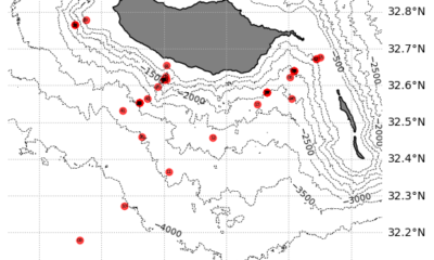
Anton and I have just brought CTD cast number 45 to light. While we are once again shaking freshly tapped bottles with great enthusiasm, I think I can make out question marks in Jamileh’s expression as she smiles good morning to us. That’s what everyone here seems to be thinking: 45 CTD casts already? And many of them in the same place? Why all this? We should know the water once we’ve “measured” it, right? Well, somehow we do.

“Our” CTD, which biologists prefer to call a “water sampler”, is moved out of the side of the hangar, lowered and in the basic version measures Conductivity (salinity), Temperature and pressure (Depth) quasi continuously (at 24 Hz), ideally down to the seafloor. In addition, oxygen and fluorescence are measured, which makes it possible to estimate biological productivity (see previous blog entries by Nicole and Manfred). As an addition, water samples can be taken at various depths using the 24 Niskin bottles (Manfred is by far our best customer in this respect). For oceanographers, however, the continuous measurements of temperature and salinity are of crucial importance, as they allow us to see how stable the water is stratified, for example, or to deduce the origin of the water masses and geostrophic currents. This is important information that forms the framework conditions that strongly influence the local ecosystem. In order to achieve maximum precision in the physical measurements, I take water samples myself “only” to calibrate the oxygen and salinity sensors later, but not to analyze the suspicious living beings in it.

Most of the deployments to date have been close to shore at a depth of about 1500 meters. The following figure shows one of our precious deeper profiles down to a depth of almost 3300 meters. Here, the top 100 meters form the so-called “mixed layer”, in which all measured variables are well mixed by the wind. We observe that the depth of this surface layer varies, but is generally comparatively thick – as is typical for the winter months at these latitudes. At our first station, the mixed layer depth was even around 200m! Temperature (red), salt (blue), oxygen (yellow) and chlorophyll (green) draw practically vertical lines in the diagram. Interestingly, a maximum of chlorophyll often forms exactly at or below the surface layer, which serves as an indicator for the presence of phytoplankton (see Nicole’s and Manfred’s blog entry on “Micro-Creatures”). Although phytoplankton is basically autotrophic, i.e. dependent on sunlight, it can survive in this rather deep layer with very little sunlight. One reason for this is the increased nutrient content in deeper layers.

In addition, the pycnocline directly below the mixed layer forms a strong physical barrier to vertical mixing and can practically “trap” organisms that cannot actively swim themselves. The pycnocline is the layer in which the density of the water increases very rapidly with depth (here due to the temperature gradient). These layers contain a wide range of temperature and salt contents and are also called Central Waters. To identify water masses, temperatures and salinities are plotted against each other in a so-called “T-S diagram” (as shown in Figure 4). In our example, you can clearly see that the water around Madeira consists largely of Eastern North Atlantic Central Water (ENACW). This water mass dominates the pycnocline in the large North Atlantic Gyre and is significantly more saline than in the South Atlantic (see Eastern South Atlantic Central Water). In our profile number 41 (Figure 3), however, something else catches the eye. At around 1100m, there is a nose with a significantly higher salinity, which does not seem to match the linear Central Water. The influence of the Mediterranean Water (MW) is noticeable here, which has a particularly high salt content due to the predominantly high evaporation and low precipitation in the Mediterranean region.
Due to this high salt content, it manifests itself at greater depths, typically around 1100m to 1200m, despite the warm temperatures. However, we can also see in the T-S diagram that the Mediterranean water in the south of Madeira is already somewhat more mixed, i.e. less warm and saline than directly at the outflow of the Mediterranean. Even further down, which we can observe particularly well at our deeper CTD stations around 3000m, resides the famous North Atlantic Deep Water (NADW). This is formed by, for instance, deep convection in the North Atlantic and plays a central role in global thermohaline circulation and climate dynamics. Although constituting deep water, it is comparatively “young” and therefore rich in oxygen (we like to say “well ventilated”) and forms a contrast to the oxygen minimum, which we observe here around Madeira at around 800-900 meters. This minimum zone is formed by respiration of the sunken organic material, e.g. from the sunlight-dependent phytoplankton in the uppermost ~150 meters. Compared to the large known oxygen minimum zones in the subtropical eastern Atlantic and Pacific, however, there is still comparatively abundant oxygen.

Now, we know the profile of a single CTD station a little better. Basically, this one is actually fairly representative of the other 44, so the question of why Anton and I keep “driving CTDs” like madmen remains unanswered. However, if we take a closer look, we can see that the temperature and salinity profiles are not completely “smooth”. In fact, we discover small wavelike deviations. Measurement inaccuracies? No. It is internal waves that bring “life” to the profiles. Internal waves can occur in any stratified medium, i.e. fluids in which the density is not constant. There are two restoring forces that act on internal waves in the ocean: Gravity and the Coriolis force. The main drivers of internal waves are the tides (such as ebb and flow), closely followed by wind. We know that internal waves play a crucial role in energy transport in the ocean. Like ordinary surface waves, internal waves can also break. When they do, mixing takes place. This in turn can transport nutrients and thereby influence biological productivity. The interaction of internal waves with topography (i.e. islands such as Madeira) and currents is very complex and not yet fully understood. By using a large number of stations at different times (and tidal stages), we obtain a better spatial and temporal resolution of the internal wave field and improve our understanding. That’s also why we are fans of so-called “yo-yo CTDs”. Just like a real yo-yo, we move the CTD up and down several times in direct succession at one and the same location.

In the figure above, we have plotted six directly consecutive profiles of a “CTD yo-yo” on top of each other. You can see that the profiles deviate more from each other at some depths and not at others (nodal points). The most impressive influence is exerted by internal waves on the mixed layer depth, which can vary by several tens of meters within minutes.
There is a particular thrill when the “Eddy hunt” is called for. That sounds more martial than it is meant to be. Eddies are oceanic vortices that reach a diameter of about 50 km around Madeira, interact with topography (islands) and internal waves and are known to have an impact on biodiversity. They develop over a period of days/weeks and are unfortunately hardly predictable. Therefore, we check satellite and model data for the region daily to identify a possible feature and, if possible, sample in situ with Merian. Strong eddies can generate a signal in sea level, surface temperatures and chlorophyll, recognizable via satellites. Our colleagues from the Oceanographic Institute of Madeira are helping us on site by providing the regional satellite and model data (see https://oomdata.arditi.pt/msm126/). Overall, it is impressive how well the collaboration on board and beyond works! One “eddy hunt” has already taken place on the night of February 13-14. However, the satellite signal was weak, and accordingly we were unable to detect a strong, coherent eddy In Situ with our shipboard ADCP (Acoustic Doppler Current Profiler, which measures ocean currents down to a depth of almost 1000m). (Side note: However, another exciting feature (presumably a strong internal wave) was identified in the surface layer, which we are now analyzing.)

In one of the following contributions, we want to prove to you that our beloved CTD is something very special in purely “objective” terms thanks to sophisticated tuning, including high-resolution camera systems. Then we’ll explain why Anton, although he’s not a physical oceanographer, also likes to drive “CTD yo-yos” and there will finally be photos of aquatic animals again!
Greetings from on board RV MARIA S. MERIAN,
Marco Schulz und Anton Theileis
Ocean Acidification
New Friends, New Addresses
The JOIDES Resolution (JR) was a renowned, international, scientific research ship. It was home to over 190 expeditions, each sailing for 60 days at a time without docking. Scientists and crew members from all over the world met to discover Earth’s secrets through studying ocean cores. Every two months the JR would get a new crew, sailing to an entirely new place. This once in a lifetime experience forms special and unforgettable social connections.
Since working on the JR I’ve kept those connections strong with snail mail. I have always been an avid penpal, so meeting new friends means new addresses to send my letters and postcards to. Experiences like sailing on the JOIDES Resolution or participating in programs like OCEAN CORE Academy is one of the ways I’ve met people from all over the world.
Now that the JR is retired, there is no more scientific research drilling being done through the International Ocean Discovery Program (IODP). But, there is still plenty to learn from ocean cores, and plenty of people to meet through programs like OCEAN CORE Academy (OCA). OCA is an annual summer opportunity from the U.S. Scientific Support Program (USSSP) that hosts undergraduates interested in geoscience related careers. Students can apply to this program for a chance to research and study data recovered from cores originally brought up by the JR, now located at the Gulf Coast Repository (GCR) in College Station, Texas. Students also practice forms of science communication with the guide of mentors. As a science communicator and fan of snail mail, I ran a craft night teaching students how to make and send science-themed postcards.

Fig. 1) students using watercolor to paint onto 4 by 6 inch board paper, a photo of a thin section slide is in the background. Photo by Dr. Leah Joseph.
For this project, we based the cover image of the postcards off of rock thin section slides. These slides are a slice of a hard rock or mineral that’s been glued to a microscope slide, sanded to 0.03 millimeter thickness, and polished. Thin section slides are used to identify grain size, shape, color, and other physical properties. This helps scientists understand the textural relationships between the rocks and determine the origin or evolution of the parent rock. Thin sections can also be helpful for identifying minerals using cross polarized light (XPL). XPL reduces light reflection and glare, commonly used for sunglasses and professional photography, but in a polarizing microscope, XPL is used to create a dark field causing certain minerals to appear brighter and more visible. Different colors are associated with different minerals, and as the stage of the microscope rotates, light passes through the slide in unique ways aiding scientists with identification. Identifying minerals can help scientists in understanding more about where the rocks came from and how old they are. These thin sections are not only informative, but are incredibly beautiful, making unique and stunning postcard covers.

Fig. 2) Examples of thin section slides under a XPL microscope, bronzitite (left) and gabbro (right). Sourced from here.
After the OCA students finished their paintings, my home-made “post card” stamps go on the back, a stamp gets added, and they’re ready to be mailed out. Although most OCA participants this year were U.S. based, they came from all over, ranging from Staten Island to San Francisco to Arizona to Connecticut. In addition to one mentor from New Zealand! For many of these students this was their first time traveling on their own, and their first time forming long-distance connections. With these scientific postcards, OCA students can stay connected by reminding each other of the science they learned together. My experience on the JR taught me great things about geological research, but it also gave me life long connections that I cherish. Although the JR is gone, its legacy lives on in our memories and the ways we stay connected with friends. I’m grateful to know that even without an international ship, I’m still able to add friends to my address book.

Fig. 3) Examples of participant made postcards
Written by Kellan Moss
Ocean Acidification
Color Traditions with Munsell Soil-Color Charts

Fig. 1) an open page of the Munsell Soil-Color Chart book
The Munsell Color Chart has been the national standard and official color system for soil research in the U.S. since the 1930s. For nearly 100 years, geologists and soil scientists have taken these color chip pages into the field to better understand the Earth they are studying, so it comes as no surprise that it is the standard for recording ocean cores brought up by the JOIDES Resolution.
Upon first glance, these charts may look like a page of free paint sample strips you can find at your local hardware store, but they are critical to classifying sediment and understanding the environments they came from and can cost several hundred dollars. The Munsell Color System is a method of numerically describing colors. It specifies colors based on hue, value, and chroma and measures them in a three dimensional space. Hue refers to the dominant color of the soil, value is the lightness of the color (scaled 0-10; 0 being black and 10 being white), and chroma is the intensity or saturation of the color.

Fig. 2) A 3D model representation of the Munsell Color System
There are five primary hues, red, yellow, green, blue, and purple, and five intermediate hues, which are a combination of primary hues such as yellow-red (YR) or green-yellow (GY). The hue of a color is represented as a ring and as the rings go up and down a vertical axis, the value of the color changes. As the color moves horizontally from the vertical axis, chroma or saturation becomes stronger or weaker. A color is specified by listing the three numbers or letters for hue, value, and chroma in that order. In the soil color chart, these number letter combinations correspond with a color. For instance, in figure 1, a 7.5YR 5/6 is also called “strong brown” (seen on the left page, bottom right). The names of colors used in weekly expedition reports are not arbitrary or subjective, they are specific and can be easily and accurately charted by anyone with a Munsell Chart reading the report.
Useful or Just Tradition?
The Munsell Color System has limitations. There are a distinct number of samples and the spacing between colors are large, making it difficult to measure thresholds. This inspired new color measuring methods to develop like CIELAB. Read more about CIELAB and what it means here (blog post “Color Science and Ocean Cores”). Changes to the Munsell system were made, doubling the number of hues in Munsell’s original book from 20 to 40, but CIELAB was already on its way to mainstream.
However, it’s still true that Munsell has been the soil color standard for nearly 100 years. That’s 100 years of geological and earth science research using this method of recording color. If scientists were to change to a system like CIELAB, it would mean having to constantly convert units when comparing previous research. Scientists compare and reference previous work all the time. Comparing sediment core colors from different sites can help support their own scientific findings. So switching to a different color recording method would mean converting all previous research. But is that a good enough reason to stick to tradition?
CIELAB creates a standard observer, which is an averaging of color matching that helps set a base value for recordings. This helps create the most accurate color reading on something such as an ocean core. Using color charts opens up the possibility for disagreements as no two human eyes see colors the same. And this really happens! In 2024 while aboard the JOIDES Resolution, EXP401 sedimentologists held long discussions about shades of grey they were recording differently.

Fig. 3) Photos of “The Great Grey Debate” on EXP401 by Dr. Patty Standring
Machines can record accurately and consistently, so why not switch to CIELAB? Well, expensive machines that use CIELAB, like the Section Half Multi-Sensor Logger (SHMSL) take anywhere from seven minutes to hours, recording only one core at a time. When on a two month cruise, pulling up hundreds of meters of core, time is crucial. Cores dry out and potentially change color as they dry, so it’s important to record fresh colors.
The color of a core can tell scientists so much information so quickly.
“Gradual color changes helped us to identify where we saw facies changes on a larger scale. There were very obvious cyclical color changes at Site U1385 that helped establish that the cores preserved a really good orbitally-driven sediment record. Color differences are also really useful when looking at different grain sizes that help identify turbidites and other sedimentary structures, and burrows from bioturbating organisms,” (Standring)
It’s important that scientists record these fresh colors as quickly and efficiently as possible. Although debates about the color grey can happen, these color discussions and international collaborations are what scientific research is all about. After 100 years, Munsell will stay the golden standard, not because it’s what we’ve always done, but because it’s still the best.
Written by Kellan Moss
Thank you to Dr. Patty Standring and Natacha Fabregas for help with this research
Sources:
Berns, R. S. (2016). Color science and the visual arts a guide for conservators, curators, and the curious. Los Angeles Getty Conservation Institute.
EXP 401 Sedimentologists: Dr. Patty Standring ad Natacha Fabregas
Featured Image: MerlinOne Archive
Fig. 1 Image: Here
Fig. 2 Image: Here
Fig. 3 Images: Dr. Patty Standring from EXP401
Ocean Acidification
Ribbegople, Rippenqualle or Comb Jelly: Whatever You Call Mnemiopsis leidyi, You Should Be Concerned
In early July at Kerteminde, most of the individuals I observed were longer than 10 cm, including one close to 15 cm. Their size, and their timing, deserve immediate attention.

One out of many large speciments I got from Kerteminde (Javidpour, July 2026)
It does not matter whether you call it ribbegople in Danish, Rippenqualle in German or comb jelly in English. The species is the same: Mnemiopsis leidyi. And what I have observed in Kerteminde this summer should concern us. During our current summer field course at the Marine Research Centre, I have repeatedly seen unusually large individuals of M. leidyi around the pier. Most of the animals I observed were longer than 10 cm, even bigger than the one I photographed.
Yes, yes, a pier observation is not a formal population survey….I know. We still need systematic sampling to determine the abundance, distribution and size structure of the population. Nevertheless, the observation is striking because both the size of the animals and the timing of their appearance are unusual, said by someone who is studying this species for the last 20 years.
This is happening earlier than expected
In previous years, the maximum population size of M. leidyi generally occurred several weeks later, mainly during August and early September. Our previous research, including work based on daily sampling, showed a clear seasonal development of the population. The timing varies among years and is influenced by environmental conditions, including winter temperature. Temperature is particularly important because it strongly affects the metabolism of M. leidyi. At warmer temperatures, individuals use their carbon reserves much faster and therefore require more food to maintain themselves and grow. This year, however, the pattern appears to be different. We are seeing very large individuals already in early July. We do not yet know whether this is a local aggregation, an unusually early bloom, transport from another area, particularly favourable feeding conditions or a combination of these factors. But it is a signal that deserves attention.
What does it take to grow by one centimetre?
It is tempting to ask how much energy an individual needs to add one centimetre to its body. The answer is not straightforward because one centimetre of length is not a fixed amount of biomass. Growing from 5 to 6 cm is not the same as growing from 14 to 15 cm…OK? However, we can make a rough carbon-budget calculation using a published relationship between the length and body-carbon content of M. leidyi:
Body carbon in milligrams = 0.0017 × body length in millimetres²·⁰¹³⁸
According to this relationship, an individual measuring 10 cm contains approximately 18.1 mg of carbon. At 11 cm, it contains about 21.9 mg. Adding this single centimetre therefore represents an increase of approximately 3.8 mg of body carbon. If we assume that the animal assimilates approximately 40% of the carbon it consumes, it would need to ingest at least ~10 mg of prey carbon to produce this additional tissue. Using an approximate value of 1 micrograms of carbon for a small copepod, this would correspond to more than 10,000 copepods.
For an already large individual growing from 14 to 15 cm, the estimated increase is approximately 5.3 mg of body carbon. At the same assimilation efficiency, that would require at least 13.3 mg of prey carbon: the equivalent of roughly 15,000 small copepods.
These calculations are only rough, conservative estimates. They are not complete energy budgets. They do not include the food needed for respiration, movement, reproduction, mucus production, excretion or unsuccessful feeding. The real prey requirement would therefore be considerably higher. The important point is that an individual measuring 15 cm represents a substantial transfer of material from the surrounding planktonic food web into gelatinous biomass. One additional centimetre is not “just” one centimetre.
Our students are tracing the food web
The timing of these observations coincides with our summer field course. The students are now collecting M. leidyi, fish, other gelatinous organisms and potential prey for stable-isotope analysis. By comparing carbon and nitrogen isotope values, we hope to obtain a rough picture of the relationships within the local food web. Carbon isotopes can help us trace the original sources of the material entering the food web, while nitrogen isotopes can provide information about relative trophic position.
This will not give us a direct photograph of one organism eating another. Stable-isotope values represent assimilated food over time, and their interpretation depends on appropriate baselines and turnover rates. Nevertheless, combined with information about size, abundance, prey availability and experimental feeding, they can help us understand where M. leidyi is obtaining its biomass and which organisms may be affected. …In simple terms, we are trying to determine who might be eating whom, and where this unusually large population fits into the food web.
Competition with fish is only part of the problem
The concern is not limited to competition for zooplankton. Mnemiopsis leidyi consumes copepods and other small planktonic animals that are also important food for pelagic fish. When the ctenophores are abundant, they can therefore compete directly with fish for prey. Our experiments have also demonstrated that M. leidyi can potentially feed directly on the early life stages of fish. In the study by my previous PhD student, the ctenophores captured and digested Baltic herring yolk-sac larvae. Predation was related to ctenophore size and was not simply eliminated when alternative copepod prey were available. This means that M. leidyi may/can affect fish populations in two ways: by consuming the food needed by fish and by consuming fish eggs or larvae directly.
A recent study by Lucila Sobrero and colleagues in Argentina, within the native range of M. leidyi, found a similar pattern. Their experiments showed size-dependent predation on fish eggs and larvae. Larger ctenophores consumed more eggs. Some eggs were later regurgitated, but many were no longer viable, while fish larvae were retained and digested. These findings are particularly relevant to what we are observing in Kerteminde. The size of an individual is not merely an interesting measurement. It can influence what that individual is capable of capturing and how strongly it affects the surrounding ecosystem. A population consisting of fewer but much larger individuals may still exert substantial pressure on zooplankton, fish eggs and fish larvae.
We need to investigate use, not only control
For several years, I have tried to obtain funding to investigate innovative approaches to this invasive species.
Once M. leidyi is well established, we may not be able to control its regional spread or completely prevent its blooms. But that does not mean that we have no options. We should investigate whether at least part of this recurring biomass can be collected and converted into something useful.
This is not a proposal for a miracle solution. Any utilisation strategy would have to be tested carefully. It must not encourage the further spread of the species, create damaging bycatch or provide an economic incentive to maintain an invasive population. We also need to understand the environmental costs of collection, transport and processing.
But these are exactly the questions that research funding should allow us to answer.
So far, my attempts to secure support for this work have been unsuccessful. Funding agencies do not seem to sense the urgency of studying approaches whose benefits may not be immediate or easily visible. and EPAs do not have any resource to invest in this part. The contrast with events on land is striking. This week, the oak processionary moth, the so-called “larva from hell”, has attracted considerable attention in Odense. Its microscopic hairs can cause rashes and allergic reactions, residents have reported serious discomfort, and a kindergarten has reportedly had to close temporarily. Those concerns are real and deserve a response.
But the case also illustrates how differently we react to environmental threats.
When the impact appears visibly on human skin, the urgency is immediately understood. When ecological damage develops below the surface of the sea, in the form of disappearing zooplankton, altered food webs, consumed fish eggs or reduced larval survival, it is much easier to overlook.
Marine ecosystem changes are often gradual, underwater and largely invisible to the public. By the time their consequences become obvious, the opportunity for early and relatively inexpensive action may already have passed.
Concern does not mean panic
One photograph and a series of observations from one pier do not prove that an ecological crisis is underway. I am not suggesting that they do. But science should not have to wait for undeniable damage before investigation becomes urgent.
The unusually large M. leidyi appearing in Kerteminde this July give us an opportunity to act early. We need systematic monitoring of their abundance and size distribution. We need to measure the available prey field. We need to determine their trophic position and investigate possible consequences for fish recruitment. And we need to explore whether biomass that we may be unable to prevent could be collected and used responsibly.
Whatever language we use and whatever name we give it, the message is the same:
We should measure early, investigate early and support innovative solutions while the warning is still only a warning, not after it has become a crisis.
Relevant publications
Javidpour, J. et al. (2009). “Seasonal changes and population dynamics of the ctenophore Mnemiopsis leidyi after its first year of invasion in the Kiel Fjord, Western Baltic Sea.” Biological Invasions.
Javidpour, J. et al. (2020). “Cannibalism makes invasive comb jelly, Mnemiopsis leidyi, resilient to unfavourable conditions.” Communications Biology.
Stoltenberg, I. et al. (2024). “Predation on Baltic Sea yolk-sac herring larvae (Clupea harengus) by the invasive ctenophore Mnemiopsis leidyi.” Fisheries Research.
Sobrero, L. et al. (2025). “Predatory impact on ichthyoplankton by Mnemiopsis leidyi is size-dependent: an experimental approach.” Marine Ecology Progress Series.
Ribbegople, Rippenqualle or Comb Jelly: Whatever You Call Mnemiopsis leidyi, You Should Be Concerned
-
Greenhouse Gases12 months ago
Guest post: Why China is still building new coal – and when it might stop
-
Climate Change12 months ago
Guest post: Why China is still building new coal – and when it might stop
-
Greenhouse Gases2 years ago嘉宾来稿:满足中国增长的用电需求 光伏加储能“比新建煤电更实惠”
-
Climate Change2 years ago嘉宾来稿:满足中国增长的用电需求 光伏加储能“比新建煤电更实惠”
-
Climate Change2 years ago
Bill Discounting Climate Change in Florida’s Energy Policy Awaits DeSantis’ Approval
-
Renewable Energy9 months agoSending Progressive Philanthropist George Soros to Prison?
-
Carbon Footprint2 years agoUS SEC’s Climate Disclosure Rules Spur Renewed Interest in Carbon Credits
-
Greenhouse Gases1 year ago
嘉宾来稿:探究火山喷发如何影响气候预测