Connect with us

Published

on

The Greenland ice sheet melt season for this year is over, resulting in the 28th year in a row in which Greenland has lost ice.

This has been a spiky year for Greenland – a mix of highs from abundant snow in winter and lows from some very high melt days in summer.

Those spikes of high snowfall delayed the onset of the melt season in June and reduced melt substantially in August. Fresh snow is a brighter white than old glacier ice, so summer snow effectively acted as a shiny protective blanket – just when the high melt season was getting going.

The 2023-24 year, as the year before, had strong melt rates throughout the northern-hemisphere summer, but also above average snowfall during winter and in June. As a result, the balance between accumulated snow and melting ice on Greenland’s surface ended above the 1981-2010 average.

The increase in both melt and snowfall are exactly what scientists expect in a warming climate. But, overall, Greenland has again lost more ice than it gained – even though, as in previous years, Greenland was comparably cool compared to North America and Europe.

High “calving” rates – the breaking off of icebergs at the face of the ice sheet – meant that Greenland lost 80bn tonnes of ice over the 12 months from September 2023 to August 2024. The last year to see a net gain of ice is still 1996.

This marks the 10th year of these annual reviews – see our previous annual analysis for 2023, 2022, 2021, 2020, 2019, 2018, 2017, 2016 and 2015.

Surface melt

Greenland’s annual cycle covers the 12 months from the previous September up to the end of August. Over this period, we calculate the “surface mass budget” (SMB) for the ice sheet.

The SMB is akin to the bank account for the surface of the Greenland ice sheet. It is the balance between gains (from snowfall) and losses (from ice melt and runoff).

As the ice sheet largely gains snow from September, accumulating ice through autumn, winter and into spring, we start the ice budget year on 1 September.

Then, as the year warms up into late spring, the ice sheet begins to lose more ice through surface melt than it gains from fresh snowfall, generally from the mid of June.

This melt season usually continues until the middle or end of August, the end of the surface budget year.

Snowfall is the only way for the ice sheet to gain mass. Therefore, for the size of the ice sheet to remain constant, this snow must outweigh all other ways the ice sheet can lose ice – iceberg calving, melt at the base of the ice sheet and evaporation from the surface.

According to our calculations, the Greenland ice sheet ended the year 2023-24 with an overall SMB of about 367bn tonnes (Gt). This is the 19th highest SMB in a dataset that goes back 44 years, and it is close to the 1981-2010 average of 348 Gt.

The past year’s SMB is illustrated in the maps and charts below, based on data from the Polar Portal. The blue line in the upper chart shows the day-to-day SMB. Large snowfall events become visible as “spikes”. The blue line in the lower chart depicts the accumulated SMB, counted from the beginning of the “mass balance year” on 1 September 2023. In grey, the long-term average and its variability are shown. For comparison, the red line shows the record-low year of 2011-12.

The map shows the geographic spread of SMB gains (blue) and losses (red) for 2023-24, compared to the long-term average. This shows that southern Greenland had a relatively wet year compared to the long-term average, but the north-west and west lost more than usual. The spikes of snow and melt are clear in the graphs on the right.

2023-24 saw a close-to-average surface mass balance for the Greenland ice sheet
Left: Map showing the difference between the annual SMB in 2023-24 and the 1981-2010 period (in mm of ice melt). Blue shows ice gain compared to average and red shows ice loss with respect to average. Right: Daily (upper chart) and cumulative (lower chart) SMB of the Greenland ice sheet, in Gt/day and Gt, respectively. (1Gt is equal to 1 cubic kilometre.) Blue lines show the 2023-24 SMB year; the grey lines and areas show the 1981-2010 average and variability; and the red line in the lower chart shows the record low SMB year of 2011-12. Credit: DMI Polar Portal.

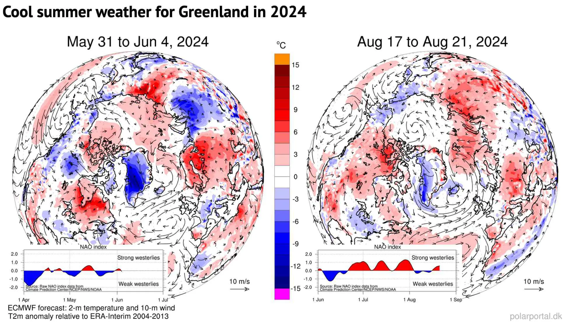
Heat over Europe and North America, cool over Greenland

While southern Europe sweltered through multiple heatwaves, northern Europe (with the exception of Arctic Scandinavia) had a rather cool and rainy July, followed by a warmer and sunnier late summer. Svalbard also suffered record temperatures and record amounts of glacier loss this year. 

And, yet, Greenland was spared these bouts of heat.

As in previous summer seasons, the comparatively wet and cool spells over the Greenland ice sheet were due to “blocking” weather patterns with ridges over North America and Europe and a trough in between over Greenland.

These high-pressure weather systems have a huge impact on weather extremes. Strong persistent blocks over North America and Europe were present in the course of the summer. This resulted in widespread heat near the cores of these high pressure areas and several heavy rainfall events in various European countries in May and June. 

In such a blocked flow, the jet stream is shaped like the Greek capital letter Omega (Ω). With the jet stream bulging up to the north over Canada and northern Europe, troughs of low pressure are found at each “foot” of the omega – including over Greenland. 

Svalbard was caught in one the opposite part of the omega with high temperatures and warm air directly over the islands, bringing large amounts of ice melt.

This contrast between Greenland on the one side and Svalbard and the eastern part of Canada is also a common pattern and shows how focusing on extremes in one region of the world means missing out on the opposite extreme in a different region.

The maps below show two examples of these recurring circulation patterns from late May/early June and mid-August. The blue shading shows the cool weather over Greenland (in the centre of the map), while the red shading shows the high temperatures over Canada, Europe and Svalbard .
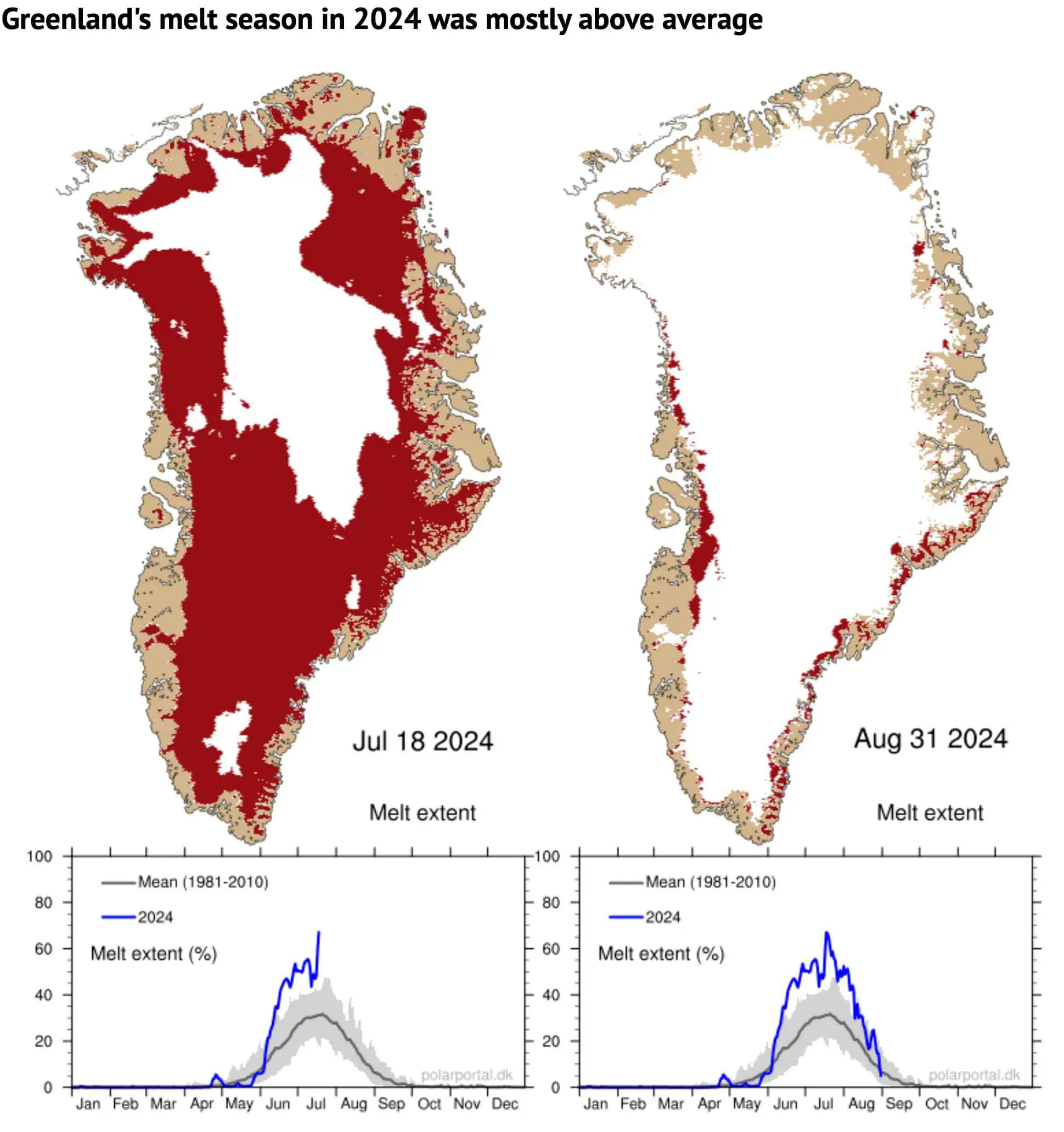
Cool summer weather for Greenland in 2024
Map showing cool summer weather in Greenland (in centre of map) and heat over northern North America and northern and eastern Europe, particularly Fennoscandia (left panel) and Svalbard (right panel). Shading indicates temperatures that are warmer (red) or cooler (blue) than the long-term average for the time of year. The arrows show the circulation patterns in the atmosphere. Credit: DMI Polar Portal.

Snow accumulation

However, the surface mass budget is not just about ice melt.

September, October and November all saw above-average snowfall. Then, as in 2022-23, a rather dry period followed in late winter, followed by spikes in snow in March, April and May.

As a result, the accumulated SMB was close to the 1981-2010 average as melting began.

Subsequently, in June, several large snow fall events brought an emergency blanket back to the ice sheet, delaying the start of the “ablation” – or melt – season to 24 June, 11 days later than the 1981-2010 median. (The ablation season is defined as the first day of three days in a row with an SMB below -1Gt.)

The melt area was well above the average for the period of 1981-2010 during most of June, July and August – despite another spike in snow in August.

The left map shows the area of ice melt on 18 July – the day with the maximum melt extent (67%) of this summer (shaded in red). The map on the right shows the situation at the end of the season on 31 August when the ice sheet was well back into the winter pattern.

The charts beneath show the daily extent of melting across the ice sheet as a percentage (blue line), with the 1981-2010 average shown in grey.

Greenland's melt season in 2024 was mostly above average
Top: Map showing areas of Greenland undergoing surface melt on 18 July and 31 August 2024 (shaded red). Bottom: Percentage of ice sheet area seeing surface melt on each day of 2024 (blue line), ending on 18 July and 31 August, respectively. The grey line shows the 1981-2010 average. Credit: DMI Polar Portal.

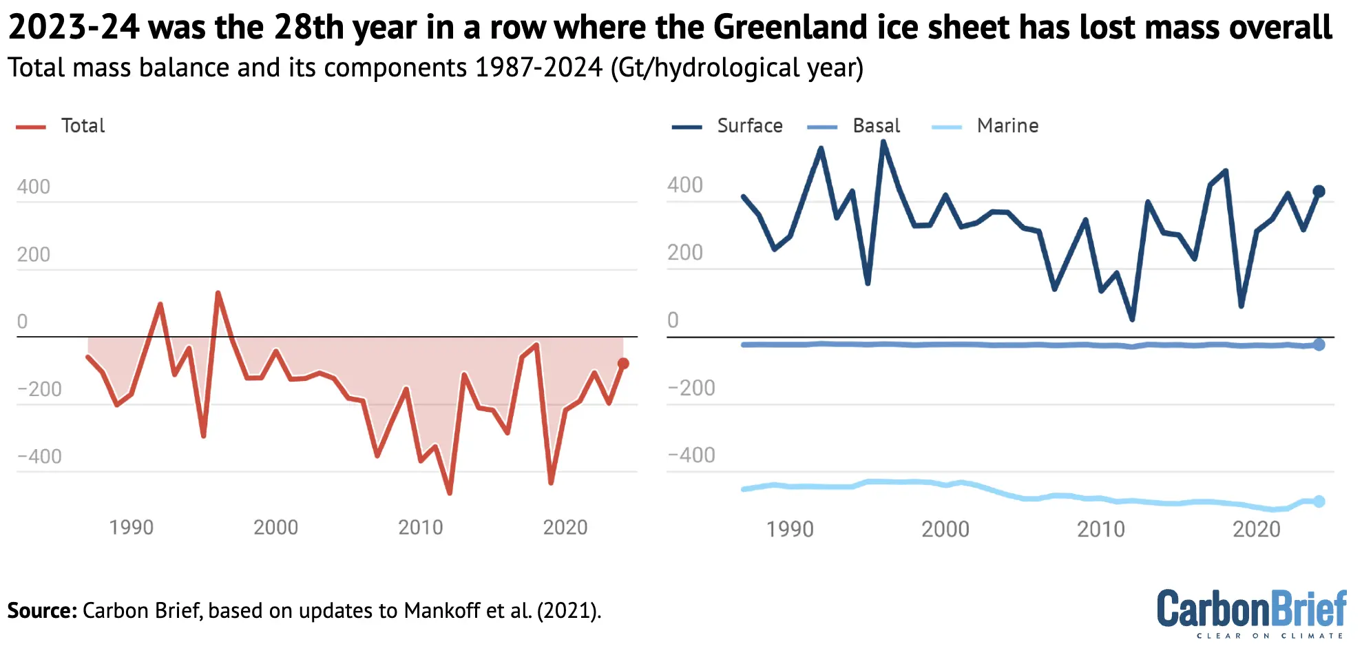
The total mass budget

The surface budget is just one component of the “total” mass budget (TMB) of the Greenland ice sheet:

TMB = SMB + MMB + BMB

Here, MMB is the “marine” mass balance, consisting of the breaking off – or “calving” – of icebergs and the melting of the front of glaciers where they meet the warm sea water. BMB is the “basal” mass balance, which refers to ice losses from the base of the ice sheet. This makes a small, but non-zero, contribution to the TMB and mainly consists of frictional effects and the ground heat flux.

The figure below shows how much ice the Greenland ice sheet has lost (red) going back to 1987, which includes the SMB (blue), MMB (green) and BMB (orange).

For 2023-24, the TMB ended with a loss of 80Gt of ice. This means that 2023-24 was the 28th year in a row with a Greenland ice sheet overall mass loss. As the chart shows, Greenland last saw an annual net gain of ice in 1996.

2023-24 was the 28th year in a row where the Greenland ice sheet has lost mass overall
Chart showing the surface (blue), marine (green), basal (yellow) and total (red) mass balance for 1987 to 2024. Figures are in Gt per year. Based on updates to Mankoff et al. (2021)

Satellite data

Using data from the GRACE satellites, we can also estimate how much ice Greenland lost – independently from our calculations above.

The distance of these twin satellites changes slightly due to tiny gravity differences caused by mass changes. In addition, we can measure the speed at which ice flows through control points on the ice sheet where we know the thickness and shape of the ice. Thus, we can estimate MMB, the amount of ice being lost by the process of calving and submarine melting.

This data is openly available, allowing us to monitor the whole ice-sheet budget.

The map and graph below show the gain (blue) and loss (red) in the mass of ice. The difference in these mass changes over a glaciological year (September-August) is the TMB of the ice sheet for that particular year.

Satellite data reveals where the Greenland ice sheet is gaining and losing mass
Gain and loss in the total mass of ice of the Greenland ice sheet based on the GRACE and GRACE-FO satellites, updated until May 2024. Both missions are twin satellites separated by a distance of around 220km. This distance depends on gravity and can be measured very precisely. Gravity changes in turn are related to mass changes for example due to the loss of ice. GRACE was launched in March 2002, and the mission ended in October 2017. GRACE-FO was launched in May 2018. Therefore a gap exists between both missions. Shown is the month-by-month mass change in billions of tonnes (Gt) = cubic kilometres (km3). Also shown is the corresponding contribution to sea level rise; 100Gt is equivalent to 0.28mm of global sea level rise. All changes are given relative to April 2002.

According to the GRACE satellite data, most of the ice loss over 2023-24 occurred along the edge of the ice sheet, in particular along the west coast. This is backed up both by PROMICE observations and model data. In the interior of Greenland, a small increase in ice mass is found, as there is usually little or no snow melt in this region.

The graph illustrates the month-by-month development in changes of mass measured in gigatonnes, relative to April 2002. The left axis on the graph shows how this ice mass loss translates into a sea level rise contribution, where 100Gt corresponds to 0.28mm of global sea level rise.

Our calculations and the GRACE satellite data are entirely independent ways of estimating Greenland’s TMB, yet the results are quite closely aligned. From April 2002 to May 2024, the ice sheet losses amounted to 4,756Gt (calculations) and 4,911Gt (satellites) of ice.

As 1Gt of water is equivalent to a cube of 1 km by 1 km by 1 km, 360 of these cubes is equivalent to 1mm of sea level rise averaged around the whole globe.

This means that, since 2002, the Greenland ice sheet alone has contributed around 14mm to global average sea level rise.

The post Guest post: How the Greenland ice sheet fared in 2024 appeared first on Carbon Brief.

Guest post: How the Greenland ice sheet fared in 2024

Continue Reading

Climate Change

Drought Turns Southeastern US Into ‘Tinderbox’ as Wildfires Rage

Published

on

Weather extremes fuel wildfires that have burned through tens of thousands of acres across Georgia, Florida and other states.

Drought and fire are a dangerous duo. The Southeastern United States is witnessing this firsthand as several major blazes burn tens of thousands of acres across the parched region, destroying homes and prompting evacuations in some areas. Florida and Georgia have been particularly hard hit, and strong winds and unusually low humidity have made it difficult to combat the flames.

Drought Turns Southeastern US Into ‘Tinderbox’ as Wildfires Rage

Continue Reading

Climate Change

Night Skies and Shifting Stars: How Indigenous Celestial Knowledge Tracks a Changing Climate

Published

on

When the land no longer answers the stars the way it once did, Indigenous peoples are among the first to notice — and the first to ask why.

A Sky Full of Knowledge

Look up on a clear night on Turtle Island and you’re seeing a sky that has guided human life for thousands of years. Across Indigenous nations in Canada, detailed systems of celestial knowledge developed not as abstract science but as living, practical guides —telling people when to plant, when to harvest, when herds would move, and when ice would come. This astronomical knowledge was woven into language, ceremony, and everyday life, passed down through generations with remarkable precision.

The Mi’kmaq and the Celestial Bear

Among the Mi’kmaq of Atlantic Canada, star stories are ecological calendars, precise and functional. The story of Muin and the Seven Bird Hunters connects the annual movement of what Western astronomy calls Ursa Major to the seasonal cycle of hunting and harvest: the bear rises in spring, is hunted through summer, and falls to earth in autumn. This knowledge was brought to broader public attention in 2009 during the International Year of Astronomy, when Mi’kmaq Elders Lillian Marshall of Potlotek First Nation and Murdena Marshall of Eskasoni First Nation shared the story through an animated film produced at Cape Breton University narrated in English, French, and Mi’kmaq.¹ The story encodes specific observations about when and where to hunt, and which species to expect at which time of year. It is science in narrative form.

The Anishinaabe and the Seasonal Star Map

Among the Anishinaabe peoples of the Great Lakes and northern Ontario, celestial knowledge forms part of a comprehensive seasonal understanding. Knowledge keepers like Michael Wassegijig Price of Wikwemikong First Nation have described how Anishinaabe constellations  quite different from those of Western astronomy connect the movement of the heavens to naming ceremonies, seasonal gatherings, and land practices.² The Royal Astronomical Society of Canada now offers planispheres featuring Indigenous constellations from Cree, Ojibwe, and Dakota sky traditions, recognizing their value as both cultural heritage and ecological knowledge systems.³

When the Stars and the Land Fall Out of Rhythm

Here’s the challenge that climate change has introduced: the stars still move on their ancient, reliable schedule. But the land no longer always responds as expected. Migratory birds that once arrived when certain constellations appeared are now showing up earlier or later. Ice that once formed in predictable windows is forming weeks late, or not at all. Berry harvests, fish runs, animal migrations, all once timed by celestial cues accumulated over millennia are shifting. Indigenous knowledge holders across Canada describe this as a kind of dissonance: the sky remains faithful, but the land has changed.⁴

Long-Baseline Ecological Records

Far from being historical curiosity, Indigenous celestial knowledge systems are now being recognized by researchers as long-baseline ecological calendars —records of how nature behaved over centuries, encoded in story and ceremony. When an Elder observes that a particular star rising no longer predicts the arrival of certain geese, that observation represents a departure from a pattern that may have held true for hundreds of years. The Climate Atlas of Canada integrates Indigenous knowledge observations alongside western climate data, recognizing that both contribute meaningfully to understanding ecological change.⁵

Keeping the Knowledge Alive

Language revitalization and land-based education programs are helping ensure this knowledge reaches the future. From youth astronomy nights on-reserve to the integration of Indigenous sky stories in school curricula, there is growing recognition that these knowledge systems belong to what comes next, not only what came before. As Canada grapples with accelerating ecological change, the quiet precision of thousands of years of skyward observation offers something no satellite can fully replicate: a continuous record of the relationship between the cosmos and a living land.

Blog by Rye Karonhiowanen Barberstock

Image Credit: Dustin Bowdige, Unsplash

References 

[1] Marshall, L., Marshall, M., Harris, P., & Bartlett, C. (2010). Muin and the Seven Bird Hunters: A Mi’kmaw Night Sky Story. Cape Breton University Press. See also: Integrative Science, CBU. (2009). Background on the Making of the Muin Video for IYA2009. http://www.integrativescience.ca/uploads/activities/BACKGROUND-making-video-Muin-Seven-Bird-Hunters-IYA-binder.pdf

[2] Price, M.W. (Various). Anishinaabe celestial knowledge. Wikwemikong First Nation. Referenced in: Royal Astronomical Society of Canada Indigenous Astronomy resources.

[3] Royal Astronomical Society of Canada. (2020). Indigenous Skies planisphere series. RASC. https://www.rasc.ca/indigenous-skies

[4] Neilson, H. (2022, December 11). The night sky over Mi’kmaki: A Q&A with astronomer Hilding Neilson. CBC News. https://www.cbc.ca/news/canada/newfoundland-labrador/hilding-neilson-indigenizing-astronomy-1.6679072

[5] Climate Atlas of Canada. (2024). Prairie Climate Centre, University of Winnipeg. https://climateatlas.ca/

The post Night Skies and Shifting Stars: How Indigenous Celestial Knowledge Tracks a Changing Climate appeared first on Indigenous Climate Hub.

https://indigenousclimatehub.ca/2026/04/night-skies-and-shifting-stars-how-indigenous-celestial-knowledge-tracks-a-changing-climate/

Continue Reading

Climate Change

World ‘will not see significant return to coal’ in 2026 – despite Iran crisis

Published

on

A much-discussed “return to coal” by some countries in the wake of the Iran war is likely to be far more limited than thought, amounting to a global rise of no more than 1.8% in coal power output this year.

The new analysis by thinktank Ember, shared exclusively with Carbon Brief, is a “worst-case” scenario and the reality could be even lower.

Separate data shows that, to date, there has been no “return to coal” in 2026.

While some countries, such as Japan, Pakistan and the Philippines, have responded to disrupted gas supplies with plans to increase their coal use, the new analysis shows that these actions will likely result in a “small rise” at most.

In fact, the decline of coal power in some countries and the potential for global electricity demand growth to slow down could mean coal generation continues falling this year.

Experts tell Carbon Brief that “the big story isn’t about a coal comeback” and any increase in coal use is “merely masking a longer-term structural decline”.

Instead, they say clean-energy projects are emerging as more appealing investments during the fossil-fuel driven energy crisis.

‘Return to coal’

The conflict following the US-Israeli attacks on Iran has disrupted global gas supplies, particularly after Iran blocked the strait of Hormuz, a key chokepoint in the Persian Gulf.

A fifth of the world’s liquified natural gas (LNG) is normally shipped through this region, mainly supplying Asian countries. The blockage in this supply route means there is now less gas available and the remaining supplies are more expensive.

(Note that while the strait usually carries a fifth of LNG trade, this amounts to a much smaller share of global gas supplies overall, with most gas being moved via pipelines.)

With gas supplies constrained and prices remaining well above pre-conflict levels, at least eight countries in Asia and Europe have announced plans to increase their coal-fired electricity generation, or to review or delay plans to phase out coal power.

These nations include Japan, South Korea, Bangladesh, the Philippines, Thailand, Pakistan, Germany and Italy. Many of these nations are major users of coal power.

Such announcements have triggered a wave of reporting by global media outlets and analysts about a “return to coal”. Some have lamented a trend that is “incompatible with climate imperatives”, while others have even framed this as a positive development that illustrates coal’s return “from the dead”.

This mirrors a trend seen after Russia’s invasion of Ukraine in 2022, which many commentators said would lead to a surge in European coal use, due to disrupted gas supplies from Russia. 

In fact, despite a spike in 2022, EU coal use has returned to its “terminal decline” and reached a historic low in 2025.

Gas to coal

So far, the evidence suggests that there has been no return to coal in 2026.

Analysis by the Centre for Research on Energy and Clean Air found that, in March, coal power generation remained flat globally and a fall in gas-fired generation was “offset by large increases in solar and wind power, rather than coal”.

However, as some governments only announced their coal plans towards the end of March, these figures may not capture their impact.

To get a sense of what that impact could be, Ember assessed the impact of coal policy changes and market responses across 16 countries, plus the 27 member states of the EU, which together accounted for 95% of total coal power generation in 2025.

For each country, the analysis considers a maximum “worst-case” scenario for switching from gas to coal power in the face of high gas prices.

It also considers the potential for any out-of-service coal power plants to return and for there to be delays in previously expected closures as a result of the response to the energy crisis.

Ember concludes that these factors could increase coal use by 175 terawatt hours (TWh), or 1.8%, in 2026 compared to 2025.

(This increase is measured relative to what would have happened without the energy crisis and does not account for wider trends in electricity generation from coal, which could see demand decline overall. Last year, coal power dropped by 63TWh, or 0.6%.)

Roughly three-quarters of the global effect in the Ember analysis is from potential gas-to-coal switching in China and the EU.

Other notable increases could come from switching in India and Indonesia and – to a lesser extent – from coal-policy shifts in South Korea, Bangladesh and Pakistan.

However, widely reported policy changes by Japan, Thailand and the Philippines are estimated to have very little, if any, impact on coal-power generation in 2026. The table below briefly summarises the potential for and reasoning behind the estimated increases in coal generation in each country in 2026.

Dave Jones, chief analyst at Ember, stresses that the 1.8% figure is an upper estimate, telling Carbon Brief:

“This would only happen if gas prices remained very high for the rest of the year and if there were sufficient coal stocks at power plants. The real risk of higher coal burn in 2026 comes not from coal units returning…but rather from pockets of gas-to-coal switching by existing power plants, primarily in China and the EU.”

Moreover, Jones says there is a real chance that global coal power could continue falling over the course of this year, partly driven by the energy crisis. He explains:

“If the energy crisis starts to dent electricity demand growth, coal generation – as well as gas generation – might actually be lower than before the crisis.”

‘Structural decline’

Energy experts tell Carbon Brief that Ember’s analysis aligns with their own assessments of the state of coal power.

Coal already had lower operation costs than gas before the energy crisis. This means that coal power plants were already being run at high levels in coal-dependent Asian economies that also use imported LNG to generate electricity. As such, they have limited potential to cut their need for LNG by further increasing coal generation.

Christine Shearer, who manages the global coal plant tracker at Global Energy Monitor, tells Carbon Brief that, in the EU, there is a shrinking pool of countries where gas-to-coal switching is possible:

“In Europe, coal fleets are smaller, older and increasingly uneconomic, while wind, solar and storage are becoming more competitive and widespread.”

In the context of the energy crisis, Italy has announced plans to delay its coal phaseout from 2025 to 2038. This plan, dismissed by the ECCO thinktank as “ineffective and costly”, would have minimal impact given coal only provides around 1% of the country’s power. 

Notably, experts say that there is no evidence of the kind of structural “return to coal” that would spark concerns about countries’ climate goals. There have been no new coal plants announced in recent weeks.

Suzie Marshall, a policy advisor working on the “coal-to-clean transition” at E3G, tells Carbon Brief:

“We’re seeing possible delayed retirements and higher utilisation [of existing coal plants], as understandable emergency measures to keep the lights on, but not investment in new coal projects…Any short-term increase in coal consumption that we may see in response to this ongoing energy crisis is merely masking a longer-term structural decline.”

With cost-competitive solar, wind and batteries given a boost over fossil fuels by the energy crisis, there have been numerous announcements about new renewable energy projects since the start of war, including from India, Japan and Indonesia

Shearer says that, rather than a “sustained coal comeback” in 2026, the Iran war “strengthens the case for renewables”. She says:

“If anything, a second gas shock in less than five years strengthens the case for renewables as the more secure long-term path.”

Jones says that Ember expects “little change in overall fossil generation, but with a small rise in coal and a fall in gas” in 2026. He adds:

“This would maximise gas-to-coal switching globally outside of the US, leaving no possibility for further switching in future years. Therefore, the big story isn’t about a coal comeback. It’s about how the relative economics of renewables, compared to fossil fuels, have been given a superboost by the crisis.”

The post World ‘will not see significant return to coal’ in 2026 – despite Iran crisis appeared first on Carbon Brief.

World ‘will not see significant return to coal’ in 2026 – despite Iran crisis

Continue Reading

Trending

Copyright © 2022 BreakingClimateChange.com