
Long-abolished discriminatory lending practices in the US are still having an impact on the inequality of climate risks facing urban populations today, according to a new study.
The research, published in Nature Cities, looks at historically “redlined” neighbourhoods – those deemed highly risky for lenders, broadly due to the race and economic profile of those in the area – and compares them to neighbourhoods that were seen as less risky.
The scientists find that, across more than 200 US cities, once-redlined neighbourhoods are at higher risk of heat exposure and flooding.
Even homes just tens of metres apart have different climate risks, they find, with those located on the redlined side of a boundary at higher risk than those living on the other side of the boundary.
The lead author of the study tells Carbon Brief that the work underscores the historical legacy of planning decisions made in the last century, adding that she hopes that current policymakers can better consider the “impact of different planning policies and the unintended consequences”.
One researcher who was not involved in the study tells Carbon Brief that the work makes several significant contributions, but cautions that the authors were “pretty bold” in some of their conclusions.
‘Risky’ investments
“Redlining” refers to a discriminatory historical practice in the US, whereby neighbourhoods were graded as too “risky” for investment based on race, income levels and housing quality. These grades were used as justification for the denial of long-term mortgages and exacerbated existing racial segregation.
One of the most recognisable remnants of redlining is the set of maps produced by the Home Owners’ Loan Corporation (HOLC), established in 1933 as part of US president Franklin D Roosevelt’s “New Deal”. The HOLC refinanced foreclosed mortgages at lower interest rates with the intention of preserving and expanding homeownership.
The HOLC created maps of “riskiness” of investment in an attempt to guarantee that the loans would be paid back and that the burden on the taxpayer would be minimal.
The maps created by the HOLC classified neighbourhoods based on a four-point risk scale, with A-grades – the “best”, or least-risky, investments – outlined in green and D-grades – the most risky, termed “hazardous” – outlined in red, giving rise to the term.
B-graded neighbourhoods, outlined in blue, were termed “still desirable”, while C-graded ones, in yellow, were “declining”.

The HOLC created maps for more than 200 cities across at least 40 states. Other federal agencies and private companies later made their own “risk-assessment” maps, further cementing the practice into policy.
Although redlining was formally outlawed in 1968 by the US Fair Housing Act, the inequalities created and exacerbated by the practice persist in many places to this day, says Dr Arianna Salazar-Miranda, an urban planner and data scientist at Yale University.
Salazar-Miranda, who is the lead author of the new study, tells Carbon Brief:
“There are many social and economic dimensions for which we should be worried about this long-standing legacy of redlining.”
For example, previous research has shown that redlined neighbourhoods have lower rates of homeownership, lower credit scores and lower home values. There are also associations between historically redlined neighbourhoods and prevalence of cancer and asthma, air pollution and proximity to hazardous waste, among other dimensions of health inequality and environmental racism.
Prof Shannon Van Zandt, an urban planner at Texas A&M University, who was a reviewer of the new paper, but not involved in the study itself, tells Carbon Brief:
“Segregation is still so relevant in the experiences of families of colour and, in particular, Black or African American households, because of the very indelible lines that we literally drew [on the map].”
Climate risk
Using maps from 202 cities across the US, Salazar-Miranda and her colleagues examine the risk of heat extremes and flooding for homes in differently graded neighbourhoods. These factors, each graded on a 1-10 scale from least to most hazardous, were developed by the climate research and technology firm First Street.
The heat risk factor combines temperature and humidity to determine a “feels-like” temperature, averaged across the month of July for each location.
The flood risk factor uses flooding factors, such as rainfall and high tide levels, as well as variables that affect water runoff, including elevation and ground permeability. It also incorporates existing community flood defences. The risk is defined by both depth and likelihood of flooding.
Both the heat and flood risk scores also factor in projections of future climate change, including higher temperatures and sea level rise.
The researchers focused specifically on homes within 100 metres of a boundary between two different grades. Salazar-Miranda tells Carbon Brief:
“We’re trying to narrow down on a subset of properties that are very comparable, where they have the same underlying conditions and the only thing that changed is whether they’re on one side of the border or the other.”
The maps below show the digitised redlining map of Baltimore (left), with the colours indicating the different grades and the bold lines depicting boundaries between different grades.
On the right, a zoomed-in portion of the map shows the 100-metre buffer zones drawn around each boundary. Locations of houses are coloured according to which side of the border they fall on – grey for the lower-graded side and black for the higher-graded side.

Geographical and climatic features, such as elevation and amount of rainfall, did not vary significantly across the boundaries because the researchers were only looking at homes close to a grade boundary.
They find that, aggregated across all cities, D-graded neighbourhoods have a flood risk factor that is 0.245 points higher than A-graded ones – more than three times higher than the additional risk of a C-graded neighbourhood.
The heat risk effect is smaller, but still significant, with D-graded neighbourhoods scoring 0.033 points higher than A-graded neighbourhoods.
The chart below shows the flood and heat exposure risks for neighbourhoods graded B, C and D, relative to the average risk for A-graded neighbourhoods. While both risk factors increase as the grade decreases, the effect is much more pronounced for flood risk.

They also find that flood risk factor increases by 0.1 points, or about 5.5% on average, for homes that are on the lower-graded side of a border, as compared to homes on the higher-graded sides. For the heat risk factor, this figure is 0.011 points.
Although the absolute change in the heat risk factor is relatively small, Salazar-Miranda tells Carbon Brief that these “very small changes…can really harm your health”. She adds:
“It really depends on your pre-determinants of health – how healthy you are, how well you eat, whether you have diabetes or an underlying health condition. And we know that these are particularly worse in disadvantaged communities.”
Doing the analysis on a parcel-scale – namely, house-by-house – is one of the most significant contributions of the new work, says Prof Vivek Shandas, a professor of geography focusing on urban climate at Portland State University in Oregon, who was not involved in the new research. However, Shandas adds:
“There’s a lot that happens across 200 or 100 metres in a city…If we’re doing parcel-scale assessments, we need to get parcel-scale understanding of movement of water and the way that heat is distributed.”
‘Environmental capital’
The researchers then investigate a potential mechanism for how historical redlining could still be impacting vulnerability to current and future climate risks.
They propose that lower-graded neighbourhoods had less investment in what they call “environmental capital”, such as trees, public parks and drainage systems.
This, they say, could be due to a combination of factors: lower property values in the neighbourhoods reduces the communities’ tax income that could be invested in such projects; places with high levels of income inequality tend to have lower community engagement; and low homeownership rates can lead to reduced community investment in public goods, such as parks.
As a proxy for environmental capital investment, the authors look at four measurable factors of environmental quality: tree canopy, street-level vegetation, ground-surface perviousness and home foundation height. Tree cover and street-level vegetation can both mitigate heat risk by providing shade and inducing a cooling effect. More pervious ground surfaces allow more drainage, while higher foundations can decrease an individual home’s risk of flooding.
They find that for each measure of environmental quality, lower-graded neighbourhoods score progressively worse than higher-graded ones, as seen in the chart below.

Houses in D-graded neighbourhoods are, on average, nearly 5.7 percentage points less pervious and have 3.4 percentage points less tree cover than those in A-graded areas.
Similarly, homes on the lower-graded side of a border have lower perviousness and foundations closer to the ground level than homes on the higher-graded side, by 1.9 and 2 percentage points, respectively. Tree canopy and street-level vegetation differ between the two by 1.03 and 1.2 percentage points.
Shandas tells Carbon Brief that introducing the idea of capital into this type of analysis is “really interesting”, but the claims the authors make about their proposed mechanism are “pretty bold”. He adds:
“Each city is so unique…We can find an association, but getting a mechanism has to be [on] a case-by-case basis.”
Van Zandt adds that the redlined maps are a “good proxy”, but not necessarily the driver of inequity. The important part, she says, is “that we identified neighbourhoods that banks should not invest in – and that those patterns persist to today”.
Lived experience
Given the disparities identified in the work, Salazar-Miranda says she hopes that policymakers can incorporate this type of information into funding and other policy decisions. As an added benefit, she says, many of the investments in environmental capital – such as additional green spaces – can improve mental and physical well-being. She adds:
“One of the conversations that would be interesting, from a policy point of view, is how do we bring the types of resources to these communities that can be helpful in mitigating these environmental risks, but also from a social point of view.”
While the findings themselves are not surprising, “it’s great to have systematic assessments” and scientific evidence to back up people’s firsthand knowledge, Shandas says. He tells Carbon Brief:
“Historically disinvested parts of cities tend to be at the frontline of extreme climate events – including flooding and heat. I know the communities that live in the cities that I [have worked with] regularly have brought this up for many, many years.
“The most significant part of this study is that it’s corroborating what the lived experiences of communities have been for quite some time.”
Van Zandt adds:
“It’s not a historical study. It’s a study of what’s happening today and what’s going to continue to happen in the future.”


The post Discriminatory ‘redlining’ increases climate risk in disadvantaged US neighbourhoods appeared first on Carbon Brief.
Discriminatory ‘redlining’ increases climate risk in disadvantaged US neighbourhoods
Climate Change
China Briefing 9 July 2026: Guangxi floods | ‘Beautiful China’ plan | New EU-China mechanism
Welcome to Carbon Brief’s China Briefing.
China Briefing handpicks and explains the most important climate and energy stories from China over the past fortnight. Subscribe for free here.
Key developments
Rain, typhoons and heat
GUANGXI FLOODS: Severe floods hit south-western China’s Guangxi province after heavy rains, killing 39 people and leaving another nine missing, reported the state-run newspaper China Daily. “Torrential rain” caused by Typhoon Maysak overwhelmed rivers and reservoirs in the province, said the New York Times. The Southern Weekly reported that several villages in Guangxi’s Hengzhou city were submerged. An unnamed researcher told the outlet that “small and medium-sized reservoirs”, not just in Guangxi but nationwide, are “severely aged, making it difficult for them to effectively withstand floods caused by extreme weather events against the backdrop of global [climate] change”.
TORNADOES AND 50C HEAT: At least 11 people were killed by two “extremely rare” tornadoes in central China’s Hubei province also linked to Maysak, according to Reuters. Typhoon Bavi is “on course to hit China’s eastern coast” in the coming days, said BBC News. Meanwhile, Xinjiang province in the north-west and Hainan province in the south both experienced “prolonged and intense heatwaves” in June, reported finance outlet National Business Daily. It added that temperatures in Xinjiang reached 50C.
‘MORE FREQUENT AND SEVERE’: China is “warming faster than the global average”, reported state-run newspaper China Daily. It said the China Meteorological Administration’s 2026 “blue book” on climate change in China found that from 1961 to 2025, China’s “annual average temperature increased by 0.31C per decade”. The blue book also found that “extreme weather and climate events in China have become more frequent and severe”, said China National Radio. The outlet said this included extreme heat, precipitation events and typhoons.
New five-year plans and action plans
‘BEAUTIFUL CHINA’ PLAN: The full text of the 15th five-year plan for building a “Beautiful China” outlines “seven key tasks”, including “actively addressing climate change”, reported Xinhua. The plan, re-published by BJX News, set quantitative targets for 2030. These included a 3% cut in carbon emissions per unit of production at industries included in China’s national carbon market. It added that the plan also called for “controlling and reducing coal use” and “reasonably controlling” the scale of coal-power capacity. Meanwhile, the outlet says, the government will “accelerate efforts” to ensure new electricity demand is met by clean energy. It also reported that the plan notes the need to “improve the capacity to respond to climate change” and to “actively participate and lead in” global climate governance. An op-ed attributed to a “commentator from this newspaper” in the environment ministry-run China Environment News said that the next five years are “pivotal” for the “Beautiful China” initiative.
OTHER FIVE-YEAR PLANS: The government also published a 15th five-year plan on “meteorological development”, calling for “enhanced” support for addressing climate change, said BJX News. It added that the plan emphasises the need to “participate deeply” in the work of the Intergovernmental Panel on Climate Change and “actively participate” in the World Meteorological Organization’s work on greenhouse gas monitoring. A third 15th five-year plan on developing a circular economy pledges to “address the shortcomings” in the recycling of clean-tech, reported finance outlet EastMoney. In a Q&A, a government official noted that used batteries, solar and wind power equipment “currently present particularly prominent challenges”, according to BJX News. The five-year plan for tourism encourages the use of carbon offsets and promotes “low-carbon travel”, said industry outlet China Travel News.
PEAKING ‘ACTION PLAN’: China released an “action plan” for peaking its carbon emissions “by 2030”, reported state news agency Xinhua. It added that the action plan reiterated China’s existing targets for carbon intensity and share of non-fossil energy in energy consumption. The plan calls on officials to “vigorously promote” non-fossil energy development and to accelerate efforts to improve “absorption” of new energy into the grid, according to International Energy Net. The plan “doesn’t seek to rein in the country’s fast-growing coal-to-chemicals industry”, said Bloomberg. It noted that the focus instead is on “low-carbon retrofits, reductions in coal consumption per unit of output and a gradual substitution of some fossil-based feedstocks and energy inputs”.
Dialogue deadline
EU-CHINA TALKS: The EU and China have set an October deadline to “reset trade ties” as tensions over cleantech exports and other economic matters “rise”, reported Bloomberg. In a joint statement, the two sides established a “trade and investment consultation mechanism” with four workstreams, including trade and investment balancing and export controls, reported state news agency Xinhua. A joint statement, released by the European Commission, said the two sides agreed to “strengthen” dialogue and to “maintain…the stability of global industrial supply chains”.
AVENUES OF COOPERATION: A Chinese state-affiliated consulting firm and several European certification bodies have established a consortium to coordinate on “green electricity certificates”, aiming to “establish a network for mutual recognition of green power”, reported financial outlet Yicai. Meanwhile, China’s foreign ministry described increasing air-conditioner and fan exports to Europe during a record heatwave as a sign of the “complementary advantages” of EU-China trade, said Xinhua. This message was echoed in several articles by Chinese state-backed outlets. The People’s Daily noted that “as climate change drives more frequent and intense heatwaves…China’s industrial and energy capabilities are…helping address rising demand in Europe”.
PRESSURE ON COMPETITION: Meanwhile, China issued strict mandatory energy consumption and efficiency standards for the solar power industry in efforts to “curb overcapacity”, said financial news outlet Caixin. The country is “rolling back” tax exemptions for plug-in hybrids and electric commercial trucks, Caixin also reported, adding that fully electric passenger cars will not be affected.
More China news
- US FRICTION: The US is “drafting a ban on imports of foreign inverters…over concerns China could use them to disrupt power supplies”, reported Reuters.
- ‘ZERO-CARBON CORRIDORS’: China called for developing “zero-carbon transport corridors” and vehicle hubs, including the promotion of low-carbon vehicles and vessels, says power news outlet BJX News.
- ‘SCALE UP SUPPORT’: At a climate meeting in Bangkok, climate envoy Liu Zhenmin advocated “scaling up support to developing countries” and creating an “inclusive, just transition mechanism”, said Earth Negotiations Bulletin.
- BRICS MEETING: The BRICS grouping will “emphasise the continued role of fossil fuels” in providing energy security, according to a joint communiqué. China will act as chair of BRICS in 2027, noted industry outlet International Energy Net.
- VENTURING NORTH: China has launched its 16th Arctic Ocean expedition, said state broadcaster CGTN. It added that “climate change and its impacts” is a key focus of the mission.
Captured
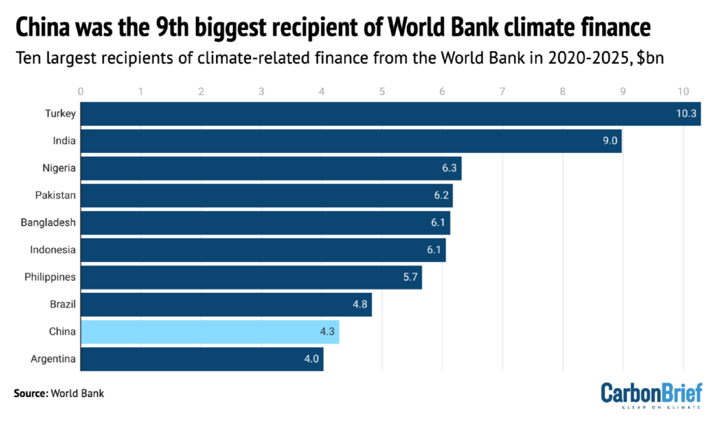
China received $4.3bn in climate finance from the World Bank in 2020-2025, according to Carbon Brief analysis. The World Bank has dropped a pledge on climate-related lending, reported the Financial Times. The newspaper also reported that the bank will also “phase out its lending to China by 2031”. (China is estimated to have provided $3-4.5bn of climate finance annually to other countries, according to estimates by different thinktanks.)
Spotlight
Interview: Dr Sun Yixian on his new database tracking Chinese climate ‘leadership’
A new database has mapped every climate initiative launched or run by China.
In this issue, Carbon Brief interviewed Dr Sun Yixian, professor of sustainability governance at the University of Bath, on what this data shows about China’s approach to climate “leadership”.
Below are highlights from the conversation. The full interview is published on the Carbon Brief website.
Carbon Brief: Your team has compiled a database of China’s “environmental leadership”. What do you mean by leadership?
Sun Yixian: In this project, what we are trying to look at is China’s role in global environmental governance – China’s shifting role, especially from a more passive participant in global governance processes to play a more proactive role in developing or managing its own initiatives on transnational or cross-border environmental governance.
So, [this includes] different environmental issues, but, of course, we found that climate change is a very important issue area. We have come up with a typology of different governance functions, trying to look at what specific activities Chinese actors are doing, or what kind of public goods Chinese actors are delivering, to the audiences of different initiatives.
CB: Could you explain what some of these climate initiatives look like in practice?
SY: In practical terms, there are all different kinds of initiatives. [The majority focus on] sharing information and building platforms, or developing capacity – capacity building activities, which can be training delivered by China to other countries.
Or also by providing funding, for example, China has created this south-south climate fund. It can also include research collaboration.
It can be traditional leadership activities, in the sense of developing certain international regulatory frameworks or rules or standards. It can also be pilot projects. China sometimes can start to work directly with some international partners to trial new ideas and new practices.
CB: The database stops at 2024 – just before the current administration withdrew the US from the Paris Agreement. Have you noticed any changes in China’s global climate engagements following this?
SY: I would say the trend is a continuous one, even [before] the withdrawal of the US…Over the past 10 years, we have seen an upward trend, with more and more new initiatives created by Chinese actors.
But I think the shift will probably help Chinese initiatives get more traction from their international partners – or countries or actors that haven’t been engaged very closely with China – to work more closely with China.
Whether or not this will translate into new initiatives or strengthen existing initiatives, I think that’s an open question.
CB: The theme of the data set is environmental leadership, but…Chinese officials have eschewed being called a climate leader. Would you say that China wants to be seen as a climate leader?
SY: We are entering into the implementation phase for the Paris Agreement. That means it is very difficult to create new agendas at this stage. [Instead the focus is] trying to see if countries can deliver.
If we want to see whether China is becoming a leader, we have to look at how fast, for example, China is accelerating its energy transition and how fast China can reduce its emissions.
Then, in terms of international engagement, what our data is trying to show is that China has become more proactive in that space.
When I was in China a few months ago, [leading experts] said the government…[is] not ready to become a global leader. But, at the same time, I think…in climate governance, but also in clean-energy supply chains – China is playing a leading role.
So, I think the question is whether this…will translate into the understanding, or mindsets, of policymakers or decision-makers.
This interview was conducted by Anika Patel via Zoom on 1 July 2026.
Watch, read, listen
ENVOY INTERVIEW: Climate envoy Liu Zhenmin spoke to state broadcasting station CGTN about climate finance, expectations for China to “lead climate action” and trade tensions.
VIEW FROM THE US: The Atlas Live podcast hosted a debate on “what it will take” for the US to match China’s strength in manufacturing clean-energy technologies.
‘ELECTROSTATE’ EXPLORED: The state media-affiliated WeChat blog Yuyuan Tantian discussed how becoming an “electrostate” would boost China’s “resilience against external risks”.
HYDROGEN TARGETS: The Switched On podcast explored what China’s new targets for “green hydrogen” mean for the development of the industry.
New science
- Offshore wind could provide 3-18% of China’s electricity by 2050 | Communications Earth and Environment
- A new “environmental and nutritional database” of the eight major cuisines of China, including Sichuan, Cantonese and Hunan, reveals “significant variability” in carbon dioxide (CO2) emissions and nutrient content | Scientific Data
Recently published on WeChat
China Briefing is written by Anika Patel, with contributions from Lekai Liu. It is edited by Simon Evans. Please send tips and feedback to china@carbonbrief.org
The post China Briefing 9 July 2026: Guangxi floods | ‘Beautiful China’ plan | New EU-China mechanism appeared first on Carbon Brief.
China Briefing 9 July 2026: Guangxi floods | ‘Beautiful China’ plan | New EU-China mechanism
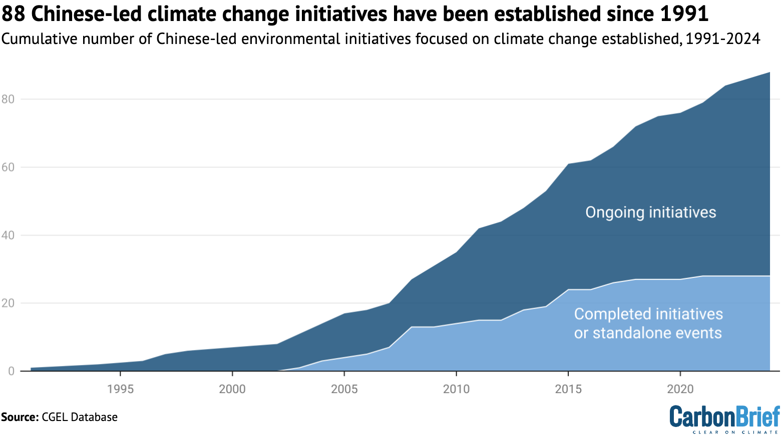
The number of global climate initiatives launched or run by China has been growing since 2009, a new study shows.
But whether this will translate into China taking up the mantle of climate leadership remains an “open question”, says Dr Sun Yixian, study co-author and professor of sustainability governance at the University of Bath.
Sun’s team has compiled a database tracking all global environmental initiatives established from the 1980s onwards that were launched or run by China.
These initiatives are either created by China or co-created with other governments, or have operations that are mainly managed by Chinese institutions.
They range from research cooperation and south-south climate funding to high-level policy signalling, such as joint statements on climate change.
In an interview with Carbon Brief, Sun discusses the key findings of the new “China’s Global Environmental Leadership” (CGEL) database.
He adds that it is not yet clear if the US withdrawal from the UN climate regime will change China’s role in global climate governance.
The conversation covers how the number of China-led initiatives has changed over time, what these projects look like and how China’s approach to climate “leadership” is changing.
The interview has been edited for length and clarity.
- Sun on the types of climate initiatives: “There are all different kinds of initiatives – we have these typologies of governance functions, including sharing information and building platforms, or developing capacity – capacity building activities, which can be training delivered by China to other countries. Or also by providing funding, for example.”
- On the rise in new climate initiatives: “From after 2009 and 2010, we’ve seen many initiatives – of course, more and more over the last 10 years, and even the last five years, from 2021…have been created.”
- On the impact of the Trump administration: “The shift of the US under the second Trump administration will probably help Chinese initiatives get more traction from their international partners…Whether or not this will translate into new initiatives or strengthen existing initiatives, I think that’s an open question.”
- On a growing focus on multilateral programmes: “What we have seen is a very clear upward trend of transnational initiatives with a global scope. That means they operate in more than two continents. So, in that sense, what we can see is, actually, China is moving from this bilateral engagement model to more kind of global engagement and trying to project its influence at the global scale.”
- On a climate leadership ‘mindset’: “[Leading Chinese experts] said the government, and also people in China, are not ready to become a global leader. But, at the same time…in climate governance, but also in clean-energy supply chains – China is playing a leading role. So, I think the question is whether this…will translate into the understanding, or mindsets, of people, including policymakers or decision-makers in the country.”
- On the future of China’s climate engagement: “My read is that China is willing to share more knowledge, and technology as well, through its international global engagements…But, at the same time, I think, it is not a given. It depends on how countries can make arrangements with China, how they can also propose viable solutions in terms of absorbing Chinese technologies.”
- On the future of multilateral climate negotiations: Multilateralism is a very important principle, championed in almost all the initiatives. That means China is not going to abandon multilateral processes. Also, we have done some work looking at the alignment of Chinese climate initiatives with existing UN institutions and frameworks, and we also see very close alignment.
Carbon Brief: Thank you for joining us, Yixian. Your team has compiled a database of China’s “environmental leadership”. What do you mean by leadership and what did you find in relation to climate change?
Sun Yixian: Thanks Anika, it’s great to speak to Carbon Brief. Leadership is a very contested concept in social science, or especially in international relations. This is why we were very cautious when we thought about the name of this dataset, but we thought it was a good way to capture what we’re trying to do.
In this project, what we are trying to look at is China’s role in global environmental governance – China’s shifting role, especially from a more passive participant in global governance processes to play a more proactive role in developing or managing its own initiatives on transnational or cross-border environmental governance.
So, [this includes] different environmental issues, but, of course, we found that climate change is a very important issue area. By leading, we are using the concept of governance – in a sense that we are looking at the initiatives where Chinese actors claim some authority over other audiences towards certain public goods. So, it’s trying to provide public goods, in different ways. We have come up with a typology of different governance functions, trying to look at what specific activities Chinese actors are doing, or what kind of public goods Chinese actors are delivering, to the audiences of different initiatives.
And by audience we mean…international actors. So, that means we are not interested in what China is doing domestically, but beyond its borders.
CB: Could you explain what some of these climate initiatives look like in practice?
SY: This is very important, because it sounds very abstract if we just talk about leadership. In practical terms, there are all different kinds of initiatives – we have these typologies of governance functions, including sharing information and building platforms, or developing capacity – capacity building activities, which can be training delivered by China to other countries.
Or also by providing funding, for example, China has created this south-south climate fund. It can also include research collaboration or producing knowledge – mainly between research institutes.
It can be traditional leadership activities, in the sense of developing certain international regulatory frameworks or rules or standards – we call this rulemaking and standard-setting. It can also be pilot projects. China sometimes can start to work directly with some international partners to trial new ideas and new practices – what we call direct actions.
These are the different types of leadership activities that we look at and we actually code each initiative that meets the criteria of our database according to this topology, to try to look at what [the Chinese government] are looking at.
Some initiatives can do multiple things at the same time…One example is the Global Energy Interconnection Development and Cooperation Organization [GEIDCO]. [This was] initially created by the State Grid of China to try to promote clean energy and energy interconnections.
This initiative will deliver different types of activities, including building the capacity of some developing countries on energy and electricity grids, and also, for example, developing an international platform – they have annual international meeting and a lot of information-sharing activities, and engagement at UN meetings, including at COP side-events, and also directly engaging with some international organisations.
So, this is an example of the type of leadership initiative that has been included in our database.
CB: And would you say that there’s one particular type of activity that dominates, in terms of China’s climate leadership? Or is it very evenly split against all of the different types?
SY: This is also one of the main findings in our work. In the first paper we published to highlight the key patterns from the dataset, we highlighted that there’s a very uneven distribution in terms of what China tries to deliver or to promote, itself, internationally on environmental governance.
There have been a lot of initiatives focusing on sharing information and building platforms and this is the most dominant category – across all environmental issues, but the same pattern applies to climate change.
In the first article we published in the Earth Systems Governance journal, we looked at the whole dataset, but we are also developing a few studies, currently under review. One paper particularly looks at climate initiatives and it’s the same pattern: information-sharing and networking.
At the same time, the least frequent or popular type is the provision of funding – creating some financing programmes to directly give funding to international partners. I think this reflects China’s position on environmental or climate finance, especially internationally.
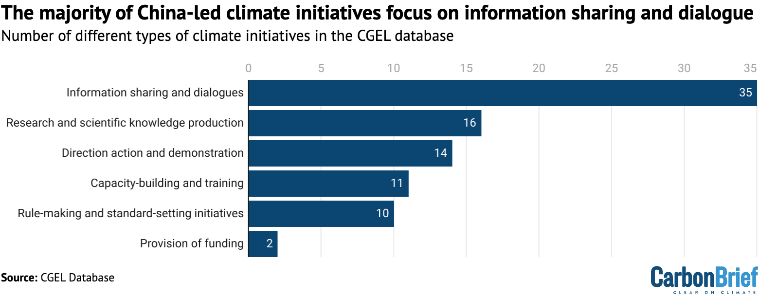
[China’s] not trying just to provide money, but really think about how to support other countries on more practical, more pragmatic terms. This is why I think that after information-sharing, what we have seen is capacity-building activities, which have also been quite frequently used by Chinese initiatives when collaborating with their international partners. This also explains China’s logic to teach [others] how to develop things, but not just giving money.
The other important category is research collaboration and knowledge production. This has been mainly led by research institutes in China, such as the Chinese Academy of Sciences, especially with a strong focus on scientific co-production.
But, lately, we have also seen more and more initiatives focused on sharing knowledge not just about science itself, but sometimes also on the social sciences side – the experiences of China as a whole. China’s experiences can also be learned from by other countries, especially in the global south.
These are just some examples, but the overall pattern is [a focus on] information-sharing, capacity building and knowledge production and not too much on provision of funding.
CB: You mentioned the GEIDCO example earlier. How much of a tangible impact would you say a lot of these initiatives have? Are they very high-level, strategic and quite abstract? Or do they kind of result in programmes on the ground?
SY: That’s a very interesting question – the answer is that it really varies. GEIDCO, as you mentioned, is a very high-level initiative. I think, initially, the idea of energy interconnection was proposed by President Xi himself. Now, of course, GEIDCO, with the backing of the State Grid, does a lot of high-level [national planning] and trans-national [grid network] planning work with developing countries.
But, at the same time, there are also a lot of grounded, locally focused initiatives. A lot, for example, are co-developed between China – especially supported by the Ministry of Ecology and Environment [MEE] – and UNEP [United Nations Environment Programme] in, for example, Africa and Southeast Asia. [This includes] some projects looking at climate adaptation and resilience. But these are more small-scale projects.
So, in our database – and I welcome your readers to explore the database itself that you can see – there are a big variety of initiatives and their scope, their mission and their intended outcomes or impacts vary significantly.
But we are just providing this public resource. Hopefully, people can use it to further explore, for example, the question of the impact or outcome. At this stage, we’re not going to assess what has been delivered, but I think if we can take, for example, a case-study approach – trying to trace what has been done, what has been delivered – this could also be a very interesting research agenda.
CB: Is there a particular time from when China’s interest in engaging on climate change started, or has this been a very long-term process?
SY: In our database, we really wanted to capture the historical trend. That’s why we looked back from early on – [we focused on] from the beginning of this century, but also traced initiatives that had been created even earlier but became active in the 21st century.
So we can [see that,] already in the late 1980s or 90s, there were some initiatives in the area of climate change. But, most importantly, the majority of the initiatives were started after 2008, mainly in the 2010s. We can see a very clear upward trend. It was not shown directly in our recently published article, but it’s in the database and we have looked at the data and produced a graph for other studies we are currently developing.
Really, from after 2009 and 2010, we’ve seen many initiatives – of course, more and more over the last 10 years, and, even the last five years, from 2021, we still see more and more initiatives have been created.
This timeframe corresponds to China’s shifting international role, to move from [being] a more regional power, a large developing country, to a global superpower, and trying to project its influence globally.
That also correlates with, for example, the belt and road initiative and lately the global development initiative – China is trying to also use climate change in this broader policy framework and trying to promote and support climate action in different parts of the world.
CB: The database stops at 2024 – just before the current administration withdrew the US from the Paris Agreement. Have you noticed any changes in China’s global climate engagements following this?
SY: I would say the trend is a continuous one, even with the withdrawal of the US from the Paris Agreement and lately from the UNFCCC. Because, as I mentioned earlier, over the past 10 years, we have seen this upward trend, with more and more new initiatives created by Chinese actors.
But I think the shift of the US under the second Trump administration will probably help Chinese initiatives get more traction from their international partners – or countries or actors that haven’t been engaged very closely with China – to work more closely with China.
Whether or not this will translate into new initiatives or strengthen existing initiatives, I think that’s an open question.
We really want to explore [this] further. Something I didn’t mention earlier is we are publishing this data set as version one, we want to keep updating on a regular basis. We hope we’ll have versions two or three out, maybe every two years. We’ll see how things go, but I think this is a very important question.
CB: Looking at how China is engaging with all of these different countries – as you mentioned, more and more potentially wanting to work with it following the US’s withdrawal – do you get the sense that the Chinese government prefers to engage with countries bilaterally, on a one-to-one basis, or are they also engaging at the regional and multilateral levels?
SY: This is a great question. This is also an important finding from our work, because the conventional understanding is that China prefers to engage with countries bilaterally.
But, if we look at our database, what we can see is that, actually, China has developed more and more transnational initiatives – meaning that it also involves non-state actors or [works] beyond the traditional multilateral processes and [develops initiatives] with a global scope.
If we look at the historical trends, initially – especially up to 2010 – there were a lot of bilateral initiatives. Most cases in our database are bilateral initiatives.
But, lately, I think this trend is shifting. Still, I think there are many more bilateral initiatives than multilateral and transnational initiatives.
How we differentiate leadership activities of Chinese [state] actors across different levels [affects the trend], but, lately, what we have seen is a very clear upward trend of transnational initiatives with a global scope. That means they operate in more than two continents.
So, in that sense, what we can see is, actually, China is moving from this bilateral engagement model to more kind of global engagement and trying to project its influence at the global scale.
I think this is also quite interesting, to understand how not only the government, but also lots of Chinese actors – including, for example, businesses and civil society actors – are trying to project and their footprint globally.
And also I think this reflects a shifting global role of China, in general. We can further explore what the implications of this phenomenon are. This is some ongoing research I’m doing – trying to understand how actors in different parts of the world react or perceive this changing rule of China and how such engagement between China and different countries shape, or reshape, the sustainability transition.
CB: You mentioned just then that there’s not just the Chinese government, but also civil society, businesses and other non-state actors. What role do you think these non-state organisations play in the country’s overall climate strategy and climate engagement?
SY: Let me start with the caveat that, first of all, as shown in our database, the government, or state actors, still play a very important role – especially central government agencies, for example, the MEE [Ministry of Ecology and Environment] or NDRC [National Development and Reform Commission].
But, at the same time, especially over the last 10 years, what we have seen is that non-state actors have become more active and engaged more, in various ways, in leading climate initiatives beyond China’s borders.
This means, sometimes, they collaborate with state actors to co-develop certain initiatives. Sometimes, they develop their own initiatives with, of course, some support from the state. One thing we need to bear in mind is, in China, it’s almost impossible to [avoid involving] the state. At least, you have to closely align with the strategy of the government.
But, at the same time, what we can see is the agency of these actors. They have developed or showed the ambition to develop certain initiatives, including, for example, standards in the critical mineral space, to provide guidelines to companies for their overseas activities.
Similarly, some civil society actors, [such as] research institutes, also want to claim their leadership in a global sphere, trying to showcase how they can lead certain activities and show how their expertise or their knowledge can support countries or actors in other parts of the world.
CB: On the standards-setting point, is that something where it might be led by one Chinese company with multiple partners – whether it be from one country or from various different countries in a region? Or is it a broad spectrum of Chinese companies coming together saying that we want to work with Chile, Zimbabwe etc, on mining standards? Is it very representative of the industry, or does it tend to be quite piecemeal?
SY: This is an inclusion criteria for the databases. We [only] look at the initiatives that are, to a large extent, institutionalised. It’s not that company’s claim that “we are doing this”. If we can’t track down any information or find any records then we cannot include things like that in our database.
That means we only tend to look at initiatives that are well-developed. These are often, for example, developed by national industry associations. They try to convene different companies together and try to collaborate with, or coordinate, different actors along supply chains and also across sectors or industries.
When they work with different international partners, this is also a question I think we need to further explore, using our data set to try to look at – sometimes I think it’s not easy for us to do everything! – but try to look at what kind of partners they select and how they get involved with partners in different countries or different regions.
But I think this probably requires some other methodologies to look at, or maybe zoom out to specific cases.
This is similar – I always want to use this as a comparison – when we started [seeing] this phenomenon in Europe or in North America, for example, where companies start to take climate actions, we didn’t really pay a lot of attention to how and who they work with, as long as they say: “We are trying to support global climate action.”
But, nowadays, when it comes to the question of China, people start to be interested in who they work with. But if we look at the narrative and discourse of these initiatives, they say as well: “We want to support actions around the world.”
They don’t always specify [the geographic scope of their standard-setting work], but if we further zoom into where they are working and why they work in specific areas or regions, this is also an interesting question – I think there is also a question of politics or political economy there. I would encourage researchers to use our dataset to further explore that kind of question.
CB: Zooming back out – the theme of the data set is environmental leadership, but – at least in global climate negotiations – Chinese officials have eschewed being called a climate leader. Your database seems to show an uptick in activity that could be defined as leadership. Would you say that China wants to be seen as a climate leader?
SY: This is a very strong claim, so I probably would not say [so] – also, it’s very subjective, depending on who you ask this question to and how people perceive it.
Let me frame me this way – let’s separate multilateral negotiation processes from what the country or different actors are doing. Of course, for leadership, another way to measure this is to see the performance itself.
But, in the end, I think we also tried to be very reflective when we developed this work to acknowledge the subjectivity of leadership and the relational nature of leadership. That means that, if you want to be a leader, others need to acknowledge your leadership or recognise this status.
But this is why I think it comes to an interesting question about what’s the role of China and how different actors perceive China’s role in today’s global climate governance.
In multilateral negotiation processes, we are entering into the implementation phase for the Paris Agreement. That means it is very difficult to create new agendas at this stage. [Instead the focus is] trying to see if countries can deliver what they have done.
Of course, I think there is a question of ambition in terms of updating your nationally determined contributions. So, there is an ambition question – there is a performance question.
If we want to see whether China is becoming a leader, we have to look at how fast, for example, China is accelerating its energy transition, trying to reduce – of course, some data shows China has already peaked its emissions – but maybe, how fast China can reduce its emissions.
Then, in terms of international engagement, what our data is trying to show is that China has become more proactive in that space. The question is also if this engagement translates into some progress in different parts of the world – if China is actually helping. We need more data to do this kind of impact assessment.
But, at the same time, I think the question of whether the Chinese government wants itself to be seen as a leader – this is also an interesting question. Depending on who they want to engage with, in different fora or on different platforms, the answer may be different.
I just want to quote, when I was in China a few months ago, we had some dialogues with leading Chinese experts. They said the government – and also people in China – are not ready to become a global leader. But, at the same time, I think, what China is doing or the role of the country – in climate governance, but also in clean-energy supply chains – China is playing a leading role.
So, I think the question is whether this physical change that has already happened will translate into the understanding, or mindsets, of people, including policymakers or decision-makers in the country.
I think this is a question that China needs to figure out, itself. Then, of course, there will be implications for China’s strategy for engaging with the rest of the world, especially on climate change.
CB: And what do you think China’s climate engagements will look like in 5-10 years from now?
SY: I think, from an energy-transition perspective – let me start from there – China is going to be, at the least, more proactive in promoting energy transition, because it aligns with China’s economic interests and, to a certain extent, its political interest as well, to support energy transitions around the world.
The key question is what role China can play in doing that. Of course, there is the question of trade, of tariffs. There is also the question of investment, intellectual property and technology transfer.
My read is that China is willing to share more knowledge, and technology as well, through its international global engagements, to support other countries. But, at the same time, I think, it is not a given. It depends on how countries can make arrangements with China, how they can also propose some viable solutions in terms of absorbing Chinese technologies.
What we have seen is a lot of countries, especially in the global south, have benefited already, or are in the process of benefiting from, affordable technologies produced by China.
But, at the same time, this is not sustainable – at least from an economic point of view – not a sustainable situation in the sense that these countries also need to find a way to move themselves upward in supply chains and try to absorb some technologies. How they can work with China [to achieve this] – that’s a very important question to me and also my team. We want to do more research in that area.
This is from the energy-transition perspective. But then, if we look at multilateral processes, I would say China is very committed to multilateralism. If we look at all the discourse, including the cases in our database – we have done some text analysis looking at the narrative discourse of the vision of these initiatives. Multilateralism is a very important principle, championed in almost all the initiatives. That means China is not going to abandon multilateral processes.
Also, we have done some work looking at the alignment of Chinese climate initiatives with existing UN institutions and frameworks, and we also see very close alignment.
So, I think this pattern will probably last. At the same time, because – depending on the other important countries’ climate policies, for example, the US – back to your question about the leadership in multilateral processes, how proactive and how ambitious China wants to be in taking on this leadership position in multilateral processes is still an open question.
This also depends on the concept of leadership in different cultures.
Whether China wants to take over the US to become the only superpower of a global system – I think this is probably very unlikely. China may want to figure out a slightly different model. Even if, physically, it’s one of the most, or the most, important or powerful countries in the world, how using how the country can use this position to support or guide the governance of global challenges, this is probably slightly different from the views or understanding of, for example, European and other global north countries.
The question is how China can propose a slightly different model – still in the current multilateral system – for governing global challenges, including climate change. This is really important. I don’t have an answer, so that’s why we will continue to look at this question and try to use our research to help people understand what role China can play in global climate governance.
CB: Thank you.
This interview was conducted by Anika Patel via Zoom on 1 July 2026.


The post Interview: Dr Sun Yixian on his new database tracking Chinese climate ‘leadership’ appeared first on Carbon Brief.
Interview: Dr Sun Yixian on his new database tracking Chinese climate ‘leadership’
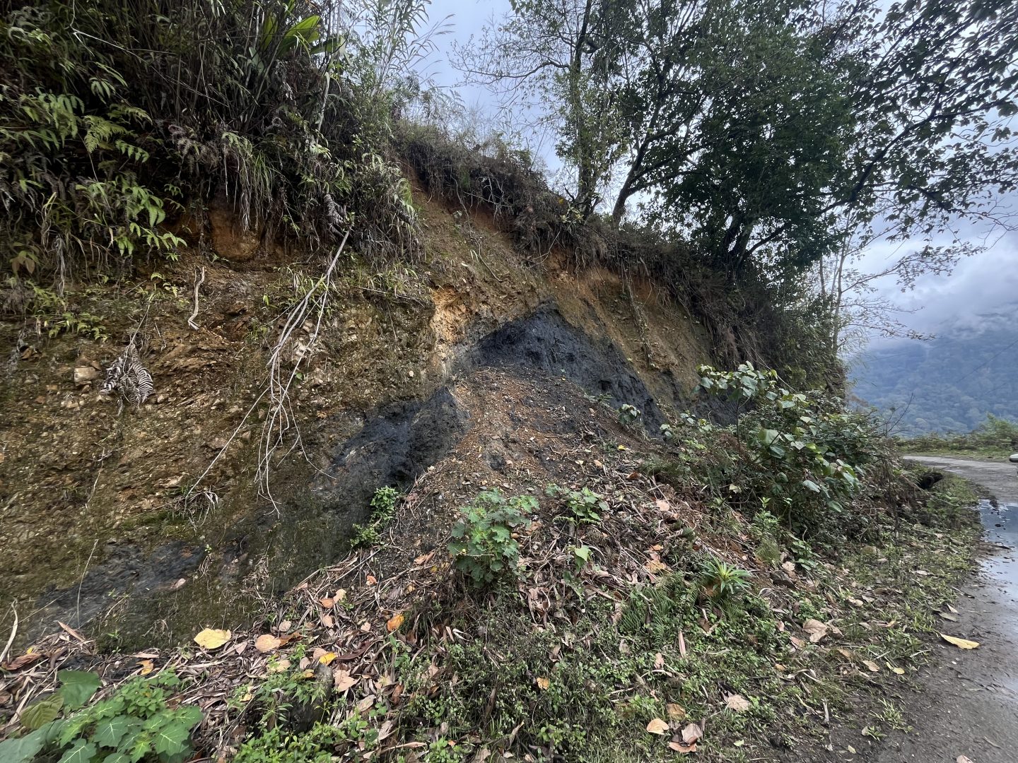
Tucked among forested slopes and pristine valleys in a corner of northeastern India, young villagers have been busy knocking on doors – hoping to convince sceptical elders that graphite mining would bring much-needed jobs to their distant region.
“The youth in our village migrate to cities for work. What’s better than to have jobs near home?” Gollo Doni, a farmer and secretary of the local youth association, told Climate Home News as he and other members in their 20s discussed the latest meetings between locals and representatives of Oil India Limited (OIL), a state company exploring graphite and vanadium reserves in Arunachal Pradesh.
The mining plans in the state, which is home to more than one-third of India’s graphite reserves and the subject of a sovereignty dispute with China, reflect a push by the Indian government to position itself as a leading producer of battery-grade graphite as the mass rollout of batteries for electric vehicles (EVs) and power storage drives demand for the mineral.
-
Warning against ‘consumer club’ as G7 forms critical minerals alliance
G7 countries want to reduce their reliance on China for minerals and protect supplies from geopolitical interests but experts see few benefits for developing nations -
Brazil jostles for rare earths share as US-China rivalry heats up
With the world’s second-largest reserves of rare earths after China, Brazil is catching the eye of US and Chinese companies – spurring the government’s critical minerals policy push -
After another battery startup bankruptcy, can Europe ever cut reliance on China?
Norway’s Morrow Batteries set out to challenge Chinese producers, but a cash crunch forced it to file for bankruptcy in a setback for European ambitions for clean energy sovereignty


An average electric car contains about 60 kg of graphite anode materials, according to the International Energy Agency, and the graphite supply chain is heavily dominated by China, which produces about 80% of the world’s natural graphite and controls more than 90% of global refining.
As Western countries seek to reduce their dependency on China, India’s reserves of graphite and other minerals vital for the switch to clean energy have caught governments’ attention, with Germany signing a critical minerals partnership agreement in January.
Ambitious plans
But hurdles remain to India’s ambitious plans to ramp up critical minerals output, both to position itself as an alternative to China and to meet its own fast-growing needs.
India has a target for 30% of new vehicle sales to be electric by 2030, and demand for EV lithium batteries looks set to surge close to 35-fold between 2023 and 2035, according to S&P Global Mobility, driven by growth in two- and three-wheelers in the country of 1.4 billion people.
Although domestic manufacturing of EV batteries is expanding, the sector remains at an early stage and India depends heavily on imports from China, South Korea and Japan.
At the same time, it wants to get graphite processing off the ground, aiming to turn its reserves of the mineral – which rank among the world’s 10 biggest – into higher value battery-grade supplies.
The energy transition has a rare earth problem: These startups are solving it
With exploration already underway, the next step should be starting discussions about developing processing facilities – including support from foreign partners, said Kaira Rakheja, South Asia energy analyst at the Institute for Energy Economics and Financial Analysis (IEEFA).
“These exploration and extraction projects have a long gestation period. So even if discussions on processing start now, it will still take a while,” she said, noting India’s simultaneous push to create “rare earth corridors” encompassing every step of production.
Hurdles ahead
India’s graphite reserves are mainly of a lower grade, however, making processing for use in battery anodes more complex, while the country is a late entrant.
“We are not a big player in the market and have missed the bus,” said Aditya Ramji, director of the Global South Clean Transportation Centre at the University of California, Davis.
While exploration work is already underway at several sites in Arunachal Pradesh, and at some places in eastern and southern India, production will take at least two years to start, said Tana Tage, director at the Centre for the Earth Sciences and Himalayan Studies, OIL’s local partner and holder of a 10% stake in the Phop project.
A mine would create about 300 jobs and the project’s partners are discussing options for processing the site’s medium- to high-grade graphite locally, Tage added, despite voicing concern about a lack of technological know-how.
“India does not have the large-scale, advanced processing capabilities to achieve the ultra-high purity levels required for EV batteries and clean technologies,” he told Climate Home News.
Diversification drive
Despite such challenges, industry experts say India could benefit from the push to find sources of battery graphite other than China.
“We can’t beat China in this space, but we can still create a space for ourselves in buying and selling, as everyone is looking for a space to diversify,” said Rishabh Jain, fellow at the Council on Energy, Environment and Water, a New Delhi-based think-tank.
India’s government hopes the bilateral memorandum of understanding (MoU) signed with Germany could help.
As well as pledging cooperation on critical minerals exploration, the declaration envisions the exchange of know-how to add value through processing and recycling, facilitating investment and building the supply chain resilience of both countries. That could include identifying joint research projects and facilitating cooperation between industry players.
-
The scramble to stockpile critical minerals could drive up energy transition costs
Researchers warn that uncoordinated stockpiling could push up prices of minerals needed for clean energy technologies and delay their roll out -
Chinese EV brands woo Yemen’s wealthy elite as war prompts solar boom
For the well-off few, buying an EV is the next step in a solar revolution that has helped Yemenis weather years of power outages and high fuel prices -
Recycling could meet half of Europe’s critical mineral needs by 2050
A new report by an EU-funded research project says the bloc could harness its “urban mines” to reduce its dependence on China for energy transition minerals


“India and Germany will work together to mutually strengthen supply chains in the field of critical minerals,” a spokesperson for the German government’s energy strategy said. “We will encourage companies to build strong ties in terms of knowledge sharing, offtake agreements and investments.”
Germany is already supporting several domestic projects focused on converting graphite into battery anode material – valuable experience that could potentially be shared with India, said Rakheja. In return for shared technical expertise, India offers a strong pool of workforce talent and a big market.
“This way, both partners can look beyond China,” she said.
India sets achievable green electricity and emissions intensity targets
The MoU, which is non-binding, is “a good start”, said Svenja Schöneich, a senior advisor at the NGO Germanwatch, adding that it was thin on details, including on how to add value to India’s critical mineral resources.
“The partnership document should figure out the problem of local value creation. It should also consider that it can’t really skip processing through China,” Schöneich said.
An official at India’s Mining Ministry did not respond to requests for comment.
Trade deals and tax breaks
Beyond the five-year German accord, India has implemented numerous policy measures aimed at securing its own supplies of critical minerals and adding value to its mineral exports, for example by signing favourable trade deals. Last year, India’s graphite was granted zero-duty access to the US, just as the tariffs on Chinese graphite imports climbed to a high 160%.
When the government announced the national budget in February, it included a raft of financial measures aimed at kickstarting a plan to process minerals domestically – the details of which are expected to be announced in the coming months.
They included zero customs duty on critical mineral inputs and enhanced tax deductions for exploration, while the government’s production-linked incentive (PLI) scheme allocated the equivalent of $1.87 billion to build domestic battery cell manufacturing.
Before that can happen, progress on new mining – such as the Arunachal Pradesh graphite projects – is vital, Jain said.
“We are in 2026, and looking to move towards a cleaner world. This is the future,” he said.
The state government in Arunachal Pradesh agrees. It called last year for fast-tracked environmental permitting for graphite projects, new infrastructure around mine sites and reforms to avoid legal disputes that could hold the sector back.
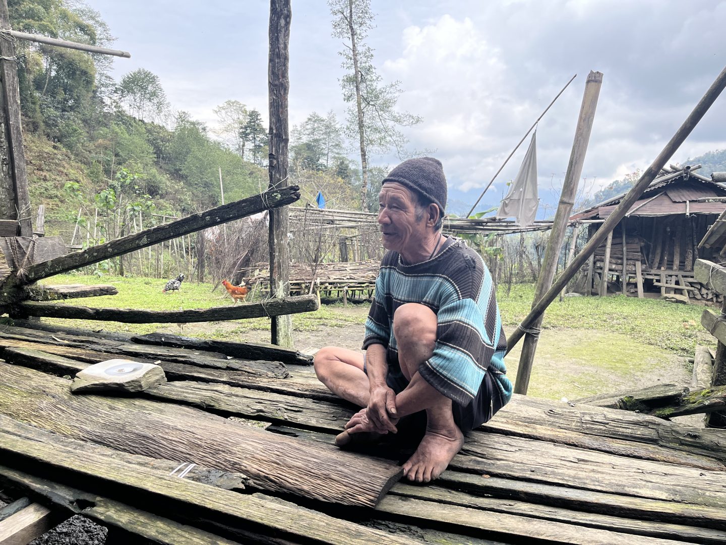
Back in the village of Phop, youth association secretary Doni said that while reluctant residents did not raise an objection to OIL’s preliminary exploration licence, he fears a bigger fight ahead.
Tage said up to 3,000 people could ultimately be displaced if the project proceeds, raising questions about whether economic benefits would outweigh the social and environmental costs.
“It has been difficult to make the elders agree to actual mining,” Doni said, as he and other young villagers sipped on sweet tea in a thatched mountain house. “We are trying to convince our elders that mining will not only bring resources for the nation, but bring us jobs here.”
The post India looks to untapped graphite riches for slice of critical minerals boom appeared first on Climate Home News.
India looks to untapped graphite riches for slice of critical minerals boom


-
Climate Change11 months ago
Guest post: Why China is still building new coal – and when it might stop
-
Greenhouse Gases11 months ago
Guest post: Why China is still building new coal – and when it might stop
-

 Greenhouse Gases2 years ago
嘉宾来稿:满足中国增长的用电需求 光伏加储能“比新建煤电更实惠”
-

 Climate Change2 years ago
嘉宾来稿:满足中国增长的用电需求 光伏加储能“比新建煤电更实惠”
-
Climate Change2 years ago
Bill Discounting Climate Change in Florida’s Energy Policy Awaits DeSantis’ Approval
-
 Renewable Energy9 months ago
Sending Progressive Philanthropist George Soros to Prison?
-

 Carbon Footprint2 years ago
US SEC’s Climate Disclosure Rules Spur Renewed Interest in Carbon Credits
-
Greenhouse Gases12 months ago
嘉宾来稿:探究火山喷发如何影响气候预测