
This year is shaping up to either match or surpass 2023 as the hottest year on record.
Global temperatures have been exceptionally high over the past three months – at around 1.6C above pre-industrial levels – following the peak of current El Niño event at the start of 2024.
The past 10 months have all set new all-time monthly temperature records, though the margin by which new records have been set has fallen from around 0.3C last year to 0.1C over the first three months of 2024.
April 2024 is on track to extend this streak to 11 record months in a row.
The first quarter of this year has seen record-high global temperatures across vast swathes of the planet, including in the tropical Atlantic and western Pacific oceans, much of South America, Central Africa, the Mediterranean and the Indian Ocean.
Based on the year so far and the current El Niño forecast, Carbon Brief estimates that global temperatures in 2024 are likely to average out at around 1.5C above pre-industrial levels.
Although precise predictions are difficult so early in the year, Carbon Brief’s projection suggests that 2024 is virtually certain to be either the warmest or second-warmest year on record.
Global temperatures continue setting records
The first three months of 2024 have each set a new record, buoyed by the peak of El Niño conditions in the tropical Pacific.
This short-term natural variability builds on top of the roughly 1.3C warming that has occurred since the mid-1800s due to human emissions of CO2 and other greenhouse gases.
The figure below shows how global temperature so far in 2024 (purple line) compares to each month in different years since 1940 (with lines coloured by the decade in which they occurred) in the Copernicus/ECMWF ERA5 surface temperature dataset.

Temperatures for each month from 1940 to 2024 from Copernicus/ECMWF ERA5. Anomalies plotted with respect to a 1850-1900 baseline. Chart by Carbon Brief.
Every month from June 2023 onward – 10 months in a row – have set a clear record. The past three months have each been around 0.1C warmer than the prior record set during the 2016 super El Niño event.
In this latest quarterly state of the climate assessment, Carbon Brief analyses records from five different research groups that report global surface temperature records: NASA, NOAA, Met Office Hadley Centre/UEA, Berkeley Earth and Copernicus/ECMWF.
The figure below shows the annual temperatures from each of these groups since 1970, along with the average over the first three months of 2024. (Note: at the time of writing, March data was not yet available for the Hadley/UEA record.)

Annual global mean surface temperatures from NASA GISTEMP, NOAA GlobalTemp, Hadley/UEA HadCRUT5, Berkeley Earth and Copernicus/ECMWF (lines), along with 2024 temperatures so far (January-March, coloured dots). Anomalies plotted with respect to the 1981-2010 period, and shown relative to pre-industrial based on the average pre-industrial temperatures in the Hadley/UEA, NOAA and Berkeley datasets that extend back to 1850. Chart by Carbon Brief.
The globe, as a whole, has warmed around 1C since 1970, with strong agreement between different global temperature records. However, there are larger differences between temperature records further back in time (particularly pre-1900) due to sparser observations and a resulting greater sensitivity to how gaps between measurements are filled in.
All show that the average global temperature for 2024 so far is higher than any prior annual record. However, the first quarter of 2024 is unlikely to end up being representative of the year as a whole due to the fading of El Niño conditions and the expectation of a developing La Niña event later in the year.
Record global daily temperatures
The figure below shows daily temperature data from the Copernicus/ECMWF ERA5 record for 2024 (purple line), 2023 (red line) and 1940-2022 (grey lines).
It highlights that April 2024 is on track to continue the streak of record warm months, with most of the individual days of the month so far setting a new daily record for the time of year.

Daily global temperatures from 1940 to present (20 April 2024) from Copernicus/ECMWF ERA5, with daily values for each year plotted as a separate line. The colours indicate 2024 (purple), 2023 (red) and all other years (grey). Anomalies plotted with respect to a 1850-1900 baseline. Chart by Carbon Brief.
The chart below shows an alternative visualisation, with daily temperatures shown by colours ranging from blue (-2C) to red (+2C), with the pre-industrial average (1850-1900) set to 0C. The figure below shows each day since 1940 in the Copernicus/ECMWF ERA5 dataset.

It is notable that almost every day over the past 50 years has seen temperatures higher than pre-industrial levels, with both 2023 and 2024 so far showing up as particularly warm compared to any prior years in the record.
El Niño boosting human-caused warming
Global temperatures have been buoyed in recent months by a strong El Niño event. However, this event has peaked and is expected to transition into La Niña conditions in the latter part of the year.
The figure below shows a range of different forecast models for the El Niño-Southern Oscillation (ENSO) for the rest of this year, produced by different scientific groups. The values shown are sea surface temperature variations in the tropical Pacific – the El Niño 3.4 region – for overlapping three-month periods.

Virtually all models expect El Niño conditions to fade rapidly and be replaced by La Niña conditions by late summer. Most models project a moderate La Niña (<-0.5C Niño 3.4 sea surface temperature – SST – anomaly) to develop by the end of the year.
Early predictions for a warm 2024
Historically, the highest global surface temperatures have occurred after an El Niño has peaked at the start of the year.
This happened in both of the last two major El Niño events, in 1998 and 2016, which were notably warmer than the prior years (1997 and 2015) during which their respective El Niño events developed.
However, 2023 was highly unusual. It showed global temperatures more akin to what we would expect after El Niño peaks, rather than while it is still developing.
Annual temperatures ended up well outside of the range that all of the different scientific groups projected at the start of the year. There is still no agreed explanation for the extreme warmth, particularly in the latter half of the year.
The figure below shows the record margin (red bars) – the amount that global average temperatures surpassed the prior monthly temperature record – in each month of over the past year.
Summer and autumn 2023 saw records being set by large margins: 0.5C in September, 0.4C in October and 0.3C in July, August, November and December.

Margin by which new monthly temperature records have been set over the past 12 months. Using data from Copernicus/ECMWF ERA5. Chart by Carbon Brief.
The past three months have seen new records set by only around 0.1C. The prior records for January, February, and March were set in 2016, and given the rate of warming since then we would expect new records to be set by about 0.1C in the year after El Niño peaks. If this year follows the trajectory of 2016, we would expect global temperatures to start falling over the coming months.
However, the fact that the exceptional warmth of 2023 remains largely unexplained raises questions about whether the past will be a good guide for what 2024 has in store. If the latter half of 2024 ends up similar to 2023, there is a worry that we might be entering what has been described as “uncharted territory” for the climate.
As NASA’s Dr Gavin Schmidt noted in a recent Nature commentary:
“If the anomaly does not stabilise by August – a reasonable expectation based on previous El Niño events – then the world will be in uncharted territory. It could imply that a warming planet is already fundamentally altering how the climate system operates, much sooner than scientists had anticipated. It could also mean that statistical inferences based on past events are less reliable than we thought, adding more uncertainty to seasonal predictions of droughts and rainfall patterns.”
By looking at the relationship between the first three months and the annual temperatures for every year since 1970 – as well as ENSO conditions for the first three months of the year and the projected development of El Niño conditions for the remaining nine months – Carbon Brief has created a projection of what the final global average temperature for 2024 will likely turn out to be.
The analysis includes the estimated uncertainty in 2024 outcomes, given that temperatures from only the first quarter of the year are available so far. The chart below shows the expected range of 2024 temperatures using the Copernicus/ECMWF global atmospheric reanalysis product (ERA5) – including a best-estimate (red) and year-to-date value (yellow). Temperatures are shown with respect to the pre-industrial baseline period (1850-1900).

Annual global average surface temperature anomalies from the Copernicus/ECMWF global atmospheric reanalysis product (ERA5) plotted with respect to a 1850-1900 baseline. To-date 2024 values include January-March. The estimated 2024 annual value is based on the relationship between the January-March temperatures and annual temperatures between 1970 and 2023. Chart by Carbon Brief.
Carbon Brief’s projection suggests that 2024 is virtually certain to be either the warmest or second- warmest year on record, with a central estimate just above 1.5C, slightly higher than 2023. However, this model assumes that 2024 follows the type of climate patterns we have seen in the past – patterns that were notably broken in 2023.
It is worth repeating that an individual year hitting 1.5C above pre-industrial levels is not equivalent to the 1.5C limit within the Paris Agreement. This limit refers to long-term warming, rather than an individual year that includes the short-term influence of natural fluctuations in the climate, such as El Niño.
The figure below shows Carbon Brief’s estimate of 2024 temperatures using ERA5, both at the beginning of the year and once each month’s data has come in. While the central estimates have remained relatively unchanged, the uncertainty has diminished with each additional month of data.

Carbon Brief’s projection of global temperatures at the start of the year, and after January, February, and March ERA5 data became available.
Record warmth over large parts of the globe
While global average surface temperature changes are an important indicator of long-term climate change, any month or year will have important regional warm or cool patterns in different parts of the world.
The first three months of 2024 saw particularly warm temperatures over the tropical Atlantic and western Pacific oceans, much of South America, Central Africa, the Mediterranean and the Indian Ocean.
The figure below shows the difference between temperatures in the first three months of 2024 and the baseline period of 1951-80, taken from Berkeley Earth (using their high-resolution temperature dataset). Red, orange and yellow shading indicate areas that have been warmer than average, while blue shows areas that have been cooler.

The figure below shows which portions of the Earth’s surface experienced record high temperatures (deep red shading) for the first three months of 2024. It is noteworthy that no location on the planet experienced record cold temperatures over the first quarter of the year.
Sea ice at the low end of the historical range
Arctic sea ice extent spent much of early 2024 at the low end of the historical 1979-2010 range, and set a few new record-low values for individual days in February and March.
Since northern hemisphere winter conditions remain cold enough to refreeze sea ice, there tends to be less variability in extent year-to-year in the winter than in the summer.
Following an all-time low maximum in September 2023, Antarctic sea ice has been tracking at near-record-low extent for the past six months. In late February, it hit its minimum extent for the year, tying with 2022 for the second-lowest Antarctic minimum in the satellite record.
The figure below shows both Arctic and Antarctic sea ice extent in 2024 (solid red and blue lines), the historical range in the record between 1979 and 2010 (shaded areas) and the record lows (dotted black line). Unlike global temperature records (which only report monthly averages), sea ice data is collected and updated on a daily basis, allowing sea ice extent to be viewed up to the present.

Arctic and Antarctic daily sea ice extent from the US National Snow and Ice Data Center. The bold lines show daily 2024 values, the shaded area indicates the two standard deviation range in historical values between 1979 and 2010. The dotted black lines show the record lows for each pole. Chart by Carbon Brief.
However, sea ice extent only tells part of the story. In addition to declining ice extent, the sea ice that remains tends to be younger and thinner than ice that used to cover the region.
The figure below, using data from the Pan-Arctic Ice Ocean Modelling and Assimilation System (PIOMAS), shows the Arctic sea ice thickness for every year between 1979 and 2024.

While sea ice volume has been flat or slightly increasing over the past five years, there has been a clear downward trend in sea ice volume since the start of the satellite record in the late 1970s.


The post State of the climate: 2024 off to a record-warm start appeared first on Carbon Brief.
N.C. Gov. Josh Stein wants state lawmakers to rethink tax breaks for data centers. The industry’s opacity makes it difficult to evaluate costs and benefits.
Tax breaks for data centers in North Carolina keep as much as $57 million each year into from state and local government coffers, state figures show, an amount that could balloon to billions of dollars if all the proposed projects are built.
The Global Environment Facility (GEF), a multilateral fund that provides climate and nature finance to developing countries, has raised $3.9 billion from donor governments in its last pledging session ahead of a key fundraising deadline at the end of May.
The amount, which is meant to cover the fund’s activities for the next four years (July 2026-June 2030), falls significantly short of the previous four-year cycle for which the GEF managed to raise $5.3bn from governments. Since then, military and other political priorities have squeezed rich nations’ budgets for climate and development aid.
The facility said in a statement that it expects more pledges ahead of the final replenishment package, which is set for approval at the next GEF Council meeting from May 31 to June 3.
Claude Gascon, interim CEO of the GEF, said that “donor countries have risen to the challenge and made bold commitments towards a more positive future for the planet”. He added that the pledges send a message that “the world is not giving up on nature even in a time of competing priorities”.
-
UK imports of “green” jet fuel linked to Amazon deforestation
A Texas refinery shipping sustainable aviation fuel to Europe has sourced beef tallow with links to a meatpacking firm fined over illegal cattle purchases -
Italy pushes coal exit back after gas prices rise
Analysts say the move sends a negative signal, but its impact will be limited given coal’s marginal role in Italy’s energy mix


Donors under pressure
But Brian O’Donnell, director of the environmental non-profit Campaign for Nature, said the announcement shows “an alarming trend” of donor governments cutting public finance for climate and nature.
“Wealthy nations pledged to increase international nature finance, and yet we are seeing cuts and lower contributions. Investing in nature prevents extinctions and supports livelihoods, security, health, food, clean water and climate,” he said. “Failing to safeguard nature now will result in much larger costs later.”
At COP29 in Baku, developed countries pledged to mobilise $300bn a year in public climate finance by 2035, while at UN biodiversity talks they have also pledged to raise $30bn per year by 2030. Yet several wealthy governments have announced cuts to green finance to increase defense spending, among them most recently the UK.
As for the US, despite Trump’s cuts to international climate finance, Congress approved a $150 million increase in its contribution to the GEF after what was described as the organisation’s “refocus on non-climate priorities like biodiversity, plastics and ocean ecosystems, per US Treasury guidance”.
The facility will only reveal how much each country has pledged when its assembly of 186 member countries meets in early June. The last period’s largest donors were Germany ($575 million), Japan ($451 million), and the US ($425 million).
The GEF has also gone through a change in leadership halfway through its fundraising cycle. Last December, the GEF Council asked former CEO Carlos Manuel Rodriguez to step down effective immediately and appointed Gascon as interim CEO.
Santa Marta conference: fossil fuel transition in an unstable world
New guidelines
As part of the upcoming funding cycle, the GEF has approved a set of guidelines for spending the $3.9bn raised so far, which include allocating 35% of resources for least developed countries and small island states, as well as 20% of the money going to Indigenous people and communities.
Its programs will help countries shift five key systems – nature, food, urban, energy and health – from models that drive degradation to alternatives that protect the planet and support human well-being by integrating the value of nature into production and consumption systems.
The new priorities also include a target to allocate 25% of the GEF’s budget for mobilising private funds through blended finance. This aligns with efforts by wealthy countries to increase contributions from the private sector to international climate finance.
Niels Annen, Germany’s State Secretary for Economic Cooperation and Development, said in a statement that the country’s priorities are “very well reflected” in the GEF’s new spending guidelines, including on “innovative finance for nature and people, better cooperation with the private sector, and stable resources for the most vulnerable countries”.
Aliou Mustafa, of the GEF Indigenous Peoples Advisory Group (IPAG), also welcomed the announcement, adding that “the GEF is strengthening trust and meaningful partnerships with Indigenous Peoples and local communities” by placing them at the “centre of decision-making”.
The post GEF raises $3.9bn ahead of funding deadline, $1bn below previous budget appeared first on Climate Home News.
GEF raises $3.9bn ahead of funding deadline, $1bn below previous budget
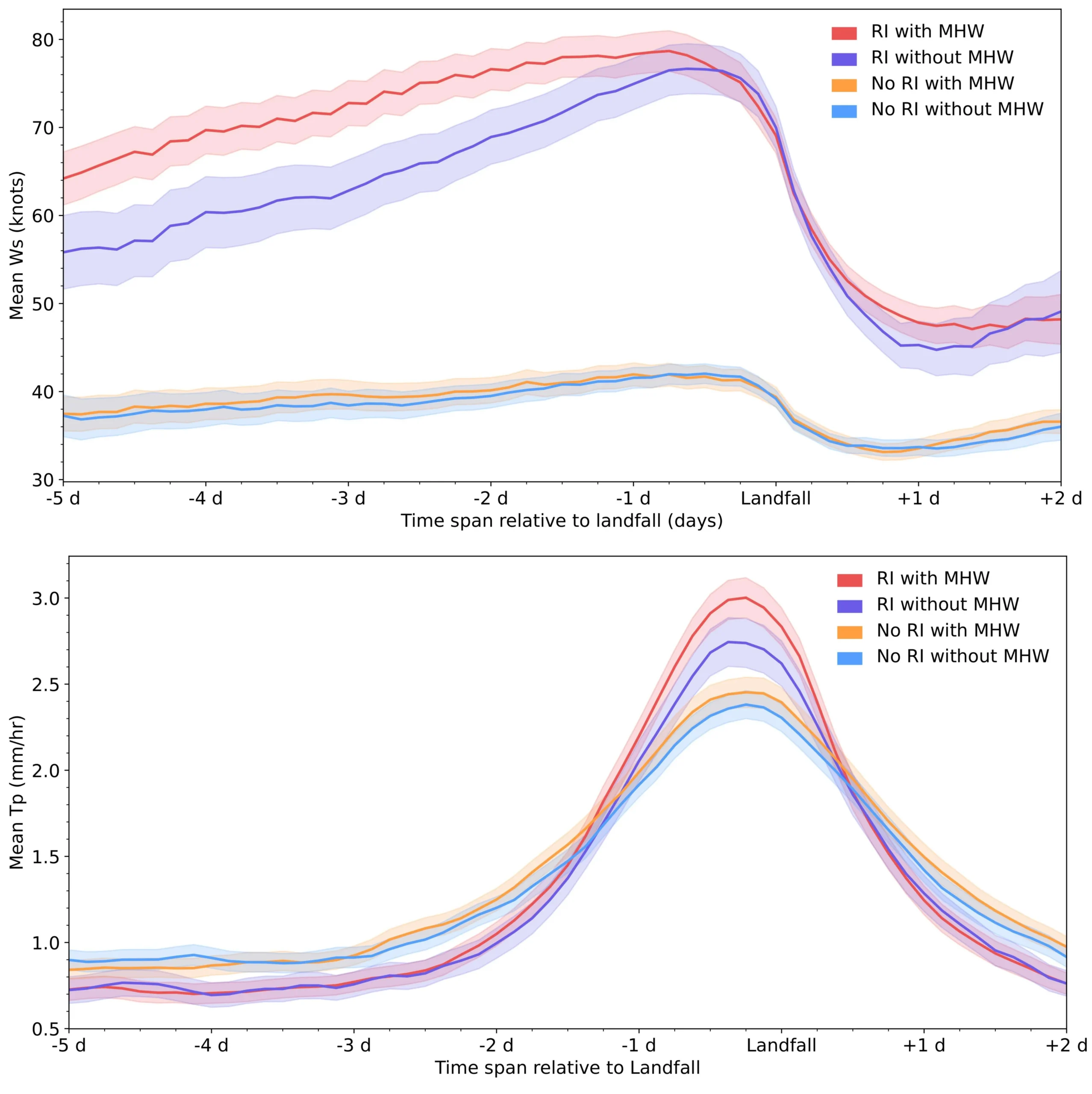
Tropical cyclones that rapidly intensify when passing over marine heatwaves can become “supercharged”, increasing the likelihood of high economic losses, a new study finds.
Such storms also have higher rates of rainfall and higher maximum windspeeds, according to the research.
The study, published in Science Advances, looks at the economic damages caused by nearly 800 tropical cyclones that occurred around the world between 1981 and 2023.
It finds that rapidly intensifying tropical cyclones that pass near abnormally warm parts of the ocean produce nearly double – 93% – the economic damages as storms that do not, even when levels of coastal development are taken into account.
One researcher, who was not involved in the study, tells Carbon Brief that the new analysis is a “step forward in understanding how we can better refine our predictions of what might happen in the future” in an increasingly warm world.
As marine heatwaves are projected to become more frequent under future climate change, the authors say that the interactions between storms and these heatwaves “should be given greater consideration in future strategies for climate adaptation and climate preparedness”.
‘Rapid intensification’
Tropical cyclones are rapidly rotating storm systems that form over warm ocean waters, characterised by low pressure at their cores and sustained winds that can reach more than 120 kilometres per hour.
The term “tropical cyclones” encompasses hurricanes, cyclones and typhoons, which are named as such depending on which ocean basin they occur in.
When they make landfall, these storms can cause major damage. They accounted for six of the top 10 disasters between 1900 and 2024 in terms of economic loss, according to the insurance company Aon’s 2025 climate catastrophe insight report.
These economic losses are largely caused by high wind speeds, large amounts of rainfall and damaging storm surges.
Storms can become particularly dangerous through a process called “rapid intensification”.
Rapid intensification is when a storm strengthens considerably in a short period of time. It is defined as an increase in sustained wind speed of at least 30 knots (around 55 kilometres per hour) in a 24-hour period.
There are several factors that can lead to rapid intensification, including warm ocean temperatures, high humidity and low vertical “wind shear” – meaning that the wind speeds higher up in the atmosphere are very similar to the wind speeds near the surface.
Rapid intensification has become more common since the 1980s and is projected to become even more frequent in the future with continued warming. (Although there is uncertainty as to how climate change will impact the frequency of tropical cyclones, the increase in strength and intensification is more clear.)
Marine heatwaves are another type of extreme event that are becoming more frequent due to recent warming. Like their atmospheric counterparts, marine heatwaves are periods of abnormally high ocean temperatures.
Previous research has shown that these marine heatwaves can contribute to a cyclone undergoing rapid intensification. This is because the warm ocean water acts as a “fuel” for a storm, says Dr Hamed Moftakhari, an associate professor of civil engineering at the University of Alabama who was one of the authors of the new study. He explains:
“The entire strength of the tropical cyclone [depends on] how hot the [ocean] surface is. Marine heatwave means we have an abundance of hot water that is like a gas [petrol] station. As you move over that, it’s going to supercharge you.”
However, the authors say, there is no global assessment of how rapid intensification and marine heatwaves interact – or how they contribute to economic damages.
Using the International Best Track Archive for Climate Stewardship (IBTrACS) – a database of tropical cyclone paths and intensities – the researchers identify 1,600 storms that made landfall during the 1981-2023 period, out of a total of 3,464 events.
Of these 1,600 storms, they were able to match 789 individual, land-falling cyclones with economic loss data from the Emergency Events Database (EM-DAT) and other official sources.
Then, using the IBTrACS storm data and ocean-temperature data from the European Centre for Medium-Range Weather Forecasts, the researchers classify each cyclone by whether or not it underwent rapid intensification and if it passed near a recent marine heatwave event before making landfall.
The researchers find that there is a “modest” rise in the number of marine heatwave-influenced tropical cyclones globally since 1981, but with significant regional variations. In particular, they say, there are “clear” upward trends in the north Atlantic Ocean, the north Indian Ocean and the northern hemisphere basin of the eastern Pacific Ocean.
‘Storm characteristics’
The researchers find substantial differences in the characteristics of tropical cyclones that experience rapid intensification and those that do not, as well as between rapidly intensifying storms that occur with marine heatwaves and those that occur without them.
For example, tropical cyclones that do not experience rapid intensification have, on average, maximum wind speeds of around 40 knots (74km/hr), whereas storms that rapidly intensify have an average maximum wind speed of nearly 80 knots (148km/hr).
Of the rapidly intensifying storms, those that are influenced by marine heatwaves maintain higher wind speeds during the days leading up to landfall.
Although the wind speeds are very similar between the two groups once the storms make landfall, the pre-landfall difference still has an impact on a storm’s destructiveness, says Dr Soheil Radfar, a hurricane-hazard modeller at Princeton University. Radfar, who is the lead author of the new study, tells Carbon Brief:
“Hurricane damage starts days before the landfall…Four or five days before a hurricane making landfall, we expect to have high wind speeds and, because of that high wind speed, we expect to have storm surges that impact coastal communities.”
They also find that rapidly intensifying storms have higher peak rainfall than non-rapidly intensifying storms, with marine heatwave-influenced, rapidly intensifying storms exhibiting the highest average rainfall at landfall.
The charts below show the mean sustained wind speed in knots (top) and the mean rainfall in millimetres per hour (bottom) for the tropical cyclones analysed in the study in the five days leading up to and two days following a storm making landfall.
The four lines show storms that: rapidly intensified with the influence of marine heatwaves (red); those that rapidly intensified without marine heatwaves (purple); those that experienced marine heatwaves, but did not rapidly intensify (orange); and those that neither rapidly intensified nor experienced a marine heatwave (blue).
Dr Daneeja Mawren, an ocean and climate consultant at the Mauritius-based Mascarene Environmental Consulting who was not involved in the study, tells Carbon Brief that the new study “helps clarify how marine heatwaves amplify storm characteristics”, such as stronger winds and heavier rainfall. She notes that this “has not been done on a global scale before”.
However, Mawren adds that other factors not considered in the analysis can “make a huge difference” in the rapid intensification of tropical cyclones, including subsurface marine heatwaves and eddies – circular, spinning ocean currents that can trap warm water.
Dr Jonathan Lin, an atmospheric scientist at Cornell University who was also not involved in the study, tells Carbon Brief that, while the intensification found by the study “makes physical sense”, it is inherently limited by the relatively small number of storms that occur. He adds:
“There’s not that many storms, to tease out the physical mechanisms and observational data. So being able to reproduce this kind of work in a physical model would be really important.”
Economic costs
Storm intensity is not the only factor that determines how destructive a given cyclone can be – the economic damages also depend strongly on the population density and the amount of infrastructure development where a storm hits. The study explains:
“A high storm surge in a sparsely populated area may cause less economic damage than a smaller surge in a densely populated, economically important region.”
To account for the differences in development, the researchers use a type of data called “built-up volume”, from the Global Human Settlement Layer. Built-up volume is a quantity derived from satellite data and other high-resolution imagery that combines measurements of building area and average building height in a given area. This can be used as a proxy for the level of development, the authors explain.
By comparing different cyclones that impacted areas with similar built-up volumes, the researchers can analyse how rapid intensification and marine heatwaves contribute to the overall economic damages of a storm.
They find that, even when controlling for levels of coastal development, storms that pass through a marine heatwave during their rapid intensification cause 93% higher economic damages than storms that do not.
They identify 71 marine heatwave-influenced storms that cause more than $1bn (inflation-adjusted across the dataset) in damages, compared to 45 storms that cause those levels of damage without the influence of marine heatwaves.
This quantification of the cyclones’ economic impact is one of the study’s most “important contributions”, says Mawren.
The authors also note that the continued development in coastal regions may increase the likelihood of tropical cyclone damages over time.
Towards forecasting
The study notes that the increased damages caused by marine heatwave-influenced tropical cyclones, along with the projected increases in marine heatwaves, means such storms “should be given greater consideration” in planning for future climate change.
For Radfar and Moftakhari, the new study emphasises the importance of understanding the interactions between extreme events, such as tropical cyclones and marine heatwaves.
Moftakhari notes that extreme events in the future are expected to become both more intense and more complex. This becomes a problem for climate resilience because “we basically design in the future based on what we’ve observed in the past”, he says. This may lead to underestimating potential hazards, he adds.
Mawren agrees, telling Carbon Brief that, in order to “fully capture the intensification potential”, future forecasts and risk assessments must account for marine heatwaves and other ocean phenomena, such as subsurface heat.
Lin adds that the actions needed to reduce storm damages “take on the order of decades to do right”. He tells Carbon Brief:
“All these [planning] decisions have to come by understanding the future uncertainty and so this research is a step forward in understanding how we can better refine our predictions of what might happen in the future.”


The post Marine heatwaves ‘nearly double’ the economic damage caused by tropical cyclones appeared first on Carbon Brief.
Marine heatwaves ‘nearly double’ the economic damage caused by tropical cyclones


-
Climate Change8 months ago
Guest post: Why China is still building new coal – and when it might stop
-
Greenhouse Gases8 months ago
Guest post: Why China is still building new coal – and when it might stop
-

 Greenhouse Gases2 years ago
嘉宾来稿:满足中国增长的用电需求 光伏加储能“比新建煤电更实惠”
-
Climate Change2 years ago
Bill Discounting Climate Change in Florida’s Energy Policy Awaits DeSantis’ Approval
-

 Climate Change2 years ago
嘉宾来稿:满足中国增长的用电需求 光伏加储能“比新建煤电更实惠”
-
Climate Change Videos2 years ago
The toxic gas flares fuelling Nigeria’s climate change – BBC News
-

 Renewable Energy6 months ago
Sending Progressive Philanthropist George Soros to Prison?
-

 Carbon Footprint2 years ago
US SEC’s Climate Disclosure Rules Spur Renewed Interest in Carbon Credits