

The Greenland ice sheet melt season 2023 is now over and it completes a 27th year in a row in which Greenland has lost ice.
The 2022-23 year saw both very high melt, particularly in July, but also higher than usual rain and snowfall in the late spring and early summer.
The increase in both melt and snowfall are exactly what scientists expect in a warming climate, and although they have tended to balance each other to some extent, Greenland has still ended up losing more ice than it gained.
As in previous years, while very high temperatures hit North America and Europe this summer, Greenland in between was comparably cool and wet. However, this was not enough to stop Greenland losing ice.
Extended snowfalls from October to December 2022 and the late onset of the melt season contributed to a relatively large accumulation of mass on Greenland’s surface. Nonetheless, this could not outweigh the losses by surface melting and breaking off of icebergs.
Overall, Greenland’s ice sheet lost 196 billion tonnes (Gt) of ice over the 12 months from September 2022 to August 2023.
This means that the last year to see a net gain of ice is still 1996.
In this annual guest post, we discuss the processes of ice sheet melt, glacier “calving” and the weather and climate that explain these losses.
(See our previous annual analysis for 2022, 2021, 2020, 2019, 2018, 2017, 2016 and 2015.)
Surface melt
Greenland’s annual cycle covers the 12 months up until the end of August.
The pattern sees the ice sheet largely gain snow from September, accumulating ice through autumn, winter and into spring. Then, as the year warms up into late spring, the ice sheet begins to lose more ice through surface melt than it gains from fresh snowfall, generally from the end of June. This melt season usually continues until the middle or end of August.
The snow gains and ice losses at the ice sheet’s surface over these 12 months are the “surface mass balance” (SMB) of the ice sheet. The SMB consists of gains through snowfall and losses through runoff and evaporation. Therefore, snowfall is the only way for the ice sheet to gain mass.
The data suggest that the Greenland ice sheet ended the year 2022-23 with a total SMB of about 398Gt. This is the 15th highest SMB in a dataset that goes back 43 years and is quite close to the 1981-2010 average.
The past year’s SMB is illustrated in the maps and charts below, based on data from the Polar Portal. The blue line in the upper chart shows the day-to-day SMB. Large snowfall events become visible as “spikes”. The blue line in the lower chart depicts the accumulated SMB, counted from the beginning of the “mass balance year” on 1 September 2022. In grey, the long-term average and its variability are shown. The red line shows the record low year of 2011-12 for comparison.
The map shows the geographic spread of SMB gains (blue) and losses (red) for 2022-23, compared to the long-term average.

Heat over North America and Europe, cool over Greenland
A closer look at the weather and ice sheet changes through the past 12 months reveals some interesting developments.
Early winter began with above-average snowfall on several occasions in September, October, November and December. In late winter, a rather dry period followed, so that the accumulated SMB was close to – and then slightly below – average as melting began.
The most remarkable feature in the evolution of the SMB in 2023 was the extended period of growth in June. At the end of that month, the accumulated SMB was almost 150Gt above average.
The effect of this extra snow meant that the onset of the melt – or “ablation” season was on 29 June – 16 days later than the 1981-2022 median. The ablation season is defined as the first day of three days in a row with an SMB below -1Gt.
As in previous summer seasons, the reason for the comparatively wet and cool spells over the Greenland ice sheet can be found quite far away from Greenland in “blocking” weather patterns.
These high-pressure weather systems have a huge impact on weather extremes. Strong persistent blocks over North America and Europe were present in the end of May and the first decade of June and at the end of August. The last of these caused catastrophic rainfall in Greece and Libya.
In such a blocked flow, the jet stream is shaped like the Greek capital letter Omega (Ω). Research suggests that such patterns in recent years have been stronger and more persistent. With the jet stream bulging up to the north over Canada and northern Europe, troughs of low pressure are found at each “foot” of the omega – including over Greenland.
The map below shows an example of the recurring circulation patterns, bringing cool weather over Greenland (blue shading) along with high temperatures over Canada and Europe (red shading).

The melt season that followed was stronger than average – even comparable with the record years of 2012 and 2019 – with melting over more than 50% of the ice sheet for 29 days in a row, from 27 June to 25 July.
And while the world was rightly focused on other extreme weather events this summer, the Greenland summer also saw its own record-breaking conditions.
The station at the summit of Greenland – about 3,000 metres above sea level – recorded a new average temperature record of -7.3C, almost 2C warmer than the previous record of -9.2C set in 2012 and 4C warmer than the long-term average at summit station.
Melt season
There were two main melting periods of the ablation season. Despite the cool start, as the melt season got underway there was a period of very high temperatures at the end of July. This brought intense melt all around the ice sheet that led to very large ice losses over a few days.
The map on the left side shows the area of ice melt on 10 July when the maximum melt extent (67%) of this summer (shaded in red) was reached. The centre map shows the second melt maximum (50%), which peaked on 23 August, and finally the map on the right depicts the situation at the end of the season on 31 August. Melting was above average from 21 June through to – and beyond – the end of the season.

Components of the mass balance
The SMB is just one component of the “total” mass mass balance (TMB) of the Greenland ice sheet:
TMB = SMB + MMB + BMB
Here, MMB is the “marine” mass balance, consisting of the breaking off – or “calving” – of icebergs and the melting of the front of glaciers where they meet the warm sea water. BMB is the “basal” mass balance, which refers to ice losses from the base of the ice sheet. This makes a small, but non-zero, contribution to the TMB and mainly consists of frictional effects and the ground heat flux.
The figure below shows the components of the TMB (red) going back to 1987, which includes the SMB (blue), MMB (green) and BMB (orange). These estimates are based on the modelling approach set out in Mankoff et al in 2021.
For the past year, the TMB clocked in at a loss of 196Gt of ice. This means that 2022-23 was the 27th year in a row where the Greenland ice sheet has lost mass overall. As the chart shows, Greenland last saw an annual net gain of ice in 1996.

The only way for the ice sheet to gain ice is via the SMB – that is, through snowfall. The other components, MMB and BMB, are always negative, so the surplus of snowfall over runoff and the two other components needs to be large enough to compensate.
Using data from the GRACE satellites, we can estimate the TMB independently. The distance of these twin satellites changes slightly due to tiny gravity differences caused by mass changes. Expressing these distance differences as mass changes is not straightforward, however, which is the reason why GRACE data are only made available a few months later.
Furthermore, using satellites, we can measure the speed at which ice flows through control points on the ice sheet where we know the thickness and shape of the ice. Thus, we can estimate MMB, the amount of ice being lost by the process of calving and submarine melting. This data is openly available, allowing us to monitor the whole ice sheet budget.
The map and graph below show the gain (blue) and loss (red) in the mass of ice. The difference in these mass changes over a glaciological year (September-August) is the TMB of the ice sheet for that particular year.

The map shows that most of the loss of ice occurs along the edge of the ice sheet, where independent observations also indicate that the ice is thinning. High up in central Greenland, there is a small increase in the mass of the ice – most likely due to a small increase in snowfall, as we would also expect in a warming climate.
The graph illustrates the month-by-month development in changes of mass measured in gigatonnes, relative to April 2002. The left axis on the graph shows how this ice mass loss translates into a sea level rise contribution, where 100Gt corresponds to 0.28mm of global sea level rise.
The two approaches to calculating TMB have a common period of 1 April 2002 to 31 March 2023. These estimates suggest that the Greenland ice sheet lost around 4,578Gt (Mankoff et al.) to 4,745Gt (GRACE) of ice over this time. Note that the two methods are completely independent.
The result from both datasets is equivalent to around 13mm of global average sea level rise. Recent research suggests that the imbalance of the Greenland ice sheet caused by climate change means it is committed to contributing at least 274mm to global sea levels in future, regardless of 21st-century climate pathways.


The post Guest post: How the Greenland ice sheet fared in 2023 appeared first on Carbon Brief.

The launch of the Africa Energy Bank (AEB) has been put back yet again, raising doubts about the institution’s future ability to finance fossil fuel projects – its main objective – as global lenders retreat from such investments over climate concerns, experts told Climate Home News.
The bank, which had been billed to launch in September after a series of delays, is now scheduled to begin operations in November, according to the head of the African Energy Chamber, an advocacy body for the continent’s oil and gas sector.
Even as the world aims to transition away from fossil fuels, many African leaders have made clear they want to continue exploring and extracting the continent’s large oil and gas deposits – estimated at around 125 billion barrels of crude and over 600 trillion cubic feet of gas – to boost economic development.
As a group, Africa sided with a number of powerful oil-and-gas producing nations in blocking progress on negotiations to craft a global roadmap to transition away from fossil fuels at last year’s UN COP30 climate talks, although some countries did individually support the proposal.
-
Campaigners oppose Dangote’s planned Kenya refinery over climate and ecological risks
Plans to build Africa’s second largest oil refinery in ecologically sensitive region criticised as “environmental recklessness” -
Tanzania pushed African nations to oppose fossil fuel transition at COP30
While chairing the African group at the summit, the gas-dependent nation advised the continent’s ministers to block language on transitioning away from fossil fuels


Meanwhile, major projects under development across the continent – including the 1,443-km East African Crude Oil Pipeline (EACOP) and Dangote’s 700,000-barrel-per-day Kenyan refinery – show that African governments see oil and gas as playing a significant role in meeting their energy and economic needs for many years to come.
In 2022, at a gathering of the African Petroleum Producers’ Organization (APPO) in oil-rich Angola, ministers from its member states adopted a resolution to create the Africa Energy Bank to finance projects for the production, use and trade of oil, gas and broader energy sources.
African control over energy resources
An article on the APPO website explains that the bank was conceived as a way to overcome “disenchantment” with fossil fuels among “the international community” which it said had crystallised around the “energy transition” concept.
“If Western countries, after having long taken advantage of the energy sources they now revile to develop, can afford the luxury of abandoning them, this is not the case in Africa,” it adds, noting that many of the continent’s economies are still largely dependent on oil and gas revenues.
A separate web page about the bank, also hosted on APPO’s website, says its objectives include financing the exploration, production and refining of oil and gas, as well as supporting member states in transitioning from fossil fuels to cleaner energy sources “while ensuring energy security”.
Said Addi, a former executive with Shell and energy commodities trading house Gunvor, said the new bank was judged necessary because financing for hydrocarbons from many traditional international lenders has become constrained.
In trying to fill this financing gap, Africa is not simply setting up another fund to support oil and gas, he added. “It is also an attempt to give African countries greater control over how their energy resources and infrastructure are financed,” he explained.
Nigeria to host the AEB
The energy bank – a joint initiative of APPO and the African Export–Import Bank (Afreximbank) – has so far suffered several delays and is almost two years behind schedule. The initial plan was to start operations in January 2025, with Nigeria as the host country, but the bank’s opening was delayed to June of that year to allow Nigeria time to finalise the construction of the bank’s headquarters in Abuja.
After the government announced the completion of the offices in late November 2025, a new launch date was set for January 2026, which was moved back to April, June and then September. Now it has shifted again to November, raising concerns that the institution may be losing momentum.
Former Shell executive Addi said that if the capital is eventually paid in, the bank becomes operational and its first projects are commercially credible, then the delays will be regarded as normal teething troubles in setting up a multilateral institution. But, he added, scepticism will be justified if it continues to stall.
Uganda may see lower oil revenues than expected as costs rise and demand falls
Baron Lamarré, an oil and gas expert and former Petronas oil trader, said that missing “three deadlines in a row is not normal”, and warned that if the timeline slips again, “the story flips from ‘ambitious institution finding its footing’ to ‘good idea that lost momentum before it found any’.”
The Nigerian government, APPO and Afreximbank did not respond to requests for comment by the time of publication.
The funding challenge
The Africa Energy Bank is targeting base capital of $5 billion, with plans to scale up to $120 billion within five years by mobilising private-sector funds. However, it is expected to start operations with initial seed capital of $500 million.
The funding plan is to have the 18 member countries of the APPO contribute $83 million each to the bank as equity for a combined $1.5 billion. Afreximbank, other non-APPO African countries and investors outside the continent are expected to provide the remaining $3.5 billion.
But even the initial $500 million has not been easy to mobilise. In May, APPO Secretary-General Farid Ghezali called on members to deliver on their pledges towards the startup goal before the end of June. But the delays suggest this may not have been met, with experts saying Africa may be finding it difficult to self-fund its oil and gas projects in the absence of international capital.
Lamarré said every extension of the deadline points to the fact that “raising fossil fuel capital in Africa without the majors and their financing networks is brutally hard”.
Why the global electrification agenda misses the point on Africa’s energy crisis
Since 2020, Western lenders, export credit agencies and insurers have been in steady retreat from African hydrocarbons, he said, while oil majors are divesting their African assets, handing over fields to smaller local operators whose credit ratings are not high enough to borrow cheaply.
Even capital from China and the Gulf, which has partially filled the gap, cannot match the volume, tenor or pricing that Western investors once offered, Lamarré argued.
“If mobilising the first $500 million of seed capital [for the AEB] has taken this long, that’s the clearest signal yet of how steep the climb to $120 billion looks,” he said, noting that the continent’s energy financing gap is as large as $30 billion-$45 billion per year.
Africa’s investment landscape, meanwhile, has been shifting. While foreign direct investment dropped from a 2024 peak, inflows remained roughly one-third above the continent’s long-term average in 2025, according to the 2026 World Investment Report from UN Trade and Development (UNCTAD). They are concentrated in a few sectors including critical minerals needed for renewable energy technologies, battery manufacturing and advanced industrial production.
At the same time, data on global energy investment from the International Energy Agency (IEA) shows that fossil fuel investment in Africa has declined over the last decade.

“Trojan horse” for fossil fuels
While the Africa Energy Bank struggles to get off the ground, climate campaigners have criticised its primary aim of financing oil and gas on the continent at a time when the world is starting to move away from high-carbon fuels to cleaner alternatives.
Bhekumuzi Dean Bhebhe, founder of Africa Change Lab, described the bank as a “Trojan horse”, arguing that its focus on fossil fuel financing runs counter to the global energy transition and the African Union’s Agenda 2063 goals of sustainable development and inclusive growth.
The energy bank, he warned, “risks locking Africa into a new cycle of debt, dependency and fossil fuel entrenchment”, adding that its financing blueprint does not pave the way for a climate-resilient future. “In truth, it is to deepen the same extractive, carbon-heavy pathways that the continent should be moving away from,” he added.
Ugandan farmers use British court to try to stop East Africa oil pipeline
Kenya-based climate and energy expert Joab Okanda said the AEB’s plan to finance oil and gas is “a misplaced priority” and it should instead back clean energy in line with the policies of some of Africa’s major export markets like Europe.
In addition, the new bank could struggle to mobilise enough resources to advance large-scale oil and gas projects, he added, noting that its proposed $5-billion initial capital is equivalent to the cost of the East African Crude Oil Pipeline alone.
The AEB’s aim of backing more fossil fuels should be flipped “to support countries that are oil-dependent to start working on their transition plans”, Okanda said.
The post Launch of Africa Energy Bank delayed again in blow to oil and gas hopes appeared first on Climate Home News.
Launch of Africa Energy Bank delayed again in blow to oil and gas hopes
A booklet published by the UK’s opposition Conservative party includes a “cost of net-zero” that appears to have been doubled by a spreadsheet error.
The “common sense” policy document argues that “what people ultimately want is a government competent enough to solve the problems for which it takes responsibility”.
In a section that says “sophisticat[ed]…modelling” should not be a substitute for “political judgement”, the “Right Way” document disparages various estimates of the cost of net-zero.
The Conservative document then claims – incorrectly – that the government’s official adviser, the Climate Change Committee (CCC), had put the cost of net-zero at close to £1tn. It says:
“In 2020, the CCC estimated that its route to net-zero would cost £957bn.”
In fact, the CCC’s 2020 estimate was exactly half this amount – £478bn – and last year it published a revised figure of £108bn, largely as a result of the falling cost of electric vehicles (EVs).
Spreadsheet error
The Conservative party’s erroneous claim appears to stem from another report that had accidentally added up numbers twice, using a spreadsheet published by the CCC in 2020.
The 2020 spreadsheet contains a table listing the additional investments that would be needed to build a net-zero economy, from low-carbon electricity generation through to heat pumps and EVs.
These extra capital expenditures, listed as “CAPEX”, add up to a total of £1.38tn over the 30 years of 2020-50. They are set against operational savings, listed as “OPEX”, of £0.90tn.
Added up over 2020-50, the combined CAPEX and OPEX figures come to a total of £478bn.
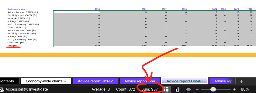
In addition to the annual sectoral CAPEX and OPEX figures, the CCC’s 2020 spreadsheet also has a line giving combined totals for each year. It appears that someone has added all of these numbers together, resulting in the savings and costs being counted twice.
This double-counted total for the cost of net-zero amounts to £957bn – as shown in the image below – and it appears to be the source of the claim in the Conservative booklet.
At the time of publication in 2020, the CCC said that the £478bn net cost of net-zero amounted to less than 1% of GDP over 30 years – and that the large investment needed would not only result in savings due to lower fossil-fuel imports, but that it would boost GDP overall, by around 2%.
In 2025, the CCC revised its estimates for investment costs and operating savings to £670bn and £562bn respectively, giving a net total of £108bn over 2025-50, or less than 0.2% of GDP.
Earlier this year, the committee said that cutting emissions to net-zero would cost less than a single fossil-fuel price shock and that doing so would have benefits worth £110bn per year.
Paper trail
The erroneous claim in the Conservative document is referenced to the CCC’s 2020 advice on the UK’s sixth “carbon budget”, which, as explained, does not contain the £957bn figure.
The earliest online use of the £957bn figure found by Carbon Brief is a 12 January 2026 article in the Spectator, by retired engineer and self-described “accidental energy analyst” David Turver.
A day later, Turver repeated the mistaken number in a report for the free-market Institute of Economic Affairs. His report cites figure 5.3 of the CCC’s 2020 advice.
However, as set out above, the CCC spreadsheet containing the data for figure 5.3 only adds up to £478bn, half the figure claimed by Turver.
It