Connect with us

Published

on

As 2026 passes its halfway point, the world is watching one of the most rapidly intensifying El Niño events in the modern record take shape in the tropical Pacific.

The developing El Niño is boosting expectations for global temperatures, both this year and next.

El Niño is the warm phase of a recurring climate pattern in the tropical Pacific that releases heat from the ocean into the atmosphere, temporarily raising global temperatures and reshaping rainfall and extreme weather around the world.

Carbon Brief’s “state of the climate” report in April gave 2026 a 19% chance of setting a new global temperature record.

That chance now stands at 35% – a near-doubling in four months – with virtually all of the change driven by ever-stronger El Niño forecasts.

The key findings from the first half of 2026 include:

  • The first six months of 2026 were the third-warmest start to a year on record – around 1.4C above pre-industrial levels – behind only 2024 and 2025. 
  • While the first few months of the year came in as the fourth or fifth warmest, both May and June were the second-warmest ever recorded as El Niño conditions took hold.
  • El Niño conditions arrived in April and reached the threshold for a “strong” event by June, when the Niño3.4 index reached 1.6C. Of the 667 model runs Carbon Brief examined, 91% project a peak later this year that is above the strongest El Niño in history.
  • The chance that 2026 beats 2024 as the warmest year on record has risen to 35%. Carbon Brief’s central estimate remains that 2026 will be the second-warmest year, at around 1.51C above pre-industrial levels.
  • Whether 2026 sets a record will depend on the dataset: the odds range from around two-in-three in NASA and Berkeley Earth data to around two-in-10 in ERA5 and one-in-10 in the JRA-3Q reanalyses.
  • June 2026 was western Europe’s hottest June on record, amid a heatwave that set hundreds of individual records. Nearly 9% of the world’s surface saw record June warmth.
  • The developing El Niño will have its largest impact on 2027, which Carbon Brief projects to be around 1.7C above pre-industrial levels – this would comfortably set a new record for the warmest year.
  • Arctic sea ice has spent 39 days of 2026 so far at, or below, record daily lows following its joint-lowest winter maximum in the satellite era.

Third-warmest start to a year

Carbon Brief analyses records from six different groups that report global surface temperatures: NASA GISTEMP, NOAA GlobalTemp, Hadley/UEA HadCRUT5, Berkeley Earth, Copernicus/ECMWF ERA5 and the JMA JRA-3Q reanalysis.

The first half of 2026 was the third warmest on record in every one of the six datasets, behind only 2024 and 2025. The figure below shows annual temperatures since 1970, along with the 2026 year-to-date average (January-June) for each group.
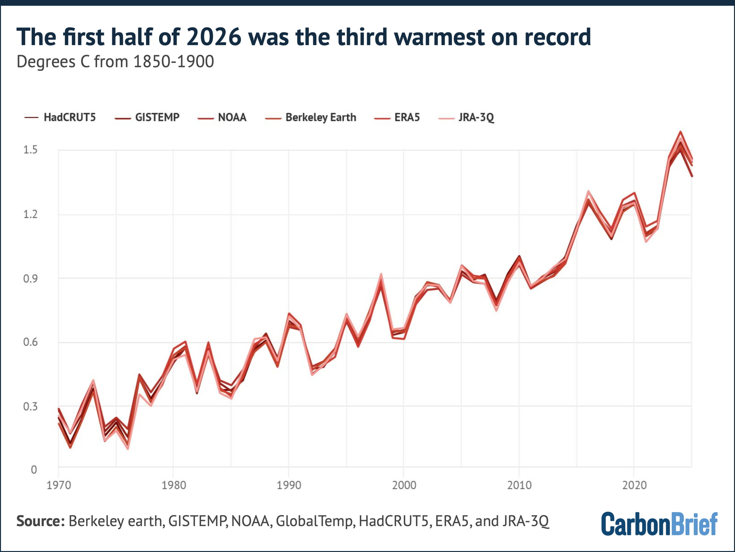
Chart showing that the first half of 2026 was the third warmest on record
Annual global average surface temperatures from the six groups (lines), along with 2026 temperatures so far (January-June, coloured dots). Note that HadCRUT5 and ERA5 dots reflect January-May, as their June values were not yet published. Chart by Carbon Brief.

January 2026 was only the fourth- or fifth-warmest January on record, as lingering weak La Niña conditions suppressed temperatures. Since then, each month has climbed the rankings.

La Niña is the cool phase of the El Niño-Southern Oscillation (ENSO). It typically brings wetter conditions to Australia, Indonesia and equatorial South America and drier conditions to the southern US.

March was second-to-fourth warmest across datasets, April the third and both May and June were the second warmest ever recorded, behind only the corresponding months of 2024.

The chart below shows how June 2026 (thick red line) came in around 0.08C below the June record set in 2024 in the average of the six datasets.

Meanwhile, Copernicus reported that global sea surface temperatures over the ice-free oceans set a new June record.
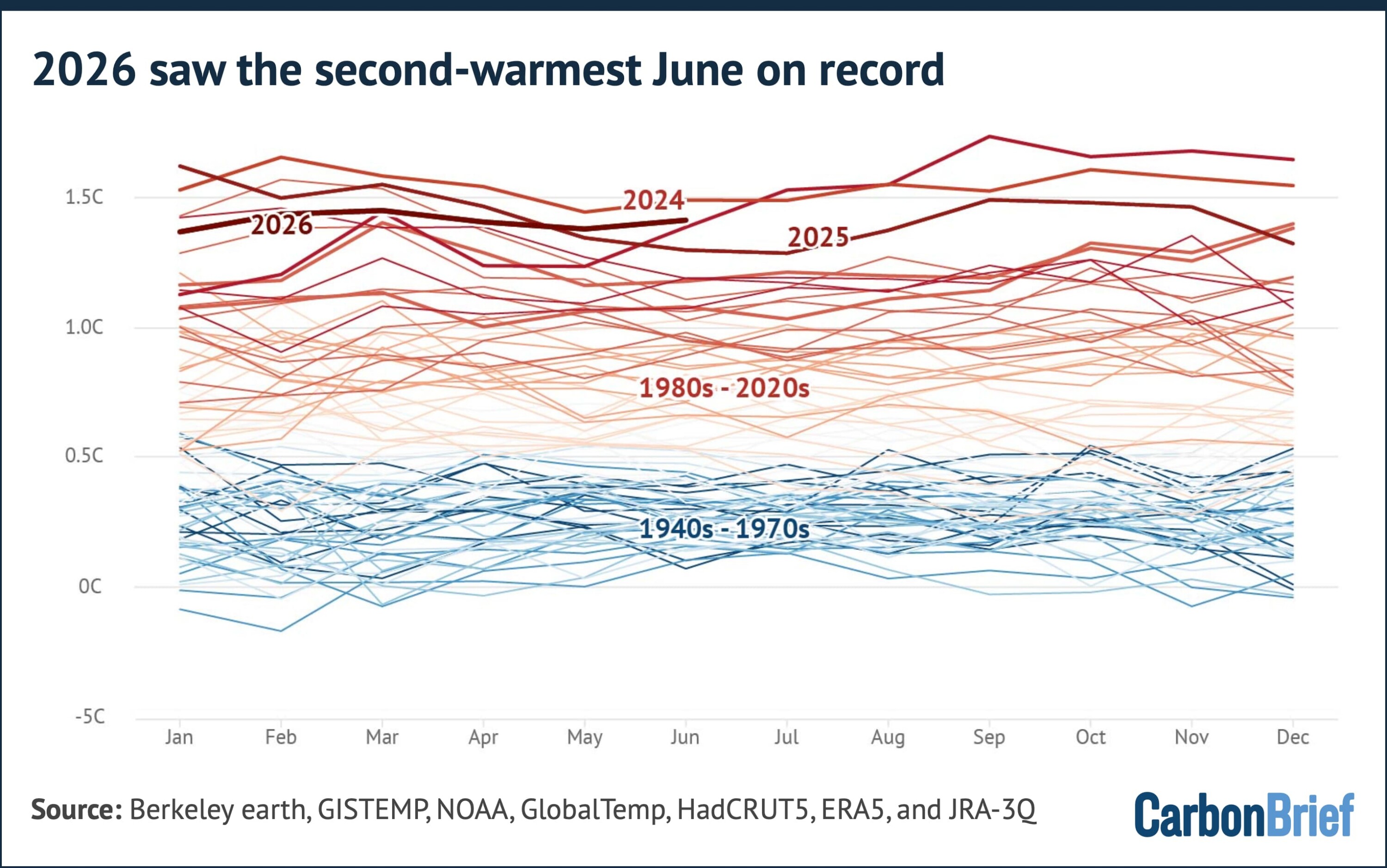
Chart showing that 2026 saw the second-warmest June on record
Average global surface temperatures for each month from 1940 to June 2028 from six forecasting groups, with lines coloured by decade. Chart by Carbon Brief.

A record-breaking El Niño

ENSO is the largest source of year-to-year variability in global temperatures.

The most common way to assess the strength of an El Niño or La Niña event is by looking at the sea surface temperature anomaly in the “Niño3.4” region of the tropical Pacific.

El Niño and its sister La Niña occur when temperatures in the tropical Pacific are more than 0.5C (El Niño) or less than 0.5C (La Niña) below normal, where normal is defined by removing the effects of long-term climate change.

The thresholds for defining the strength of an El Niño or La Niña are above/below 1C for “moderate” events, 1.5C for “strong” events and 2C for “very strong” (or “super”) events.

After two years dominated by La Niña conditions, the tropical Pacific flipped decisively in April when the Niño3.4 index crossed the 0.5C El Niño threshold. It subsequently reached 1C in May and hit 1.6C in June, marking one of the fastest onsets in the observational record.

In the first few weeks of July, the index shot above 2C, significantly outpacing the speed at which any prior El Niño events developed.

Forecast models expect even more to come.

An analysis by Carbon Brief of the median of 667 model runs from 14 different modelling groups suggests that sea surface temperatures in theNiño3.4 region could peak at 3.59C between July and December.

More than 91% of runs predict the strongest El Niño event in the modern record. The previous record was set during the event of 2015-16, when temperatures peaked around 2.75C.

This is shown in the chart below, which features a histogram of the likelihood of different possible 2026 El Niño peaks across all the models on the top. The forest plot beneath shows the best estimate and range of outcomes predicted by each individual model.
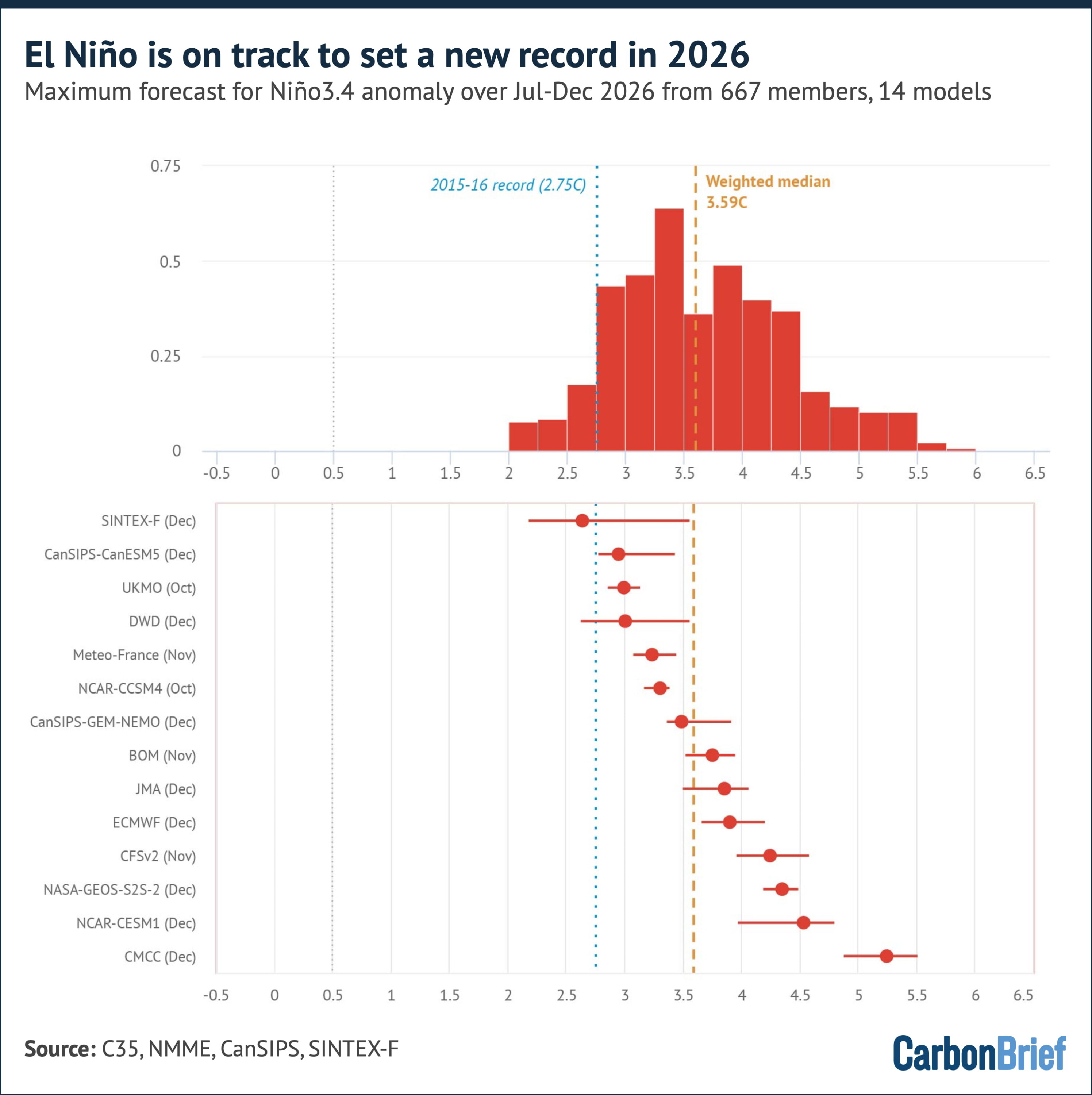
Chart showing that El Niño is on track to set a new record in 2026
Top panel: Model-weighted distribution of each member’s peak Jul-Dec 2026 Niño3.4 anomaly (red bars), with the dotted yellow line indicating the weighted median (+3.6C) and the dotted blue line the prior record peak (2015-16, 2.75C). Bottom panel: median and 10th-90th percentile peak for each modelling group, with its typical peak month. The figure includes 667 model runs from 14 different modelling groups (from the CFS, NMME, C3S, CanSIPS and SINTEX-F systems). Chart by Carbon Brief.

The median forecast in every one of the 14 models suggests a peak that exceeds the 2C “super” El Niño threshold, with most models peaking in November or December.

Some caution here is warranted, however. Raw model Niño3.4 anomalies are measured against a fixed climatology. Because the entire tropical ocean has warmed due to human-caused greenhouse gas emissions, the models tend to overstate event strength relative to the historical record.

A cleaner comparison uses the relative Niño3.4 index (RONI), which subtracts the average tropical ocean warming.

This relative measure suggests the median forecast peak for El Niño in the latter half of 2026 is 3.1C. The prior record stands at a lower 2.69C, set in 1982-83.

Nevertheless, 77% of model runs still show a new record event occurring. This is shown in the chart below.
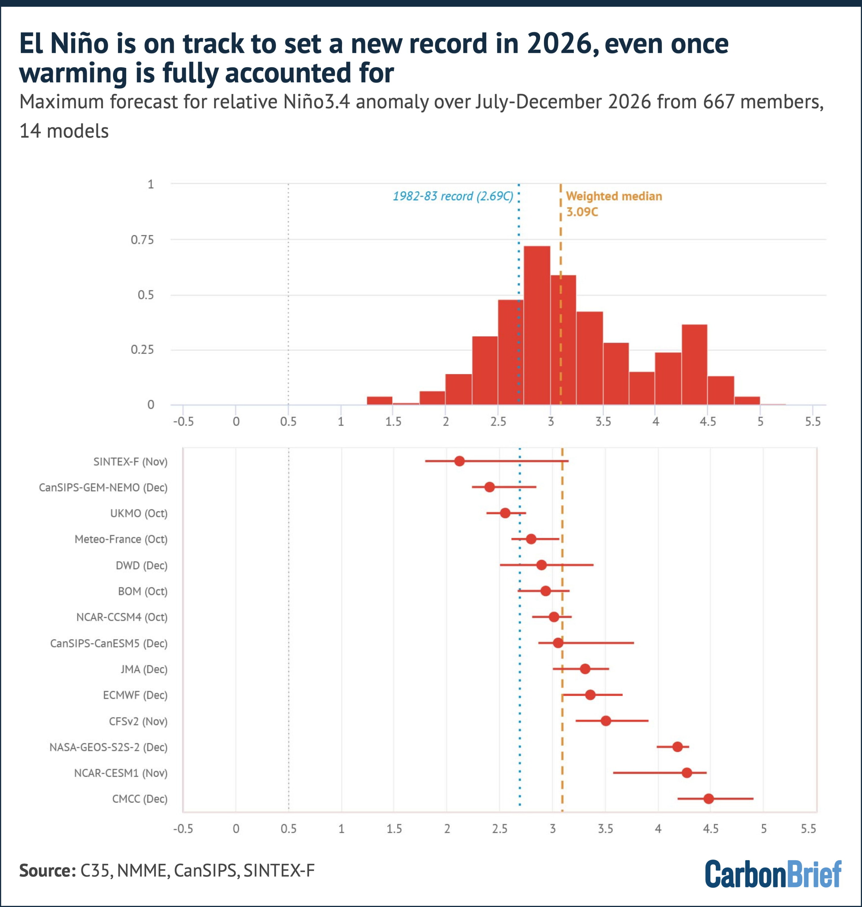
Chart showing that El Niño is on track to set a new record in 2026, even once warming is fully accounted for
Top panel: Model-weighted distribution of each member’s peak Jul-Dec 2026 RONI (red bars), with the dotted yellow line indicating the weighted median (+3.1C) and the dotted blue line the prior record peak (1982-83, 2.69C). Bottom panel: median and 10th-90th percentile peak for each modelling group, with its typical peak month. The figure includes 667 model runs from 14 different modelling groups (from the CFS, NMME, C3S, CanSIPS and SINTEX-F systems). Chart by Carbon Brief.

In summary, on both indexes, the central expectation is now for the strongest El Niño in the observational record.

Model forecasts made in the spring and early summer have historically shown some bias toward overpredicting event strength. However, forecasts made after the spring are considerably more reliable.

Widespread record warmth and a massive European heatwave

The map below shows the temperature anomaly for the first half of 2026 in the ERA5 dataset, relative to a 1981-2010 baseline period.
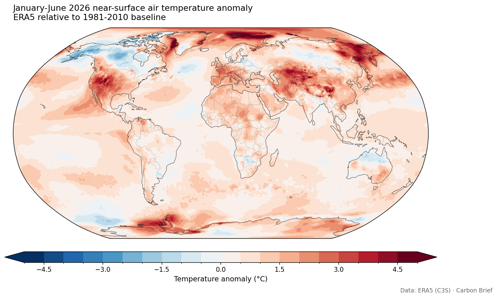
Global map showing global mean surface temperatures for January-June 2026 compared to a 1981-2010 baseline, using data from ERA5.
Global mean surface temperatures for January-June 2026 compared to a 1981-2010 baseline, using data from ERA5.

It shows how the largest warm anomalies were found across the Arctic – particularly north of Scandinavia and Svalbard – as well as western Europe, the western US, northern Mexico, central Asia, western China, eastern Russia and the Antarctic Peninsula region.

The developing El Niño is clearly visible as a tongue of warm anomalies stretching along the equatorial eastern Pacific. Only a few regions – central Canada, Alaska and parts of the Southern Ocean – saw temperatures below the 1981-2010 average.

Where 2026 ranks against history is even more striking. The map below shows where the period of January-June 2026 ranked among all 87 years in the ERA5 record, which stretches from 1940 to 2026. Grid cells marked in red saw temperatures in the first half of the year that were in the top-five warmest years.
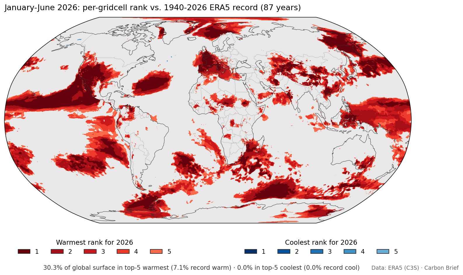
Global map showing January-June 2026 per-gridcell ranks in ERA5.
January-June 2026 per-gridcell ranks in ERA5. 30% of the global surface saw a top-five warmest first half of the year; 7.1% saw record warmth. No areas (0.0%) saw top-five cold.

More than 30% of the global surface had a top-five warmest start to the year and 7.1% saw its warmest on record, including much of western Europe, the eastern equatorial Pacific and the seas around Japan.

Not a single grid cell had a top-five coolest start to the year. In June alone, 8.9% of the world’s surface saw record warmth for the month. This is illustrated in the map below, where grid cells marked in red saw temperatures that were in the top-five warmest years and grid cells in blue in the top-five coolest.
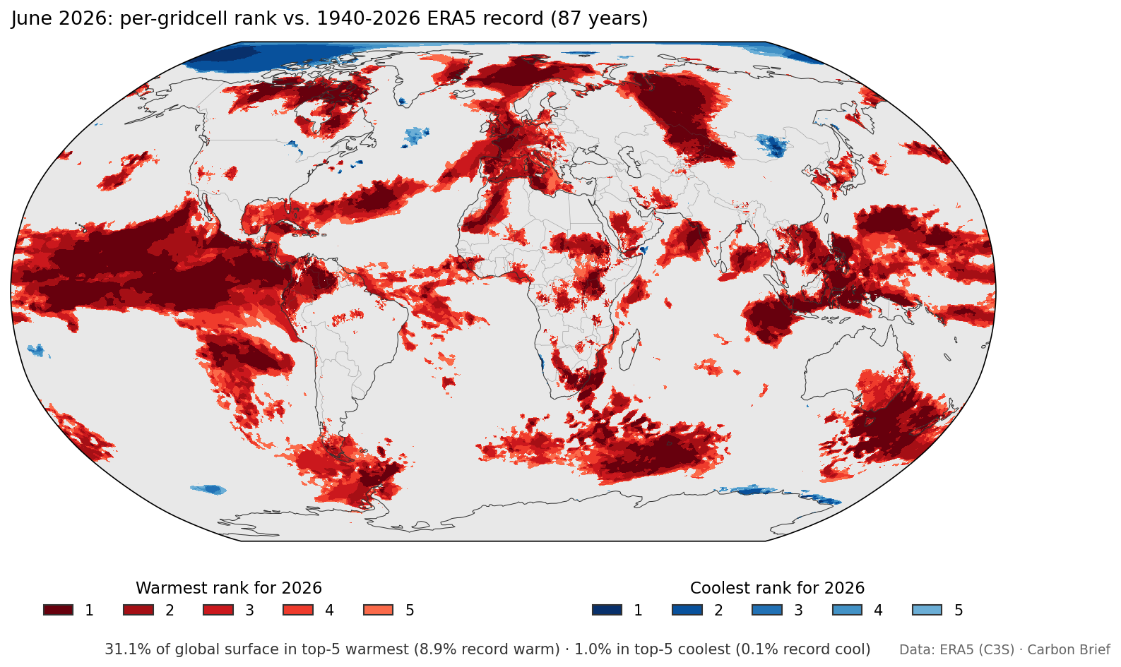
Global map showing June 2026 per-gridcell ranks in ERA5.
June 2026 per-gridcell ranks in ERA5.

The standout regional temperature event was a heatwave that struck Europe in late June.

Western Europe had its hottest June on record, recording an average temperature of 3.05C above the 1991-2020 average and beating the record set only a year earlier, according to Copernicus. A heat dome over 22-30 June broke 10 all-time national heat records and around 400 long-record station records.

France set a new June national record of 44.3C, while the UK broke its June record on three consecutive days, reaching 37.3C. The humid heat drove a death toll estimated in the thousands.

A separate heat dome also brought record June temperatures to parts of North America in late June.

On track to be second warmest, but a real chance at first

Carbon Brief’s updated projection for 2026 as a whole combines the observed January-June temperatures with the latest El Niño forecast. It uses a statistical model trained on the historical relationship between the first half of the year, ENSO conditions and annual temperatures observed over 1950-2025, excluding major volcanic eruption years.

Carbon Brief estimates that 2026 will be around 1.51C above pre-industrial levels, with a 90% range of 1.45C to 1.57C, shown by the yellow dot in the chart below.

This is up from 1.47C in the projection set out in April – and is notably more certain now that half the year has passed.

This central estimate would make 2026 the second-warmest year on record, just below 2024 (1.52C) and ahead of 2023 (1.43C) and 2025 (1.41C).
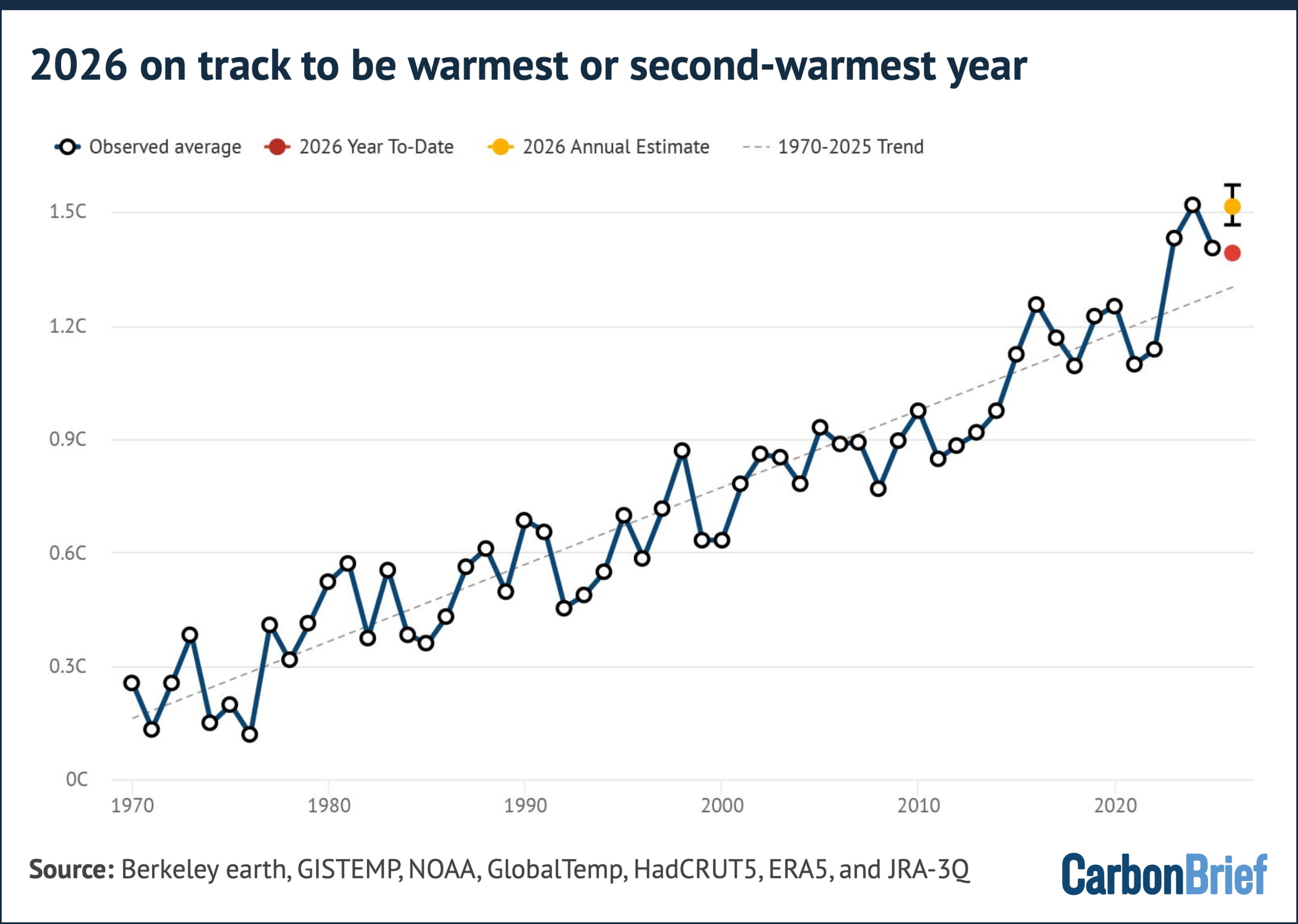
Chart showing that 2026 is on track to be the warmest or second-warmest year
Annual composite temperatures over 1970-2025, the 2026 year-to-date value (January-June, red dot), and Carbon Brief’s 2026 annual estimate (yellow dot with the 5th to 95th percentile range). Chart by Carbon Brief.

Carbon Brief’s modelling puts the chance that 2026 beats 2024 as the warmest year on record at 35%, using the average of the six different surface temperature records assessed. It puts the chance that 2026 comes in above 1.5C at around 63%.

If it does, 2026 would be the second calendar year – after 2024 – where warming averaged above 1.5C, in a further sign that the world is rapidly approaching the Paris Agreement’s 1.5C limit.

A single year above 1.5C does not by itself constitute a breach of the goal, which refers to the longer term average temperature of the planet. This is defined as the midpoint of a 20-year period by the Intergovernmental Panel on Climate Change (IPCC).

These likelihood of a record have been climbing rapidly throughout 2026.

Global temperatures so far throughout the year have run well below the record-setting levels of 2024 – around 0.13C cooler over the first six months.

On their own, temperatures observed so far in 2026 would make a new annual record unlikely.

However, rerunning the projection using only the data available at the end of each month since March – including both the year-to-date observations and the El Niño forecast issued that month – shows a shifting picture.

Using March data, 2026 had just a 7% chance of setting a new record. That rose to 16% in April, 24% in May, 27% in June and 35% using the latest data in mid-July.

This is shown in the chart below.
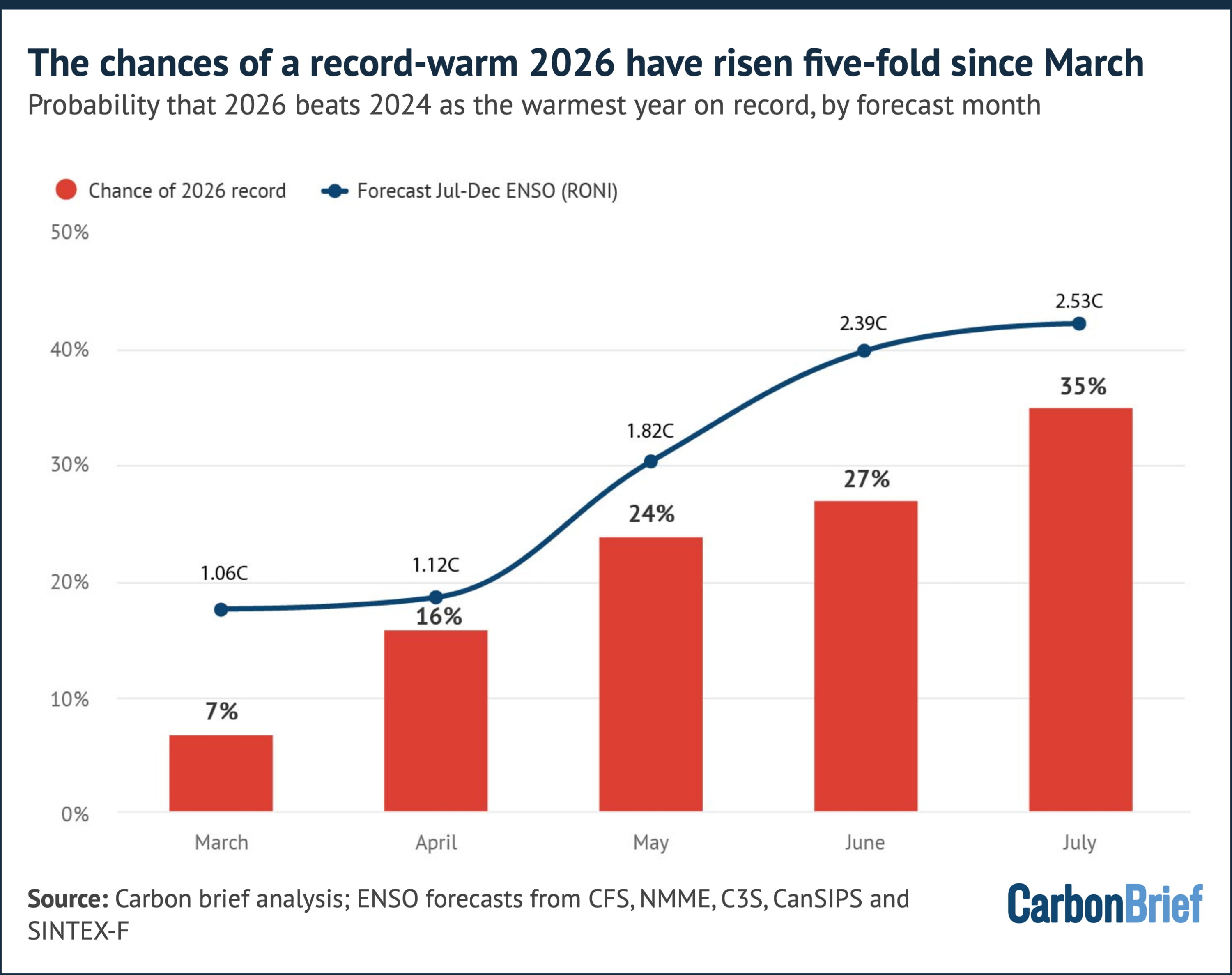
Chart showing that the chances of a record-warm 2026 have risen five-fold since March
Columns show the probability that 2026 exceeds 2024 as the warmest year on record, based on data available at the end of each month; the line shows the corresponding forecast of July-December ENSO conditions (relative Niño3.4 index). Chart by Carbon Brief.

Notably, this rise has little to do with observed temperatures. The year-to-date anomaly has actually drifted slightly down, from 1.41C after March to 1.39C after June.

Observed temperatures and fewer remaining months of the year contributed only around four percentage points of the 28-point rise in the likelihood; the remaining ~84% of the change comes from successive upward revisions to the El Niño forecast for late 2026.

However, whether 2026 ends up becoming the warmest year on record may end up depending on which dataset is used.

Running the same projection gives odds of a 2026 record of around two-in-three for Berkeley Earth (66%) and NASA GISTEMP (65%), but only 35% for HadCRUT5, 24% for NOAA and just 13% and 9% for the ERA5 and JRA-3Q reanalyses, respectively.

This is shown below.
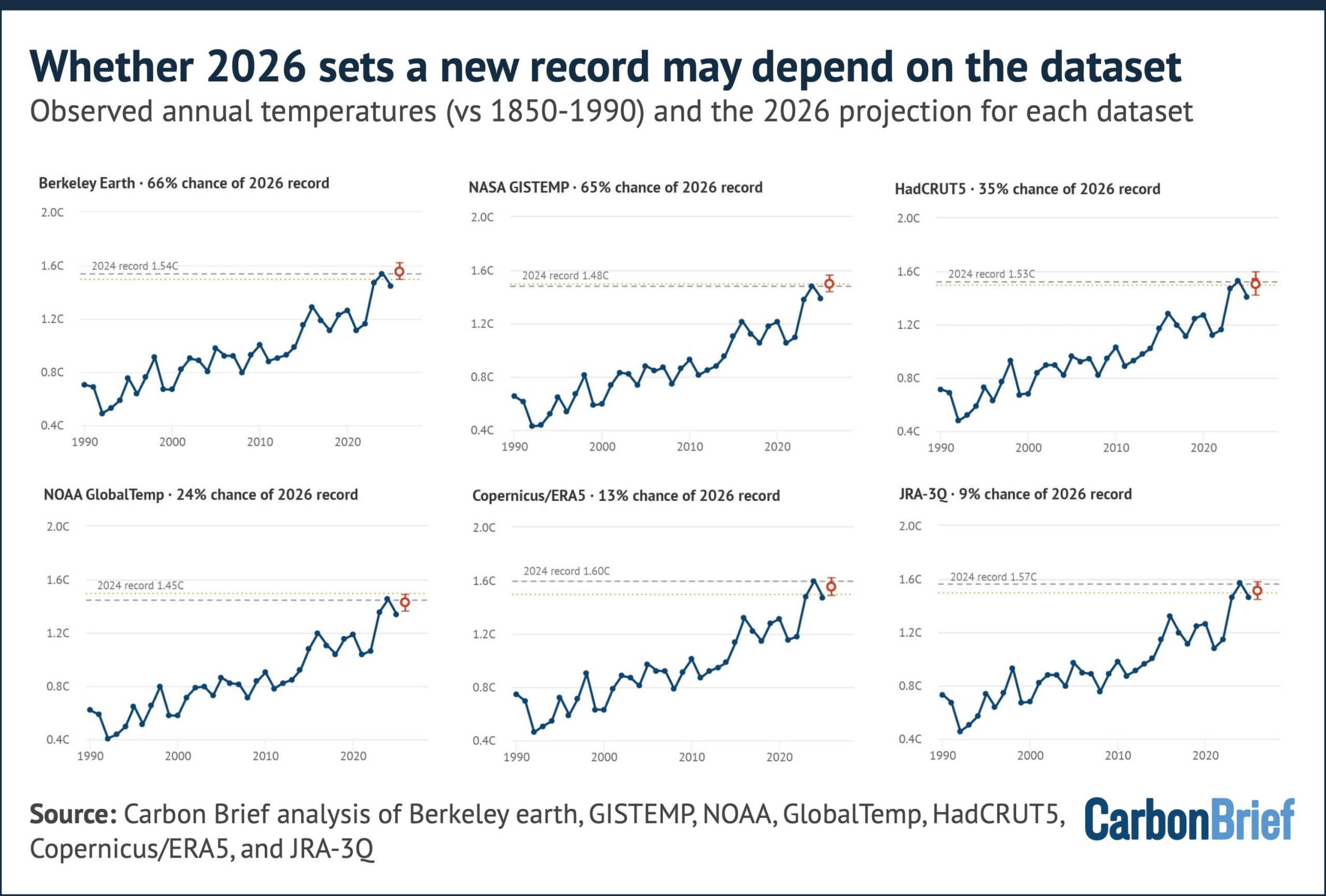
Six charts showing observed annual temperatures for 2026 and the projections for each dataset
Observed annual temperatures since 1990, with each dataset’s own 2024 record (dashed line) and the 2026 projection (median, 25-75% bar and 5-95% whisker), with the per-dataset chance of a 2026 record in each panel’s title. Chart by Carbon Brief.

The divergence between projections mostly reflects how exceptional each dataset’s 2024 was.

The reanalysis approaches recorded a particularly warm 2024, leaving 2026 more ground to make up. GISTEMP and Berkeley, on the other hand, project 2026 modestly above their 2024 values.

A repeat of the situation in 2015 where different groups disagreed on record rankings is a real possibility. Headlines in January 2027 may hinge on choices of dataset.

2027 likely to be the warmest year in human history

The biggest climate story of the developing super El Niño may not be 2026 at all.

Global temperatures typically lag in the tropical Pacific by around three months. So, an El Niño event peaking in November and December 2026 will have its largest warming influence on 2027.

We saw this same pattern occur in 1997-98, 2015-16 and 2023-24 – where the year in which the El Niño developed was warm, but the following year was record-smashing.

Carbon Brief has extended its projection into 2027 by using the historical relationship between year-over-year temperature changes and ENSO conditions in the preceding autumn.

This yields a best estimate for 2027 of around 1.71C above pre-industrial levels, with a 90% range of 1.49C to 1.93C. This is shown by a yellow square on the chart below.
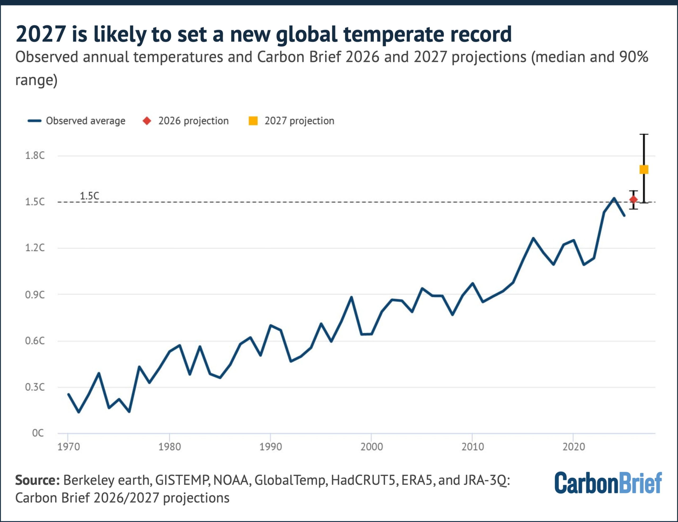
Chart showing that 2027 is likely to set a new global temperature record
Observed annual composite temperatures 1970-2025 and Carbon Brief’s projections for 2026 and 2027 (medians and 5th to 95th percentile ranges). Chart by Carbon Brief.

That would give 2027 a 92% chance of setting a new global temperature record and a 94% chance of exceeding 1.5C.

Taking 2026 and 2027 together, there is a 93% chance that at least one of the two years sets a new record.

The 2027 estimate is more uncertain than the 2026 one. As with 2026, there are uncertainties in the projection due to unknowns around exactly how strong the El Niño peak proves to be and how quickly it decays.

However, even the low end of the 2027 range would put it among the warmest years on record and the central estimate of 1.71C would exceed 2024 by nearly 0.2C.

If these projections bear out, the 2020s will have delivered new global temperature records in 2023, 2024 and 2027 – and potentially 2026 too – with a number of individual years well above the 1.5C threshold.

The long-term warming trend, driven by human emissions of carbon dioxide and other greenhouse gases, has increased from around 0.18C per decade in the early 2000s to around 0.27C per decade today. El Niño and La Niña play a big role in determining which years along that rising path stand out as records.

Arctic sea ice at record lows

Arctic sea ice has spent much of 2026 in record-low territory.

Following the joint-lowest winter maximum in the satellite record in mid-March, daily extent has set or tied record lows for the date on 39 days so far this year, including extended spells in mid-to-late March and in early-to-mid June.

The most recent record-low days were in early July.

The chart below shows how Arctic sea ice in 2026 (dark red line) has been below the historical range (shaded red).

It also shows how Antarctic sea ice (dark blue), meanwhile, has remained below the 1979-2010 range for almost all of 2026 to date.
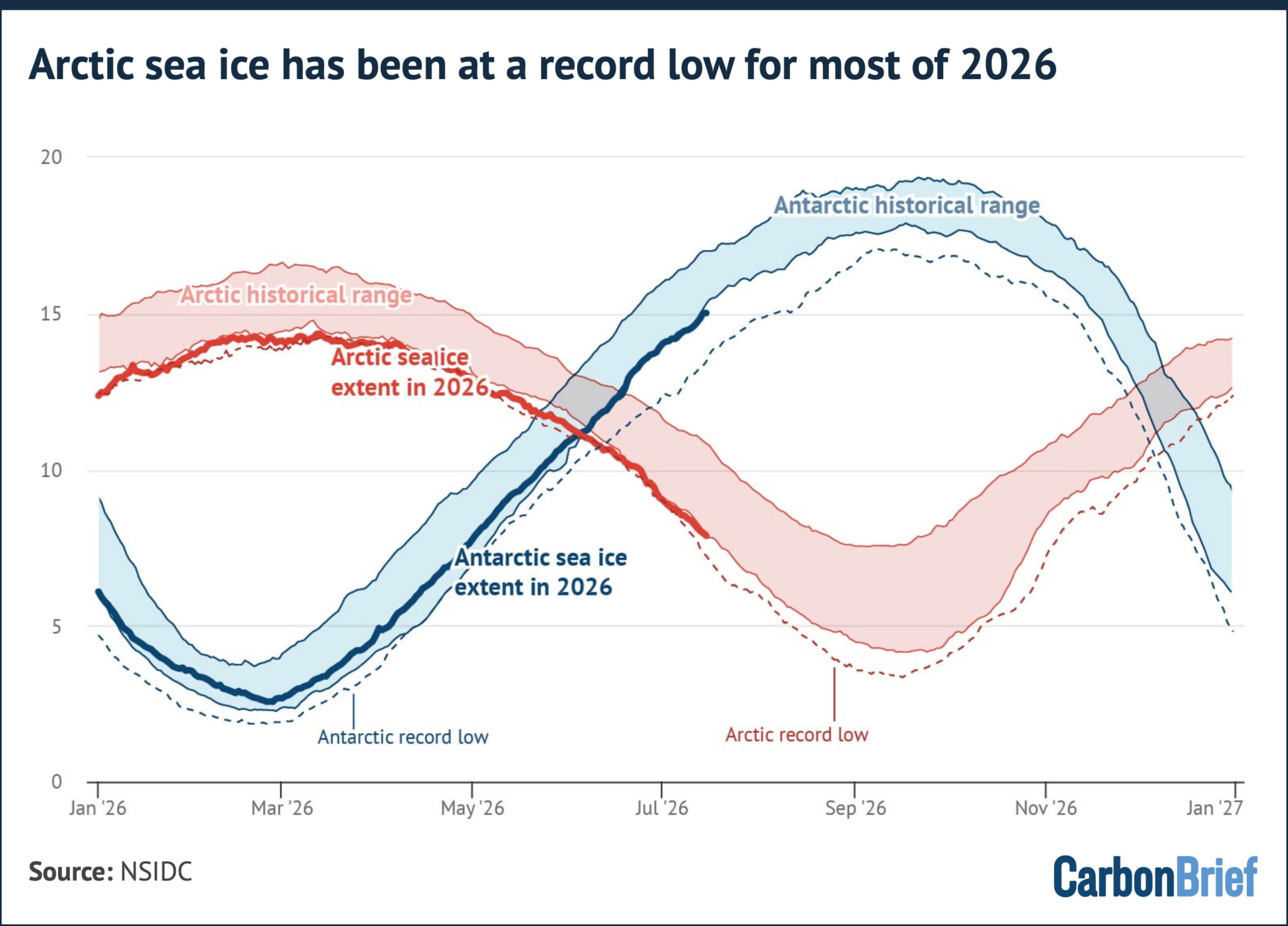
Chart showing that Arctic sea ice has been at a record low for most of 2026
Daily 2026 sea ice extent (bold lines) compared to the 1979-2010 historical range (shaded) and the record daily low from any prior year (dotted). Chart by Carbon Brief using data from NSIDC

As of mid-July, Arctic extent is a bit below the 1979-2010 historical range for the date, though it remains around 0.6m square kilometres (km2) larger than the record low for the date set during 2020’s exceptional summer melt season.

The trajectory over the coming two months will determine whether 2026 challenges 2012’s record September minimum. Early-summer conditions are a poor predictor of the September minimum, which depends heavily on summer weather.

Antarctic sea ice, meanwhile, is currently around 300,000km2 below the historical envelope, but has stayed well clear of the record lows set in 2023 and has not set any new daily records yet this year.

The post State of the climate: Rapidly developing El Niño raises chance of record-warm 2026 appeared first on Carbon Brief.

State of the climate: Rapidly developing El Niño raises chance of record-warm 2026

Continue Reading

Climate Change

Palestine: Israel’s bombing has left Gaza vulnerable to climate change

Published

on

Israel’s bombardment of Gaza during the conflict that broke out in October 2023 has wrecked progress towards adapting the enclave to climate change and left two million Gazans vulnerable to heatwaves, drought and disease, the Palestinian Authority (PA) said in a new climate plan submitted to the United Nations.

Palestine’s third nationally determined contribution (NDC), uploaded to the UN climate body’s website this week, says that while “the aggression on the Gaza Strip did not make the climate worse”, “it removed the housing, water and sanitation systems, health facilities, energy networks, roads and livelihoods through which people absorb a climate they were already struggling with.”

The 91-page document lists the types of infrastructure it says Israel has destroyed and notes how the destruction will worsen the impacts of climate change. It says the bombing of hospitals and rising hunger have make it harder for Gazans to cope with the health impacts of climate-driven heatwaves and waterborne diseases.

On beaches of Gaza and Tel Aviv, two tales of one heatwave

The destruction of water tanks, boreholes and desalination plants, meanwhile, have left Gazans struggling with the effects of water shortages and drought, while mass unemployment reduces people’s ability to afford climate-driven price rises. The erasure of most of the Strip’s homes makes it more difficult for people to avoid the sun’s increasing heat, the NDC said.

Many Gazans are now living in the ruins of collapsed buildings or in makeshift shelters and tents that offer little or no protection from high temperatures.

A displaced Palestinian child fills water containers on July 2, 2026 in Gaza City, Gaza. (Photo by Ahmad Hasaballah/Getty Images)

Palestine’s previous goals to cut emissions and adapt to climate change in Gaza, expressed in its last NDC five years ago, were based on a pre-war baseline that “no longer describes anything that exists”, the NDC says. Progress made since 2021 has now been destroyed, it adds.

Green reconstruction of Gaza

Instead of continuing to aim for these adaptation and emissions-reduction goals, the PA is now calling for the green reconstruction of Gaza. It says buildings should be constructed again in an energy-efficient manner with solar panels and served with modern water, waste and transport systems.

While the PA, controlled by the Fatah political party, continues to claim legitimate control of Gaza, the strip was effectively governed by Fatah’s rival Hamas between 2007 and the recent war. Control is now split between Israel and the political wing of Islamist militant group Hamas, after a US-backed ceasefire took effect in October 2025, although a UN-backed committee plans to take over.

    The United Nations, European Union and World Bank have jointly estimated that Gaza needs $71.4 billion of investment in the next two years to recover and build back. This process should be Palestinian-led, they said in April.

    But US President Donald Trump has said the US should “take over” and “own” Gaza and redevelop it as the “Riviera of the Middle East”. Israel’s right-wing prime minister Benjamin Netanyahu has said that Israel should control the territory with civil administration managed by Palestinians favourable to Israel.

    With occupation, targets conditional

    In the other part of Palestine, the West Bank, the Palestinian Authority carries out some government functions, but ultimate control rests with Israel, which has occupied the West Bank since 1967.

    Because Israel controls planning in most of the West Bank, the NDC argues that the PA cannot pursue all the climate projects it wants. In addition, Israel restricts the movement of PA officials, making data collection difficult, and controls the West Bank’s electricity supply meaning that the PA cannot control whether it comes from dirty or clean sources of energy.

    Given this situation, the NDC says that all of Palestine’s new climate targets are conditional but it will aim to reduce emissions 12.8% below a business-as-usual baseline by 2035 and 17.1% by 2040. If the Israeli occupation ends and Palestine regains full sovereignty over its land and resources, it will aim for reductions of 15.1% and 19.1% by 2035 and 2040 respectively under an “independence pathway”.

    That could allow, for example, for greater electrification and reducing emissions per unit of growth, the document said.

    To achieve the 2035 emissions-reduction target and adapt to the impacts of climate change, the PA says it needs $8.6 billion in total. This funding would be spent on measures like encouraging solar farms and rooftop solar and scaling up solar water heating to cover four-fifths of households. To complement the planned increase in solar power, the authority wants to modernise the electricity grid and install battery storage.

    In the transport sector, it aims to promote the uptake of electric vehicles, develop bus rapid transit corridors and scrap old polluting trucks and buses. In Gaza in particular, it wants to deploy 66 electric buses when the conflict ends.

    A bus rapid transit system in Sao Paulo (Flickr/EMBARQ BRASIL)

    To adapt to climate-driven drought, the NDC includes initiatives to reuse wastewater through treatment plants, build desalination plants in Gaza to remove salt from seawater, and promote irrigation for farmers.

    The new climate plan was prepared by Palestine’s Environment Quality Authority, with support from the United Nations Development Programme and the governments of Britain and Spain.

    The United Nations recognised Palestine’s statehood in 2012 and it joined the UN’s climate convention and signed the Paris climate agreement – which requires countries to submit more ambitious NDCs every five years – in 2016.

    The Israeli foreign ministry did not respond to a request for comment. But in late 2024, then Israeli climate envoy Gideon Behar told Climate Home News that the war and the resulting environmental destruction in Gaza was the fault of Hamas.

    The post Palestine: Israel’s bombing has left Gaza vulnerable to climate change appeared first on Climate Home News.

    Palestine: Israel’s bombing has left Gaza vulnerable to climate change

    Continue Reading

    Climate Change

    Analysis: UK solar power hits record high over summer 2026

    Published

    on

    Solar power generation in the UK reached a new record over the summer of 2026, as temperatures across the nation soared, according to new analysis by Carbon Brief.

    Collectively over June, July and August, solar farms and rooftops generated 8.8 terawatt-hours (TWh) of electricity in the UK*, as shown in the chart below.

    Line chart showing that UK solar generation reached an all-time high during record-hot summer 2026

    Speaking to Carbon Brief, Chris Hewett, chief executive of trade association Solar Energy UK welcomed the new record, adding that it was driven by “clear skies and continued growth in deployment”.

    This surge in generation took place amid the hottest summer on record in the UK, with five heatwaves between May and August.

    Summer 2026 was the sixth sunniest on record, with more than 620 hours of sunshine, according to the Met Office. England and Wales – which experienced the most extreme heat – saw their second-sunniest summers on record.

    June 2026 was the hottest June in England since records began in 1884, according to Met Office data, while Wales and the UK as a whole experienced their second-warmest June.

    It was the driest July for England and Wales since records began in 1836, with some parts of London seeing no rain at all in the month, while Wisley in Surrey had no rain for 62 days.

    In England, temperatures peaked at 38.1C at Kew Gardens in London on 13 August.

    According to the Met Office, this summer’s record mean temperature was made 130 times more likely by climate change.

    Amid these hot and sunny months, solar power generation increased 23% from the same period in 2025. This is double the level of solar generation over the summer of 2021, according to Carbon Brief analysis.

    While solar panels can be affected by periods of extreme heat, the longer hours of daylight and higher levels of irradiation over the summer more than offset any efficiency losses.

    June, July and August all saw solar set new monthly records for solar generation – July saw the highest solar generation in a calendar month ever, with 3.3TWh meeting 15% of overall electricity demand for the month.

    As of the end of August, the total UK solar generation in 2026 stood at 17TWh – 13% higher than the same point in 2025.

    The number of solar farms and rooftop installations has grown substantially in recent years, helping to boost generation. Domestic rooftop solar accounts for around 29% of total capacity.

    In 2025, the UK’s solar capacity reached 21 gigawatts (GW) by the third quarter of the year, according to UK government figures. This is a jump of 3GW, or 18%, year-on-year, as Carbon Brief reported in January.

    (Capacity is the maximum output possible from an electricity generation, whereas generation is what was produced over a certain time period, such as a day, month or year.)

    According to the University of Sheffield, the installed solar capacity is now nearly 24GW.

    This includes nearly 172,000 solar installations that have been fitted across the UK since the start of 2026, according to recent government figures. In July alone, more than 19,800 rooftop solar panels were installed – the equivalent of one installation every two minutes.

    In total, nearly 1.7m households in the UK now have solar panels installed.

    Over 26 heatwave days this summer – periods of at least three days when temperatures exceed the Met Office’s county-level heatwave temperature threshold – UK households with rooftop solar panels avoided an estimated £86.7m in electricity costs, according to analysis by Utility Bidder.

    Talking about the surge in solar generation this summer, Hewett says:

    “[It] not only kept bills down for people with solar and batteries in their homes, but helped keep overall power prices much lower than they would have been if Britain had been relying on more gas generation during the day”.

    Despite the record generation, no new half-hourly solar power output record was set in the summer of 2026. This still stands at 15.2 megawatts (MW) on 23 April 2026.

    * This article refers to the UK throughout, but strictly relates to the island of Great Britain, made up of England, Scotland and Wales. Northern Ireland is part of the separate, all-Ireland electricity system.

    The post Analysis: UK solar power hits record high over summer 2026 appeared first on Carbon Brief.

    Analysis: UK solar power hits record high over summer 2026

    Continue Reading

    Climate Change

    How this summer’s heat and drought impacted crops in Europe – in six charts

    Published

    on

    Farmers around Europe are dealing with the aftermath of a summer of extreme heat, drought and wildfires that were exacerbated by climate change.

    Human-caused climate change is increasing the severity and likelihood of many extreme weather events around the world, which is increasing volatility for food producers.

    This summer resulted in, for example, shrunken potatoes in the Netherlands, reduced carrot harvests in France, dried-up rice fields in Italy and scorched olive groves in parts of the Mediterranean region.

    Global food prices are currently at their highest level since early 2023 due to “heatwaves and energy price dynamics”, according to the UN Food and Agriculture Organization.

    Other factors such as blocked fertiliser supplies in the Strait of Hormuz and high fuel costs have also played a role in this year’s agricultural outputs.

    In the six charts below, Carbon Brief provides a snapshot of the impact this summer’s extremes are considered to have had on crop production and yields across Europe.

    1. Most EU countries expect to see declines in cereal production this year

    2. Most countries are recording reduced crop yields

    3. Around €2bn worth of cereal losses after June heatwave

    4. UK yields of wheat, barley and oats are all due to drop in 2026

    5. Maize production in France is due to hit a four-decade low

    6. Declines in EU grains since 2025

    Article Contents

    1. Most EU countries expect to see declines in cereal production this year

    Bar chart showing that France is due to see the largest drops in cereal production in the EU in 2026. The bar chart shows that France's cereal production in 2026 has dropped -7.7 Mt of followed by Germany (-3.5 Mt), Poland (-3.2 Mt), Spain (-2.9 Mt), and Hungary (-2.6)
    Changes in cereal production in 26 EU countries between 2025 and 2026. Malta is excluded due to a lack of available data. Source: European Commission.

    France, in particular, will see heavy losses in the amount of cereals – such as wheat, barley and oats – it produces this year, according to European Commission data.

    French cereal production is expected to drop by almost 8 megatonnes (Mt) in 2026, compared to 2025.

    The chart above shows that most European countries, aside from Bulgaria, will also see production losses this year.

    Germany is due to see the second-largest losses in production, dropping by almost 4Mt compared to 2025.

    Prof Til Feike, a cropping systems expert at the Julius Kühn-Institut, says many areas in Germany and Austria, as with other parts of Europe, have been “hit hard by a long-lasting dry period in combination with record-high heatwaves”.

    This has resulted in dry grassland for animals and lower yields of maize, which is a “key fodder crop” for livestock. He tells Carbon Brief:

    “In the long run, farming must adapt better to more extreme weather conditions, not only heat and drought, but also prolonged wet periods. So, there is no one-fits-all solution for climate change adaptation.”

    2. Most countries are recording reduced crop yields

    Heat and a lack of water have “substantially worsened” crop expectations this summer in western and most of central Europe, according to a recent bulletin from the EU Joint Research Centre.

    Yields are expected to be “significantly reduced”, with local crop failures “likely” in areas such as France, southern Germany, northern and central Italy, and Hungary, it added.

    The chart below shows that yields of cereal grains – which, here, refers to the tonnes of a grain grown per hectare of land – are expected to fall in most EU countries in 2026.

    Bar chart showing that Slovakia and Austria are due to see the largest cereal yield declines in 2026. The bar chart shows that both Slovakia and Austria have seen their cereal yields drop -1.3 tonnes per hectare over 2025-26.
    Changes in cereal yields in 26 EU countries between 2025 and 2026. Malta is excluded due to a lack of available data. Source: European Commission.

    Slovakia, Austria and Hungary are expected to see the largest declines in cereal yields, reducing by more than one tonne per hectare in 2026 compared to 2025.

    The recent EU bulletin noted that irrigated crops performed well in Portugal this summer – the country with the largest yield increases. Other crops relying on rainfall showed growing signs of heat stress, it added.

    3. Around €2bn worth of cereal losses after June heatwave

    The record heatwave that hit many parts of Europe in June contributed to an estimated €2-2.3bn in cumulative grain production losses, as shown in the chart below.

    Bar chart showing that the June heatwave in 2026 led to around €2bn in cereal production losses in Europe. The bar chart shows that France is the EU country that lost the most revenue, with an estimated loss of €891 million, followed by Hungary (with an estimated loss of €444 million) and Spain (with an estimated loss of €276)
    Estimates of revenue lost due to changes in production forecasts between June and July 2026. Source: ECIU.

    The intense June heat in western Europe would have been “virtually impossible” just 50 years ago, according to a rapid climate attribution study. It was the region’s hottest June on record.

    The Energy & Climate Intelligence Unit (ECIU) thinktank analysed June and July 2026 grain forecasts from Coceral, a European grain traders association.

    ECIU estimated lost supply by multiplying the change in tonnes of grains between these two months by prices for harvest delivery in 28 European countries.

    Major grain producers France, Germany, Hungary and Spain accounted for 86% of the lost revenue, according to the ECIU.

    Extreme heat is also expected to have a wider economic impact across the continent. Analysis from Triodos Bank found that this summer’s extreme weather could reduce the EU’s gross domestic product (GDP) by around 1% this year, or around €180bn.

    4. UK yields of wheat, barley and oats are all due to drop in 2026

    If current trends continue, the average yields for cereals and oilseeds will result in the UK’s worst harvest since detailed records began in 1984, according to ECIU.

    Line chart showing that UK cereal yields could hit lowest levels since at least 1990 this year.
    Yields of cereals and oilseed rape in the UK over 1990-2026. Source: Department for Environment, Food & Rural Affairs and Agriculture and Horticulture Development Board.

    Barley yields could fall by 15%, oats by 14% and wheat yields by 6% year-on-year, according to 2026 harvest surveys from the Agriculture and Horticulture Development Board, a non-departmental public body that provides agricultural data to the UK government.

    ECIU said that, even if the situation improves, this year is still expected to be one of the five worst harvests on record. This means that four of the five worst harvests in the UK have occurred in the past decade.

    Consumers will likely see higher prices and/or smaller vegetables in supermarkets as a result, Tim O’Malley, chairman of UK company Nationwide Produce, told BBC News in August.

    Other crops, such as berries, have grown successfully in the extreme heat. But the Guardian noted fears this could dip later this year “as plants become exhausted from heavy cropping during the heatwave”.

    5. Maize production in France is due to hit a four-decade low

    France has been acutely affected by this summer’s extreme weather, with more than 7,300 excess deaths during heatwaves and a record number of weather stations recording temperatures of above 40C.

    The country is the EU’s largest agricultural producer, but heat, drought and wildfires have affected many crops.

    The chart below shows that maize production is set to drop by more than one-third (35%) year-on-year.

    Line chart showing that maize production in France is due to reach lowest levels since 1980
    Maize production in France over 1980-2026. Source: Agreste.

    This could result in France’s lowest maize production since 1980, according to data from Agreste, the country’s agriculture ministry’s statistics service.

    Due to the heat, “record-early” grape harvests have also been recorded in various parts of the nation since mid-July, reported Le Monde. In some cases, this means “smaller, less juicy grapes, which will yield less wine”, explained the newspaper.

    6. Declines in EU grains since 2025

    Chart showing that EU cereal production is set to reduce by 9% in 2026.
    Production of cereal crops in Europe over 1993-2026. The “other” category includes oats, rye, sorghum, millet and buckwheat. Source: European Commission.

    Overall in the EU, data and projections indicate declines in the output of cereal grains this year.

    Cereal production is set to fall by 9% compared to 2025, according to the European Commission.

    Just one year in the past decade – 2024 – recorded lower production levels.

    Maize production is set to be particularly affected, with projections indicating a 13% drop, to 52Mt – the lowest level in the EU since 2007.

    The post How this summer’s heat and drought impacted crops in Europe – in six charts appeared first on Carbon Brief.

    How this summer’s heat and drought impacted crops in Europe – in six charts
    Continue Reading

    Trending

    Copyright © 2022 BreakingClimateChange.com