

The average UK winter has become around 1C warmer and 15% wetter over the past century, new Carbon Brief analysis shows.
The analysis covers more than 100 years of data on temperature, rainfall, wind speed and snow, to assess how UK winters have changed.
The data show that extremely warm and wet winters are becoming more common. Six of the 10 warmest winters on record were in the 21st century, and four of these also rank in the top 10 wettest years on record.
Despite the trend towards milder conditions, extreme cold snaps still hit the UK. The winter of 2009-10, for example, was dubbed the “Big Freeze of 2010” and clocked in as the UK’s least-windy, second-snowiest and eighth-coldest winter on record.
However, extreme cold periods are becoming less common. On average, the UK saw more than 12 snow days each winter in 1971-2000. This dropped to 9.5 snow days each winter by 1991-2020.
As the climate continues to warm, the UK can expect winters to continue getting warmer and wetter. Met Office projections suggest that, under an emissions pathway in line with current global policies, the average UK winter by 2080-99 will be 2C warmer and 11% wetter than they were in 1981-2000.
Warmer winters
The UK Met Office has been collecting meteorological data from thousands of weather stations across the UK since the 1880s. Using this data, it has produced a gridded dataset called HadUK, which provides complete coverage across the UK for a range of climate variables – including rainfall, temperature, snow days and wind speed – on a one-square-kilometre grid.
Carbon Brief has analysed the data for meteorological winters – defined as December, January and February – to determine how weather conditions have changed since records began.
The plot below shows a timeseries of annual winter average temperature (dark blue) over 1884-2021. These are shown as anomalies – that is, the difference compared to a baseline, which in this case is the average winter temperature over 1991-2020.
(Winters are shown on graphs in this article according to the year in which December falls. For example, the winter of December 2021 to February 2022 is shown as 2021.)

The Met Office, in line with the World Meteorological Organisation, uses 30-year averages to assess changes in UK climate. The table below shows average absolute UK winter temperatures for overlapping 30-year time periods across the full data record.
| Time period | Average temperature | Maximum temperature | Minimum temperature |
|---|---|---|---|
| 1881-1910 | 2.96* | 5.77* | 0.18* |
| 1891-1920 | 3.29 | 6.06 | 0.53 |
| 1901-1930 | 3.50 | 6.21 | 0.80 |
| 1911-1940 | 3.51 | 6.21 | 0.83 |
| 1921-1950 | 3.41 | 6.12 | 0.73 |
| 1931-1960 | 3.29 | 6.05 | 0.56 |
| 1941-1970 | 3.09 | 5.84 | 0.35 |
| 1951-1980 | 3.17 | 5.91 | 0.46 |
| 1961-1990 | 3.22 | 5.94 | 0.51 |
| 1971-2000 | 3.65 | 6.40 | 0.91 |
| 1981-2010 | 3.75 | 6.58 | 0.94 |
| 1991-2020 | 4.12 | 6.97 | 1.28 |
Average, maximum and minimum winter temperatures for overlapping 30-year time periods, from 1881 to 2020, using the December-February average of mean monthly temperatures. An asterisk (*) indicates that a full 30 years was not available for this average.
The average UK winter in 1991-2020 was 0.9C warmer than during 1961-90. The most recent 30-year period also includes the warmest maximum, minimum and average temperatures since Met Office records began.
In addition, with an average winter temperature of 4.64C, the most-recent decade (2013-22) – not shown in the table – has seen a further temperature increase of 0.52C above the 1991-2020 average.
Warmer winters are already impacting UK wildlife. For example, Grahame Madge – senior press officer for the Met Office – told the Guardian that animals including hedgehogs, bats and butterflies are emerging from hibernation too early:
“Abnormal warm spells during winter can encourage species out of hibernation. Butterflies such as red admirals and small tortoiseshells and other insects can be particularly challenged as they can emerge largely without access to life-saving food sources like nectar. If the warm spell is followed by a return to colder conditions, the hibernating individuals will have used up valuable energy reserves without being able to replace them, possibly with disastrous consequences.”
Meanwhile, the National Trust says warmer winters have “particularly devastating impacts for trees”, as cold snaps are often not long enough to kill off harmful diseases and pests.
Looking at individual years gives a more detailed picture. The graphic below shows the warmest and coldest 10 winters in the UK since 1884. The dark blue line shows average UK winter temperature, and red and blue dots indicate the warmest and coldest individual winters, respectively. The table below shows the dates and temperatures of these winters.

| Warmest winters | Coldest winters | |||
|---|---|---|---|---|
| Years | Temperature (C) | Years | Temperature (C) | |
| 1 | 1988-99 | 5.76 | 1962-63 | -0.31 |
| 2 | 2006-07 | 5.53 | 1894-95 | 0.42 |
| 3 | 2015-16 | 5.43 | 1946-47 | 0.75 |
| 4 | 1997-98 | 5.40 | 1978-79 | 1.13 |
| 5 | 2019-20 | 5.28 | 1939-4 | 1.23 |
| 6 | 1974-75 | 5.22 | 1916-17 | 1.33 |
| 7 | 2021-22 | 5.20 | 1928-29 | 1.46 |
| 8 | 2013-14 | 5.19 | 2009-10 | 1.63 |
| 9 | 1934-35 | 5.13 | 1885-8 | 1.65 |
| 10 | 2018-19 | 5.09 | 1940-41 | 1.80 |
Warmest and coldest 10 winters in the UK since 1884. The dark blue line shows average UK winter temperature, and red and blue dots indicate the warmest and coldest individual winters. The table beneath shows the dates and temperatures of these winters. Credit: Chart by Carbon Brief, based on the Met Office HadUK dataset.
The graph shows that six of the 10 warmest winters on record have occurred in the 21st century. Conversely, only one of the UK’s coldest 10 winters were in the 21st century – the winter of 2009-10.
The Met Office also provides country-level data for different parts of the UK. The plot below shows 10-year rolling average winter temperature for England (dark blue), Scotland (red), Northern Ireland (light blue) and Wales (yellow).

The plot shows that Scotland consistently sees the coldest winters, while England, Wales and Northern Ireland experience winter temperatures that are an average of around 1.5-2C warmer.
Snow days
As average temperatures rise across the UK, extremely cold days are becoming less common, while record-breaking warm days are becoming more frequent.
Five of the top 10 warmest days ever recorded during UK winters occurred during a single week February 2019.
Carbon Brief analysed the warmest maximum and coldest minimum temperature on record for each UK winter. The table below shows the years with the warmest (red) maximum daily temperatures and coldest (blue) minimum daily temperatures since 1960.
| Warmest maximum temperatures | Coldest minimum temperatures | |||
|---|---|---|---|---|
| Temperature (C) | Year | Temperature (C) | Year | |
| 1 | 16.1 | 2018-19 | -10.2 | 1986-87 |
| 2 | 14.3 | 1997-98 | -10.1 | 1962-63 |
| 3 | 14.0 | 2015-16 | -10.0 | 1981-82 |
| 4 | 13.8 | 1989-90 | -9.9 | 1978-79 |
| 5 | 13.6 | 2003-04 | -9.5 | 1971-72 |
| 6 | 13.5 | 1985-86 | -9.3 | 2010-11 |
| 7 | 13.4 | 2011-12 | -9.1 | 1995-96 |
| 8 | 13.3 | 2016-17 | -8.9 | 1969-70 |
| 9 | 13.3 | 2021-22 | -8.7 | 2009-10 |
| 10 | 13.2 | 1994-95 | -8.7 | 1968-69 |
Years with the 10 warmest (red) maximum temperatures, and coldest (blue) minimum temperatures, based on individual winter days since 1960. Credit: Chart by Carbon Brief, based on the Met Office HadUK dataset.
Most of the warmest winter extremes on record were in the 21st century. Meanwhile, most of the coldest extremes were in the 20th century.
One way of measuring the change in extreme cold days is to count the number of “frost days” – days with a minimum temperature below 0C – recorded throughout the winter. Another way is to count the number of “snow days”, when snow can be seen on the ground at 9am.
Dr Mark McCarthy is the head of the Met Office National Climate Information Centre, which manages the UK’s climate records. He explains that to calculate snow days, an individual looks at a “representative patch of ground” at 9am in the morning, and if at least half of it is covered in snow, then it is counted as “snowy”.
These results are averaged across hundreds or thousands of observations. This means that, for example, “an average of five days of snow might mean that half of that region had 10 days and half the region had no days”, he explains.
The plot below shows the number of frost days since 1960 (red) and snow days since 1971 (blue) over winter. The black lines show the 10-year running average.

The table below shows the total number of first and snow days during UK winters for four overlapping 30-year time periods.
| Time period | Frost days | Snow days |
|---|---|---|
| 1961-1990 | 38.43 | – |
| 1971-2000 | 35.07 | 12.29 |
| 1981-2010 | 35.17 | 11.73 |
| 1991-2020 | 32.75 | 9.54 |
Total number of frost and snow days for 30-year time periods, from 1931 to 2020, using the December-February average of mean monthly temperatures. An asterisk (*) indicates that a full 30 years was not available for this average.
The plot shows that air frost and snow days are closely linked. Snow will generally not form if the ground temperature is above 5C, and in the UK, the heaviest snowfalls tend to occur when the air temperature is between 0C and 2C.
On average, the UK saw 12.3 snow days each winter over 1971-2000. This dropped to 9.5 snow days each winter by 1991-2020.
There is also regional variation in snow days. Over the entire 1971-2020 dataset, Scotland received 18.6 days of snow per winter on average, while the UK, Northern Ireland and Wales received between 7.2 and 8.8.
“Significant and widespread lying snow might have been considered fairly typical for a UK winter of several decades ago,” says the Met Office’s latest State of the UK climate report. However, it adds that “this type of event has become increasingly unusual in a warming climate over the last two or three decades”.
The graph below shows the UK winters with the greatest (light blue dots) and smallest (red dots) number of snow days since 1971.

| Snowiest winters | Least snowy winters | |||
|---|---|---|---|---|
| Years | Snow days | Years | Snow days | |
| 1 | 1978-79 | 35.62 | 2019-20 | 2.12 |
| 2 | 2009-10 | 30.59 | 1991-92 | 2.39 |
| 3 | 1981-82 | 26.90 | 2007-08 | 2.97 |
| 4 | 1985-86 | 23.69 | 1988-89 | 3.15 |
| 5 | 2010-11 | 23.13 | 2021-22 | 3.35 |
| 6 | 1984-85 | 21.54 | 1997-98 | 3.45 |
| 7 | 1976-77 | 20.77 | 2013-14 | 3.49 |
| 8 | 1977-78 | 18.54 | 2016-17 | 3.57 |
| 9 | 1995-96 | 18.43 | 2005-06 | 3.72 |
| 10 | 1990-91 | 18.13 | 1974-75 | 3.90 |
Snowiest and least snowy 10 winters in the UK since 1884. The dark blue line shows seasonal “snow days”, and red and blue dots indicate the snowiest and least snowy individual winters. The table beneath shows the dates and number of snow days of these winters. Credit: Chart by Carbon Brief, based on the Met Office HadUK dataset.
While the climate is becoming milder and snow is becoming less common, very cold and snowy winters can still happen. For example, the winter of 2009-10, dubbed the “Big Freeze of 2010” in parts of the UK media, was the least-windy, second-snowiest and eighth-coldest winter on record in the UK.
Severe snowfall that winter caused “very significant disruption across the UK”, according to the UK Met Office, which adds that “transport was particularly badly affected with snowfalls causing numerous road closures, and train and flight cancellations”.
On 18 December 2009, five Eurostar trains got stuck in the Channel Tunnel after cold temperatures caused electrical failures, trapping 2,000 people for 16 hours. All Eurostar services were cancelled for the next three days.
In January that winter, BBC News reported that “heavy snow and freezing temperatures has caused chaos across Scotland over the past three weeks, with hundreds of schools closed and motorists facing hazardous conditions on the roads”.

Research from the UK Met Office indicates that the odds of the UK having a winter as cold as the one in 2009-10 will drop to less than 1% by the end of the century as global temperatures continue to rise.
Wetter winters
The total volume of rainfall recorded during UK winters is also rising. The plot below shows total winter rainfall in mm over 1836-2021 (blue) and the 10-year rolling average (black).

The table below shows average UK winter rainfall totals for a series of overlapping 30-year time periods across the full data record.
| 30-year period | Average annual winter rainfall (mm) |
|---|---|
| 1831-1860 | 254.69* |
| 1841-1870 | 276.00 |
| 1851-1880 | 284.28 |
| 1861-1890 | 287.46 |
| 1871-1900 | 281.51 |
| 1881-1910 | 279.06 |
| 1891-1920 | 300.55 |
| 1901-1930 | 311.07 |
| 1911-1940 | 314.51 |
| 1921-1950 | 305.00 |
| 1931-1960 | 298.76 |
| 1941-1970 | 290.82 |
| 1951-1980 | 293.23 |
| 1961-1990 | 301.82 |
| 1971-2000 | 329.22 |
| 1981-2010 | 330.01 |
| 1991-2020 | 346.98 |
Average winter rainfall over overlapping 30-year time periods, from 1831 to 2020, using the December-February average of mean monthly temperatures. An asterisk (*) indicates that a full 30 years was not available.
Between 1961-90 and 1990-2020, the UK winters became 15% wetter on average – increasing from around 300mm of rainfall to almost 350mm. The more recent decade of 2012-21 – not shown in the table – has seen further increases, with average winter rainfall of 380mm.
The Met Office also provides country-level rainfall data. The plot below shows 10-year rolling average winter temperature for England (dark blue), Scotland (red), Northern Ireland (light blue) and Wales (yellow).

The graph shows that rainfall is increasing across all four regions of the UK, but remains consistently the lowest in England and the highest in Scotland and Wales.
Looking at the wettest and driest years across the UK shows that individual rainfall extremes are becoming more common. In a ranking going back to 1884, seven of the driest years were in the 19th century, while three were in the 20th. None of the driest years on record have been in the 21st century.
Meanwhile, four of the rainiest winters have been in the 21st century. The graph below shows the wettest (blue dots) and driest (red dots) winters since 1884.

| Rainiest winters (mm) | Least rainy winters (mm) | |||
|---|---|---|---|---|
| Years | Winter rainfall | Years | Winter rainfall | |
| 1 | 2013-14 | 540.3 | 1963-64 | 121.3 |
| 2 | 2015-16 | 505.7 | 1890-91 | 141.4 |
| 3 | 1994-95 | 498.2 | 1844-45 | 164.6 |
| 4 | 1989-90 | 482.2 | 1933-34 | 170.4 |
| 5 | 2019-20 | 474.5 | 1846-47 | 171.3 |
| 6 | 1876-77 | 458.0 | 1962-63 | 171.5 |
| 7 | 1914-15 | 450.7 | 1857-58 | 176.6 |
| 8 | 1868-69 | 439.6 | 1840-41 | 179.6 |
| 9 | 2006-07 | 435.8 | 1937-38 | 186.9 |
| 10 | 1993-94 | 431.4 | 1854-55 | 189.1 |
Wettest and driest 10 winters in the UK since 1884. The dark blue line shows total winter rainfall, and blue and red dots indicate the driest and wettest snowy individual winters. The grey dashed lines the volume of rainfall recorded during the rainiest and least rainy winters on record. The table beneath shows the dates and total rainfall in mm of these winters. Credit: Chart by Carbon Brief, based on the Met Office HadUK dataset.
The fact that UK winters are getting wetter makes sense, McCarthy tells Carbon Brief, because as the atmosphere heats up, it is able to hold more moisture, which can then fall as rain. According to the Clausius-Clapeyron equation, the air can generally hold around 7% more moisture for every 1C of temperature rise.
However, he adds that the observed trend in UK winter rainfall is “somewhat larger than can be explained purely through the thermodynamic process”, and explains that natural variability is also very important when discussing changes in UK winter rainfall.
“We’re in a particularly wet regime at the moment,” McCarthy explains, “so we are seeing lots of winter rainfall records and wetter winters, but it’s the combination of variability and climate change”.
For example, December 2015 topped the charts as the UK’s wettest month on record, after Storm Desmond swept across the UK, bringing very heavy rainfall and gale-force winds to much of northern England, southern Scotland and Ireland. The resulting floods left many homes inundated and at least 60,000 without power.
The winter of 2015-16 was also the third warmest on record. Preliminary analysis conducted at the time suggested that the exceptional rainfall totals were 40% more likely because of rising global temperatures.
The jet stream
The graph below shows the relationship between temperature and rainfall, where warm and wet winters are shown in the top right, while cool and dry winters are in the bottom left. Darker dots indicate more recent years.

The UK’s winter weather regime is strongly linked to the strength of the jet stream. This thin, fast flowing ribbon of air in the troposphere – the lowest layer of the earth’s atmosphere – acts to steer weather systems towards the UK.
A strong jet stream brings warm and damp winds to the UK from the west, resulting in a warm and wet winter.
For example, the winter of 2023-24 has already been dominated by a series of storms. Storm Jocelyn, which swept across the UK at the end of January 2024, was the 10th named storm of the season. “The storms have mainly been driven by a powerful jet stream,” BBC News reported.
Similarly, during the winter of 2013-14, a series of storms brought record-breaking rainfall to the UK, clocking in as the wettest and eighth-warmest winter on record in the UK. Intense rainfall led to “remarkably widespread and persistent flooding”, according to the Met Office. Around 18,700 insurance claims related to flooding were filed across the UK in the aftermath of the storms, costing an estimated £451m.
One study suggests that climate change made the sustained wet and stormy weather seen around 43% more likely, and put an extra 1,000 houses at risk of flooding along the River Thames.
The study attributes about two-thirds of the increase in likelihood to the atmosphere being able to hold more moisture because the world is warming up and the remaining third to the position of the jet stream.

Conversely, a weak jet stream allows cold air from the Arctic and mainland Europe to enter from the east and north. “A slower, more buckled jet stream can cause areas of higher pressure to take charge, which typically brings less stormy weather, light winds and dry skies,” the Met Office says.
This was the case in the winter of 2009-10, which clocked in as the eighth-coldest and least-windy UK winter on record.
Sometimes, the jet stream can even get “stuck” – a phenomenon called blocking – and instead of shunting weather systems from west to east, it can allow a spell of cold, dry weather to sit over the UK for many days.
While there is a clear trend of UK winters getting warmer and wetter, the data on wind speed is less clear-cut. However, cool weather in the UK is often associated with low speeds, while warm weather is often brought by strong gusts.
The plot below shows average UK winter wind speed over 1969-2021 in knots. The darker line shows the 10-year rolling average, and the most and least windy years are shown by red and blue dots, respectively.

| Windiest winters | Least windy winters | |||
|---|---|---|---|---|
| Years | Average windspeed (knots) | Years | Average windspeed (knots) | |
| 1 | 1973-74 | 13.08 | 2009-10 | 7.90 |
| 2 | 1989-90 | 12.77 | 2010-11 | 8.62 |
| 3 | 1974-75 | 12.72 | 2005-06 | 8.81 |
| 4 | 1994-95 | 12.71 | 2008-09 | 9.03 |
| 5 | 2013-14 | 12.47 | 1984-85 | 9.04 |
| 6 | 1982-83 | 12.41 | 1976-77 | 9.31 |
| 7 | 1980-81 | 12.24 | 2018-19 | 9.32 |
| 8 | 1999-2000 | 12.11 | 2000-01 | 9.54 |
| 9 | 1988-89 | 12.11 | 1986-87 | 9.59 |
| 10 | 2019-20 | 12.08 | 2016-17 | 9.68 |
Windiest and least windy 10 winters in the UK since 1969. The dark blue line shows winter average wind speed, and red and blue dots indicate the windiest and least windy individual winters. The grey dashed lines the average wind speed during the windiest and least windy winters on record. The table beneath shows the dates and wind speeds of these winters. Credit: Chart by Carbon Brief, based on the Met Office HadUK dataset.
The table below shows average UK wind speed totals for three overlapping 30-year time periods.
| 30-year averages | Average wind speed (knots) |
|---|---|
| 1971-2000 | 11.06 |
| 1981-2010 | 10.60 |
| 1991-2020 | 10.55 |
Average winter wind speed for overlapping 30-year time periods, from 1971 to 2020, using the December-February average of mean monthly temperatures.
McCarthy tells Carbon Brief that there has been a notable decline in UK wind speed when looking at annual data, which is consistent with the trend of “stilling” – a slowdown in near surface wind speeds – measured globally. However, he says that this trend is less obvious in the winter-only data.
Meanwhile, the UK State of the Climate report 2022 states that there are no compelling trends in storminess when considering maximum gust speeds over the last four decades.
A range of other atmospheric circulation patterns can also impact UK winters.
The North Atlantic Oscillation (NAO) is a large-scale atmospheric pressure see-saw in the North Atlantic region, which describes the difference in air pressure between the high pressure sitting over the Azores, to the west of Portugal, and the low pressure over Iceland.
When the NAO is “positive” and the pressure difference is stronger than usual, the jet stream shifts towards the poles, bringing mild, wet and windy weather to North American and Eurasian winters and leaving the Arctic very cold.
When it is “negative” and the pressure difference weakens, storm tracks shift towards the equator, bringing cold, dry and calm winters to Europe.
Another mechanism is the “stratospheric polar vortex”. This low-pressure weather system sits around 50km above the Arctic in the stratosphere – the layer of the atmosphere above the troposphere. Its main feature is the strong west-to-east winds which encircle the north pole. These winds are known as the “polar night jet” because they only appear during the dark Arctic winter.
As with the jet stream in the troposphere, the polar night jet forms a boundary between the very cold Arctic air and the warmer air over the mid-latitudes. However, if something disrupts the stratospheric polar vortex it can weaken, reverse direction and even split into two. This can trigger a “sudden stratospheric warming” event where air collapses in over the Arctic, causing a spike in temperatures in the stratosphere – by as much as 50C in just a couple of days.
This allows the cold air the polar vortex was holding in to spill out into the mid-latitudes during the weeks that follow. This is what caused the “Beast from the East” snowstorm that hit the UK in 2018. (This is not well reflected in the UK winter data, as the brunt of the storm hit in March 2018 after the end of meteorological winter.)
In general, however, the UK has experienced a run of mild, wet winters in the most recent decade, including the very wet winters of 2013, 2015 and 2019. These are consistent with a positive phase of the NAO and strong polar vortex, according to the latest State of the UK Climate report.
Projections
As the planet continues to warm, the UK’s climate will shift “towards warmer, wetter winters and hotter, drier summers”, the Met Office says.
The UK Climate Projections 2018 (UKCP18) is a series of climate change projections for the UK produced by the UK Met Office, taking advantage of the latest observed data and climate models
The projections include temperature and rainfall changes – for averages and extremes – for each month and season of the year, and for different emissions scenarios and future time periods throughout this century.
The maps below show the probabilistic projections for summer average temperature (top) and winter precipitation (bottom) in the 2080s under the RCP4.5 emissions pathway, relative to a 1961-90 baseline. In this pathway, global temperatures are projected to rise by around 2.7C of warming above pre-industrial levels by 2081-2100, which is broadly in line with the trajectory under current global policies.
The three percentiles (10th, 50th and 90th) reflect the likelihood of those temperatures and rainfall anomalies occurring. The 50th percentile (middle maps) is the “central estimate” across the models, while the 10th (left) and 90th (right) percentiles reflect the lowest 10% and highest 10% of the model results.

The table below shows UKCP18 projections for changes in average UK winter temperature and precipitation under RCP4.5, under the 10th, 50th and 90th percentile, for 2080-99, compared to a 1981-2000 baseline.
| 10th percentile change | 50th percentile change | 90th percentile change | |
|---|---|---|---|
| Change in average winter temperature (C) | +0.7 | +2.0 | +3.5 |
| Change in average winter precipitation (%) | -2.0 | +11.0 | +25.0 |
Source: UKCP18 Key results spreadsheet
As a central estimate, these projections suggest that by 2080-99, UK winters will be 2C warmer and 11% wetter than they were in 1981-2000.
However, the picture is more complex for wind speed. The Met Office explains that storms in the UK are influenced by factors including sea surface temperatures, Arctic sea ice melt and the jet stream.
It says that “under climate change some of these influences will strengthen storms and others weaken them, as well as potentially change the parts of the world that storms affect”.
It adds:
“UKCP18 projected an increase in near surface wind speeds over the UK for the second half of the 21st century for the winter season when more significant impacts of wind are experienced. However, the increase in wind speeds is modest compared to natural variability from month to month and season to season, so confidence is low.”


The post Analysis: How UK winters are getting warmer and wetter appeared first on Carbon Brief.

COP31’s flagship initiative to accelerate the electrification of the world’s economy has been criticised for failing to include a commitment to produce the power from clean energy.
Governments that sign the voluntary pledge at this year’s UN climate summit will commit to increasing electricity’s share of total energy consumption to 35% globally by 2035 in line “with pathways consistent with keeping 1.5C alive”, the text unveiled by the Turkish presidency on Tuesday says.
While the document says that the electrification goal is “complementary to efforts to expand renewable energy and improve energy efficiency”, governments are not explicitly asked to commit to producing the extra power with clean sources and driving down greenhouse gas emissions.
The text instead says the “use of clean electricity” will vary according to national circumstances. Fossil fuels are not mentioned by name, although the pledge cites the COP28 Global Stocktake decision, which called for “transitioning away from fossil fuels” in energy systems.
-
Climate change and energy transition rise up national security agenda
Leaders highlighted the national security risks posed by global warming and fossil fuel dependency at New York Climate Week -
Fossil fuel expansion threatens COP31 hosts’ credibility, experts warn
Türkiye and Australia are pushing coal, oil and gas at home with no national timeline for their own fossil fuel phase-out

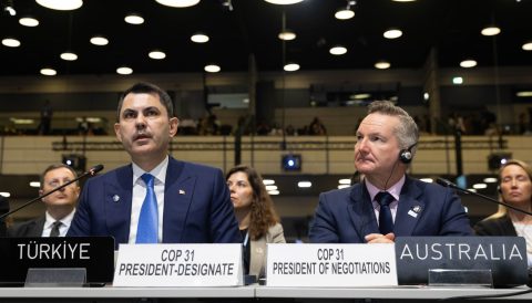
COP31 president Murat Kurum said earlier this month that the push to make electrification more “widespread” – through measures like the rollout of electric vehicles and heat pumps – will “automatically” lead to a reduction in the use of fossil fuels.
But many campaigners disagree, criticising the proposed pledge for failing to give an explicit signal on the fossil fuel transition.
Lack of clarity on energy sources
“Let’s not let electrification become the Trojan horse of our times, used to hide new fossil fuel consumption rather than promote renewable energy,” Claire Smith from civil society umbrella group Beyond Fossil Fuels said in reaction to the pledge’s publication.
She added that the commitment will only help address the climate crisis if electrification is powered by a flexible energy system where solar and wind are complemented by enhanced grids and storage.
The pledge’s text says that the electricity goal should be supported by “diverse and sustainable energy sources”, but it stops short of explaining what these sources are.
Alden Meyer, an international climate policy expert and senior associate at think-tank E3G, said the details of the pledge matter to how effective it will be in helping bring planet-heating emissions down.
“It has to be clean, and we haven’t got enough clarity on a guarantee that it will be a decarbonisation move,” he told Climate Home News.
China’s industrial engine starts to break its fossil fuel habit
According to an annual electricity review from energy think-tank Ember, in 2025 renewables edged ahead of coal power for the first time in 100 years. Continued growth in solar and wind pushed the share of renewables above a third of global electricity generation to just under 34%, compared with coal at 33%, it said.
Janet Milongo, energy Transition lead at CAN International, said success cannot be measured simply by how much of the world’s final energy consumption becomes electric.
“We must ask what generates that electricity, who has access to it, who owns the infrastructure, and whether it is helping communities transition away from fossil fuels,” she added.
Electrification alone can’t meet climate goals
Analysis published by the IEA on Tuesday, alongside the pledge, found that it would already be cost-effective to raise electricity’s share of global energy use from 23% today to around 33% with existing technologies, putting the COP31 goal “within striking distance”. Based on current policies, however, the share reaches only about 30% by 2035.
Hitting the 35% target would cut fossil fuel importers’ import bills by around $400 billion a year by 2035, the IEA said. At the higher prices caused by the conflict in the Middle East, that saving rises to more than $500 billion.
Speaking at New York Climate Week on Tuesday, IEA executive director Fatih Birol said the agency’s figures show that in 2026, about 80% of all new power plants built will run on renewables, with a few percentage points coming from nuclear power and the rest from fossils fuels. “So therefore, electrification itself will lead reduction of the [greenhouse gas] emissions,” he added.
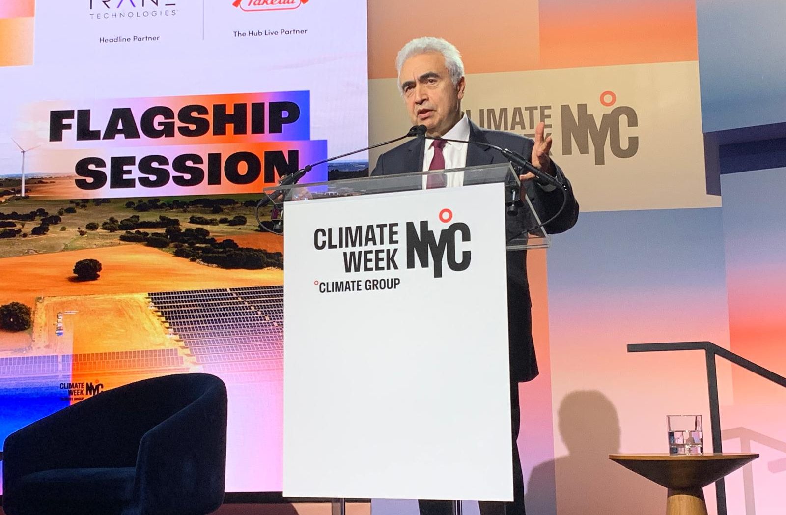
However, the IEA warned in its new report that electrification “by itself is not enough” to meet the world’s climate targets. It noted that, if “low-emission” sources of power continue to simply grow in line with current policy scenarios, that would be only just enough to cover the extra demand from electrification, driving a modest decline in emissions.
Matt Webb, associate director of global clean power diplomacy at E3G, said the pledge is a “welcome signal of leadership” and can help COP31 be a “critical moment” for countries to double down on the energy commitments made at COP28.
But to secure the full benefits of electrification, he added, it is essential that we “urgently clean up” by speeding up the rollout of renewables and developing credible national plans to transition away from fossil fuels.
The post COP31 electrification pledge leaves out clean power commitment appeared first on Climate Home News.
COP31 electrification pledge leaves out clean power commitment
People around the world have donated almost $90 million to a government-led campaign to help Nepal recover from its recent devastating Himalayan flood, according to a Nepali climate negotiator, even as the UN chief slammed the tiny amount of money in a new fund to deal with such disasters.
Individuals and companies from Nepal and abroad have chipped in from $5 to “many millions” of dollars to the Prime Minister’s Disaster Relief Fund, Manjeet Dhakal, an advisor to the poorest countries at UN climate talks, told an event on Monday focused on early warning systems.
The prompt and substantial response from the public contrasts with the slower, more limited support that is potentially on offer from the UN’s new Fund for Responding to Loss and Damage (FRLD), set up by governments to compensate developing countries for climate disasters.
Comment: Human security relies on adapting to the world’s new climate reality
Over three weeks have passed since Nepal’s finance and environment ministers asked the FRLD board to take an urgent decision to allocate funding to help Nepal protect people and restore essential services in the wake of the disaster, which caused around 1,450 deaths and left more than 5,000 people missing.
“Time is of the essence,” the ministers wrote in an appeal to the FRLD on August 31, which was swiftly followed by a letter from a group of developing-country board members urging the FRLD board’s co-chairs to organise an extraordinary meeting to come up with a response.
Loss and damage fund hesitates
Yet, despite informal online meetings, the co-chairs have yet to convene a meeting with the power to allocate funds. The board’s next scheduled meeting begins on December 15.
Dhakal said on Monday that the request has “received some positive response, but still there is some discussion ongoing about how to respond to that”.
“If they can’t respond in a timely manner, then is [the fund] fit for purpose in terms of disasters that the world would be facing in the coming years? The scale and intensity of these disasters is increasing,” he said.
With just $820 million pledged to it by rich countries and not all of that yet delivered, the FRLD has earmarked just $350 million to spend in its initial phase and without further contributions could run out of money next year.
Because of these limited funds, and a huge number of requests for funding totalling nearly $3 billion, the FRLD has said it will only give out a maximum of $20 million to each project for now. It has yet to approve funding for any projects.
Dhakal recently told The Nation magazine that this amount was just a “symbolic gesture”. Nepal’s government has estimated the costs of recovery and reconstruction at $4.8 billion, with homes, roads, bridges, hospitals and hydropower stations in the affected area needing to be repaired and rebuilt.
“Ridiculously small” funding
In a speech to the UN General Assembly on Tuesday, the body’s outgoing Secretary-General António Guterres criticised the “ridiculously small” level of funds made available by wealthy governments to the FRLD. Developed countries should “make the loss and damage fund work at scale”, he said.

The Portuguese diplomat told world leaders that when he travelled to Nepal three years ago, he had “sounded the alarm on accelerating glacier melt, warning that the rooftops of the world are caving in”.
“Some dismissed it all as overstating dangers, but as tragic events have shown, impacts are arriving sooner, hitting harder, and spreading further than many anticipated,” he said.
A recent study by scientists with the World Weather Attribution group found that climate change contributed to the rock-ice avalanche which sparked a huge flash flood along a river valley on the Nepal-Tibet border.
Speaking at a separate event in New York on Monday, leading climate scientist Johan Rockström highlighted those findings on the role of global warming in the Himalayan disaster.
“This will be potentially the first poster-child case of a loss and damage invoice, because here we have a proven case of a catastrophe which would not have occurred if it hadn’t been for human-caused climate change,” he said.
The post As loss and damage fund stalls, Nepal crowdfunds flood relief appeared first on Climate Home News.
As loss and damage fund stalls, Nepal crowdfunds flood relief
Climate Change
Explainer: How sea level rise poses an ‘existential threat’ to humans, heritage and nature
For millions of people around the world, rising sea levels are already reshaping economies, livelihoods and cultures.
The world’s oceans are currently rising at a faster rate than at any time in at least the past three millennia, with human influence the “dominant cause” of sea level rise since at least 1970.
At the UN general assembly in New York this week, world leaders are set to adopt a high-level declaration on the “existential threats” posed by sea level rise.
The declaration notes: “Sea level rise is not a distant scenario, but a real and lived experience for many.”
On average, global sea levels rose by 20 centimetres (cm) between 1901 and 2018.
This is due to both the melting of glaciers and ice sheets and the expansion of seawater as it warms, as well as changes in land-water storage.
The rate of the rise has accelerated in recent years, with ocean levels rising 10.6cm since 1993.
Sea level rise can vary locally due to seismic and volcanic activity, groundwater extraction and changes to the Earth’s surface resulting from ice melt.
Under a moderate-emissions scenario, scientists predict that global average sea level will rise an additional 56cm by 2100, relative to a 1995-2014 baseline.
Here, Carbon Brief unpacks some of the key ways that sea level rise threatens both societies and ecosystems.
Cities and coastal communities
Around 770 million people – 10% of the world’s population – are at “acute risk” of negative impacts from sea level rise, according to a report from the UN secretary general released last month.
(The report defines locations at acute risk as those that are less than five metres above the high-tide line.)
The people at risk include the residents of several of the world’s largest cities, including Mumbai and Kolkata in India and Shenzhen and Guangzhou in China. It also encompasses the entire populations of many island nations. (See: Small island developing states.)
There are two ways to consider sea level rise.
Global-average sea level rise is the amount the ocean surface has moved upwards, on average, relative to a baseline.
Relative, or local, sea level rise, is how much the ocean has risen in a given place. This can vary from the global average due to a number of factors, including land motion and ocean circulation, as well as changes to the Earth’s surface, rotation and gravitational pull due to the melting of the ice sheets.
Higher sea levels bring with them myriad dangers for coastal communities: they can increase persistent flooding and inundation, strengthen dangerous storm surges and erode beaches and cliffs. Sea level rise also causes the water table of coastal land to rise, which exacerbates flood risk.
The frequency of 100-year “extreme sea level events” has already increased 12-fold since 1900. These are events where high tides, storm surges and relative sea level rise combine to produce exceptionally high sea levels. Under a moderate-emissions scenario, these events are likely to occur at least annually – and, potentially, even more frequently – in many places by the end of the century.
In addition to damage to homes and other buildings, critical infrastructure – such as water systems and wastewater management projects – is increasingly vulnerable to flooding as a result of sea level rise. Flooding can cut communities off from essential services, such as hospitals and markets, with low-income and other marginalised groups disproportionately affected.
Inland encroachment of seawater leads to the saltwater intrusion and threatens agriculture in low-lying coastal areas.
Vertical land motion can also amplify the risk of rising seas. This includes a shifting of the land in response to seismic or volcanic activity or to land sinking, known as subsidence. The changes in local sea level due to these types of vertical motion can equal or surpass the contributions of climate-driven sea level rise.
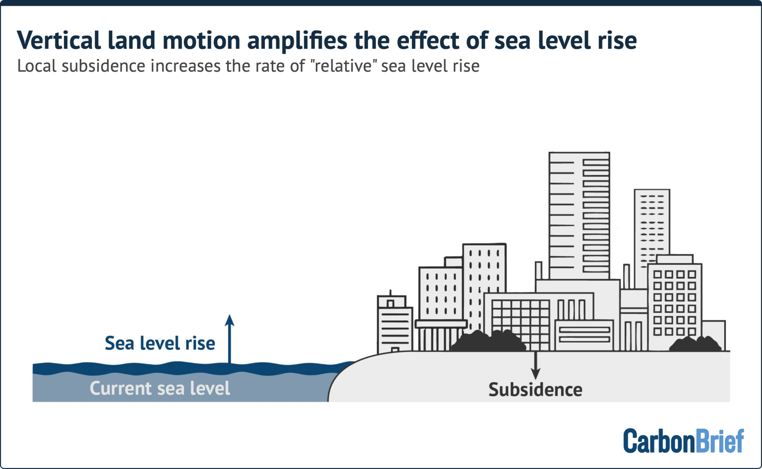
Many of the coastal cities experiencing the largest changes in their relative sea level are located in east and south-east Asia. One notable example is Jakarta, Indonesia, which has been sinking by up to 15cm per year over the past decade, due largely to the overextraction of groundwater, which leads to the collapse of underground aquifers.
But even as the risks from sea level rise increase, population growth in coastal areas continues to outstrip that of inland areas. Between 2000 and 2018, the global population grew by slightly more than 23%. The population living within 5km of a coast increased by 28% over that same time.
The associated development of coastal areas means that, even without future sea level rise, global losses from flooding in the world’s largest 136 coastal cities could reach up to $52bn per year by 2050 – up from $6bn in 2005.
In response to the growing threats posed by sea level rise, communities around the world have implemented a number of adaptive actions.
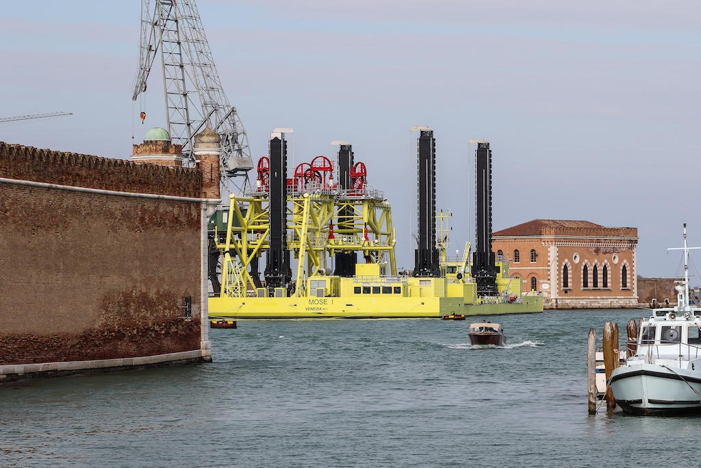
In 2003, the Italian city of Venice began a years-long project to construct three floodgates that could be raised during high tide events to protect the city’s lagoon from the encroachment of the Adriatic Sea. The system was engaged for the first time in October 2020 and then another 48 times in the following two years.
Other communities have opted for less technologically intensive adaptations, including constructing seawalls, restoring mangrove forests and marshes, disincentivising development in high-risk areas and relocating residents, buildings and infrastructure to higher ground or inland areas.
However, existing adaptations may not be sufficient to protect communities. Under a low-emissions scenario, these protections may be breached 10 times as frequently over the next 30 years as they currently are.
Biodiversity and coastal ecosystems
The world’s coastal ecosystems are rapidly being destroyed due to both development and sea level rise.
This combination of pressures is called “coastal squeeze”, where ecosystems that may have otherwise shifted inland in response to sea level rise find their paths blocked by human-made structures.
Coastal squeeze has contributed to the widespread loss of the world’s wetlands.
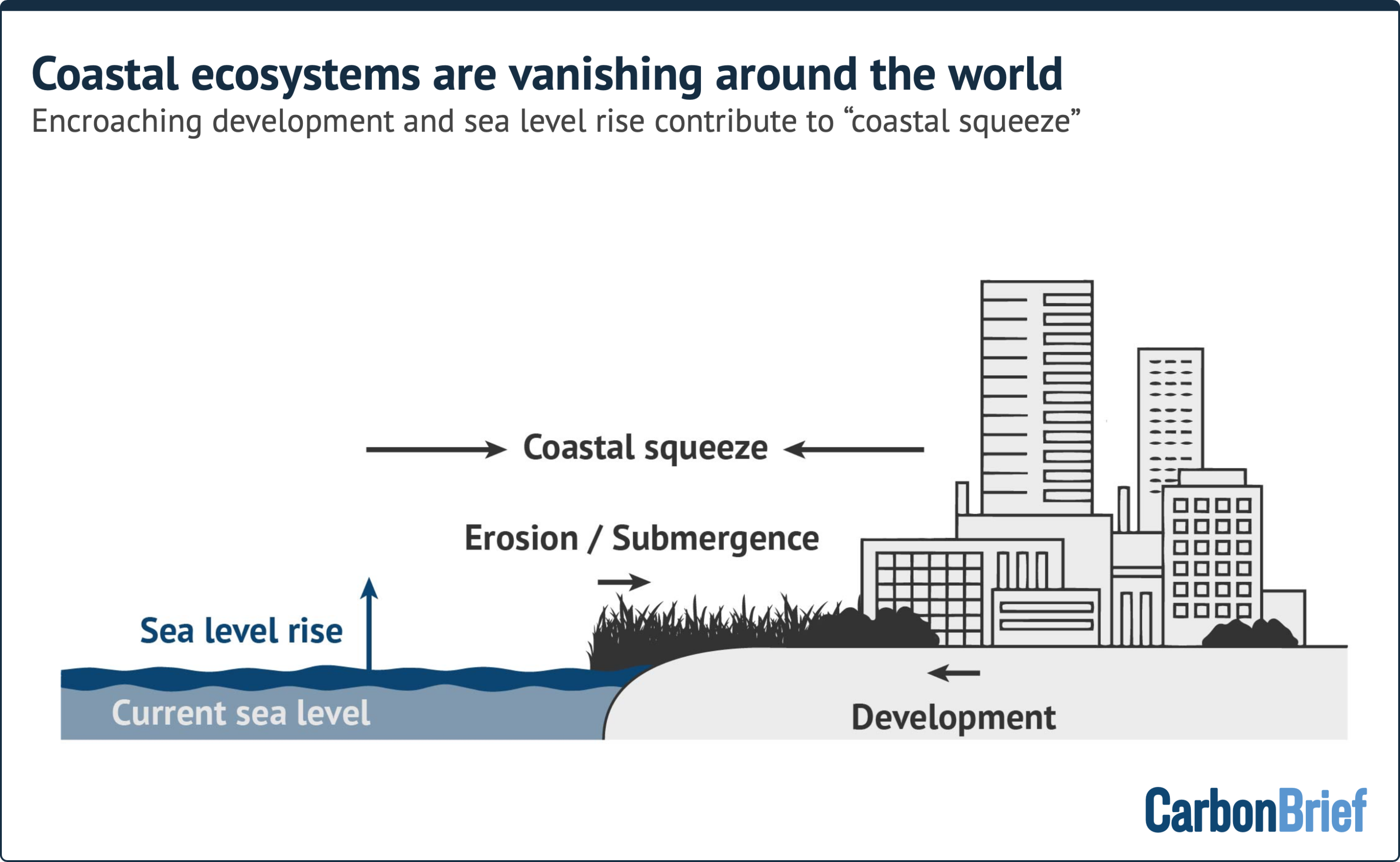
Globally, nearly 28m hectares of coastal wetlands – including estuaries, tidal flats, mangroves and seagrass – have disappeared since 1970, according to the 2025 “global wetland outlook” report. This is an area equivalent to roughly the size of Ecuador.
Although the report names conversion to agriculture as the largest driver of wetland loss, it notes:
“Climate change is increasingly exacerbating the impact of other drivers on wetlands and human wellbeing through changes in the frequency and intensity of extreme weather events, associated fires, floods and droughts and through sea level rise.”
In the continental US, just 16% of coastal wetlands are migrating inland at rates that exceed local sea level rise. Nearly three-quarters of sites are moving at rates that do not outpace sea level rise, while 11% are submerging.
Low-lying islands are particularly threatened by sea level rise, due to their large amounts of coastline relative to their land areas. At the same time, islands are often “hotspots” of biodiversity, with many home to species found nowhere else in the world. More than 20% of the Earth’s known plant species are found only on islands.
A 2013 study modelled the impact of different amounts of sea level rise on 10 island biodiversity hotspots, comprising nearly 4,450 individual islands. It found that in a future with one metre of sea level rise, around 6% of the island habitat area would be completely submerged, while more than 11% of the hotspot islands would see their land area reduced by at least half. This could put dozens of species at risk of extinction, the study said.

In 2024, researchers documented the first known extirpation, or local extinction, of a plant species in the US due to sea level rise. Hurricanes and storm surges – amplified by sea level rise – began to kill off the only US population of the Key Largo cactus in the 2010s.
The remaining cacti suffered from soil erosion and saltwater intrusion and the final remaining specimens were removed in 2021 in an effort to cultivate them in greenhouses. (Other Caribbean islands, including Cuba, do still have surviving populations of the cactus.)
As native flora and fauna are diminished or even eliminated by rising sea levels, coastal ecosystems may become vulnerable to colonisation by invasive alien species, further harming biodiversity.
And as coastal communities are forced to relocate due to sea level rise, there are knock-on effects for biodiversity as they develop on new lands. These secondary biodiversity impacts are likely to be particularly prevalent in south-east Asia, due to the large number of people living in low-lying areas who may be forced to migrate due to sea level rise.
Small island developing states
Sea level rise poses an “acute and disproportionate” threat to small island developing states, says the recent UN report. It adds:
“Even under moderate scenarios, rising seas will render many low-lying coastal zones and small island developing states increasingly uninhabitable without extraordinary adaptation.”
Climate change is already resulting in loss and damage to small island nations, which are particularly vulnerable to both climate change in general and sea level rise specifically.
This vulnerability is in large part due to the geography of these countries. Several small island Pacific states are made up of atolls – ring-shaped coral or sandy islands that encircle lagoons. These often have average elevations of 1-2 metres above sea level and maximum elevations of 3-5 metres above sea level.
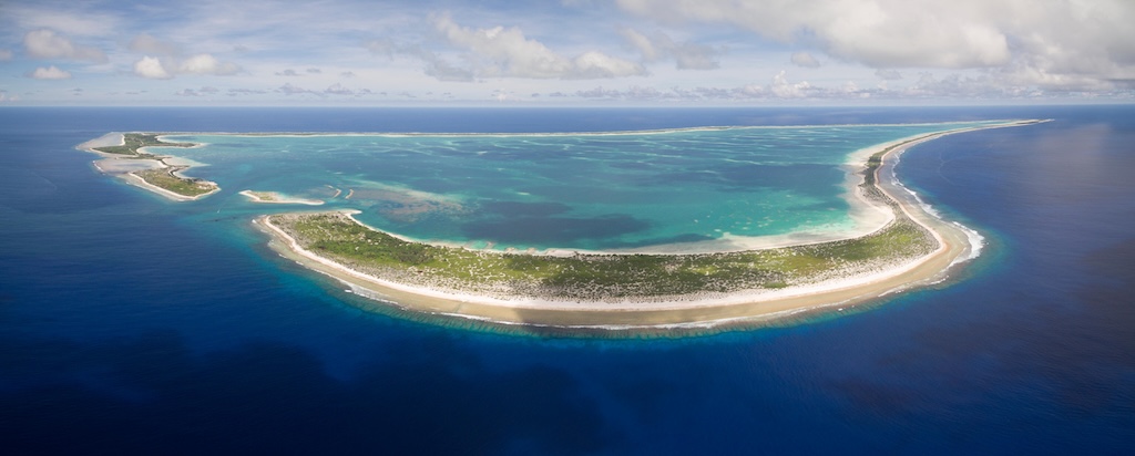
Some modelling evidence has shown that reef islands can grow vertically in response to sea level rise, as waves washing over the islands transport sediment from the ocean onto the surface. However, the strength of such waves would likely make these islands unsuitable for building on.
Other research has shown that Pacific islands respond in many different ways to rising sea levels, with “complex” outcomes, both positive and negative.
In addition, most of the small-island nations in the Pacific Ocean are located in a region where relative sea level rise from the melting of the Antarctic ice sheet is projected to be 11-33% higher than the global average rise in 2100 – regardless of emissions scenario.
The effects of this higher-than-average sea level rise is already evident.
In 1999, Kiribati lost two small, uninhabited islands to the rising seas. Several uninhabited islands in the Solomon Islands had vanished by 2014, while a further six islands had been severely eroded by the ocean, necessitating the relocation of some communities.
In addition, most small island developing states are located in parts of the ocean that are often hit by tropical cyclones. Sea level rise can enhance storm surge, leading to greater destruction during such storms.
However, small island developing states are also vulnerable “because they lack the means to address the impacts on their own”, reads the UN report.
According to the UN, these countries will require up to $6bn annually by 2035 in order to adapt to climate change. However, they received just $1.2bn in public adaptation finance in 2022-23.
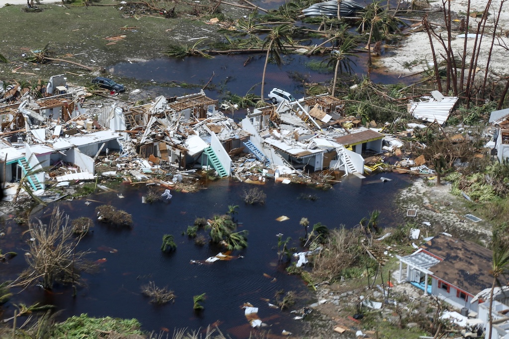
Currently, small island developing states experience “expected” annual climate damages of $1.64bn due to coastal flooding, equivalent to 0.13% of their cumulative GDP. But, even if warming were limited to 1.5C above pre-industrial temperatures, these annual damages are projected to grow to $24bn.
In the international policy arena, questions have arisen over what should happen to island nations’ maritime boundaries as their land is enveloped by the sea. This is because maritime holdings, such as exclusive economic zones, are determined based on a country’s land borders.
However, a 2025 report by the UN International Law Commission considered the legal implications of sea level rise. It concluded that international law allows for countries’ borders to stay the same, “notwithstanding changes to the coastline as a result of climate change-related sea level rise”. It also noted:
“There is a need to develop legal and practical solutions to better protect persons affected by sea level rise, including those who remain in situ and those who are internally or externally displaced by it.”
Other small islands also face similar issues in their exposure to threats posed by sea level rise.
Coral reefs
Coral reefs are among the ecosystems that are most vulnerable to climate change.
They are also being visibly affected already – almost entirely due to ocean warming. Even though these ecosystems are completely submerged to begin with, they are also impacted by sea level rise.
As the ocean rises, the water over shallow ecosystems deepens.
The effects of this are twofold. Deeper water reduces the temperatures experienced by reefs. This can act as a buffer against marine heatwaves and global ocean warming.
At the same time, the increased depth reduces the amount of light that can reach the coral communities, which can impact their survival.
In addition, sea level rise-assisted erosion will add more sediment to the near-shore waters. These particles can settle on corals, impeding their ability to feed and reproduce, as well as interfering with photosynthesis by the zooxanthellae algae that live symbiotically with corals. Together, this leads to slower coral growth and increased stress on reefs.
So far, reefs in some parts of the world have been able to “keep pace” with sea level rise, growing vertically at accelerated rates and therefore maintaining suitable levels of light availability.
However, modelling has shown that few reefs have the capacity to continue to maintain their distance from the surface under a moderate-emissions scenario.
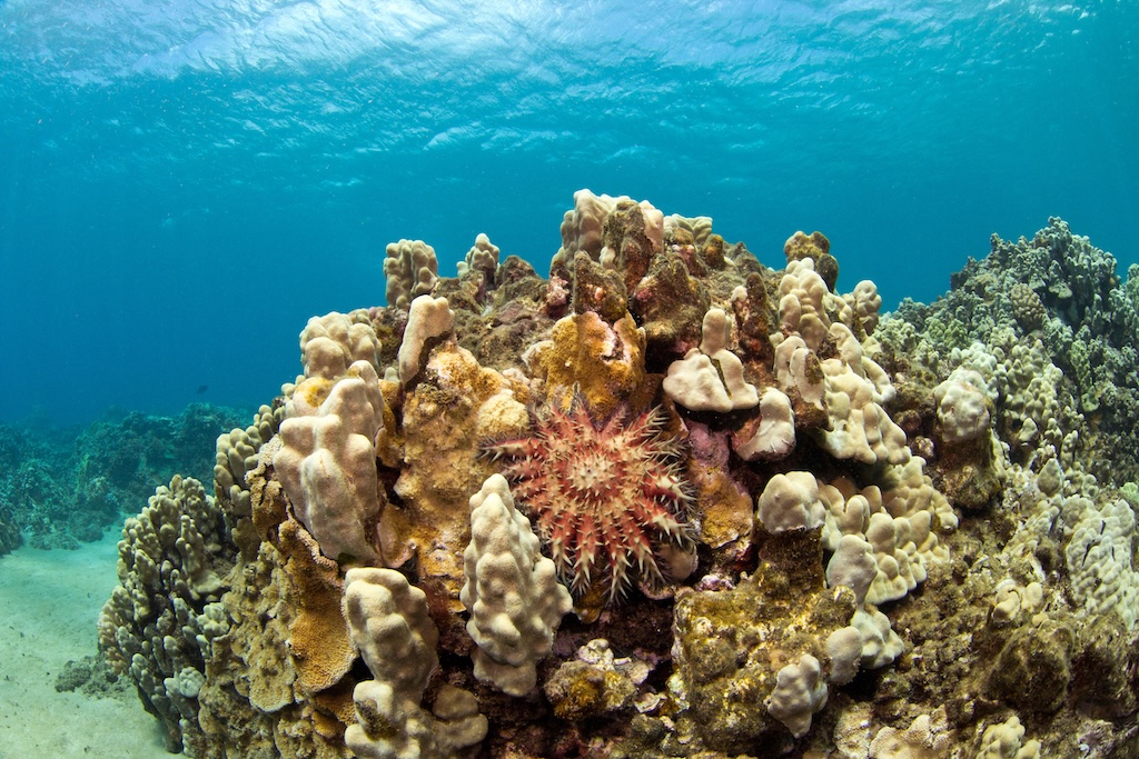
As coral reefs degrade, the seafloor below them can wear away. This erosion is contributing to greater apparent levels of sea level rise on coral reefs in the Caribbean, as well as the US states of Florida and Hawaii.
Sea level rise may also have the ability to spur reef growth in shallow environments previously thought to be uninhabitable for corals. In Sanya Bay in the northern South China Sea, sea level rise since the mid-1980s has allowed for the recolonisation of a reef that had been dormant for more than five millennia.
But the opportunities for such recolonisation are far outstripped by the loss of coral elsewhere. Since 1980, the world has lost nearly 10% of its coral cover due to climate change-induced ocean warming. The UN declaration reads:
“Every fraction of a degree of global warming increases the risks to coral reefs.”
Heritage sites
Throughout human history, many societies developed along rivers and coastlines, due to the abundance of food and ease of transportation. However, their proximity to the sea means that many of these sites are now at risk of being damaged or destroyed by sea level rise.
Cultural heritage includes “physical sites, living heritage, traditional lands, burial grounds, underwater cultural heritage, archaeological and sacred sites and culturally significant coastal landscapes”, according to the UN sea level rise report.
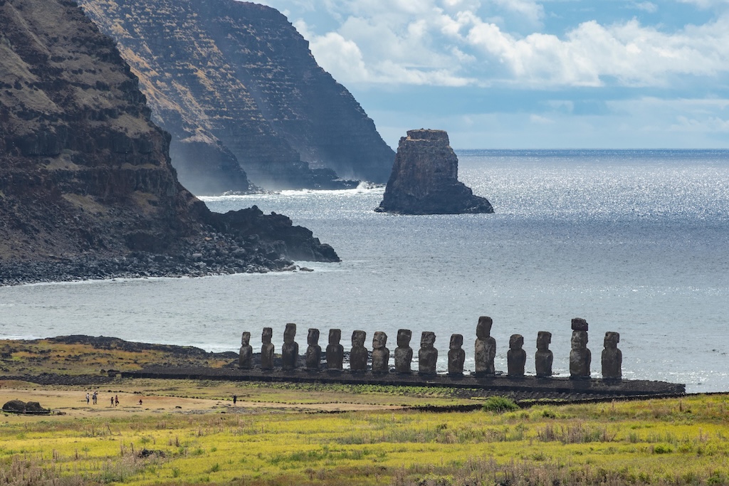
Several studies have mapped the cultural and natural heritage sites that are most at risk from flooding and erosion due to sea level rise.
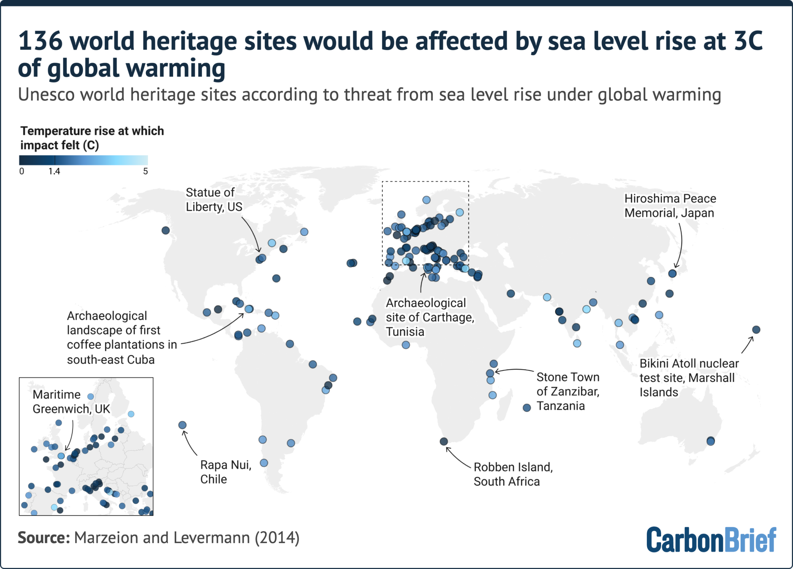
There are 49 Unesco world heritage sites located at low elevations along the coast of the Mediterranean Sea. Nearly every one of these is already at risk from erosion or severe flooding events – 42 face issues with erosion, while 37 are at risk from a 100-year flood event. Both of these risks will increase over the remainder of the century as sea levels continue to rise.
The locations at risk include the archaeological sites of the ancient cities of Carthage in present-day Tunisia and Ephesus in Turkey, the ruins of Pompeii and Herculaneum in Italy and the medieval Cathedral of St James in Šibenik, Croatia.
The sea level rise associated with warming of 3C above pre-industrial temperatures would impact nearly one-fifth of all Unesco cultural world heritage sites. The sites at risk include Japan’s Hiroshima Peace Memorial, South Africa’s Robben Island, Chile’s Rapa Nui and the Sydney Opera House. Many of these become vulnerable at lower levels of global warming.
In Africa, 56 out of 284 cultural and natural heritage sites already face threats from flooding or erosion due to sea level rise. This number is expected to nearly triple – to 191 threatened sites – by 2050 under a moderate-emissions scenario. However, mitigating emissions could reduce the number of very-highly exposed sites – those with at least 75% of their area vulnerable – by one-quarter.
Globally, there are 386 Unesco heritage sites along the coast that are, at most, 20 metres above sea level and are therefore potentially affected by coastal erosion and flood hazards.
These threatened sites include 289 cultural heritage sites and 91 natural heritage sites, as well as six “mixed” sites that are recognised for both their cultural and natural significance.
The UN declaration calls for action to mitigate damage to significant sites, saying:
“Protection, preservation and documentation of cultural heritage is a priority.”

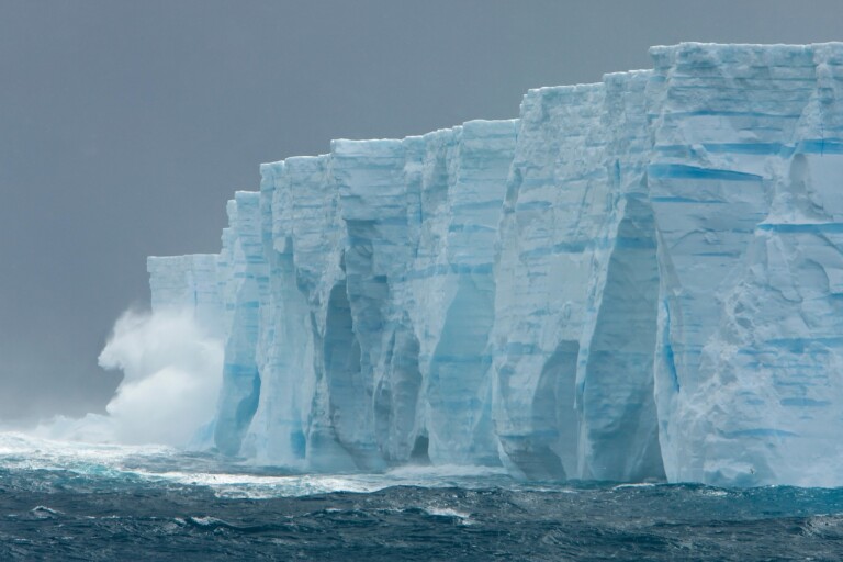
The post Explainer: How sea level rise poses an ‘existential threat’ to humans, heritage and nature appeared first on Carbon Brief.
Explainer: How sea level rise poses an ‘existential threat’ to humans, heritage and nature



-

 Greenhouse Gases2 years ago
嘉宾来稿:满足中国增长的用电需求 光伏加储能“比新建煤电更实惠”
-
Climate Change1 year ago
Guest post: Why China is still building new coal – and when it might stop
-
Greenhouse Gases1 year ago
Guest post: Why China is still building new coal – and when it might stop
-

 Climate Change2 years ago
嘉宾来稿:满足中国增长的用电需求 光伏加储能“比新建煤电更实惠”
-

 Renewable Energy11 months ago
Sending Progressive Philanthropist George Soros to Prison?
-
Climate Change2 years ago
Bill Discounting Climate Change in Florida’s Energy Policy Awaits DeSantis’ Approval
-
Greenhouse Gases1 year ago
嘉宾来稿:探究火山喷发如何影响气候预测
-

 Carbon Footprint2 years ago
US SEC’s Climate Disclosure Rules Spur Renewed Interest in Carbon Credits